


今天我们来学习一下唐老师的商品信息可视化与文本处理结果可视化展示。
注意:在启动jupyter notebook时使用命令:
jupyter notebook --NotebookApp.iopub_data_rate_limit=1.0e101.首先,导入需要用到的包(缺啥装啥pip install ....)
import nltk
import re
import pandas as pd
import numpy as np
import pickle
import string
import matplotlib.pyplot as plt
import seaborn as sns
sns.set(style="white")

from nltk.tokenize import word_tokenize, sent_tokenize
from nltk.corpus import stopwords
from sklearn.feature_extraction import stop_words
from nltk.stem.porter import *

from collections import Counter
from wordcloud import WordCloud
from sklearn.feature_extraction.text import TfidfVectorizer
from sklearn.feature_extraction.text import CountVectorizer
from sklearn.decomposition import LatentDirichletAllocation

import plotly.offline as py
py.init_notebook_mode(connected=True)
import plotly.graph_objs as go
import plotly.tools as tls
%matplotlib inline

import bokeh.plotting as bp
from bokeh.models import HoverTool, BoxSelectTool
from bokeh.models import ColumnDataSource
from bokeh.plotting import figure, show, output_notebook
#from bokeh.transform import factor_cmap

import warnings
warnings.filterwarnings('ignore')
import logging
logging.getLogger("lda").setLevel(logging.WARNING)
2.读取数据
train = pd.read_csv('train.tsv',sep='\t')
test = pd.read_csv('test.tsv',sep='\t')其中,tsv文件是一个以制表符来进行分隔数据并存储的文件格式文件,内存储数据是以表格的格式进行保存的。sep='\t'指的是你读取的数据的分隔方式在数据集中数据的分割符是‘\t’
读取完数据显示一下效果。
train.head()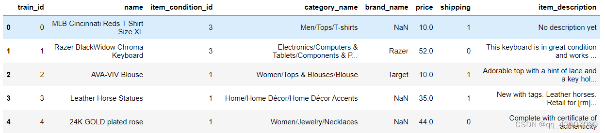
3.统计个数
train.shipping(列名).value_counts() #value默认数量从大到小排序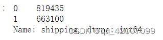
train.price.describe()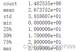
计算price一列的基本数值情况,包括平均数,最大最小值
4.数据可视化
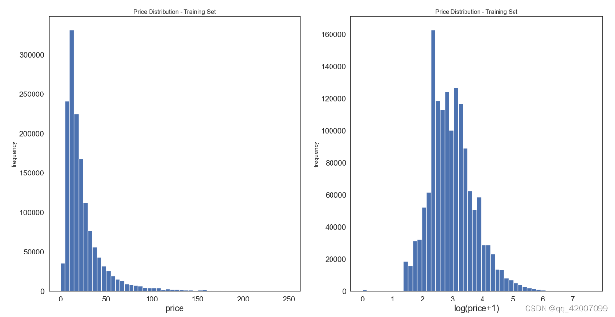
为了研究价格与数量之间的关系,将所有价格对应的数量进行展示
plt.subplot(1,2,1)
(train['price']).plot.hist(bins=50,figsize(10,5),edgecolor='white',range[0,250])
plt.xlabel('price',fontsize=17)   #x轴表示的意义
plt.ylabel('frequency')            #y轴表示的意义
plt.tick_params(labelsize=15)
plt.title('Price Distribution - Training Set')其中,subplot(1,2,1)表示定义了一行两列的图排版,这张图片显示在1位置。(train['price']).plot.hist绘制直方图,分箱数为 50 个 (bins=10),alpha 为颜色的透明度,取 0 - 1 范围,figszie表示figsize是设置幕布大小尺寸。范围为【0,250】
可以看到,用原始数据的展示效果看不数据的分布规律,因此把数据经过log函数转换使得数据更符合正太分布。
plt.subplot(1,2,1)
np.log(train['price']+1).plot.hist(bins=50,figsize(10,5),edgecolor='white',range[0,250])
plt.xlabel('price',fontsize=17)   #x轴表示的意义
plt.ylabel('frequency')            #y轴表示的意义
plt.tick_params(labelsize=15)      #刻度标签字体大小
plt.title('Price Distribution - Training Set')
train['price']+1是因为log函数在0点的为负无穷大,因此要加1
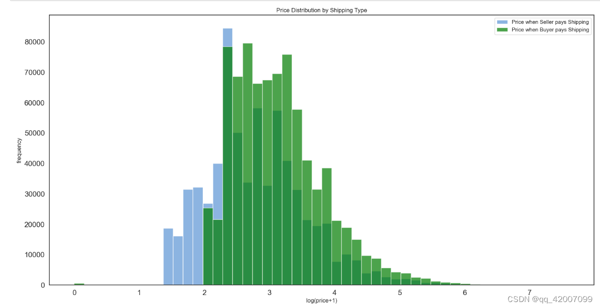
接下来看看train.shipping==0或1的对应的价格多少 。根据条件定位: train.loc[train.“某个列名” ==0],定位某个列值等于0的所有行。
prc_shipBySeller = train.loc[train.shipping==1,'price']    #包邮时的价格
prc_shipByBuyer = train.loc[train.shipping==0,'price']
为了进一步的了解卖家包邮与价格的关系,比如可能包邮的价格会更高。因此我们在拿到包邮和不包邮的价格来绘制出直方图。
fig, ax = plt.subplots(figsize=(20,10))
ax.hist(np.log(prc_shipBySeller+1), color='#8CB4E1', alpha=1.0, bins=50,
       label='Price when Seller pays Shipping')
ax.hist(np.log(prc_shipByBuyer+1), color='#007D00', alpha=0.7, bins=50,
       label='Price when Buyer pays Shipping')
plt.legend()
plt.xlabel('log(price+1)')
plt.ylabel('frequency')
plt.title('Price Distribution by Shipping Type')
plt.tick_params(labelsize=15)
plt.show()plt.subplots()是一个函数,返回一个包含figure和axes对象的元组,把多个子图一起合并到一个图上。使用fig,ax=plt.subplots()将元组分解为fig和ax两个变量。通常,我们只用到ax。
其中fig, ax = plt.subplots()==fig, ax1 = plt.subplots(1, 1) 表示创建一个1个图,若要设置图表大小则在其中加入figsize=(10,20);tick_params中可设置一系列属性,包括刻度值字体大小、方向、大小,颜色等一系列属性。这里的alpha=1.0表示设置的透明的,因为是两个颜色的重叠,可以更加清楚的表示重叠部分。


 384
384


 被折叠的 条评论
为什么被折叠?
被折叠的 条评论
为什么被折叠?
 到【灌水乐园】发言


