


目录
1. Layout 布局
2. Container 布局容器
3. Color 色彩
4. Typography 字体
5. Icon 图标
6. Button 按钮
汇总
Layout
Row Attributes:
| 参数 | 说明 | 类型 | 可选值 | 默认值 |
|---|---|---|---|---|
| gutter | 栅格间隔 | number | — | 0 |
| type | 布局模式,可选 flex,现代浏览器下有效 | string | — | — |
| justify | flex 布局下的水平排列方式 | string | start/end/center/space-around/space-between | start |
| align | flex 布局下的垂直排列方式 | string | top/middle/bottom | top |
| tag | 自定义元素标签 | string | * | div |
Col Attributes
| 参数 | 说明 | 类型 | 可选值 | 默认值 |
|---|---|---|---|---|
| span | 栅格占据的列数 | number | — | 24 |
| offset | 栅格左侧的间隔格数 | number | — | 0 |
| push | 栅格向右移动格数 | number | — | 0 |
| pull | 栅格向左移动格数 | number | — | 0 |
| xs | <768px 响应式栅格数或者栅格属性对象 | number/object (例如: {span: 4, offset: 4}) | — | — |
| sm | ≥768px 响应式栅格数或者栅格属性对象 | number/object (例如: {span: 4, offset: 4}) | — | — |
| md | ≥992px 响应式栅格数或者栅格属性对象 | number/object (例如: {span: 4, offset: 4}) | — | — |
| lg | ≥1200px 响应式栅格数或者栅格属性对象 | number/object (例如: {span: 4, offset: 4}) | — | — |
| xl | ≥1920px 响应式栅格数或者栅格属性对象 | number/object (例如: {span: 4, offset: 4}) | — | — |
| tag | 自定义元素标签 | string | * | div |
基础布局:
<el-row>
  <el-col :span="24"><div class="grid-content bg-purple-dark"></div></el-col>
</el-row>
分栏间隔:
<el-row :gutter="20">
  <el-col :span="6"><div class="grid-content bg-purple"></div></el-col>
  <el-col :span="6"><div class="grid-content bg-purple"></div></el-col>
  <el-col :span="6"><div class="grid-content bg-purple"></div></el-col>
  <el-col :span="6"><div class="grid-content bg-purple"></div></el-col>
</el-row>
分栏偏移:
<el-col :span="6" :offset="6"><div class="grid-content bg-purple"></div></el-col>
基于断点的隐藏类:
- hidden-xs-only - 当视口在 xs 尺寸时隐藏
- hidden-sm-only - 当视口在 sm 尺寸时隐藏
- hidden-sm-and-down - 当视口在 sm 及以下尺寸时隐藏
- hidden-sm-and-up - 当视口在 sm 及以上尺寸时隐藏
- hidden-md-only - 当视口在 md 尺寸时隐藏
- hidden-md-and-down - 当视口在 md 及以下尺寸时隐藏
- hidden-md-and-up - 当视口在 md 及以上尺寸时隐藏
- hidden-lg-only - 当视口在 lg 尺寸时隐藏
- hidden-lg-and-down - 当视口在 lg 及以下尺寸时隐藏
- hidden-lg-and-up - 当视口在 lg 及以上尺寸时隐藏
- hidden-xl-only - 当视口在 xl 尺寸时隐藏
Container
基本结构:
<el-container> :外层容器。当子元素中包含 或 时,全部子元素会垂直上下排列,否则会水平左右排列。
<el-header>:顶栏容器。
<el-aside>:侧边栏容器。
<el-main>:主要区域容器。
<el-footer>:底栏容器
Container Attributes:
| 参数 | 说明 | 类型 | 可选值 | 默认值 |
|---|---|---|---|---|
| direction | 子元素的排列方向 | string | horizontal / vertical 子元素中有 el-header 或 el-footer 时为 vertical,否则为 | horizontal |
Header Attributes:
| 参数 | 说明 | 类型 | 可选值 | 默认值 |
|---|---|---|---|---|
| height | 顶栏高度 | string | — | 60px |
Aside Attributes:
| 参数 | 说明 | 类型 | 可选值 | 默认值 |
|---|---|---|---|---|
| width | 侧边栏宽度 | string | — | 300px |
Footer Attributes:
| 参数 | 说明 | 类型 | 可选值 | 默认值 |
|---|---|---|---|---|
| height | 底栏高度 | string | — | 60px |
Color
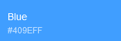
Element 主要品牌颜色是鲜艳、友好的蓝色:
 辅助色:
辅助色:
 中性色:
中性色:

Typography
| 字体 | 字体类别 |
|---|---|
| 中文字体 | PingFang SC ,Hiragino Sans GB,Microsoft YaHei |
| 英文/数字字体 | Helvetica Neue,Helvetica,Arial |
Font-family 代码:
font-family: "Helvetica Neue",Helvetica,"PingFang SC","Hiragino Sans GB","Microsoft YaHei","微软雅黑",Arial,sans-serif;
字体使用规范:
| 主标题 | 20px Extra large |
| 标题 | 18px large |
| 小标题 | 16px Medium |
| 正文 | 14px Small |
| 正文(小) | 13px Extra Small |
| 辅助文字 | 12px Extra Extra Small |
Icon
el-icon-iconName


Button
 Attributes:
| 参数 | 说明 | 类型 | 可选值 | 默认值 |
|---|---|---|---|---|
| size | 尺寸 | string | medium / small / mini | — |
| type | 类型 | string | primary / success / warning / danger / info / text | — |
| plain | 是否朴素按钮 | boolean | — | false |
| round | 是否圆形按钮 | boolean | — | false |
| loading | 是否加载中状态 | boolean | — | false |
| disabled | 是否禁用状态 | boolean | — | false |
| icon | 图标类名 | string | — | — |
| autofocus | 是否默认聚焦 | boolean | — | false |
| native-type | 原生 type 属性 | string | button / submit / reset | button |
图标按钮:
<el-button type="primary" icon="el-icon-search">搜索</el-button>


 1925
1925


 被折叠的 条评论
为什么被折叠?
被折叠的 条评论
为什么被折叠?
 到【灌水乐园】发言


