


今天把原来学html时,做过的小项目拿出来写一下,总结一下。
苹果官网这个首页,主要的要点在于它对于浏览器窗口大小的自适应变化
目标图

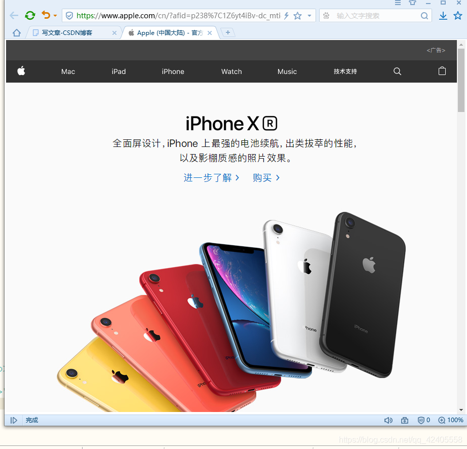
大页面
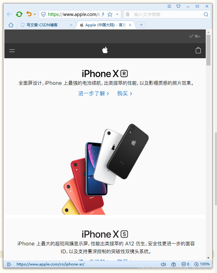
中等页面
小页面
这里我只截取了一部分。它整个页面都会根据窗口大小来变化。
实现代码
页面
<!DOCTYPE html>
<html>
<head>
<meta charset="utf-8" />
<link rel="stylesheet" type="text/css" href="css/reset.css"/>
<link rel="stylesheet" type="text/css" href="css/mid.css" />
<link rel="stylesheet" type="text/css" href="css/long.css"/>
<link rel="stylesheet" type="text/css" href="css/min.css"/>
</head>
<body>
<div id="nav">
<ul>
<li class="tag"><a href=""><img src="img/logo_min.svg" alt="" /></a></li>
<li class="tag"><a href="">Mac</a></li>
<li class="tag"><a href="">iPad</a></li>
<li class="tag"><a href="">iPhone</a></li>
<li class="tag"><a href="">Watch</a></li>
<li class="tag"><a href="">Music</a></li>
<li class="tag"><a href="">技术支持</a></li>
<li class="tag"><a href=""><img src="img/ser_min.svg" alt="" /></a></li>
<li class="tag"><a href=""><img src="img/buy_min.svg" alt="" /></a></li>
<li class="xiao"><a href=""><span class="line1"></span><span class="line2"></span></a></li>
<li class="xiao"><a href=""><img src="img/logo_min.svg" alt="" /></a></li>
<li class="xiao"><a href=""><img src="img/buy_min.svg" alt=""/></a></li>
</ul>
</div>
<div id="part1">
<div id="part1-con">
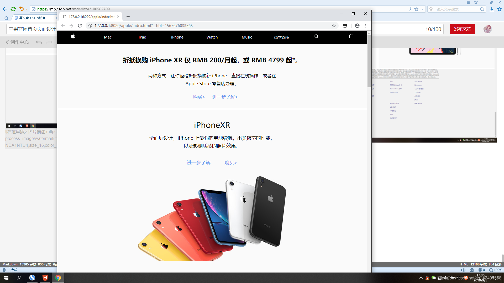
<p class="font1">折抵换购 iPhone XR 仅 RMB 200/月起,或 RMB 4799 起*。</p>
<p class="font2"><span>两种方式,让你轻松折抵换购新 iPhone:直接在线操作,或者在 Apple Store 零售店办理。</span></p>
<p class="font5"><a href="" class="font3">购买></a><a href="" class="font4">进一步了解></a></p>
</div>
</div>
<div id="part2">
<a href="">
<div id="part2-con">
<p class="font6">iPhoneXR</p>
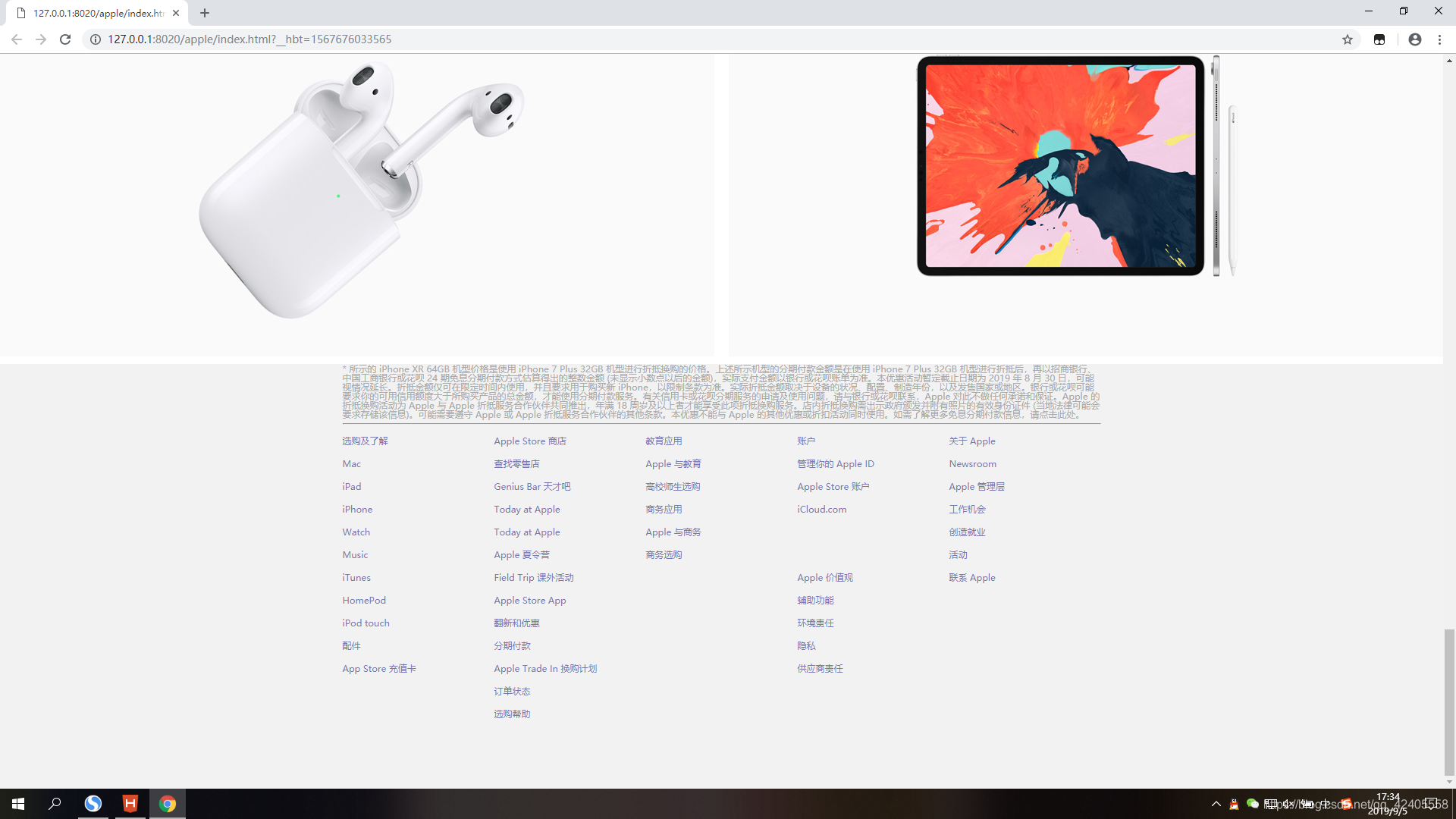
<p class="font7">全面屏设计,iPhone 上最强的电池续航,出类拔萃的性能,<br />以及影棚质感的照片效果。</p>
<p class="font8">进一步了解 购买></p>
<p class="c1-pic"></p>
</div>
</a>
</div>
<div id="part3">
<div id="part3-con">
<p class="font6">iPhoneXS</p>
<p class="font7">iPhone 上最大的超视网膜显示屏,性能出类拔萃的 A12 仿生,<br />安全性更进一步的面容 ID,以及支持景深控制的突破性双镜头<br />系统。</p>
<p class="font8">进一步了解 购买></p>
<p class="c2-pic"></p>
</div>
</div>
<div id="part4">
<div id="part4-con">
<p class="font6">WATCH <br /><span>SERIES 4</span></p>
<p class="font7">更强,更出彩</p>
<p class="font8">进一步了解 购买></p>
<p class="c3-pic"></p>
</div>
</div>
<div class="part5">
<div class="part5-con">
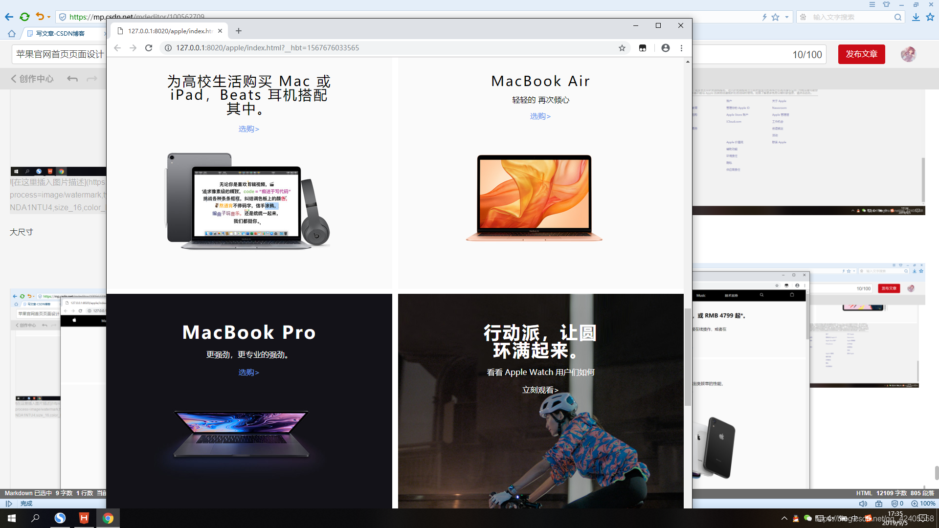
<p class="font9">为高校生活购买 Mac 或 iPad,Beats 耳机搭配其中。</p>
<p class="font10"><a href="">选购></a></p>
<p class="c4-pic"></p>
</div>
</div>
<div class="part6">
<div class="part6-con">
<p class="font9">MacBook Air</p>
<p class="font11">轻轻的 再次倾心</p>
<p class="font10"><a href="">选购></a></p>
<p class="c5-pic"></p>
</div>
</div>
<div class="part7">
<div class="part7-con">
<p class="font12">MacBook Pro</p>
<p class="font13">更强劲,更专业的强劲。</p>
<p class="font14"><a href="">选购></a></p>
<p class="c6-pic"></p>
</div>
</div>
<div class="part8">
<div class="part8-con">
<p class="font12">行动派,让圆环满起来。</p>
<p class="font13">看看 Apple Watch 用户们如何</p>
<p class="font14">立刻观看></p>
</div>
</div>
<div class="part9">
<div class="part9-con">
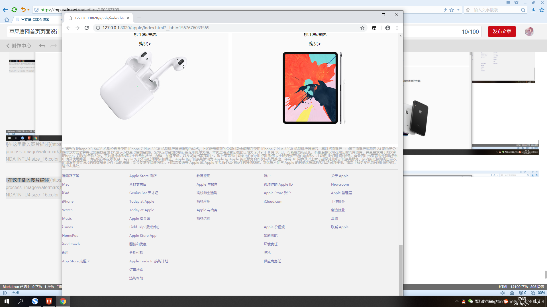
<p class="font9">AirPods</p>
<p class="font11">秒出新境界</p>
<p class="font10">购买></p>
<p class="c9-pic"></p>
</div>
</div>
<div class="part10">
<div class="part10-con">
<p class="font9">AirPods</p>
<p class="font11">秒出新境界</p>
<p class="font10">购买></p>
<p class="c10-pic"></p>
</div>
</div>
<div id="part11">
<div id="part11-con">
<p>* 所示的 iPhone XR 64GB 机型价格是使用 iPhone 7 Plus 32GB 机型进行折抵换购的价格。上述所示机型的分期付款金额是在使用 iPhone 7 Plus 32GB 机型进行折抵后,再以招商银行、中国工商银行或花呗 24 期免息分期付款方式估算得出的整数金额 (未显示小数点以后的金额),实际支付金额以银行或花呗账单为准。本优惠活动暂定截止日期为 2019 年 8 月 30 日,可能视情况延长。折抵金额仅可在限定时间内使用,并且要求用于购买新 iPhone,以限制条款为准。实际折抵金额取决于设备的状况、配置、制造年份,以及发售国家或地区。银行或花呗可能要求你的可用信用额度大于所购买产品的总金额,才能使用分期付款服务。有关信用卡或花呗分期服务的申请及使用问题,请与银行或花呗联系,Apple 对此不做任何承诺和保证。Apple 的折抵换购活动为 Apple 与 Apple 折抵服务合作伙伴共同推出,年满 18 周岁及以上者才能享受此项折抵换购服务。店内折抵换购需出示政府颁发并附有照片的有效身份证件 (当地法律可能会要求存储该信息)。可能需要遵守 Apple 或 Apple 折抵服务合作伙伴的其他条款。本优惠不能与 Apple 的其他优惠或折扣活动同时使用。如需了解更多免息分期付款信息,请点击此处。</p>
<hr />
<div id="last">
<div class="tap">
<ul>
<li>选购及了解</li>
<li>Mac</li>
<li>iPad</li>
<li>iPhone</li>
<li>Watch</li>
<li>Music</li>
<li>iTunes</li>
<li>HomePod</li>
<li>iPod touch</li>
<li>配件</li>
<li>App Store 充值卡</li>
</ul>
</div>
<div class="tap">
<ul>
<li>Apple Store 商店</li>
<li>查找零售店</li>
<li>Genius Bar 天才吧</li>
<li>Today at Apple</li>
<li>Today at Apple</li>
<li>Apple 夏令营</li>
<li>Field Trip 课外活动</li>
<li>Apple Store App</li>
<li>翻新和优惠</li>
<li>分期付款</li>
<li>Apple Trade In 换购计划</li>
<li>订单状态</li>
<li>选购帮助</li>
</ul>
</div>
<div class="tap">
<ul>
<li>教育应用</li>
<li>Apple 与教育</li>
<li>高校师生选购</li>
<li>商务应用</li>
<li>Apple 与商务</li>
<li>商务选购</li>
</ul>
</div>
<div class="tap">
<ul>
<li>账户</li>
<li>管理你的 Apple ID</li>
<li>Apple Store 账户</li>
<li>iCloud.com</li>
<li> </li>
<li> </li>
<li>Apple 价值观</li>
<li>辅助功能</li>
<li>环境责任</li>
<li>隐私</li>
<li>供应商责任</li>
</ul>
</div>
<div class="tap">
<ul>
<li>关于 Apple</li>
<li>Newsroom</li>
<li>Apple 管理层</li>
<li>工作机会</li>
<li>创造就业</li>
<li>活动</li>
<li>联系 Apple</li>
</ul>
</div>
<div class="tapmin">
<span>选购及了解</span>
<span class="click">+</span>
</div>
<div class="tapmin">
<span>App Store商店</span>
<span class="click">+</span>
</div>
<div class="tapmin">
<span>教育应用</span>
<span class="click">+</span>
</div>
<div class="tapmin">
<span>商务应用</span>
<span class="click">+</span>
</div>
<div class="tapmin">
<span>账户</span>
<span class="click">+</span>
</div>
<div class="tapmin">
<span>Apple价值观</span>
<span class="click">+</span>
</div>
<div class="tapmin">
<span>关于Apple</span>
<span class="click">+</span>
</div>
</div>
</div>
</div>
</body>
</html>
图片可以在苹果官网中,按f12进去开发者选项,然后去文件夹中找
(一个页面的好看程度很大程度上取决于它的图片质量)
3种不同尺寸下的css
@media  screen and (min-width: 1200px) {
#nav>ul{width: 1200px;margin: 0 auto;}
#part1-con{
	width: 1200px;
	margin: 0 auto;
}
.font1{
	font-size:28px;
	width: 1200px;
}
.font2{
	font-size: 19px;
	width: 1200px;
}
.font5{
	width: 1200px;
	font-size: 19px;
}
#part2-con{
	width: 800px;
	height: 100%;
	margin: 0 auto;
}
.font6{
	width: 800px;
	font-size: 36px;
}
.font7{
	font-size: 22px;
	width: 800px;
}
.font8{
	font-size: 22px;
	width: 800px;
}
.c1-pic{
	background: url(../img/c1_big.jpg);
	width: 800px;
	height: 453px;

}
#part3-con{
	width: 800px;
	height: 100%;
	margin: 0 auto;
}
.c2-pic{
	background: url(../img/c2_big.jpg) no-repeat;
	width: 800px;
	height: 453px;

}
#part4-con{
	width: 800px;
	height: 100%;
	margin: 0 auto;
}
.c3-pic{
	background: url(../img/c3_big.jpg) no-repeat;
	width: 800px;
	height: 400px;
	position: relative;
	top: 130px;
}
.part5{
	height: 580px;
}
.part5-con{
	width: 500px;
	height: 500px;
}
.font9{
	font-size: 34px;
	letter-spacing: 2px;
}
.font10{
	font-size: 18px;
}
.c4-pic{
	width: 500px;
	height: 300px;
	background: url(../img/c4_big.jpg) -380px -200px;
}
.part6{
	height: 580px;
}
.part6-con{
	width: 750px;
	height: 460px;
}
.c5-pic{
	width: 750px;
	height: 250px;
	background: url(../img/c5_big.jpg) -250px -250px;
}
.part7{
	height: 580px;
}
.part7-con{
	width: 540px;
	height: 380px;
}
.c6-pic{
	width: 520px;
	height: 250px;
	background: url(../img/c6_big.jpg)no-repeat -370px -250px;
	position: relative;
	top: 200px;
}
.part8{
	height: 580px;
	background: url(../img/c8_big.jpg)-150px;
}
.part8-con{
	width: 430px;
	height: 200px;
}
.part9{
	height: 580px;
}
.part9-con{
	width: 450px;
	height: 500px;
}
.c9-pic{
	width: 450px;
	height: 360px;
	background:url(../img/c9_big.jpg)-400px -200px;
}
.part10{
	height: 580px;
}
.part10-con{
	width: 450px;
	height: 500px;
}
.c10-pic{
	width: 450px;
	height: 350px;
	background:url(../img/c10_big.jpg)no-repeat;
}
#part11-con{
	width: 1000px;
}
}
最大尺寸(浏览器尺寸大于1200px时)
#nav{
	width: 100%;
	height: 50px;
	background: black;
}
#nav>ul{
	list-style: none;
	display: flex;justify-content: space-between;
	position: relative;
}
#nav li{
	width: 120px;
	height: 50px;
	text-align: center;
	vertical-align: top;
	line-height: 50px;
	font-size: 14px;
}
#nav li a{
	text-decoration: none;
	color: white;
}
.line1{
	width: 17px;
	display: block;
	height: 1px;
	background: white;
	position: absolute;
	left: 7px;
	top: 25px;
}
.line2{
	width: 17px;
	display: block;
	height: 1px;
	background: white;
	position: absolute;
	left: 7px;
	top: 20px;
}
.xiao{
	display: none;
}
#part1{
	width: 100%;
	height: 244px;
	background: rgb(250,250,250);
	position: relative;
}
#part1-con{
	width: 100%;
	height: 100%;
}
.font1{
	text-align: center;
	font-size: 24px;
	height: 36px;
	position: relative;
	top: 50px;
	font-weight: 600;
}
.font2{
	font-size: 17px;
	height: 36px;
	text-align: center;
	position: relative;
	top: 70px;
	line-height: 30px;
}
.font2>span{
	display: inline-block;
	width: 520px;
}
#part1-con>p>a{
	text-decoration: none;
	color: cornflowerblue;
}
.font5{
	font-size: 17px;
	position: relative;
	top: 100px;
	line-height: 60px;
	text-align: center;
}
.font3{
	display: inline-block;
	text-decoration: none;
	width: 100px;
}
.font4{
	text-decoration: none;
}
#part2{
	margin-top: 10px;
	width: 100%;
	height: 680px;
	background: rgb(250,250,250);
	position: relative;
}
#part2>a{
	text-decoration: none;
}

.font6{
	text-align: center;
	position: relative;
	top: 40px;
	font-size: 30px;
	color: black;
}
.font7{
	font-size: 18px;
	color: black;
	text-align: center;
	position: relative;
	top: 60px;
	line-height: 30px;
}
.font8{
	font-size: 18px;
	color: cornflowerblue;
	text-align: center;
	position: relative;
	top: 100px;
}
.c1-pic{
	background: url(../img/c1_mid.jpg)no-repeat;
	position: relative;
	margin: 0 auto;
	width: 573px;
	top: 130px;
	height: 337px;
}
#part3{
	margin-top: 10px;
	width: 100%;
	height: 680px;
	background: rgb(250,250,250);
	position: relative;
}
.c2-pic{
	background: url(../img/c2_mid.jpg)no-repeat;
	position: relative;
	margin: 0 auto;
	width: 573px;
	top: 130px;
	height: 337px;
}
#part4{
	margin-top: 10px;
	width: 100%;
	height: 680px;
	background: rgb(250,250,250);
	position: relative;
}
.font6>span{
	font-weight: 700;
	font-size: 18px;
	color: red;
}
.c3-pic{
	background: url(../img/c3_mid.jpg)no-repeat;
	position: relative;
	margin: 0 auto;
	width: 573px;
	top: 130px;
	height: 337px;
}
.part5{
	margin-top: 10px;
	width: 49.5%;
	height: 500px;
	background:rgb(250,250,250);
	float: left;
}
.part5-con{
	width: 350px;
	height: 380px;
	margin: 0 auto;
}
.font9{
	font-size: 28px;
	letter-spacing: 3px;
	text-align: center;
	position: relative;
	top: 60px;
}
.font10{
	font-size: 16px;
	text-align: center;
	position: relative;
	top: 80px;
}
.font10>a{
	text-decoration: none;
	color: cornflowerblue;
}
.c4-pic{
	width: 340px;
	height: 230px;
	background: url(../img/c4_min.jpg) -90px -200px;
	position: relative;
	top: 120px;
}
.part6{
	margin-top: 10px;
	width: 49.5%;
	height: 500px;
	background:rgb(250,250,250);
	float: right;
}
.part6-con{
	width: 310px;
	height: 370px;
	margin: 0 auto;
}
.font11{
	font-size: 16px;
	color: black;
	text-align: center;
	position: relative;
	top: 70px;
	line-height: 30px;
}
.c5-pic{
	width: 310px;
	height: 200px;
	position: relative;
	top: 150px;
	background: url(../img/c5_min.jpg) no-repeat;
}
.part7{
	margin-top: 10px;
	width: 49.5%;
	height: 500px;
	float: left;
	background:rgb(19,18,24);
}
.part7-con{
	width: 390px;
	height: 370px;
	margin: 0 auto;
}
.font12{
	font-size: 36px;
	font-weight: 700;
	letter-spacing: 3px;
	text-align: center;
	position: relative;
	top: 60px;
	color: white;
}
.font13{
	font-size: 16px;
	text-align: center;
	position: relative;
	top: 80px;
	color: white;
}
.font14{
	font-size: 16px;
	text-align: center;
	position: relative;
	top: 100px;
	color: white;
}
.font14>a{
	text-decoration: none;
	color:cornflowerblue;
}
.c6-pic{
	width: 370px;
	height: 240px;
	background: url(../img/c6_mid.jpg)no-repeat -190px -250px;
	position: relative;
	top:120px;
}
.part8{
	margin-top: 10px;
	width: 49.5%;
	height: 500px;
	float: right;
	background: url(../img/c8_mid.jpg) ;
}
.part8-con{
	width: 270px;
	height: 200px;
	margin: 0 auto;
}
.part9{
	margin-top: 10px;
	width: 49.5%;
	height: 500px;
	background: rgb(250,250,250);
	float: left;
}
.part9-con{
	width: 330px;
	height: 400px;
	margin: 0 auto;
}
.c9-pic{
	width: 320px;
	height: 270px;
	background:url(../img/c9_min.jpg)-100px -200px;
	position: relative;
	top: 100px;
}
.part10{
	margin-top: 10px;
	width: 49.5%;
	height: 500px;
	background: rgb(250,250,250);
	float: right;
}
.part10-con{
	width: 330px;
	height: 400px;
	margin: 0 auto;
}
.c10-pic{
	width: 300px;
	height: 290px;
	background:url(../img/c10_min.jpg) no-repeat 50px 0 ;
	position: relative;
	top: 100px;
}
#part11{
	margin-top: 10px;
	width: 100%;
	height: 560px;
	background: rgb(242,242,242);
	float: left;
}
#part11-con{
	width: 100%;
	height: 100%;
	margin: 0 auto;
	font-size: 12px;
	color: darkgray;
}
.tap{
	width: 20%;
	height: 350px;
	line-height: 30px;
	float: left;
	color: rgb(120,119,176);
}
.tapmin{
	display: none;
}
中等尺寸(浏览器界面在7668 到1200之间时)
@media  screen and (max-width: 768px) {
	#nav .tag{display: none;}
	#nav .xiao{display: block;}
	#part1-con{
		width:420px;
		margin: 0 auto;
	}
	.font1{
		font-size: 22px;
	}
	.font2{
		font-size: 14px;
	}
	.font2>span{
		width: 300px;
	}
	.font5{
		width: 370px;
		font-size: 14px;
	}
	.font6{
		font-size: 22px;
	}
	.font7{
		font-size: 14px;
	}
	.font8{
		font-size: 14px
	}
	.c1-pic{
		width: 279px;
		height: 351px;
		background: url(../img/c1_min.jpg);
	}
	.c2-pic{
		background: url(../img/c2_min.jpg) no-repeat;
		width: 279px;
		height: 351px;
}
.c3-pic{
	background: url(../img/c3_min.jpg)no-repeat;
	width: 279px;
	height: 351px;
}
.part5{
	width: 100%;
	height: 500px;
}
.part6{
	width: 100%;
	height: 500px;
}
.part7{
	width: 100%;
	height: 500px;
}
.part8{
	width: 100%;
	height: 500px;
}
.part9{
	width: 100%;
	height: 500px;
}
.part10{
	width: 100%;
	height: 500px;
}
.tap{
	display: none;
}
.tapmin{
	display: inline-block;
	width: 100%;
	height: 40px;
	border-bottom:  1px solid darkgray ;
	line-height: 40px;
	color: black;
}
.click{
	float: right;
}
}
小尺寸(浏览器在768以下时)
注意在编写前要加上reset.css (自行百度)
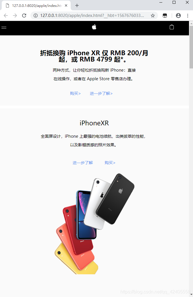
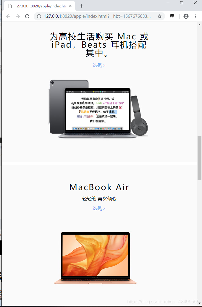
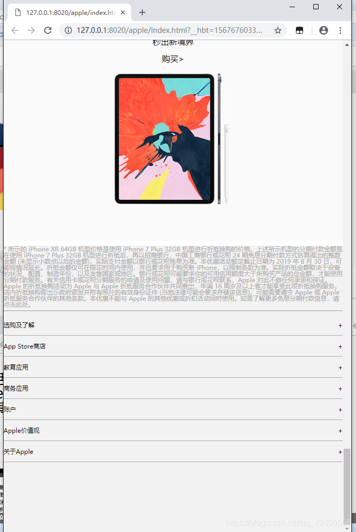
实际效果图
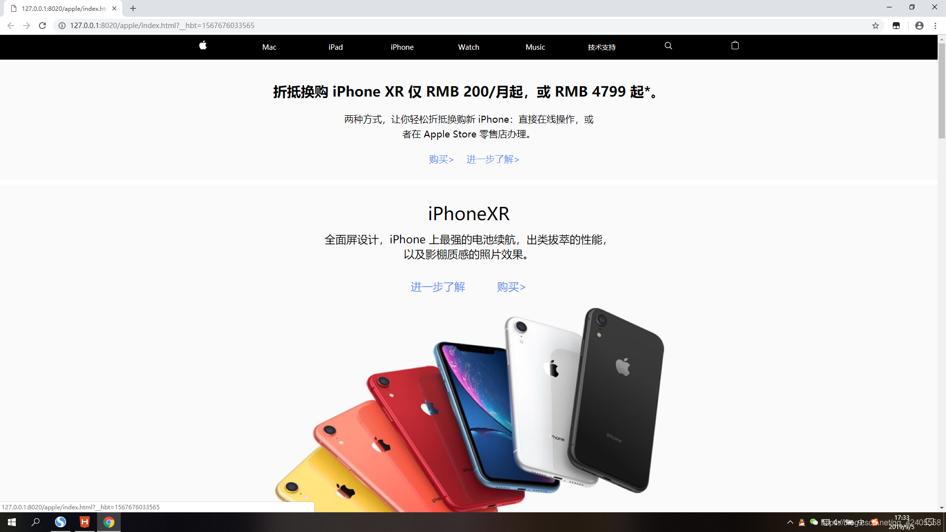
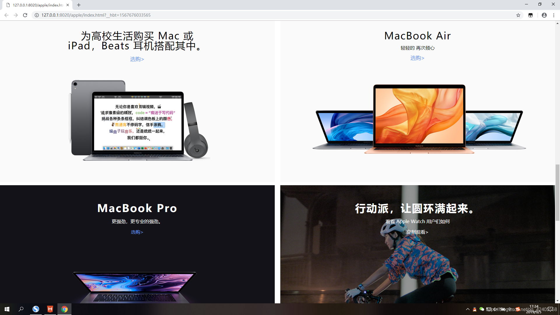
大尺寸
中等尺寸
小尺寸
当时在写这个的时候,还是花了不少时间的,以为要根据不同的尺寸写不同的css样式,还挺麻烦的。今天听老师讲的时候说以后学了框架技术后,自适应写起来就不会这么复杂了。所以还是很期待学完框架后能不能简化这些代码。
请大神多度指教!


 扫一扫
扫一扫


 4517
4517

 被折叠的 条评论
为什么被折叠?
被折叠的 条评论
为什么被折叠?
 到【灌水乐园】发言


