


 本文详细介绍了如何使用CSS实现动态光亮效果,包括背景渐变、位置变化及动画效果,通过实际代码示例展示了不同光效的实现技巧。
<!DOCTYPE html>
<html lang="en">
<head>
<meta charset="UTF-8">
<meta name="viewport" content="width=device-width, initial-scale=1.0">
<title>光亮效果</title>
<style>
body{
margin:0;
padding:0;
}
.line{
background-image: repeating-linear-gradient(130deg,#ccc 0%,#fff 3%,#ccc 5%,#ccc 50%);
background-size:300% 100%;
background-position: -50% 100% ;
/* transition:all 2s; */
height:200px;
margin-bottom:10px;
}
.line2{
background-image: repeating-linear-gradient(to right,#ccc 0%,#fff 3%,#ccc 5%,#ccc 100%);
background-size:1000px 500px;
background-position: 10% ;
/* transition:all 2s; */
height:200px;
margin-bottom:10px;
}
.line3{
height:200px;
background:repeating-linear-gradient(to right,#ccc 0%,#fff 3%,#ccc 5%,#ccc 100%);
animation: gogo 2s linear 0s infinite normal;
}
@keyframes gogo{
0% {background-position: 0%;}
100% {background-position:600px ;}
}
.line4{
background:url('./img/5.jpg');
background-position: 100% 0%;
height:200px;
border:2px solid blue;
}
</style>
</head>
<body>
<div class='line'>点击有光亮效果</div>
<div class='line2'>点击有光亮效果二</div>
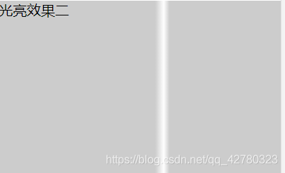
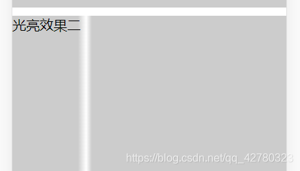
<div class='line3'>光亮效果二</div>
<div class='line4'>第四个</div>
<script>
document.getElementsByClassName('line')[0].οnclick=function(){
this.style.transition='all 2s';
this.style.backgroundPosition="-200% 0%"
}
document.getElementsByClassName('line2')[0].οnclick=function(){
this.style.transition='all 2s';
this.style.backgroundPosition="750px"
}
</script>
</body>
</html>


 扫一扫
扫一扫


 被折叠的 条评论
为什么被折叠?
被折叠的 条评论
为什么被折叠?
 到【灌水乐园】发言


