


实现效果:鼠标移入移出后,给card添加对应的样式,视觉上增加动态效果
主要使用到 transition 与 box-shadow 这两个属性。页面实现上部分代码使用到了antDesign组件。
最下方赋完整代码
首先,先在界面中创建几个div框,前台界面我在js文件中创建的vue组件
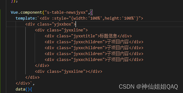
<div class="yjxxbox">
     <div class="jyxxline">
         <div class="jyxxtitle">标题信息</div>
         <div class="jyxxchildren">子项目内容</div>
         <div class="jyxxchildren">子项目内容</div>
         <div class="jyxxchildren">子项目内容</div>
         <div class="jyxxchildren">子项目内容</div>
     </div>
     <div class="jyxxline"></div>
 </div>
然后css中给每个div框设置样式
.yjxxbox{
    height: 100%;
    width: 100%;
    box-sizing: border-box;
    overflow: auto;
}
/* 每一个项目的窗口 */
.jyxxline{
    display: flex;
    align-items: center;
    height: 300px;
    width: 100%;
    margin: 10px;
    padding: 5px 6px;
}
/* 每个项目的标题信息 */
.jyxxtitle{
    height: 300px;
    width: 300px;
    background-color: #fff;
    border-radius: 2px;
    border: 1px solid #d9ecff;
    transition: all .2s cubic-bezier(.645,.045,.355,1);
}
/* 每个子项目的项目窗体 */
.jyxxchildren{
    border-radius: 2px;
    height: 300px;
    width: 400px;
    margin: 0 10px;
    background-color: #fff;
    border: 1px solid #d9ecff;
    transition: all .2s cubic-bezier(.645,.045,.355,1);
}
.jyxxtitle:hover,.jyxxchildren:hover{
    cursor: pointer;
    box-shadow: 0 6px 16px -8px #00000014, 0 9px 28px #0000000d, 0 12px 48px 16px #00000008;
}
前台展示效果为(鼠标移入后):
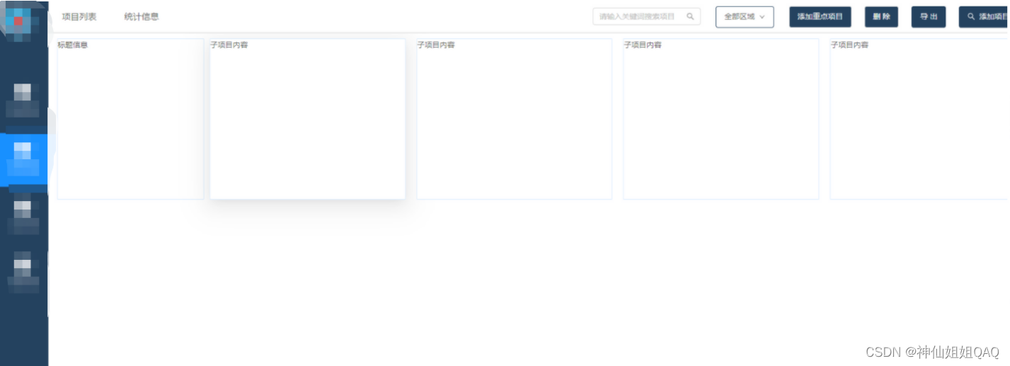
再根据项目的实际情况,填充card。
根据实际需求,大致的实现效果如下:

完整代码(数组这里我随便设置了两个值):
js部分:
  Vue.component("s-table-newsjyxx",{
    template:`<div :style="{width:'100%',height:'100%'}">
        <div class="yjxxbox">
            <div class="jyxxline" v-for="(item,index) in jyxxList">
                <div class="jyxxtitle">
                    <div class="jyxxtitle-xmmc">{{item.name}}</div>
                    <div class="jyxxtitle-xmbh">({{item.xmbh}})</div>
                </div>
                <div class="jyxxchildren">
                    <div class="jyxxchildren-head">
                        <a-icon type="star" theme="filled" />
                        <div class="headxmlx">1:500现状工程图</div>
                    </div>
                    <div class="jyxxchildren-body">
                        <img src="/lsxmgl/alsxmgl/images/jyxx/blank-noData.png" style="width:50%;"/>
                        <div>暂无详细信息</div>
                        <div :style="{padding:'25px'}">
                            <a-button icon="search" @click="addywxx">完善项目信息</a-button>
                        </div>
                    </div>
                </div>
                <div class="jyxxchildren">
                    <div class="jyxxchildren-head">
                        <a-icon type="star" theme="filled" />
                        <div class="headxmlx">勘测定界图</div>
                    </div>
                    <div class="jyxxchildren-body">
                        <div class="jyxxchildren-body-content">
                            <div class="jyxxchildren-body-content-jdxx" v-for="(items,indexs) in jdList" :key="indexs" class="tablejdinfo" :class="[{'tableerror' : items.SFKFP == 'wk' && items.SFYSK !='是','tableorange' : items.SFKFP == 'yk' && items.SFYSK !='是'}]">
                                <div class="tablejdtitle">第{{indexs + 1}}收款节点</div>
                                <div>是否开发票:{{items.SFKFP == 'wk' ? '未开发票' : '已开发票'}}</div>
                                <div>收款时间:{{items.SKSJ == null || items.SKSJ == "" ? '暂未收款' : items.SKSJ.substring(0,11)}}</div>
                                <div>节点收款:{{items.SKJE}}元</div>
                                <div>实际收款:{{items.SJSKJE}}元</div>
                            </div>
                        </div>
                        <div class="jyxxchildren-body-edit">
                            <a-breadcrumb>
                                <a-breadcrumb-item href="">
                                    <a-icon type="line-chart" />
                                    <span>进度</span>
                                </a-breadcrumb-item>
                                <a-breadcrumb-item href="">
                                    <a-icon type="form" />
                                    <span>详情</span>
                                </a-breadcrumb-item>
                                <a-breadcrumb-item href="">
                                    <a-icon type="file-text" />
                                    <span>洽谈</span>
                                </a-breadcrumb-item>
                                <a-breadcrumb-item href="">
                                    <a-icon type="profile" />
                                    <span>合同</span>
                                </a-breadcrumb-item>
                            </a-breadcrumb>
                        </div>
                    </div>
                </div>
                <div class="jyxxchildren addchildren">
                    <a-icon type="plus"/>
                </div>
            </div>
        </div>
    </div>`,
    data(){
        return{
            jyxxList:[],//全部项目数组
            jdList:[],//进度数组
        }
    },
    mounted(){
        this.jyxxList = [
            {xmmc:'XXX项目',xmbh:'XMGL2021-09-06'},
            {xmmc:'XXX项目',xmbh:'XMGL2022-01-11'},
        ],
        this.jdList = [
            {xmmc:'XXX项目',SFKFP:'yk',SKSJ:'2022-10-19',SKJE:6500,SJSKJE:6000,SFYSK:'是'},
            {xmmc:'XXX项目',SFKFP:'wk',SKSJ:'',SKJE:8000,SJSKJE:0,SFYSK:'否'},
        ]
    },
    methods:{

    }
  })
css部分
.yjxxbox{
    height: 100%;
    width: 100%;
    box-sizing: border-box;
    overflow: auto;
}
/* 每一个项目的窗口 */
.jyxxline{
    display: flex;
    align-items: center;
    height: 400px;
    width: 100%;
    margin: 10px;
    padding: 5px 6px;
}
/* 每个项目的标题信息 */
.jyxxtitle{
    height: 400px;
    width: 300px;
    background-color: #fff;
    border-radius: 2px;
    border: 1px solid #EBDFD5;
    display: flex;
    justify-content: center;
    align-items: center;
    flex-direction: column;
    transition: all .2s cubic-bezier(.645,.045,.355,1);
}
/* 项目的项目名称和项目编号样式 */
.jyxxtitle-xmmc{
    color: blue;
    font-weight: bold;
    font-size: 24px;
}
.jyxxtitle-xmbh{
    font-weight: 400;
    font-size: 22px;
}
/* 每个子项目的项目窗体 */
.jyxxchildren{
    border-radius: 2px;
    height: 400px;
    width: 400px;
    margin: 0 10px;
    background-color: #fff;
    border: 1px solid #EBDFD5;
    transition: all .2s cubic-bezier(.645,.045,.355,1);
}
/* 每个子项目的标题和内容信息 */
.jyxxchildren-head{
    display: flex;
    padding: 0 8px;
    align-items: center;
    height: 50px;
    padding: 0 12px;
    font-size: 14px;
    margin-bottom: -1px;
    color: #000000d9;
    font-weight: 500;
    background: transparent;
    border-bottom: 1px solid #EBDFD5;
    border-radius: 2px 2px 0 0;
}
.jyxxchildren-body{
    height: calc(100% - 36px);
    display: flex;
    justify-content: center;
    align-items: center;
    flex-direction: column;
}
.jyxxtitle:hover,.jyxxchildren:hover{
    cursor: pointer;
    box-shadow: 0 6px 16px -8px #00000014, 0 9px 28px #0000000d, 0 12px 48px 16px #00000008;
}

/* 子项目中的样式设置 */
.anticon-star{
    font-size: 28px;
    color: red;
    margin-right: 5px;
}
/* 子项目标题 */
.headxmlx{
    font-size: 20px;
    /* font-weight: bold; */
}
/* 子项目内容展示区间 */
.jyxxchildren-body-content{
    padding: 8px;
    width: 100%;
    height: 80%;
    border-bottom: 1px solid #EBDFD5;
}
/* 子项目内容下半部分按钮区域 */
.jyxxchildren-body-edit{
    width: 100%;
    height: 20%;
    display: flex;
    justify-content: center;
    align-items: center;
}
/* 添加子项目 */
.addchildren{
    display: flex;
    justify-content: center;
    align-items: center;
}
.anticon-plus{
    font-size: 56px;
}
/* 子项目内容信息展示--------start */
/* 进度 */
.jyxxchildren-body-content-jdxx{
    /* margin-top: 5px; */
}
.tablejdinfo{
    background-color: #e1f3d8;
    color: #67c23a;
    margin-bottom: 5px;
    border-radius: 5px;
    padding: 4px 5px;
}
/* 子项目内容信息展示--------end */


 5114
5114


 被折叠的 条评论
为什么被折叠?
被折叠的 条评论
为什么被折叠?
 到【灌水乐园】发言


