


简言
介绍下nuxt3的内置组件用法。
ClientOnly
使用 <ClientOnly> 组件仅在客户端渲染组件。
属性:
- placeholderTag | fallbackTag — 指定要在服务器端呈现的标记。
- placeholder | fallback — 指定要在服务器端渲染的内容,并在浏览器挂载 <ClientOnly> 之前显示。
示例:
<template>
  <div>
    <Sidebar />
    <!-- This renders the "span" element on the server side -->
    <ClientOnly fallbackTag="span">
      <!-- this component will only be rendered on client side -->
      <Comments />
      <template #fallback>
        <!-- this will be rendered on server side -->
        <p>Loading comments...</p>
      </template>
    </ClientOnly>
  </div>
</template>
DevOnly
使用 <DevOnly> 组件,仅在开发过程中渲染组件。
Nuxt 提供了 <DevOnly> 组件,用于仅在开发过程中呈现组件。
这些内容不会包含在生产构建中,它有一个fallback插槽可以用于在生产环境替换devOnly的内容。
这在开发时显示辅助开发工具比较有用
<template>
  <div>
    <Sidebar />
    <DevOnly>
      <!-- this component will only be rendered during development -->
      <LazyDebugBar />
      <!-- be sure to test these using `nuxt preview` -->
      <template #fallback>
        <div><!-- empty div for flex.justify-between --></div>
      </template>
    </DevOnly>
  </div>
</template>
NuxtClientFallback
Nuxt 提供了 <NuxtClientFallback> 组件,用于在其任何子组件触发 SSR 中的错误时在客户端呈现其内容。
这个是实验性的,需要在nuxt.config.ts配置才可开启
export default defineNuxtConfig({
  experimental: {
    clientFallback: true
  }
})
slots
#fallback:指定插槽渲染失败时在服务器端显示的内容。
示例
  <template>
    <!-- render <span>Hello world</span> server-side if the default slot fails to render -->
    <NuxtClientFallback fallback-tag="span" fallback="Hello world">
      <BrokeInSsr />
    </NuxtClientFallback>
  </template>
NuxtPage
需要使用 <NuxtPage> 组件来显示位于 pages/ 目录中的页面。
NuxtPage 是 Nuxt 的内置组件。它允许你显示位于 pages/ 目录中的顶层或嵌套页面。
它相当于vue-router的routerview,并且接收相同的name和route属性
属性
- name — 会告诉 RouterView 渲染匹配路由记录组件选项中对应名称的组件。
- route — 已解决所有组件的路由位置。
- pageKey — 渲染 NuxtPage 组件的key。
- transition — 为使用 NuxtPage 组件渲染的所有页面定义全局过渡效果。
- keepalive — 控制使用 NuxtPage 组件渲染的页面的状态保存。
Nuxt 通过扫描和渲染在 /pages 目录中找到的所有 Vue 组件文件,自动解析名称和路由。
示例
一般情况直接使用<NuxtPage />就好。
<template>
  <div>

    <NuxtPage />
  </div>
</template>
<script lang="ts" setup></script>
NuxtLayout
用于在页面使用layouts目录下的布局。
<NuxtLayout /> 通过 <slot /> 渲染传入内容,然后将其包裹在 Vue 的 <Transition /> 组件周围,以激活布局转换。为使其达到预期效果,建议 <NuxtLayout /> 不是页面组件的根元素。
<template>
<div>
  <NuxtLayout>
    some page content
  </NuxtLayout>
 </div>
</template>
默认情况下,他使用的是layouts目录下的default布局。
属性
- name — 指定要渲染的布局名称,可以是字符串、反应式引用或计算属性。该名称必须与 layouts/ 目录中相应布局文件的名称一致。
示例
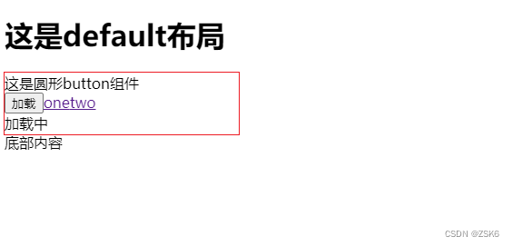
default布局
<template>
  <div class="default">
    <div>
      <h1>这是default布局</h1>
    </div>
    <slot />
    <slot name="footer"></slot>
  </div>
</template>
<script lang="ts" setup>
import { reactive, ref, onMounted } from "vue";
</script>
<style lang="scss" scoped></style>
使用:
<template>
  <div>
    <NuxtLoadingIndicator color="green" />
    <NuxtLayout>
      <NuxtPage />
      <template #footer>
        <div>底部内容</div>
      </template>
    </NuxtLayout>
  </div>
</template>
<script lang="ts" setup></script>
NuxtLink
Nuxt 提供了 <NuxtLink> 组件,用于处理应用程序中的各种链接。
是 Vue Router 的 <RouterLink> 组件和 HTML 的 <a> 标记的直接替代品。它能智能判断链接是内部链接还是外部链接,并通过可用的优化(预取、默认属性等)进行相应的渲染。
属性
在不使用外部链接时,<NuxtLink> 支持所有 Vue 路由器的 RouterLink 属性:
- to — 任何 URL 或 Vue 路由器中的路由位置对象。
- custom — 自定义导航工作方式,与vue-router的custom属性相同。
- exactActiveClass : 指定点击后的类样式。其作用与 Vue 路由器的 exact-active-class prop 在内部链接上的作用相同。默认为 Vue 路由器的默认 “router-link-exact-active”)。
- replace — 与 Vue Router 在内部链接上的replace属性功能相同。
- ariaCurrentValue — 与 Vue Router 的 aria-current-value prop 在内部链接上的作用相同.
- activeClass — 其作用与 Vue Router 的 active-class prop 在内部链接上的作用相同。默认值为 Vue 路由器的默认值("router-link-active)。
- href — to 的别名。如果与 to 一起使用,href 将被忽略。
- noRel — 如果设置为 true,则不会在链接中添加 rel 属性。
- external — 强制链接以 a 标记而不是 Vue Router RouterLink 的形式呈现。
- prefetch — 启用后,将预取视口中链接的中间件、布局和有效载荷(使用 payloadExtraction 时)。由实验性的 crossOriginPrefetch 配置使用。
- noPrefetch — 禁用预取。
- prefetchedClass — 用于预取链接的类。
- target — 应用于链接的目标属性值。
- rel — 用于链接的 rel 属性值。外部链接默认为 “noopener noreferrer”。
示例
<template>
  <NuxtLink to="https://twitter.com/nuxt_js" target="_blank">
    Nuxt Twitter
  </NuxtLink>
  <!-- <a href="https://twitter.com/nuxt_js" target="_blank" rel="noopener noreferrer">...</a> -->

  <NuxtLink to="https://discord.nuxtjs.org" target="_blank" rel="noopener">
    Nuxt Discord
  </NuxtLink>
  <!-- <a href="https://discord.nuxtjs.org" target="_blank" rel="noopener">...</a> -->

  <NuxtLink to="https://github.com/nuxt" no-rel>
    Nuxt GitHub
  </NuxtLink>
  <!-- <a href="https://github.com/nuxt">...</a> -->

  <NuxtLink to="/contact" target="_blank">
    Contact page opens in another tab
  </NuxtLink>
  <!-- <a href="/contact" target="_blank" rel="noopener noreferrer">...</a> -->
</template>
NuxtLoadingIndicator
在页面导航之间显示进度条。
属性
- color — 加载条的颜色。可将其设置为 false,以关闭明确的颜色样式。
- height — 加载条高度,默认3px。
- duration — 加载条的持续时间,毫秒(默认为 2000)。
- throttle — 限制出现和隐藏的时间,毫秒数(默认 200)。
- estimatedProgress — 默认情况下,Nuxt 会在接近 100% 时退出。你可以提供一个自定义函数来自定义进度估算,这是一个接收加载条(上图)持续时间和已用时间的函数。它应该返回一个介于 0 和 100 之间的值。
您可以使用 useLoadingIndicator 可组合挂钩到底层指标实例,这样就可以自己触发开始/结束事件。
示例
<NuxtLoadingIndicator color="green" />
NuxtErrorBoundary
<NuxtErrorBoundary> 组件处理在其默认槽中发生的客户端错误。
slots
#error:指定出错时要显示的后备内容。
示例
  <template>
    <NuxtErrorBoundary>
      <!-- ... -->
      <template #error="{ error }">
        <p>An error occurred: {{ error }}</p>
      </template>
    </NuxtErrorBoundary>
  </template>
NuxtWelcome
<NuxtWelcome> 组件用于在使用启动模板制作的新项目中向用户致意。
它包括 Nuxt 文档、源代码和社交媒体账户的链接。
没屁用
示例
<template>
  <NuxtWelcome />
</template>
NuxtIsland
Nuxt 提供了 <NuxtIsland> 组件,用于呈现非交互式组件,无需任何客户端 JS。
在渲染island组件时,island组件的内容是静态的,因此客户端无需下载 JS。
更改island组件道具会触发island组件的重新获取,从而再次重新渲染。
仅服务器组件在引擎盖下使用 <NuxtIsland>
这是一个提高性能的组件,如果你的组件内容只需要在服务端加载运行一次就行,然后在客户端只显示,不做后续交互,即可使用它。
它是实验性的组件 ,需要以下配置
// nuxt.config.ts
export default defineNuxtConfig({
  experimental: {
    componentIslands: true
  }
})
属性
- name — 要渲染的组件名称。
- lazy — 使组件不阻塞。
- props — 要发送给组件进行渲染的属性。
- source — 调用island 渲染的远程源。
- dangerouslyLoadClientComponents — 需要从远程源加载组件。
强烈不建议启用危险加载客户端组件(dangerouslyLoadClientComponents),因为远程服务器的 javascript 不可信。
slots
如果声明了插槽,插槽可以传递给岛组件。
由于提供插槽的是父组件,因此每个插槽都是交互式的。
#fallback:指定在岛屿加载前(如果组件是懒惰的)或 NuxtIsland 无法获取组件时要渲染的内容。
示例
<template>
    <NuxtIsland name="Hello" />
</template>
NuxtImg
Nuxt 提供了一个<NuxtImg> 组件来处理自动图像优化。
<NuxtImg> 是本地 标签的直接替代品。
- 使用内置提供程序优化本地和远程图像
- 将 src 转换为提供程序优化的 URL
- 根据宽度和高度自动调整图片大小
- 在提供尺寸选项时生成响应尺寸
- 支持本地懒加载和其他 <img> 属性
详细内容请参考:NuxtImage
使用
要使用 <NuxtImg>,必须安装并启用 Nuxt Image 模块:
npx nuxi@latest module add image
<NuxtImg> 可直接输出原生 img 标记(周围没有任何封装)。使用它就像使用 标签一样:
<NuxtImg src="/nuxt-icon.png" />
NuxtPicture
Nuxt 提供了一个 <NuxtPicture> 组件来处理自动图像优化。
<NuxtPicture> 是原生 <picture> 标签的直接替代品。
<NuxtPicture> 的用法与 <NuxtImg> 几乎相同,但它也允许在可能的情况下提供 webp 等现代格式。
要使用 <NuxtPicture>,必须安装并启用 Nuxt Image 模块:
npx nuxi@latest module add image
Teleport
<Teleport> 组件可将组件传送到 DOM 中的不同位置。
和vue的teleport组件一样。
示例
<template>
  <button @click="open = true">
    Open Modal
  </button>
  <Teleport to="body">
    <div v-if="open" class="modal">
      <p>Hello from the modal!</p>
      <button @click="open = false">
        Close
      </button>
    </div>
  </Teleport>
</template>
<template>
  <ClientOnly>
    <Teleport to="#some-selector">
      <!-- content -->
    </Teleport>
  </ClientOnly>
</template>
结语
结束了。


 扫一扫
扫一扫


 170
170

 被折叠的 条评论
为什么被折叠?
被折叠的 条评论
为什么被折叠?
 到【灌水乐园】发言


