


05-CSS3转换
第1章 transform简介

第2章 transform的2D转换

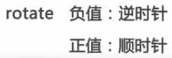
2-1 rotate

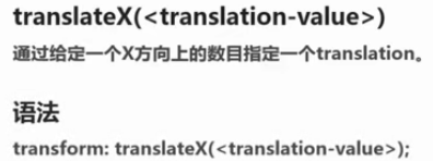
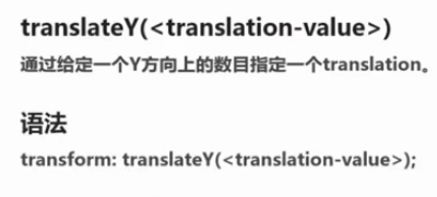
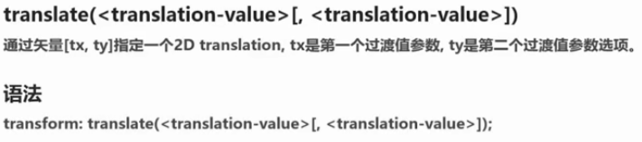
2-2 translate

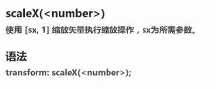
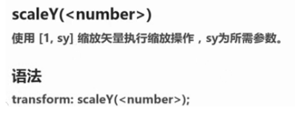
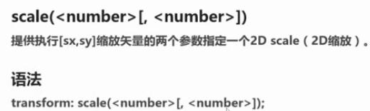
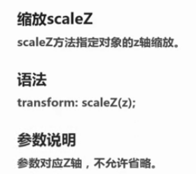
2-3 scale


<!DOCTYPE html>
<html lang="en">
<head>
	<title>3</title>
	<meta http-equiv="Content-Type" content="text/html;charset=utf-8"/>
	<style type="text/css">
		*{
	    	margin:0;
	    	padding: 0;
	    }
	    section{
	    	width: 600px;
	    	height: 400px;
	    	background-color: red;
	    	margin-top: 100px;
	    	margin-left: 100px;
	    	position: relative;
	    }
		div{
			width: 0;
			height: 0;
			border-top:30px solid yellow;
			border-right: 50px solid transparent;
			border-left: 50px solid transparent;
			position: absolute;
			left:40px;
			top:60px;
		}
		div::before,div::after{
			content: "";
			display: block;
			width: 0;
			height: 0;
			border-top:30px solid yellow;
			border-right: 50px solid transparent;
			border-left: 50px solid transparent;
		}
		div:before{
			transform:rotate(74deg);
			position: relative;
			left: -50px;
			top:-30px;
		}
		div::after{
			transform: rotate(-73deg);
			position: relative;
			left: -50px;
			top:-60px;
		}
		div:nth-child(2){
			transform: scale(.3,.3) rotate(35deg) translate(100px,-280px);
		}
		div:nth-child(3){
			transform: scale(.3,.3) rotate(55deg) translate(200px,-350px);
		}
		div:nth-child(4){
			transform: scale(.3,.3)  translate(390px,150px);
		}
		div:last-child{
			transform: scale(.3,.3) rotate(35deg) translate(350px,100px);
		}
	</style>
</head>
<body>
	<section>
	    <div></div>
	    <div></div>
	    <div></div>
	    <div></div>
	    <div></div>
	</section>
</body>
</html>
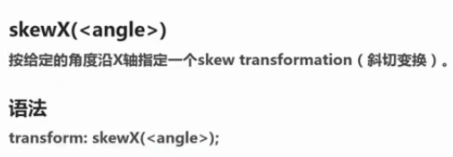
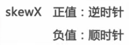
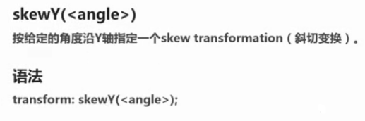
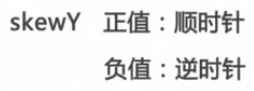
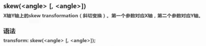
2-4 skew
第3章 transform的3D转换(必备技能点,多练习)
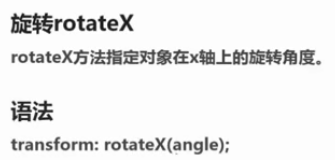
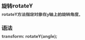
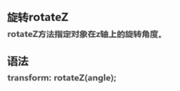
3-1 rotate3d

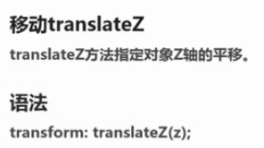
3-2 translate3d

3-3 scale3d

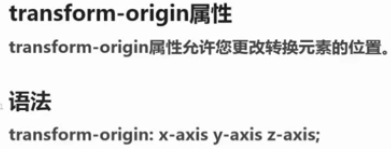
第4章 transform与坐标系统
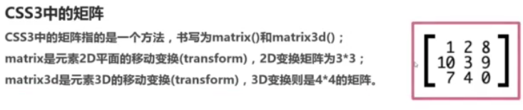
第5章 CSS3矩阵(扩展,选修)
矩阵理论

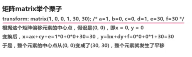


矩阵实践


第6章 扩展属性
6-1 transform-style

6-2 perspective

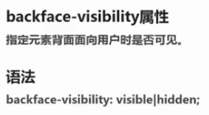
6-3 backface-visibility


 被折叠的 条评论
为什么被折叠?
被折叠的 条评论
为什么被折叠?
 到【灌水乐园】发言


