


通过filter实现
首先,我们只需要实现这样一个图形:
<div class="g-container">
    <div class="g-content">
        <div class="g-filter"></div>
    </div>
</div>
css样式:
.g-container {
position: relative;
width: 300px;
height: 100px;
.g-content {
height: 100px;
.g-filter {
height: 100px;
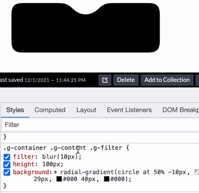
background: radial-gradient(circle at 50% -10px, transparent 0, transparent 39px, #000 40px, #000);
}
}
}
运用 filter: contrast() 和 filter: blur() 这对神奇的组合。
.g-container {
    position: relative;
    width: 300px;
    height: 100px;

    .g-content {
        height: 100px;
        filter: contrast(20);
        background-color: white;
        overflow: hidden;

        .g-filter {
            filter: blur(10px);
            height: 100px;
            background: radial-gradient(circle at 50% -10px, transparent 0, transparent 29px, #000 40px, #000);
        }
    }
}
我们给 .g-content 添加了 filter: contrast(20) 和 background-color: white,给 .g-filter 添加了 filter: blur(10px)。
神奇的事情发生了,我们得到了这样一个效果:

通过对比度滤镜把高斯模糊的模糊边缘给干掉,将原本的直角,变成了圆角
这里有几个细节需要注意:
-
.g-content 这一层需要设置 background、需要 overflow: hidden
-
外侧的直角也变成了圆角
基于上述第二点,外侧的直角也变成了圆角,如果希望这个圆角也是直角,就有了 .g-container 这一层,我们可以通过在这一层添加一个伪元素,将 4 个角覆盖成直角
.g-container {
    &::before {
        content: "";
        position: absolute;
        top: 0;
        left: 0;
        bottom: 0;
        right: 0;
        z-index: 1;
        background: radial-gradient(circle at 50% -10px, transparent 0, transparent 60px, #000 60px, #000 0);
    }
}
当然,上述平滑内凹圆角由于应用了模糊滤镜,内部不建议再放置 DOM,最好当做背景使用,内部内容可以通过其他方式叠加在其上方即可。


 1万+
1万+


 被折叠的 条评论
为什么被折叠?
被折叠的 条评论
为什么被折叠?
 到【灌水乐园】发言


