


 文章详细介绍了QtQuick中的GridLayout布局器,包括其基本概念、依赖属性以及通过示例展示了如何创建不含跨行、带跨行列和从右到左的布局。强调了不要在布局中绑定Item的尺寸属性,而应使用preferredWidth和preferredHeight等属性来指定元素的大小。
一、概述
GridLayout 是最常用的布局器,也叫网格布局器,如果网格布局被调整大小,布局中的所有 Item 将被重新排列。它类似于基于widget的QGridLayout。GridLayout元素的所有可见子元素都将属于该布局。如果你想要一个只有一行或一列的布局,可以使用RowLayout或ColumnLayout。这些提供了更方便的API,并提高了可读性。
默认情况下, Item 将根据 flow 属性进行排列。flow属性的默认值是GridLayout.LeftToRight,就是从左到右排列。
如果指定了columns属性,它将被视为布局可以拥有的列数的最大限制,在自动定位包装回下一行的开始之前。columns属性只在flow为GridLayout.LeftToRight时使用。rows 属性的工作方式类似,但 Item 是自动垂直定位的。只有当flow为GridLayout.TopToBottom时,才会使用rows属性。
您可以通过设置布局来指定您想要 Item 占用的单元格。行和布局。列的属性。您还可以通过设置布局来指定行跨度或列跨度。rowSpan或Layout。columnSpan属性。
其实网格布局就 要指定多少行列,由此来计算出网格数,我们还可以设置这个网格之间的距离,网格外部的距离之类的,就是设置东西,布局就是能缩放大小,不布局就可以通过 x, y , anchor 来布局也可以,只是不会随着窗口变化
二、依赖属性
这些的依赖属性是指 在这个布局器 里面的元素可以写在里面的属性些。就是这些宽高 要注意,
这里有一个注意事项:不要在布局中绑定 Item 的x、y、width或height属性,因为这将与布局的目标冲突,也可能导致绑定循环。布局引擎使用 width 和 height 属性来存储根据 minimum/preferred/maximum 计算出的 Item 的当前大小,并且在每次布局 Item 时都会被重写。使用Layout.preferredWidth 和 Layout.preferredHeight, 或者 implicitWidth and implicitHeight 指定元素的首选尺寸。
- Layout.row
- Layout.column
- Layout.rowSpan
- Layout.columnSpan
- Layout.minimumWidth
- Layout.minimumHeight
- Layout.preferredWidth
- Layout.preferredHeight
- Layout.maximumWidth
- Layout.maximumHeight
- Layout.fillWidth
- Layout.fillHeight
- Layout.alignment
- Layout.margins
- Layout.leftMargin
- Layout.rightMargin
- Layout.topMargin
- Layout.bottomMargin
三、例子
1. 不含跨行的
效果
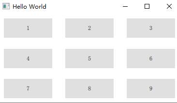
代码
import QtQuick 2.0
import QtQuick.Window 2.3
import QtQuick.Layouts 1.3
import QtQuick.Controls 2.5

Window {
    id: root
    visible: true
    width: 319
    height: 570
    title: qsTr("Hello World")

    GridLayout{
        rows: 3
        columns: 3

        anchors.fill: parent

        Button{
            text: "1"

            Layout.column: 0
            Layout.row: 0

            Layout.alignment: Qt.AlignHCenter
        }

        Button{
            text: "2"

            Layout.column: 1
            Layout.row: 0
            Layout.alignment: Qt.AlignHCenter
        }

        Button{
            text: "3"

            Layout.column: 2
            Layout.row: 0
            Layout.alignment: Qt.AlignHCenter
        }

        Button{
            text: "4"

            Layout.column: 0
            Layout.row: 1
            Layout.alignment: Qt.AlignHCenter
        }

        Button{
            text: "5"

            Layout.column: 1
            Layout.row: 1
            Layout.alignment: Qt.AlignHCenter
        }

        Button{
            text: "6"

            Layout.column: 2
            Layout.row: 1
            Layout.alignment: Qt.AlignHCenter
        }

        Button{
            text: "7"

            Layout.column: 0
            Layout.row: 2
            Layout.alignment: Qt.AlignHCenter
        }

        Button{
            text: "8"

            Layout.column: 1
            Layout.row: 2
            Layout.alignment: Qt.AlignHCenter
        }

        Button{
            text: "9"

            Layout.column: 2
            Layout.row: 2
            Layout.alignment: Qt.AlignHCenter
        }
    }
}
2. 带跨行列的
效果
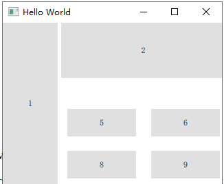
代码
import QtQuick 2.0
import QtQuick.Window 2.3
import QtQuick.Layouts 1.3
import QtQuick.Controls 2.5

Window {
    id: root
    visible: true
    width: 319
    height: 570
    title: qsTr("Hello World")

    GridLayout{
        id: mainlayout
        rows: 3
        columns: 3

        anchors.fill: parent

        Button{
            id:slider
            text: "1"

            Layout.column: 0
            Layout.row: 0
            Layout.rowSpan: 3
            Layout.preferredWidth: 80
            Layout.preferredHeight: mainlayout.height

            Layout.alignment: Qt.AlignHCenter
        }

        Button{
            text: "2"

            Layout.column: 1
            Layout.row: 0
            Layout.columnSpan: 2
            Layout.preferredWidth: mainlayout.width-slider.width
            Layout.preferredHeight: 80

            Layout.alignment: Qt.AlignTop
        }


        Button{
            text: "5"

            Layout.column: 1
            Layout.row: 1
            Layout.alignment: Qt.AlignHCenter
        }

        Button{
            text: "6"

            Layout.column: 2
            Layout.row: 1
            Layout.alignment: Qt.AlignHCenter
        }


        Button{
            text: "8"

            Layout.column: 1
            Layout.row: 2
            Layout.alignment: Qt.AlignHCenter
        }

        Button{
            text: "9"

            Layout.column: 2
            Layout.row: 2
            Layout.alignment: Qt.AlignHCenter
        }
    }
}
3. 从右到左
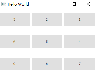
代码
只需要加一点 layoutDirection: Qt.RightToLeft 就可以啦
...
    GridLayout{
        rows: 3
        columns: 3
        layoutDirection:  Qt.RightToLeft
....


 扫一扫
扫一扫


 902
902

 被折叠的 条评论
为什么被折叠?
被折叠的 条评论
为什么被折叠?
 到【灌水乐园】发言


