HTML实现旋转太极图
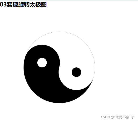
效果图
前端实例代码
<!DOCTYPE html>
<html>
<head>
<meta charset="utf-8">
<title>03实现旋转太极图</title>
<style type="text/css">
*{margin: 0;padding: 0;}
#box{width: 300px;height: 300px;margin: 100px;position: relative;animation: move 30s infinite linear;}
#black{
height: 300px;
width: 300px;
background-color: #000000;
border-radius: 50%;
}
#white{
height: 300px;
width: 150px;
background-color: white;
border-top-right-radius: 150px;
border-bottom-right-radius: 150px;
position: absolute;
top: 0;
right: 0;
}
#bb{
width: 150px;
height: 150px;
border-radius: 50%;
background-color: black;
position: absolute;
top: 0;
left: 75px;
}
#ww{
width: 150px;
height: 150px;
border-radius: 50%;
background-color: white;
position: absolute;
top: 150px;
left: 75px;
}
#bbl{
width: 40px;
height: 40px;
background-color: #000000;
border-radius: 50%;
position: absolute;
bottom: 55px;
left: 130px;
}
#wwl{
width: 40px;
height: 40px;
background-color: #FFFFFF;
border-radius: 50%;
position: absolute;
top: 55px;
left: 130px;
}
@keyframes move{
from{transform: rotate(0deg);}
to{transform: rotate(360deg);}
}
</style>
</head>
<body>
<h2>03实现旋转太极图</h2>
<div id="box">
<div id="black">
</div>
<div id="white">
</div>
<div id="bb">
</div>
<div id="ww">
</div>
<div id="bbl">
</div>
<div id="wwl">
</div>
</div>
</body>
</html>


 1173
1173


 被折叠的 条评论
为什么被折叠?
被折叠的 条评论
为什么被折叠?
 到【灌水乐园】发言


