


字体图标
IconFont,图标字体也叫字体图标,就是字体做的图标。可以通过设置字体的方式改变图标的样式,受到近些年 扁平化设计 的影响,越来越多的图标都开始使用 IconFont。
下载字体图标
- 首先打开IconFont-阿里巴巴矢量图标库,在这个图标库里面可以找到很多图片资源,当然了需要登录才能下载或者使用,用GitHub账号或者新浪微博账号登录都可以。
- 登录以后,可以搜索自己需要的资源,然后直接下载使用,或者建立图标库然后再使用。
- 选择需要的图标,然后可以执行三种操作:
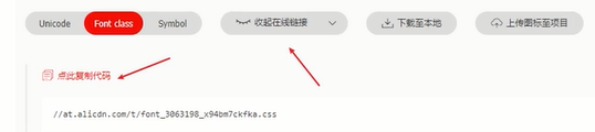
添加入库、收藏或者直接下载,可以根据自己的实际情况来选择相应操作,这里选择添加入库,操作完可以看到图标已经添加进右上角的购物车里了。 - 添加到项目,无项目可以点击+号的图标创建一个新项目——添加入库后,点击右上角的购物车按钮
- 下载到本地——下载完成解压到本地,放入工程目录即可使用

注意:如果在图标库中新增加了图标,则需要更新在线链接并把该链接重新引入到实际项目中,或者重新下载代码到本地,然后在实际项目中引入最新的iconfont文件。
使用字体图标
Unicode、Fontclass以及Symbol:三种使用的方式,在下载到本地的代码中找到demo,demo的html文件中有这三种方式的详细使用说明
类名使用更多,字体图标都是使用单独的盒子,字体图标我们喜欢用i标签
- 本地调用字体图标。
1)引入相关文件,创建fonts文件夹,把以下目录复制到该文件夹下 。
-
使用类名引入字体图标(重点)
1)引入字体图标样式表。<link rel="stylesheet" href="./fonts/iconfont.css">2)调用图标对应的
类名,必须调用2个类名。
iconfont类:基本样式,包含字体的使用等。
icon-xxx:图标对应的类名。可在下载的demo.html中查看,或者可以在阿里矢量图标库的网站上,进入我的项目查看<span class="iconfont iocm-map"></span> <!--style设置样式时,用类名icon-xxx设置,span设置需加权重 !important--> -
使用Unicode编码(了解)
<span class="iconfont"></span> -
Symbol方式
a) 引入项目下面生成的Symbol代码<script src="./iconfont.js"></script>b) 加入通用css代码(引入一次就行)
.icon {
	width: 1em; height: 1em;
	vertical-align: -0.15em;
	fill: currentColor;
	overflow: hidden;
}
c) 挑选相应图标并获取类名,应用于页面
 <svg class="icon" aria-hidden="true">
    <use xlink:href="#icon-xxx"></use>
  </svg>
- 在线调用字体图标。
<link rel="stylesheet" type="text/css" href="http://at.alicdn.com/t/font_kpdcqplvwqwr8uxr.css"><!-- fontclass -->
变形transform(2D)
位移(translate)
	transform: translate(x, y);  // 位移连写形式
	transform: translateX(x);   // 水平方向,正值往右,负值往左
	transform: translateY(y);  // 垂直方向,正值往下,负值往上
- 与margin区别
- margin移动盒子会影响其余的盒子。把其他挤走。
- 位移translate移动盒子不会影响其他的盒子。不脱标。
- 子盒子水平和垂直居中
- 定位
<!DOCTYPE html> <html> <head> <meta charset="utf-8"> <title></title> <style type="text/css"> /*第一种方法*/ .father{ position: relative; margin: 6.25rem auto; width: 25rem; height: 25rem; background-color: skyblue; } .son{ position: absolute; top:0px; bottom: 0px; left: 0; right: 0; margin: auto; width: 12.5rem; height: 12.5rem; background-color: pink; } /*第二种方法*/ .father{ position: relative; margin: 6.25rem auto; width: 25rem; height: 25rem; background-color: skyblue; } .son{ position: absolute; top: 50%; left: 50%; margin-top: -6.25rem; margin-left: -6.25rem; width: 12.5rem; height: 12.5rem; background-color: pink; } </style> </head> <body> <div class="father"> <div class="son"> </div> </div> </body> </html>- 利用translate

注意:移动的时候可以写百分比,如果使用的百分比,移动的是盒子自身的宽度。 - flex布局
<style type="text/css">
	.father{
		margin: 6.25rem auto;
		display: flex;
		justify-content: center;
		align-items: center;
		width: 25rem;
		height: 25rem;
		background-color: skyblue;
	}
	.son{
		width: 12.5rem;
		height: 12.5rem;
		background-color: pink;
	}
</style>
旋转(rotate)
用法:transform: rotate(角度); 注意角度单位是deg
-
设置中心点transform-origin
作用:transform动作之前可以改变元素的基点位置(参照点),默认点是元素的中心点。
其中X和Y的值可以是百分值,em,px,其中X也可以是字符参数值left,center,right;Y和X一样除了百分值外还可以设置字符值top,center,bottom,这个看上去有点像我们background-position设置一样;transform-origin: right bottom; -
多形态变形
transform: translate(-50%, -50%) rotate(360deg);注意:先移动,再旋转。
缩放(scale)
它比这宽度和高度最大的优势: 他是用中心点来进行缩放的,同样他不会影响其他的盒子。
transform: scale(倍数);
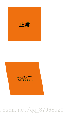
倾斜 (skew)
用法:transform: skew(30deg) 或者 transform: skew(30deg, 30deg);
参数表示倾斜角度,单位deg
- 一个参数时:表示水平方向的倾斜角度;
- 两个参数时:第一个参数表示水平方向的倾斜角度,第二个参数表示垂直方向的倾斜角度。
- 关于skew倾斜角度的计算方式表面上看并不是那么直观,这里借鉴某大拿绘制的图举例说明一下:
首先需要说明的是skew的默认原点transform-origin是这个物件的中心点
渐变
- 线性渐变
background-image: linear-gradient(top,rgba(0,0,0,0),rgba(0,0,0,1));
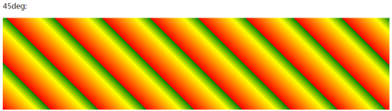
- 重复的线性渐变
background-image: repeating-linear-gradient(45deg,red,yellow 7%,green 10%);
- CSS3 径向渐变
background-image: radial-gradient(circle, red, yellow, green);
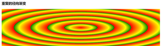
- 重复的径向渐变
background-image: repeating-radial-gradient(red, yellow 10%, green 15%);
案例
 <!DOCTYPE html>
 <html lang="en">
     <head>
         <meta charset="UTF-8" />
         <title>Document</title>
		 <link rel="stylesheet" href="http://at.alicdn.com/t/font_3234864_h0da2uig61r.css" />
		<style type="text/css">
		 *{
			 margin: 0;
			 padding: 0;
			 box-sizing: border-box;
		 }
		 .box{
			 width: 1400px;
			 margin: 100px auto;
		 }
		 .item{
			 overflow: hidden;
			 position: relative;
			 float: left;
			 width: 27.8125rem;
			 height: 19.6875rem;
			 background-color: pink;
		 }
		 .box .item:nth-child(2){
			 margin: 0 2rem;
		 }
		 img{
			 width: 100%;
			 height: 100%;
			 transition: all .3s;
		 }
		 .info{
			 z-index: 999;
			 position: absolute;
			 left: 0;
			 bottom: -3.4375rem;
			 padding: 1.5625rem 1.875rem;
			 font-size: 1.125rem;
			 color: #fff;
			 transition: all .3s;
		 }
		 .name{
			 font-size: 1.375rem;
			 font-weight: 700;
			 margin: 0.625rem 0;
		 }
		 .text{
			 line-height: 1.875rem;
		 }
		 .more{
			 margin-top: 0.625rem;
		 }
		 .iconfont{
			 color: red;
		 }
		 .box .item:hover img{
			 transform: scale(1.1);
		 }
		 .item:hover .info{
			 bottom: -0.625rem;
		 }
		 .item::after{
			 content: "";
			 position: absolute;
			 top: 0;
			 left: 0;
			 width: 100%;
			 height: 100%;
			 background-image: linear-gradient(rgba(0,0,0,0),rgba(0,0,0,1));
			 opacity: 0;
		 }
		 .item:hover::after{
			 opacity: 1;
		 }
		</style>
     </head>
     <body>
         <div class="box">
			<div class="item">
				<img src="../resources/img/1.jpg" alt="">
				<div class="info">
					<p>招聘</p>
					<div class="name">华为面向全球招聘</div>
					<p class="text">
						诚邀东欧、中欧、亚太等全球的科学家、博士、竞赛人才、研发工程师、优秀大学生
					</p>
					<p class="more">
						了解更多
						<i class="iconfont icon-a-10-you"></i>
					</p>
				</div>
			</div>
         	<div class="item"></div>
			<div class="item"></div>
         </div>
     </body>
 </html
变形 transform(3d)
3D变形涉及的属性主要是transform-origin、transform、transform-style、perspective、perspective-origin、backface-visibility。

3d位移(translate3d)
transform:translate3d(x,y,z);// z轴 +z 沿着z的正方向  -z沿着z的负方向 px px px % % %

transform:translateX(xpx);
transform:translateY(ypx);
transform:translateZ(zpx);
透视perspective:代表眼睛到变形物体的距离,默认为0px,一般设置到变形元素的父盒子身上(父级添加)。
事件触发的情况下 用此属性去呈现近大远小的效果 3d效果
perspective: 1000px;
案例
<html>
	<head>
		<meta charset="utf-8">
		<title></title>
		<style type="text/css">
			body{
				perspective: 500px;
			}
			.box{
				margin: 100px auto;
				width: 12.5rem;
				height: 12.5rem;
				background-color: blue;
				transition:all .3s ;
			}
			.box:hover {
				transform: translateZ(100px);
			}
		</style>
	</head>
	<body>
		<div class="box"></div>
	</body>
</html>
空间旋转
transform:rotate3d(x,y,z,ndeg)
x: 在x轴有没有旋转 旋转度数ndeg  0 没有旋转 其他值 是有旋转
y: 在y轴有没有旋转 旋转度数ndeg  0 没有旋转 其他值 是有旋转
z: 在z轴有没有旋转 旋转度数ndeg  0 没有旋转 其他值 是有旋转

transform: rotateX(deg);
transform: rotateY(deg);
transform: rotateZ(deg);
立体呈现
用法·:transform-style: preserve-3d;
perspective 和 transform-style 区别
- perspective 是透视,可以让电脑模拟3d效果,实现近大远小的效果。
- transform-style 立体呈现,可以让子元素里面按照设置位移,旋转,缩放,扭曲等。如果不给父元素这个属性,这里面所有的子盒子都是平面的。
- 正常情况下:爷爷设置perspective、父亲设置 transform-style:preserve-3d、孩子们设置位移、旋转、缩放、扭曲等。
案例
<!DOCTYPE html>
<html>
	<head>
		<meta charset="utf-8">
		<title></title>
		<style type="text/css">
			.cube{
				position: relative;
				margin: 6.25rem auto;
				width: 12.5rem;
				height: 12.5rem;
				background-color: pink;
				transition: all .5s;
				/* 让子元素3d空间显示 */
				transform-style: preserve-3d;
			}
			.cube div{
				position: absolute;
				width: 12.5rem;
				height: 12.5rem;
			}
			.front{
				background-color: aqua;
				transform: translateZ(6.25rem);
			}
			.back{
				background-color: blueviolet;
				transform: translateZ(-6.25rem);
			}
			.cube:hover {
				transform: rotateY(180deg);
			}
		</style>
	</head>
	<body>
		<div class="cube">
			<div class="front">前面</div>
			<div class="back">后面</div>
		</div>
	</body>
</html>
动画animation
transition过渡是通过初始和结束两个状态之间的平滑过渡实现简单动画的;而animation则是通过关键帧@keyframes来实现更为复杂的动画效果。
定义
和transition类似,animation也是一个复合属性,包括animation-name、animation-duration、animation-timing-function、animation-delay、animation-iteration-count、animation-direction、animation-play-state、animation-fill-mode共8个子属性
animation-name: 动画名称(默认值为none)
animation-duration: 持续时间(默认值为0)
animation-timing-function: 时间函数(默认值为ease)
animation-delay: 延迟时间(默认值为0)
animation-iteration-count: 循环次数(默认值为1)
animation-direction: 动画方向(默认值为normal)
animation-play-state: 播放状态(默认值为running)
animation-fill-mode: 填充模式(默认值为none)
关键帧
1)animation制作动画效果需要两步,首先用关键帧声明动画,再用animation调用动画
2)关键帧的语法是以@keyframes开头,后面紧跟着动画名称animation-name。from等同于0%,to等同于100%。百分比跟随的花括号里面的代码,代表此时对应的样式。
@keyframes animation-name{
    from | 0%{}
    n%{}
    to | 100%{}
}
鼠标暂停动画
.box:hover ul{
	animation-play-state: paused;
}
多组动画,用逗号隔开
/* 我们想要2个动画一起执行 animation:动画1,动画2,.... 动画n*/
animation: run 1s steps(12) infinite,move 5s linear forwards;//  逐帧动画steps(数字);
transition 和 animation 的区别
- transition: 属性 花费时间 速度曲线 延时时间;
transition: all 2s ease 1s;
- animation: 动画名称 花费时间 速度曲线 延时时间 重复次数 动画方向 执行完毕的状态。
- 过渡经常配合鼠标经过使用,只能设置起始和结束状态。
- 动画可以自动执行,而且无限循环等。(其中动画名称和花费时间必须要写)
移动动画案例
<!DOCTYPE html>
<html>
	<head>
		<meta charset="utf-8">
		<title></title>
		<style type="text/css">
			.cube{
				position: relative;
				margin: 6.25rem auto;
				width: 12.5rem;
				height: 12.5rem;
				background-color: pink;
				transition: all 5s;
				/* 让子元素3d空间显示 */
				transform-style: preserve-3d;
				animation: run 5s linear infinite;
			}
			.cube div{
				position: absolute;
				width: 12.5rem;
				height: 12.5rem;
			}
			.front{
				background-color: aqua;
				transform: translateZ(6.25rem);
			}
			.top{
				background-color: palegoldenrod;
				transform: translateY(-6.25rem) rotateX(90deg) ;
			}
			.bottom{
				background-color: darkblue;
				transform: translateY(6.25rem) rotateX(90deg) ;
			}
			.left{
				background-color: palevioletred;
				transform: translateX(6.25rem) rotateY(90deg) ;
			}
			.right{
				background-color: darkgreen;
				transform: translateX(-6.25rem) rotateY(90deg) ;
			}
			.back{
				background-color: blueviolet;
				transform: translateZ(-6.25rem);
			}
			.cube:hover {
				transform: rotateY(180deg);
			}
			@keyframes run{
				0%{
					transform: rotateY(0deg);
				}
				50%{
					transform: rotateY(180deg) rotateZ(45deg);
				}
				100%{
					transform: rotateY(360deg) rotateX(90deg);
				}
			}
		</style>
	</head>
	<body>
		<div class="cube">
			<div class="front">前面</div>
			<div class="top">上面</div>
			<div class="bottom">下面</div>
			<div class="left">左面</div>
			<div class="right">右面</div>
			<div class="back">后面</div>
		</div>
	</body>
</html>


 390
390


 被折叠的 条评论
为什么被折叠?
被折叠的 条评论
为什么被折叠?
 到【灌水乐园】发言


