


封装Button组件
封装button组件流程
对于button组件的封装,可能较为简单,只需全局注册组件,然后校验传入该组件的props参数,最后渲染组件即可。
注册组件
我们打开入口文件–main.js,组件名字遵循骆驼写法,可自定义。
- 引入组件 import corningButton from ‘@/views/componets/corning-button’
- 注册组件 Vue.component(“corning-button”,corningButton)
编写组件代码
1.template标签代码
  <template>
    <div>
        <button :class="btnClass" @click="handlerClick" :disabled="disabled">
             <slot></slot>
        </button>
    </div>
</template>
- script代码
<script>
export default {
    name:"corning-button",
    props:{
        type:{
            type:String,
            default:'default',
            //添加自定义验证规则
            validator:(value)=>['default','error','warn','info'].includes(value)
        },
        disabled:{
            type:Boolean,
            default:false
        }
    },
    computed:{
        btnClass(){
            if(this.disabled){
                return `${this.type} disabled`
            }
            return this.type
        }
    },
    methods:{
        handlerClick(){
            //触发调用该组件传入的单击事件
            this.$emit("click")
        }
    }
}
</script>
- style代码
<style scoped>
button{
    color: #fff;
    border: none;
    border-radius: 7px;
    padding:5px 15px;
}
button:hover{
    cursor: pointer;
    opacity: 0.8;
}
.disabled:hover{
    cursor: not-allowed;
    opacity: 0.6;
}
.default{
    background: #3096e1;
}
.error{
    background: #ff826f;
}
.warn{
    background: #ffc05f;
}
.info{
    background: #54d2dc;
}
.disabled{
    opacity: .6;
}
</style>
引用调用组件
<template>
<div>
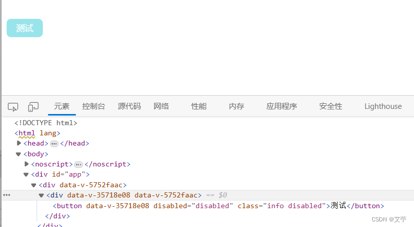
<corning-button type="info" @click="handlerClick" disabled>测试</corning-button>
</div>
</template>
<script>
import corningButton from '@/components/corning-button.vue'
export default {
components: { corningButton },
name:"test",
methods:{
handlerClick(){
console.log("触发单击事件")
}
}
}
</script>
效果展示


 1524
1524


 被折叠的 条评论
为什么被折叠?
被折叠的 条评论
为什么被折叠?
 到【灌水乐园】发言


