


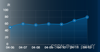
我的实现效果如下:
1.在echarts的折线图的拐点样式,文档中就给了好多。
在series中的symbol属性中可以定义,比如:circle (圆形),rect(矩形),roundRect(圆角矩形),triangle(三角形),diamond(菱形),pin(地图针),arrow(箭头),none(无标记点),image://url(自定义图片)。
2.具体代码如下
import * as echarts from "echarts";
const lineChart = ref()
 const lineChartValue = ref()
 function lineChartInit() {
  if (!lineChartValue.value)
    lineChartValue.value = markRaw(echarts.init(lineChart.value));
  else lineChartValue.value.clear();
  lineChartValue.value.setOption({
    tooltip: {
      trigger: 'axis',
    },
      grid: {
        top: 40,
      },
      xAxis:[
        {
          type: 'category',
          data:['04-06', '04-07', '04-08', '04-09', '04-10', '04-11', '04-12'],
          color: '#fff',
          axisTick: {
            show: false,
          },
          label: {
            itemStyle: {
              color: '#ffffff'
            }
          },
          axisLabel: {
            textStyle: {
              color: '#fff'
            }
          },
          boundaryGap: false,
          splitLine: {
            show: true,
            lineStyle: {
              type: 'solid',
              color: 'rgba(255, 255, 255, 0.1)'
            }
          }
        },
      ],
      yAxis: {
        type: 'value',
        name: '次',
        min: 0,
        max: 100,
        axisLabel: {
          textStyle: {
            color: '#fff'
          }
        },
        tooltip: {
        },
        nameTextStyle: {
          nameLocation: 'end',
          align: 'right',
          color: '#ffffff'
        },
        splitLine: {
          show: true,
          lineStyle: {
            type: 'solid',
            color: 'rgba(255, 255, 255, 0.1)'
          }
        }
      },
      series: [
        {
          type: 'line',
          smooth: true,
          symbol: 'circle',//定义为圆形
          symbolSize: 3,//内圆点的大小
          itemStyle: {
            normal: {
              color: 'white',
              borderWidth: 10,//加的外圆的大小,自定义调节
              borderColor: 'rgb(10, 120, 190)'
            }
          },
          areaStyle: {
            color: new echarts.graphic.LinearGradient(0, 0, 0, 1, [
              { offset: 0, color: 'rgba(10, 120, 190, 0.7)' },
              { offset: 1, color: 'rgba(10, 120, 190, 0)' }
            ])
          },
          lineStyle: {
            color: 'rgb(0, 120, 190)'
          },
          data: [50, 60, 57, 60, 59, 70, 80]
        },
      ]
  })
 }


 342
342

 被折叠的 条评论
为什么被折叠?
被折叠的 条评论
为什么被折叠?
 到【灌水乐园】发言


