


flutter学习笔记——组件、列表、跳转
给Container设置边距
设置左右上下
padding: EdgeInsets.only(left: 10, right: 10, top: 50, bottom:10),
设置水平垂直边界
padding: EdgeInsets.symmetric(vertical: 10,horizontal: 10),
给Container设置边框
border: Border.all(color: Colors.red,width: 0.0),
设置一个搜索文本框,效果图如图:

child: TextField(
                            decoration: InputDecoration(
                              icon: Container(
                                  padding: EdgeInsets.only(top: 2),
                                  child: Icon(Icons.search,color: Colors.grey.shade600,)
                              ),
                              contentPadding: const EdgeInsets.only(left: -15,right: 5, top: 0, bottom: 0),
                              hintText: "请输入搜索内容",border: InputBorder.none,
                              isDense: true
                            ),
                          ),
设置一个循环列表;itemCount为列表数量,itemBuilder中Context和index为List集合和当前下标,context,index为必传项;下图可以看到这个为必传。

我们需要返回一个Column()/Row()/Container()类型,在Container中我们可以设置容器的高度、边距、颜色、圆角等等。值得注意的是有decoration时,有些属性需要写在decoration里面,比如color属性。
child: ListView.builder(
                  itemCount: 10,
                  itemBuilder: (context, index) {
                    return Column(
                      children: [
                        Container(
                          padding: EdgeInsets.only(left: 10,right: 10,top:10,bottom: 5),
                          child: Container(
                                height: 300,
                                width:double.infinity,
                                decoration: const BoxDecoration(
                                color: Colors.white,
                                borderRadius: BorderRadius.all(Radius.circular(5)),
                              ),
                            ),
                          )
                        ],
                      );
                  }
                )
列表的效果图如图所示:

TabBar控制器
首先需要继承StatefulWidget并初始化tabController
class TextDemo extends StatefulWidget
late TabController tabController;///定义一个tab控制器

  @override
  void initState() {///初始化tabController
    super.initState();
    tabController = TabController(length: 5, vsync: this);///5个小标题,这里显示5个,在length中设置为5
  }
将以上设置完毕之后,在我们的Container中就可以去设置TabBar属性了,
 Container(
            height: 40,
            width: double.infinity,
            child: TabBar(
              labelPadding: EdgeInsets.zero,///标签边距设置为0
              controller: tabController,
              labelColor: ConfigColor.blueSrm,///TabBar中每一个标签的字体颜色
              unselectedLabelColor: Colors.black45,///未被选中的标签字体颜色
              isScrollable: false,///是否滚动
              indicatorSize: TabBarIndicatorSize.tab,///设置标签下划线
              indicatorColor: ConfigColor.blueSrm,///指示器下划线的颜色
              tabs: [
                Tab(text: "全部",),
                Tab(text: "已提交",),
                Tab(text: "已审批",),
                Tab(text: "审批拒绝",),
                Tab(text: "审批中",),
              ],
              onTap: (index) {
                print("tab点击了:$index");
              },
            ),
          ),
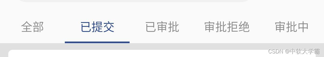
效果图如图所示:
跳转页面通过TextButton组件,完成页面的跳转,return到demo_02的方法中Demo02类中,child后Text,按钮上“文字”,在child中可以设置TextButton的样式
Container(
	child: TextButton(onPressed: (){
 		Navigator.of(context).push(MaterialPageRoute(builder: (BuildContext context){
			return const Demo02();
        }));
    },
    child: Text("确定",style: TextStyle(color: Colors.blueAccent),),
              style: ButtonStyle(
                ///设置按钮内边框
                padding: MaterialStateProperty.all(EdgeInsets.fromLTRB(30, 5, 30, 5)),
                ///设置边框颜色和宽度
                side:MaterialStateProperty.all(BorderSide(width: 1,color: Colors.blue)),
                ///设置背景颜色,当点击时为蓝色,不点击时为白色;
                backgroundColor: MaterialStateProperty.resolveWith((states) {
                  if(states.contains(MaterialState.pressed)){
                    return Colors.blue;
                  }else{
                    return Colors.white;
                  }
                }),
                ///设置水波纹颜色
                overlayColor: MaterialStateProperty.all(Colors.cyan),
                ///设置按钮大小
                minimumSize: MaterialStateProperty.all(Size(50, 40)),
                ),
 ),
为Row设置统一高度
Container(
            color: ColorUtil.getRandomColor(),
            child: IntrinsicHeight(
              child: Row(
                children: [
                  Container(
                    color: ColorUtil.getRandomColor(),
                    child: Column(
                      children: [
                        Text("JHJJKJKJJJJ"),
                      ],
                    ),
                  ),
                  Container(
                    color: ColorUtil.getRandomColor(),
                    child: Column(
                      children: [
                        Text("JHJJKJKJJJJ"),
                        Text("JHJJKJKJJJJ"),
                        Text("JHJJKJKJJJJ"),
                        Text("JHJJKJKJJJJ"),
                      ],
                    ),
                  )
                ],
              ),
            ),
          )


 1561
1561


 被折叠的 条评论
为什么被折叠?
被折叠的 条评论
为什么被折叠?
 到【灌水乐园】发言


