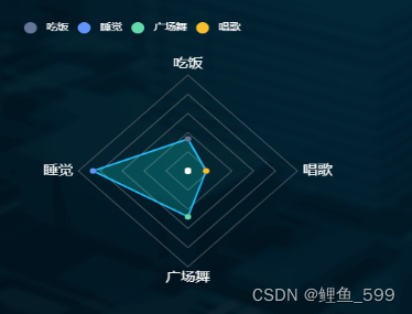
vue+echarts 绘制一个雷达图组件,每个点的颜色不同,按照顶点的数据所在显示图例

效果图:

在这里插入图片描述

组件代码(可直接使用,自己调整div大小)

<template>
  <div>
    <div id="radar-pie" ref="radar"></div>
  </div>
</template>

<script>
import * as echarts from 'echarts'
export default {
  // props: {
  //   loopData: {
  //     typeof: Array,
  //     default: () => []
  //   }
  // },
  data() {
    return {
    }
  },
  computed() {
    this.nextIndex()
  },
  methods: {
    draw() {
      const maxIndicator = 180 // 雷达图的最大值
      const myChart = echarts.init(this.$refs.radar)
      const itemArr = [60, 156, 86, 30] //  数据数组
      // const thisData = [
      //   { value: 60, name: '吃饭' },
      //   { value: 156, name: '睡觉' },
      //   { value: 86, name: '广场舞' },
      //   { value: 30, name: '唱歌' }
      // ]
      const colorList = ['#647798', '#6395F9', '#64DAAB', '#F6C02E']
      // 这里可以自己手动设置或者写个函数
      const n1 = [60, '', '', '']
      const n2 = ['', 156, '', '']
      const n3 = ['', '', 86, '']
      const n4 = ['', '', '', 30]
      const n7 = ['', '', '', '']
      const labelArr = ['吃饭', '睡觉', '广场舞', '唱歌'] // 显示图例用
      const Option = {
        legend: {
          left: '0',
          icon: 'circle',
          data: labelArr,
          textStyle: {
            color: '#fff'
          }
        },
        radar: [
          {
            splitLine: {
              lineStyle: {
                color: '#000'
              }
            }
          },
          {
            indicator: [
              { name: '吃饭', max: maxIndicator },
              { name: '睡觉', max: maxIndicator },
              { name: '广场舞', max: maxIndicator },
              { name: '唱歌', max: maxIndicator }
            ],
            nameGap: 6,
            center: ['50%', '50%'],
            radius: '65%',
            name: {
              textStyle: {
                color: '#fff',
                fontSize: 16,
                fontWeight: 400
              }
            },
            splitArea: {
              areaStyle: {
                color: ['none',
                  'none', 'none',
                  'none', 'none']
              }
            },
            axisLine: {
              lineStyle: {
                color: 'rgba(137, 137, 137, 0)'
              }
            },
            splitLine: {
              lineStyle: {
                color: 'rgba(137, 137, 137, 0.6)' // 网格的颜色
              }
            }
          }
        ],
        series: [
          {
            type: 'radar', // 绘制总的图形不设置拐点
            radarIndex: 1,
            data: [
              {
                value: itemArr,
                symbolSize: 7,
                lineStyle: {
                  width: 2,
                  color: '#29B8FF'
                },
                areaStyle: {
                  normal: {
                    opacity: 0.2,
                    color: 'rgb(22, 255, 239)'
                  }
                }
              }
            ],
            itemStyle: {
              normal: {
                borderWidth: 0,
                color: '#000' //   show:false
              }
            },
            silent: true,
            z: 1 // 图层是一层一层叠加,所以这个也是一级一级递增
          },
          {
            type: 'radar', // 绘制第一个点
            radarIndex: 1,
            name: labelArr[0],
            silent: true,
            z: 2, // 图层是一层一层叠加,所以这个也是一级一级递增
            data: [
              {
                value: n1,
                symbolSize: 7
              }
            ],
            itemStyle: {
              normal: {
                borderWidth: 2,
                color: colorList[0]
              }
            },
            lineStyle: {
              width: 0,
              labelLine: {
                show: false //  隐藏标示线
              }
            }
          },
          {
            type: 'radar',
            radarIndex: 1, // 绘制第二个点
            name: labelArr[1],
            silent: true,
            z: 3, // 图层是一层一层叠加,所以这个也是一级一级递增
            data: [
              {
                value: n2,
                symbolSize: 7
              }
            ],
            itemStyle: {
              normal: {
                borderWidth: 2,
                color: colorList[1]
              }
            },
            lineStyle: {
              width: 0,
              labelLine: {
                show: false //  隐藏标示线
              }
            }
          },
          {
            type: 'radar', // 绘制第三个点
            radarIndex: 1,
            name: labelArr[2],
            silent: true,
            z: 4, // 图层是一层一层叠加,所以这个也是一级一级递增
            data: [
              {
                value: n3,
                symbolSize: 7
              }
            ],
            itemStyle: {
              normal: {
                borderWidth: 2,
                color: colorList[2]
              }
            },
            lineStyle: {
              width: 0,
              labelLine: {
                show: false //  隐藏标示线
              }
            }
          },
          {
            type: 'radar', // 绘制第四个点
            radarIndex: 1,
            name: labelArr[3],
            silent: true,
            z: 5, // 图层是一层一层叠加,所以这个也是一级一级递增
            data: [
              {
                value: n4,
                symbolSize: 7
              }
            ],
            itemStyle: {
              normal: {
                borderWidth: 2,
                color: colorList[3]
              }
            },
            lineStyle: {
              width: 0,
              labelLine: {
                show: false //  隐藏标示线
              }
            }
          },
          {
            type: 'radar', // 这个图层是为了盖住圆心,如果去掉,圆心的颜色为最后一个图层的颜色(不信就自己试试)
            radarIndex: 1,
            name: '',
            silent: true,
            z: 8, // 图层是一层一层叠加,所以这个也是一级一级递增
            data: [
              {
                value: n7,
                symbolSize: 7
              }
            ],
            itemStyle: {
              normal: {
                borderWidth: 2,
                color: '#f8f7f7'
              }
            },
            lineStyle: {
              width: 0,
              labelLine: {
                show: false //  隐藏标示线
              }
            }
          }
        ]
      }
      console.log('图', Option)
      myChart.setOption(Option)
      // window.onresize = myChart.resize
      window.addEventListener('resize', function () { myChart.resize() })
    },
    getData() {
      this.draw()
    },
    setCurrentIndex(index) {
      this.currentIndex = index
    },
    nextIndex() {
      console.log('currentIndex:' + this.currentIndex)
      if (this.currentIndex === this.imgList.length - 1) {
        return 0
      } else {
        return this.currentIndex + 1
      }
    }
  },
  mounted() {
    this.draw()
  }
}
</script>

<style>
#radar-pie {
  width: 367px;
  height: 380px;
  margin-top: 20px;
  margin-left: 60px;
}
</style>

  • 2
    点赞
  • 1
    收藏
    觉得还不错? 一键收藏
  • 0
    评论
Vue Echarts 是一个基于Vue.js框架的表库,用于绘制各种类型的表,包括 k 线。 要使用 Vue Echarts 绘制 k 线,首先需要在项目中引入 EchartsVue Echarts,可以通过 npm 或者通过 CDN 引入。 在 Vue 组件中,可以创建一个 div 元素作为容器,将其绑定到 Echarts 实例上。代码类似于以下形式: ```html <template> <div ref="chart"></div> </template> <script> import echarts from 'echarts'; import VueECharts from 'vue-echarts'; export default { components: { VueECharts }, mounted() { this.chart = echarts.init(this.$refs.chart); this.renderChart(); }, methods: { renderChart() { // 设置表配置项和数据 const option = { // ... }; // 调用 setOption 方法,将配置项应用到表中 this.chart.setOption(option); } } } </script> ``` 在上述代码中,mounted 钩子函数中初始化了 Echarts 实例,并将其绑定到 ref 为 "chart" 的 div 元素上。然后,在 renderChart 方法中,设置表的配置项和数据,并使用 setOption 方法将配置项应用到表中。 绘制 k 线的具体配置项和数据根据需求和数据源的格式而定,可能包括 x 轴和 y 轴的设置、k 线的样式设置等。 在配置项中,需要指定 k 线的类型为 "candlestick",并根据实际情况设置相关参数。 以上是使用 Vue Echarts 绘制 k 线的基本流程,通过设置配置项和数据,可以实现自定义的 k 线效果。

“相关推荐”对你有帮助么?

  • 非常没帮助
  • 没帮助
  • 一般
  • 有帮助
  • 非常有帮助
提交
评论
添加红包

请填写红包祝福语或标题

红包个数最小为10个

红包金额最低5元

当前余额3.43前往充值 >
需支付:10.00
成就一亿技术人!
领取后你会自动成为博主和红包主的粉丝 规则
hope_wisdom
发出的红包
实付
使用余额支付
点击重新获取
扫码支付
钱包余额 0

抵扣说明:

1.余额是钱包充值的虚拟货币,按照1:1的比例进行支付金额的抵扣。
2.余额无法直接购买下载,可以购买VIP、付费专栏及课程。

余额充值