


前言
最近在学WPF,由于人比较烂,有一个星期没怎么动代码了。感觉有点堕落。现在开始记录WPF项目,使用MaterialDesignInXamlToolkit。
环境搭建
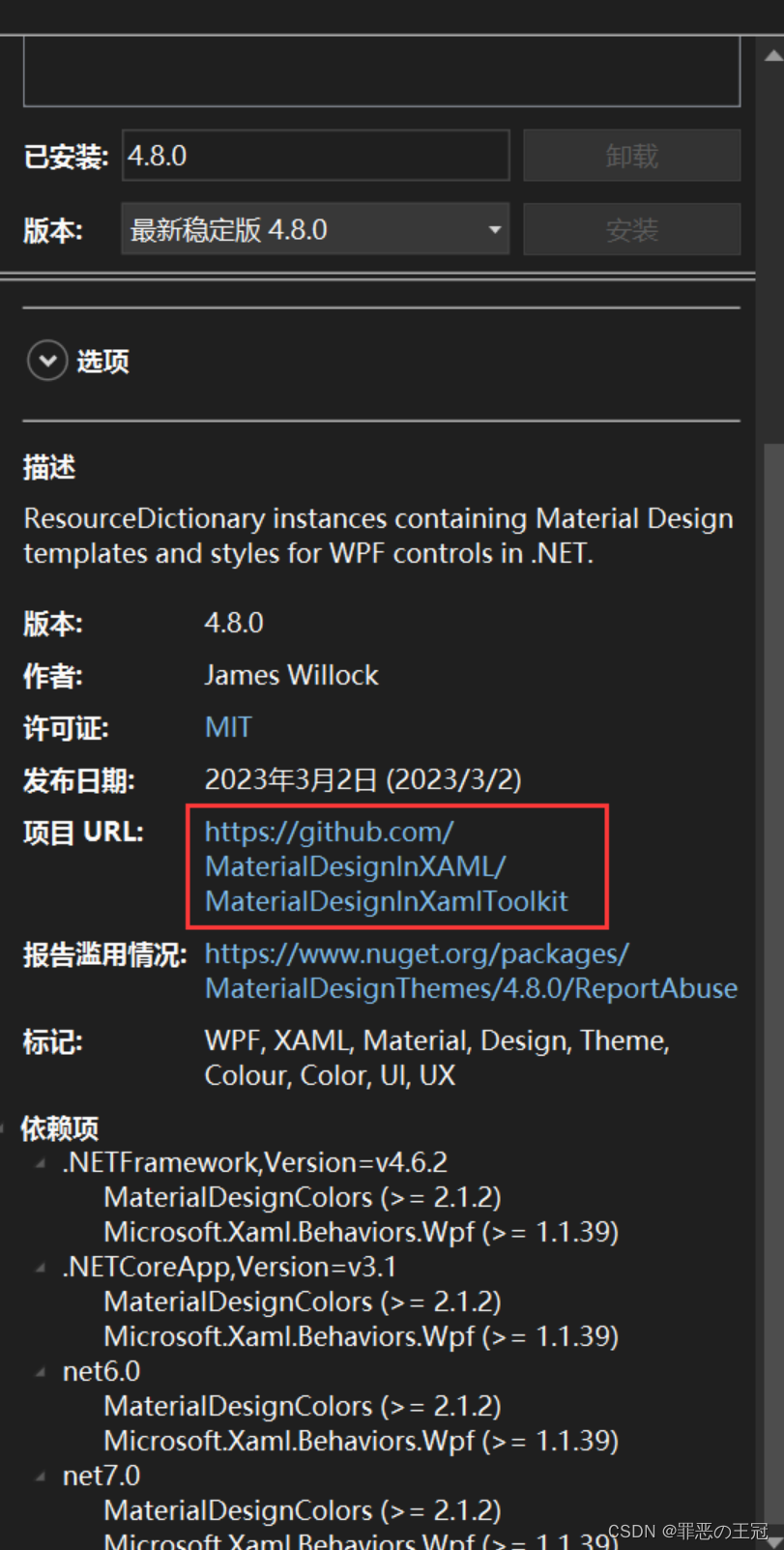
如果没下载MaterialDesign 的源码
github源码运行
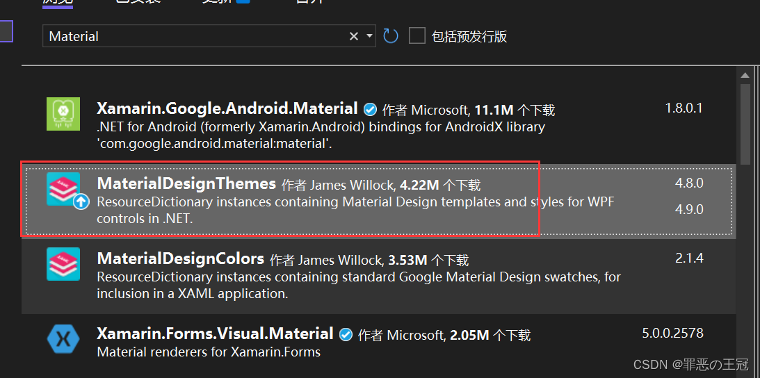
在Nuget里面引入MaterialDesign
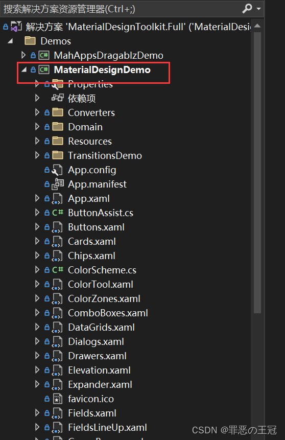
MaterialDesign控件简介
项目运行成功之后左边的列表就是提供的控件的列表
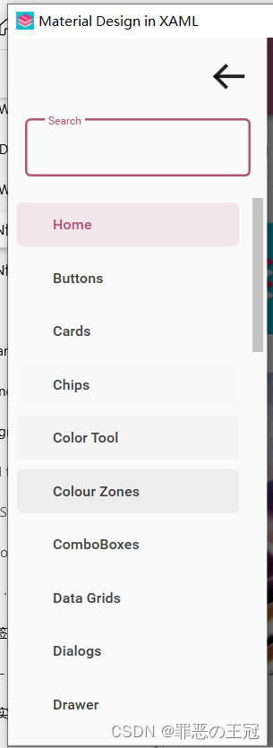
仔细看的话提供的控件非常的完整,消息提示,弹出层,手风琴,面包屑,卡片等。常用的都具备了。
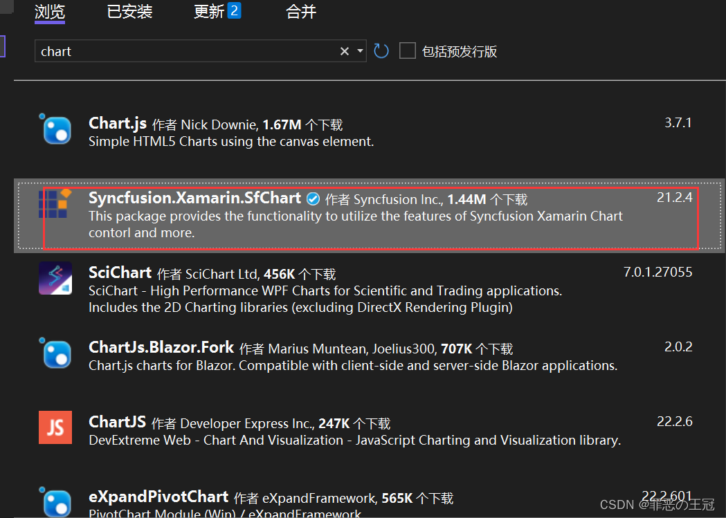
这里顺便说一下,前端的UI一般是+UI框架+统计图解决。
例如:
- Vue
- Elemnent-ui
- ECharts
- Uniapp
- uView
- uChart
这个框架还挺好看的,但是没有提供统计图的方法。我去NuGet上面搜了一下,发现了统计图。
看了一下官网
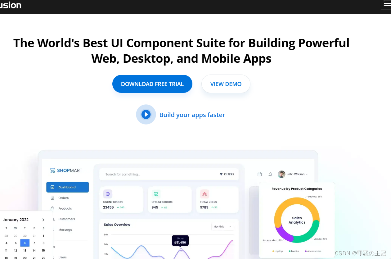
不知道要不要收费,等这个结束了我去学一下这个统计图的UI。基本前端的UI就这些了。
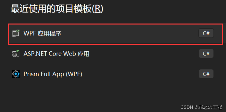
如何自己新建一个项目
Prism基础搭建
新建WPF项目程序
引入命名空间:
在App.xmal里面添加为:
<prism:PrismApplication x:Class="MyToDo.App" //将Application改为prism下面的Application.注意:这里的prism:PrismApplication没有代码提示,但是有是否正确提示。输入完全之后就没有波浪线提醒
             xmlns="http://schemas.microsoft.com/winfx/2006/xaml/presentation"
             xmlns:x="http://schemas.microsoft.com/winfx/2006/xaml"
             xmlns:local="clr-namespace:MyToDo"
             xmlns:prism="http://prismlibrary.com/"//引入prism的命名空间

             StartupUri="MainWindow.xaml">
    <Application.Resources>

    </Application.Resources>
</prism:PrismApplication>
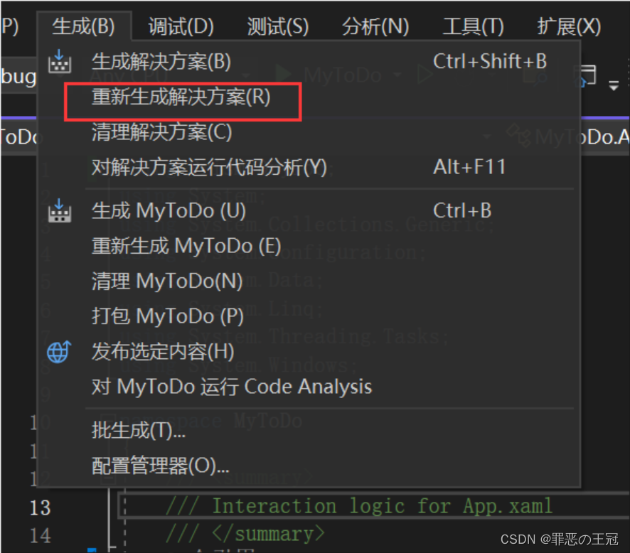
主函数继承关系:
App继承:PrismApplication,但是代码提示可能会有延迟
可以通过重新生成文件来修复代码提示BUG
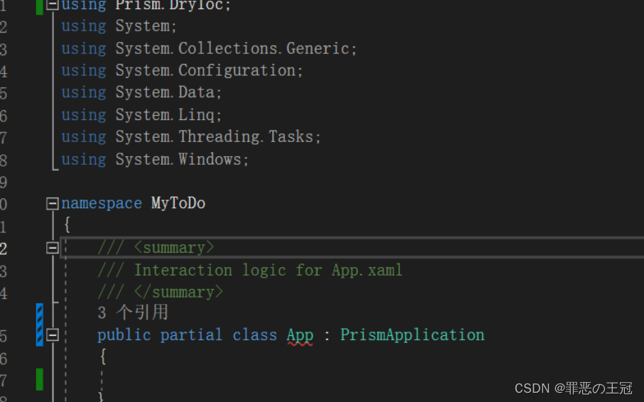
初始化App.xmal
using Prism.DryIoc;
using Prism.Ioc;
using System;
using System.Collections.Generic;
using System.Configuration;
using System.Data;
using System.Linq;
using System.Threading.Tasks;
using System.Windows;

namespace MyToDo
{
    /// <summary>
    /// Interaction logic for App.xaml
    /// </summary>
    public partial class App : PrismApplication
    {
        /// <summary>
        /// 重写运行主窗口
        /// </summary>
        /// <returns></returns>
        /// <exception cref="NotImplementedException"></exception>
        protected override Window CreateShell()
        {
            //重定向主窗口
            return Container.Resolve<MainWindow>();

        }

        /// <summary>
        /// 依赖注入
        /// </summary>
        /// <param name="containerRegistry"></param>
        protected override void RegisterTypes(IContainerRegistry containerRegistry)
        {

        }
    }
}
Ui资源引入
打开github网址
在Github上面选择Wiki
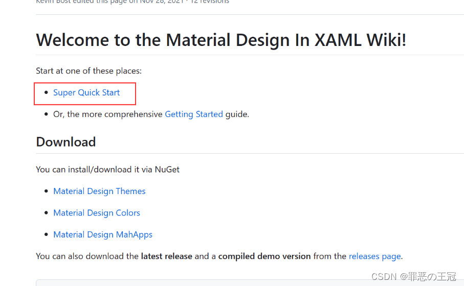
选择快速开始此项目
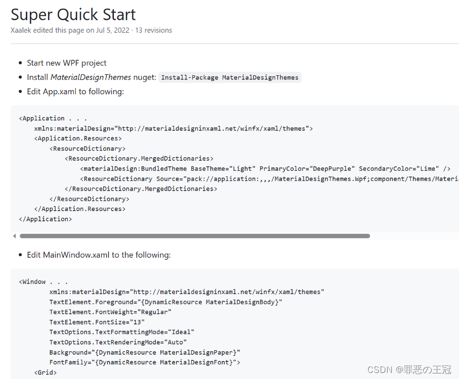
将代码复制粘贴
App.xmal
<prism:PrismApplication x:Class="MyToDo.App"
                        xmlns="http://schemas.microsoft.com/winfx/2006/xaml/presentation"
                        xmlns:x="http://schemas.microsoft.com/winfx/2006/xaml"
                        xmlns:local="clr-namespace:MyToDo"
                        xmlns:prism="http://prismlibrary.com/"
                        xmlns:materialDesign="http://materialdesigninxaml.net/winfx/xaml/themes"
                        StartupUri="MainWindow.xaml">
    <Application.Resources>
        <ResourceDictionary>
            <ResourceDictionary.MergedDictionaries>
                <materialDesign:BundledTheme BaseTheme="Light"
                                             PrimaryColor="DeepPurple"
                                             SecondaryColor="Lime" />
                <ResourceDictionary Source="pack://application:,,,/MaterialDesignThemes.Wpf;component/Themes/MaterialDesignTheme.Defaults.xaml" />
            </ResourceDictionary.MergedDictionaries>
        </ResourceDictionary>
    </Application.Resources>
</prism:PrismApplication>


MainWindow.xmal

<Window x:Class="MyToDo.MainWindow"
        xmlns="http://schemas.microsoft.com/winfx/2006/xaml/presentation"
        xmlns:x="http://schemas.microsoft.com/winfx/2006/xaml"
        xmlns:d="http://schemas.microsoft.com/expression/blend/2008"
        xmlns:mc="http://schemas.openxmlformats.org/markup-compatibility/2006"
        xmlns:local="clr-namespace:MyToDo"
        mc:Ignorable="d"
        Title="MainWindow" Height="450" Width="800"
        xmlns:materialDesign="http://materialdesigninxaml.net/winfx/xaml/themes"
        TextElement.Foreground="{DynamicResource MaterialDesignBody}"
        TextElement.FontWeight="Regular"
        TextElement.FontSize="13"
        TextOptions.TextFormattingMode="Ideal"
        TextOptions.TextRenderingMode="Auto"
        Background="{DynamicResource MaterialDesignPaper}"
        FontFamily="{DynamicResource MaterialDesignFont}">
    <Grid>
        <StackPanel>
            <materialDesign:Card Padding="32"
                                 Margin="16">
                <TextBlock Style="{DynamicResource MaterialDesignHeadline6TextBlock}">My First Material Design App</TextBlock>
            </materialDesign:Card>
        </StackPanel>
    </Grid>
</Window>
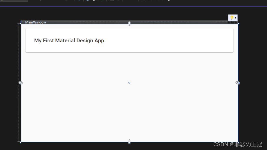
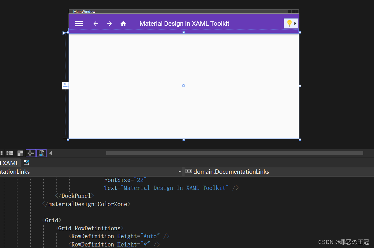
实现效果:
照着Demo写UI
读书人的事情,那能叫偷吗?
使用Github上面的源码
github源码运行
首页导航栏框架
找到主窗体控件
将Ui代码复制
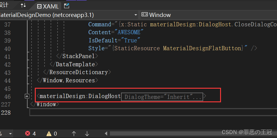
粘贴之后显示是无效代码,因为我们没有引入命名空间
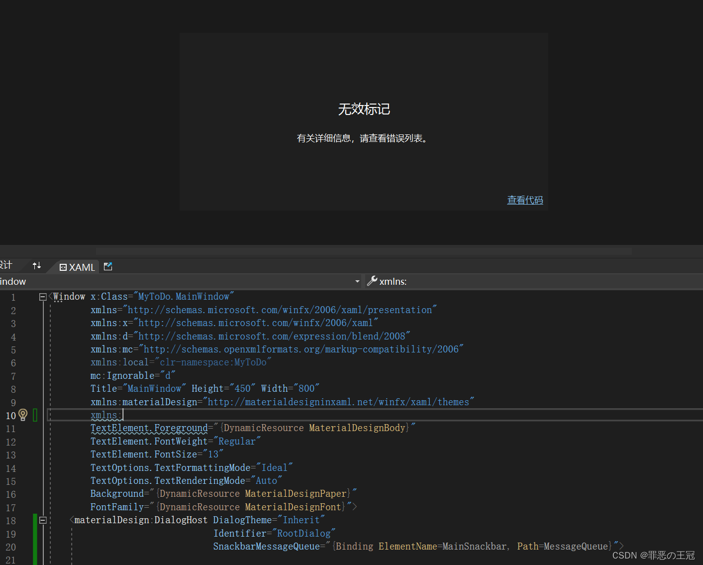
引入命名空间
xmlns:materialDesign=“http://materialdesigninxaml.net/winfx/xaml/themes”
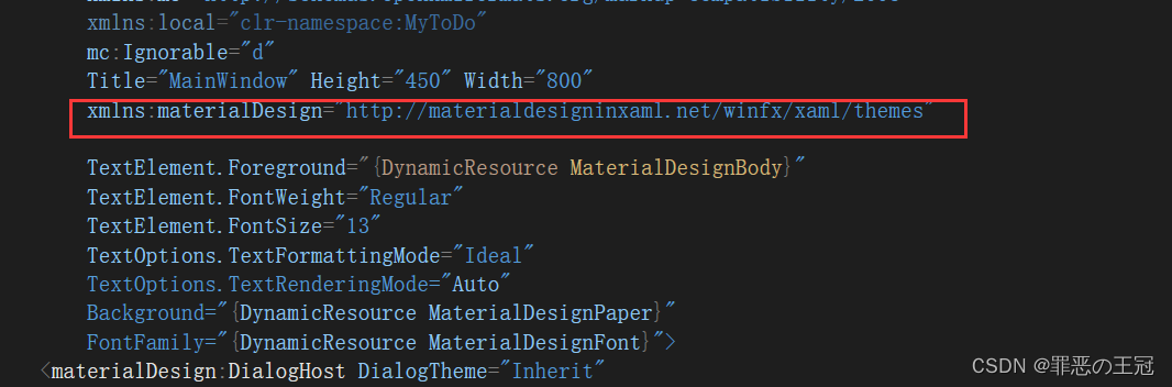
将代码中报错的删除
我们就抄好了源码的首页
Ui整体逻辑
- materialDesign:DialogHost:materialDesignUi框架,我试过删除了第一层对显示效果没有任何影响
- materialDesign:DialogHost:第二层Ui
- materialDesign:DrawerHost.LeftDrawerContent:左侧列表(删除)
- DockPanel:
- materialDesign:ColorZone :顶部导航栏
- Grid:中间主内容(删除)
最终效果
<Window x:Class="MyToDo.MainWindow"
        xmlns="http://schemas.microsoft.com/winfx/2006/xaml/presentation"
        xmlns:x="http://schemas.microsoft.com/winfx/2006/xaml"
        xmlns:d="http://schemas.microsoft.com/expression/blend/2008"
        xmlns:mc="http://schemas.openxmlformats.org/markup-compatibility/2006"
        xmlns:local="clr-namespace:MyToDo"
        mc:Ignorable="d"
        Title="MainWindow" Height="450" Width="800"
        xmlns:materialDesign="http://materialdesigninxaml.net/winfx/xaml/themes"

        TextElement.Foreground="{DynamicResource MaterialDesignBody}"
        TextElement.FontWeight="Regular"
        TextElement.FontSize="13"
        TextOptions.TextFormattingMode="Ideal"
        TextOptions.TextRenderingMode="Auto"
        Background="{DynamicResource MaterialDesignPaper}"
        FontFamily="{DynamicResource MaterialDesignFont}">
    <materialDesign:DialogHost DialogTheme="Inherit"
                               Identifier="RootDialog"
                               SnackbarMessageQueue="{Binding ElementName=MainSnackbar, Path=MessageQueue}">

        <materialDesign:DrawerHost IsLeftDrawerOpen="{Binding ElementName=MenuToggleButton, Path=IsChecked}">
            <materialDesign:DrawerHost.LeftDrawerContent>
                <DockPanel MinWidth="220">

                </DockPanel>
            </materialDesign:DrawerHost.LeftDrawerContent>

            <DockPanel>
                <materialDesign:ColorZone Padding="16"
                                          materialDesign:ElevationAssist.Elevation="Dp4"
                                          DockPanel.Dock="Top"
                                          Mode="PrimaryMid">
                    <DockPanel>
                        <StackPanel Orientation="Horizontal">
                            <ToggleButton x:Name="MenuToggleButton"
                                          AutomationProperties.Name="HamburgerToggleButton"
                                          Click="MenuToggleButton_OnClick"
                                          IsChecked="False"
                                          Style="{StaticResource MaterialDesignHamburgerToggleButton}" />

                            <Button Margin="24,0,0,0"
                                    materialDesign:RippleAssist.Feedback="{Binding RelativeSource={RelativeSource Self}, Path=Foreground, Converter={StaticResource BrushRoundConverter}}"
                                    Command="{Binding MovePrevCommand}"
                                    Content="{materialDesign:PackIcon Kind=ArrowLeft,
                                                        Size=24}"
                                    Foreground="{Binding RelativeSource={RelativeSource AncestorType={x:Type FrameworkElement}}, Path=(TextElement.Foreground)}"
                                    Style="{StaticResource MaterialDesignToolButton}"
                                    ToolTip="Previous Item" />

                            <Button Margin="16,0,0,0"
                                    materialDesign:RippleAssist.Feedback="{Binding RelativeSource={RelativeSource Self}, Path=Foreground, Converter={StaticResource BrushRoundConverter}}"
                                    Command="{Binding MoveNextCommand}"
                                    Content="{materialDesign:PackIcon Kind=ArrowRight,
                                                        Size=24}"
                                    Foreground="{Binding RelativeSource={RelativeSource AncestorType={x:Type FrameworkElement}}, Path=(TextElement.Foreground)}"
                                    Style="{StaticResource MaterialDesignToolButton}"
                                    ToolTip="Next Item" />

                            <Button Margin="16,0,0,0"
                                    materialDesign:RippleAssist.Feedback="{Binding RelativeSource={RelativeSource Self}, Path=Foreground, Converter={StaticResource BrushRoundConverter}}"
                                    Command="{Binding HomeCommand}"
                                    Content="{materialDesign:PackIcon Kind=Home,
                                                        Size=24}"
                                    Foreground="{Binding RelativeSource={RelativeSource AncestorType={x:Type FrameworkElement}}, Path=(TextElement.Foreground)}"
                                    Style="{StaticResource MaterialDesignToolButton}"
                                    ToolTip="Home" />
                        </StackPanel>

                        <materialDesign:PopupBox DockPanel.Dock="Right"
                                                 PlacementMode="BottomAndAlignRightEdges"
                                                 StaysOpen="False">

                            <StackPanel>
                                <Grid Margin="10">
                                    <Grid.ColumnDefinitions>
                                        <ColumnDefinition Width="Auto" />
                                        <ColumnDefinition Width="Auto" />
                                        <ColumnDefinition Width="Auto" />
                                    </Grid.ColumnDefinitions>
                                    <Grid.RowDefinitions>
                                        <RowDefinition />
                                        <RowDefinition />
                                        <RowDefinition />
                                    </Grid.RowDefinitions>
                                    <TextBlock Margin="0,0,10,0"
                                               Text="Light" />
                                    <ToggleButton x:Name="DarkModeToggleButton"
                                                  Grid.Column="1"
                                                  Click="MenuDarkModeButton_Click" />
                                    <TextBlock Grid.Column="2"
                                               Margin="10,0,0,0"
                                               Text="Dark" />
                                    <TextBlock Grid.Row="1"
                                               Margin="0,10,10,0"
                                               Text="Enabled" />
                                    <ToggleButton x:Name="ControlsEnabledToggleButton"
                                                  Grid.Row="1"
                                                  Grid.Column="1"
                                                  Margin="0,10,0,0"
                                                  IsChecked="{Binding ControlsEnabled}" />

                                    <TextBlock Grid.Row="2"
                                               Margin="0,10,10,0"
                                               Text="LTR" />
                                    <ToggleButton x:Name="FlowDirectionToggleButton"
                                                  Grid.Row="2"
                                                  Grid.Column="1"
                                                  Margin="0,10,0,0"
                                                  Click="FlowDirectionButton_Click" />
                                    <TextBlock Grid.Row="2"
                                               Grid.Column="2"
                                               Margin="10,10,0,0"
                                               Text="RTL" />
                                </Grid>

                                <Separator />

                                <Button Click="MenuPopupButton_OnClick"
                                        Content="Hello World" />

                                <Button Click="MenuPopupButton_OnClick"
                                        Content="Nice Popup" />

                                <Button Content="Can't Touch This"
                                        IsEnabled="False" />

                                <Separator />

                                <Button Click="MenuPopupButton_OnClick"
                                        Content="Goodbye" />
                            </StackPanel>
                        </materialDesign:PopupBox>

                        <TextBlock Margin="-152,0,0,0"
                                   HorizontalAlignment="Center"
                                   VerticalAlignment="Center"
                                   AutomationProperties.Name="Material Design In XAML Toolkit"
                                   FontSize="22"
                                   Text="Material Design In XAML Toolkit" />
                    </DockPanel>
                </materialDesign:ColorZone>

            </DockPanel>
        </materialDesign:DrawerHost>
    </materialDesign:DialogHost>
</Window>
首页导航栏细化
将框架搭好了之后就是细化了
现在直接启动会报错,因为我们没有定义Button上面的按钮事件。语法不报错,但是编译会报错。
边框去掉
‘+’添加代码,‘-’删除代码。后面不再说明
<Window x:Class="MyToDo.MainWindow"
        xmlns="http://schemas.microsoft.com/winfx/2006/xaml/presentation"
.......
       + WindowStyle="None" //取消窗口边框
       + WindowStartupLocation="CenterScreen"//启动时在显示屏中间

        ......
>
其他的就不写了,就是把没用到的删除了,下面是修改好的代码
<Window x:Class="MyToDo.MainWindow"
        xmlns="http://schemas.microsoft.com/winfx/2006/xaml/presentation"
        xmlns:x="http://schemas.microsoft.com/winfx/2006/xaml"
        xmlns:d="http://schemas.microsoft.com/expression/blend/2008"
        xmlns:mc="http://schemas.openxmlformats.org/markup-compatibility/2006"
        xmlns:local="clr-namespace:MyToDo"
        mc:Ignorable="d"
        Title="MainWindow" Height="450" Width="800"
        xmlns:materialDesign="http://materialdesigninxaml.net/winfx/xaml/themes"

        TextElement.Foreground="{DynamicResource MaterialDesignBody}"
        TextElement.FontWeight="Regular"
        TextElement.FontSize="13"
        TextOptions.TextFormattingMode="Ideal"
        TextOptions.TextRenderingMode="Auto"
        WindowStartupLocation="CenterScreen"
        WindowStyle="None"
        Background="{DynamicResource MaterialDesignPaper}"
        FontFamily="{DynamicResource MaterialDesignFont}">
    <materialDesign:DialogHost DialogTheme="Inherit"
                               Identifier="RootDialog"
                               SnackbarMessageQueue="{Binding ElementName=MainSnackbar, Path=MessageQueue}">

        <materialDesign:DrawerHost IsLeftDrawerOpen="{Binding ElementName=MenuToggleButton, Path=IsChecked}">
            <materialDesign:DrawerHost.LeftDrawerContent>
                <DockPanel MinWidth="220">

                </DockPanel>
            </materialDesign:DrawerHost.LeftDrawerContent>

            <DockPanel>
                <materialDesign:ColorZone Padding="16"
                                          materialDesign:ElevationAssist.Elevation="Dp4"
                                          DockPanel.Dock="Top"
                                          Mode="PrimaryMid">
                    <DockPanel>
                        <StackPanel Orientation="Horizontal">
                            <ToggleButton x:Name="MenuToggleButton"
                                          AutomationProperties.Name="HamburgerToggleButton"
                                          IsChecked="False"
                                          Style="{StaticResource MaterialDesignHamburgerToggleButton}" />

                            <Button Margin="24,0,0,0"
                                    materialDesign:RippleAssist.Feedback="{Binding RelativeSource={RelativeSource Self}, Path=Foreground, Converter={StaticResource BrushRoundConverter}}"
                                    Command="{Binding MovePrevCommand}"
                                    Content="{materialDesign:PackIcon Kind=ArrowLeft,
                                                        Size=24}"
                                    Foreground="{Binding RelativeSource={RelativeSource AncestorType={x:Type FrameworkElement}}, Path=(TextElement.Foreground)}"
                                    Style="{StaticResource MaterialDesignToolButton}"
                                    ToolTip="Previous Item" />

                            <Button Margin="16,0,0,0"
                                    materialDesign:RippleAssist.Feedback="{Binding RelativeSource={RelativeSource Self}, Path=Foreground, Converter={StaticResource BrushRoundConverter}}"
                                    Command="{Binding MoveNextCommand}"
                                    Content="{materialDesign:PackIcon Kind=ArrowRight,
                                                        Size=24}"
                                    Foreground="{Binding RelativeSource={RelativeSource AncestorType={x:Type FrameworkElement}}, Path=(TextElement.Foreground)}"
                                    Style="{StaticResource MaterialDesignToolButton}"
                                    ToolTip="Next Item" />


                            <TextBlock Margin="25,0,0,0"
                                       HorizontalAlignment="Center"
                                       VerticalAlignment="Center"
                                       AutomationProperties.Name="Material Design In XAML Toolkit"
                                       FontSize="22"
                                       Text="笔记本" />
                        </StackPanel>


                    </DockPanel>
                </materialDesign:ColorZone>

            </DockPanel>
        </materialDesign:DrawerHost>
    </materialDesign:DialogHost>
</Window>
运行效果
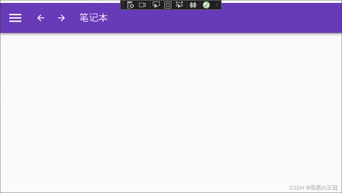
还凑合,现在已经有模有样了。
结尾
Ok,你现在已经做的有模有样了,接下来接着修改吧


 291
291


 被折叠的 条评论
为什么被折叠?
被折叠的 条评论
为什么被折叠?
 到【灌水乐园】发言


