


## 加载包
import numpy as np
import pandas as pd
import matplotlib.pyplot as plt
import scipy as sp
## 图像在jupyter notebook中显示
%matplotlib inline
## 显示的图片格式(mac中的高清格式),还可以设置为"bmp"等格式
%config InlineBackend.figure_format = "retina"
## 输出图显示中文
from matplotlib.font_manager import FontProperties
fonts = FontProperties(fname = "D:\Desktop\python在机器学习中的应用\方正粗黑宋简体.ttf",size=14)
## 引入3D坐标系
from mpl_toolkits.mplot3d import Axes3D
## cm模块提供大量的colormap函数
from matplotlib import cm
import matplotlib as mpl
## 挖掘频繁项集和关联规则
from mlxtend.frequent_patterns import apriori,association_rules
from mlxtend.preprocessing import TransactionEncoder
## 读取数据
datadf = pd.read_excel("D:\Desktop\python在机器学习中的应用\调查问卷2.xls")
## 对数据集进行编码
datanew = np.array(datadf.iloc[:,1::])
oht = TransactionEncoder() # 相应类别若含有实例则为true,否则为false
oht_ary = oht.fit(datanew).transform(datanew)
## 将编码后的数据集做成数据表,每列为各个选项
df = pd.DataFrame(oht_ary, columns=oht.columns_)
## 发现频繁项集,最小支持度为0.3
df_fre = apriori(df, min_support=0.3,use_colnames=True)
## 找到关联规则,通过置信度阈值发现规则
rule2 = association_rules(df_fre, metric="confidence", min_threshold=0.7)
rule2["antelen"] = rule2.antecedents.apply(lambda x:len(x))
rule2 = rule2[(rule2.antelen == 1) & (rule2.lift > 1)]
rule2.head()
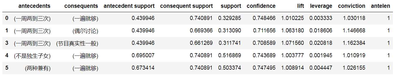
*rule2 = association_rules(df_fre, metric=“confidence”, min_threshold=0.7)*寻找置信度大于0.7的规则,
rule2 = rule2[(rule2.antelen == 1) & (rule2.lift > 1)]
只提取前项的事件数量大于1的规则得到新的规则 rule2
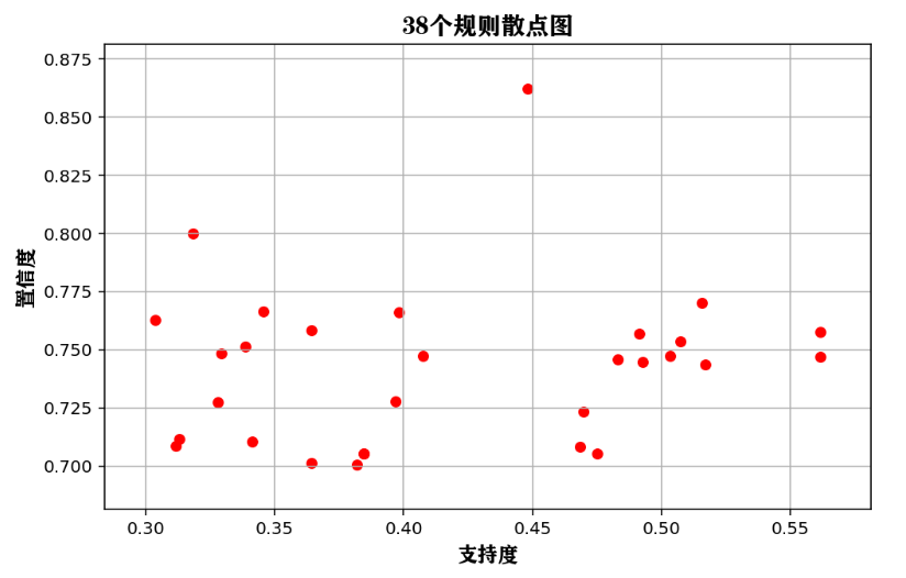
## 绘制支持度和置信度的散点图
rule2.plot(kind="scatter",x = "support",c = "r",
           y = "confidence",s = 30,figsize=(8,5))
plt.grid("on")
plt.xlabel("支持度",FontProperties = fonts,size = 12)
plt.ylabel("置信度",FontProperties = fonts,size = 12)
plt.title("38个规则散点图",FontProperties = fonts)
plt.show()
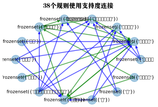
## 将部分关联规则使用关系网络图进行可视化
import networkx as nx
plt.figure(figsize=(12,12))
## 生成社交网络图
G=nx.DiGraph()

## 为图像添加边
for ii in rule2.index:
    G.add_edge(rule2.antecedents[ii],rule2.consequents[ii],weight = rule2.support[ii])

## 定义2种边
elarge=[(u,v) for (u,v,d) in G.edges(data=True) if d['weight'] >0.6]
emidle=[(u,v) for (u,v,d) in G.edges(data=True) if (d['weight'] <= 0.6)&(d['weight'] >= 0.45)]
esmall=[(u,v) for (u,v,d) in G.edges(data=True) if d['weight'] <= 0.45]

## 图的布局方式
pos=nx.circular_layout(G)

# 根据规则的置信度节点的大小
nx.draw_networkx_nodes(G,pos,alpha=0.4,node_size=rule2.confidence * 500)

# 设置边的形式
nx.draw_networkx_edges(G,pos,edgelist=elarge,
                    width=2,alpha=0.6,edge_color='r')
nx.draw_networkx_edges(G,pos,edgelist=emidle,
                    width=2,alpha=0.6,edge_color='g',style='dashdot')
nx.draw_networkx_edges(G,pos,edgelist=esmall,
                    width=2,alpha=0.6,edge_color='b',style='dashed')

# 为节点添加标签
nx.draw_networkx_labels(G,pos,font_size=10,font_family="STHeiti")

plt.axis('off')
plt.title("38个规则使用支持度连接",FontProperties = fonts)
plt.show()


 523
523


 被折叠的 条评论
为什么被折叠?
被折叠的 条评论
为什么被折叠?
 到【灌水乐园】发言


