


Python可视化各省近20年地区生产总值数据!
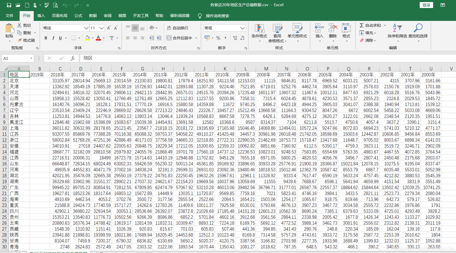
1,数据展示
2,代码绘图
# -*- coding: utf-8 -*-
#@Project filename:PythonDemo  time_bar.py
#@IDE   :IntelliJ IDEA
#@Author :ganxiang
#@Date   :2020/05/20 0020 10:06


import pandas as pd
from pyecharts.charts import Timeline,Bar
from pyecharts import options as opts
from pyecharts.globals import ThemeType


def time_bar():
    df1 =pd.read_csv("./各省近20年地区生产总值数据.csv",engine='python')
    #width="1450px",height="600px"
    timeLine2=Timeline(init_opts=opts.InitOpts(theme=ThemeType.LIGHT,width="1450px",height="600px"))
    #一,经过数据处理的时间图
    #思路:读取数据,因为数据是杂乱的,需要进行排序处理
    #1,读取数据并出入字典 2,对字典中的数据按value排序可升序降序排序 3,取出排序好的数据进行画时间图
    for i in range(2018,1999,-1):
        m=0#通过m的改变获取每一列的值
        dd={}#存储地区和数据
        for k in range(1,32):
            data =df1[str(i)+"年"].head(k)[m]
            region =df1["地区"].head(k)[m]
            m+=1
            dd[region]=data
        #对字典按值进行排序,升序排序
        sortList = sorted(dd.items(),key = lambda x:x[1],reverse = False)
        region=[]#接收key
        data=[]#接受values
        for k,n in sortList:
            region.append(k)
            data.append(n)
        bar=(
            Bar()
                .add_xaxis(list(region))
                .add_yaxis("近20年各省生产总值(单位:亿元)",list(data))
                .reversal_axis()
                .set_series_opts(label_opts=opts.LabelOpts(position="right"))  # 系列配置项
                .set_global_opts(
                # toolbox_opts=opts.ToolboxOpts(),
                title_opts=opts.TitleOpts("{}年各省生产总值".format(i)),
                xaxis_opts=opts.AxisOpts(axislabel_opts=opts.LabelOpts(rotate=0,font_size=12,interval=0)),
                yaxis_opts=opts.AxisOpts(axislabel_opts=opts.LabelOpts(rotate=0,font_size=12,interval=0)),

            )
        )
        timeLine2.add_schema(play_interval=800)
        timeLine2.add(bar,"{}年".format(i))
    timeLine2.render("./time_bar.html")
    return timeLine2

if __name__=='__main__':
    time_bar()
3,效果展示


 1073
1073


 被折叠的 条评论
为什么被折叠?
被折叠的 条评论
为什么被折叠?
 到【灌水乐园】发言


