


一、垂直结构
  display: flex;
  flex-direction: column;
二、项目自动补齐剩余空间
左中右结构,左右固定宽度,中间自动补齐宽度;
.omni-warpper{
  display: flex;
}
.content-left{
  width: 150rpx;
}
.content-center{
  flex-grow: 1; // 设置 flex-grow
}
.content-right{
  width: 55rpx;
}
三、项目之间预留一定空间
一、给定项目宽度;
width:30%;
二、给项目设置margin值;
四、项目右对齐 justify-content: flex-end
justify-content: flex-start | flex-end | center | space-between | space-around;
justify-content: flex-end;
五、flex布局,如何实现色子
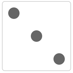
<div class="box">
  <span class="item"></span>
  <span class="item"></span>
  <span class="item"></span>
</div>
.box {
  width: 200px;
  height: 200px;
  border: 2px solid #ccc;
  border-radius: 10px;
  padding: 20px;
  display: flex;
  justify-content: space-between; /* 两端对齐 */
}
.item {
  display: block;
  width: 40px;
  height: 40px;
  border-radius: 50%;
  background-color: #666;
}
.item:nth-child(2) {
  align-self: center; /* 垂直方向居中 */
}
.item:nth-child(3) {
  align-self: flex-end; /* 垂直方向尾对齐 */
}


 6912
6912


 被折叠的 条评论
为什么被折叠?
被折叠的 条评论
为什么被折叠?
 到【灌水乐园】发言


