


案例目标
文字部分自适应并且居中
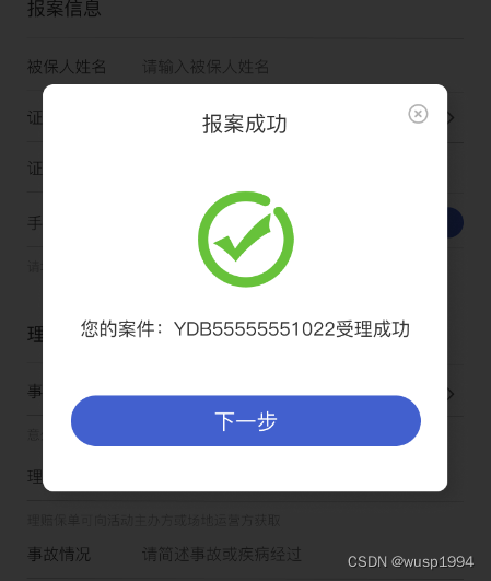
图中是一个弹窗,我现在使用flex的布局来实现,标题和关闭按钮。因为是uni-app,所以标签是view 。你可以自行替换为
代码
<view class="popup-box">
    <view class="title">
        <view class="text">报案成功</view>
        <image style="width: 32rpx;" mode="widthFix" src="close-icon.png"></image>
    </view>
</view>
.popup-box{
  width: 80vw;
  margin: 0 auto;
  .title{
    display: flex;
    justify-content: space-between;
    align-items: center;
    .text{
      text-align: center;
      flex: auto;
    }
  }
}
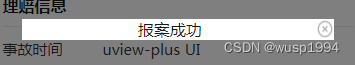
实现效果如下:
总结
这里的title 文字部分是自适应剩余宽度的。想要自适应剩余宽度的话,需要满足以下条件:
- 父级dispalay : flex;
- 其中一个子级的宽度或者高度为固定。
- 另外一个子级的 flex: auto;
案例二:子级宽度超过父级
<!DOCTYPE html>
<html>
<head>
  <style>
    .parent {
      display: flex;
      flex-direction: row;
      width: 500px; /* 可以根据需要设置父级div的宽度 */
      height: 200px;
      background-color: lightgray;
    }

    .child1 {
      width: 100px;
      flex-shrink: 0;/*防止第二个子div的内容超出了父级div的宽度,其在空间不足时缩小*/
      background-color: red;
    }

    .child2 {
      flex-grow: 1;
      background-color: blue;
    }
  </style>
</head>
<body>
  <div class="parent">
    <div class="child1"></div>
    <div class="child2">
        很多汉字》很多汉字》很多汉字》很多汉字》很多汉字》很多汉字》很多汉字》很多汉字》很多汉字》很多汉字》很多汉字》很多汉字》很多汉字》
    </div>
  </div>
</body>
</html>
当第二个子div的内容超出了父级div的宽度时,父级div的剩余空间将被第二个子div占据,导致第一个子div的宽度变小。
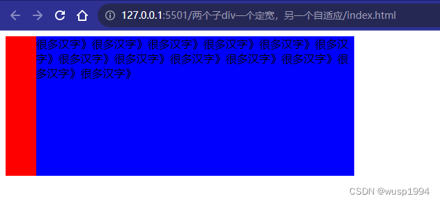
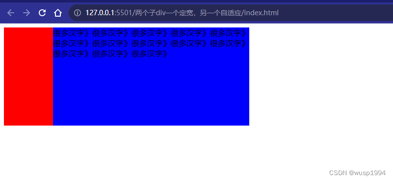
此时要将第一个子div的flex-shrink属性设置为0,可以防止其缩小。
.child1 {
     flex-shrink: 0;/*防止第二个子div的内容超出了父级div的宽度,其在空间不足时缩小*/
    }


 3613
3613


 被折叠的 条评论
为什么被折叠?
被折叠的 条评论
为什么被折叠?
 到【灌水乐园】发言


