


目录
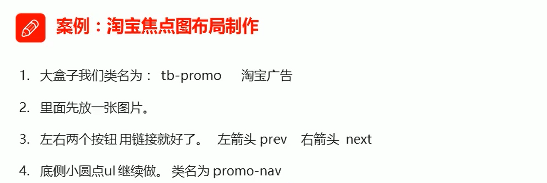
1、定位
1.1、为什么需要定位
- 定位可以让盒子自由的在某个盒子内移动位置或者固定屏幕中某个位置,并且可以压住其他盒子
- 浮动:可以让多个块级盒子一行没有缝隙排列显示,经常用于横向排列盒子
1.2、定位组成
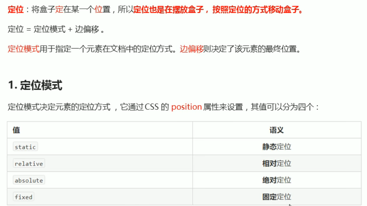

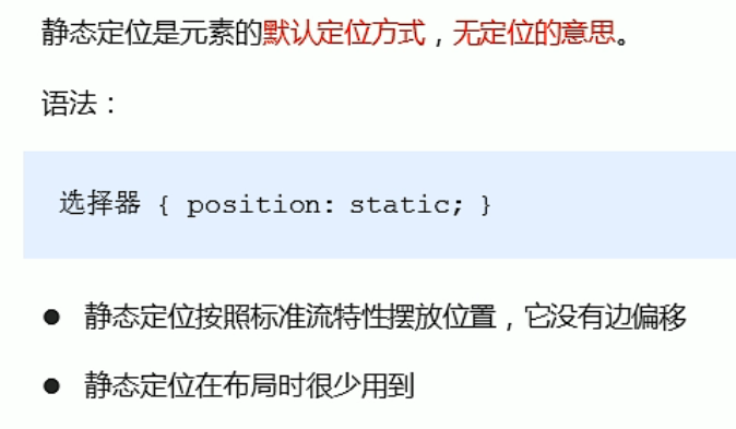
1.3、静态定位static(了解)
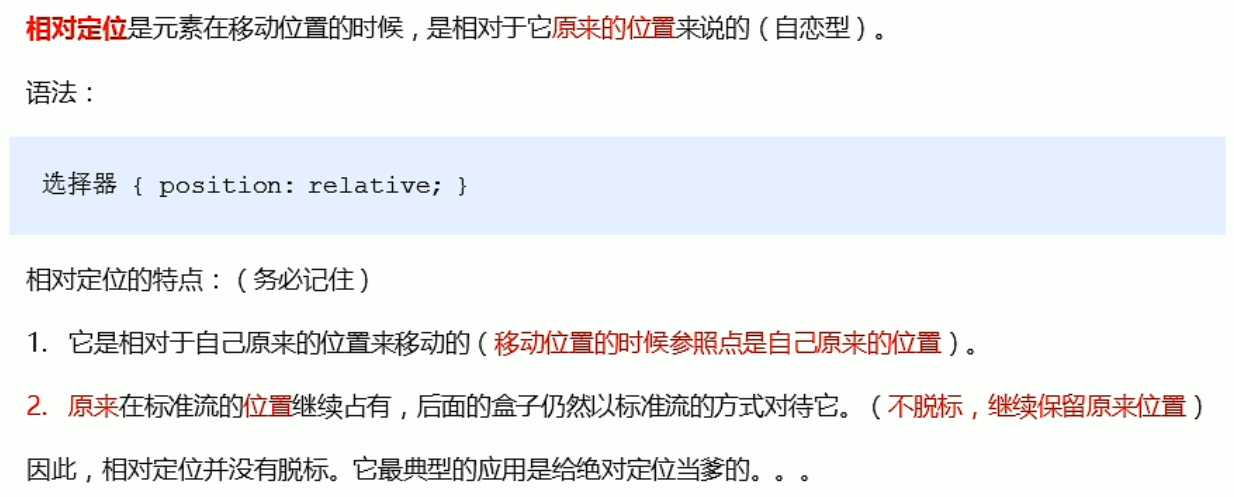
1.4、相对定位relative(重要)
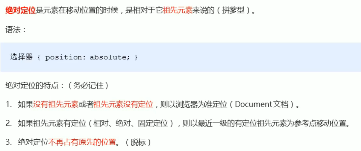
1.5、绝对定位absolute(重要)
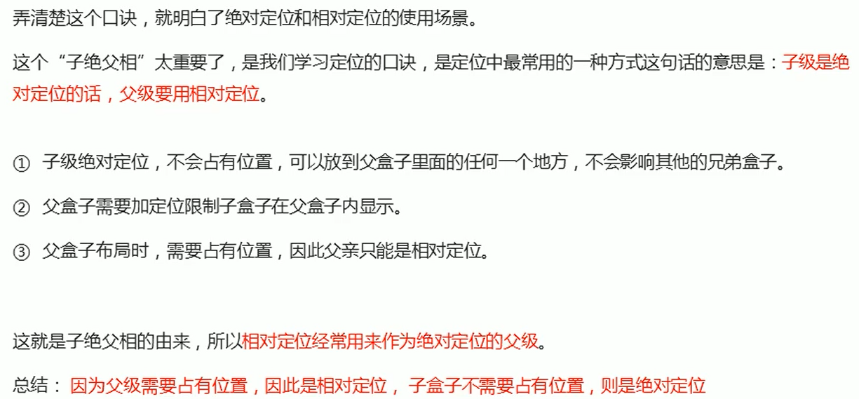
1.6、子绝夫相的由来
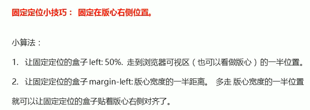
1.7、固定定位fixed(重要)

1.8、粘性定位sticky(重要)

1.9、定位总结

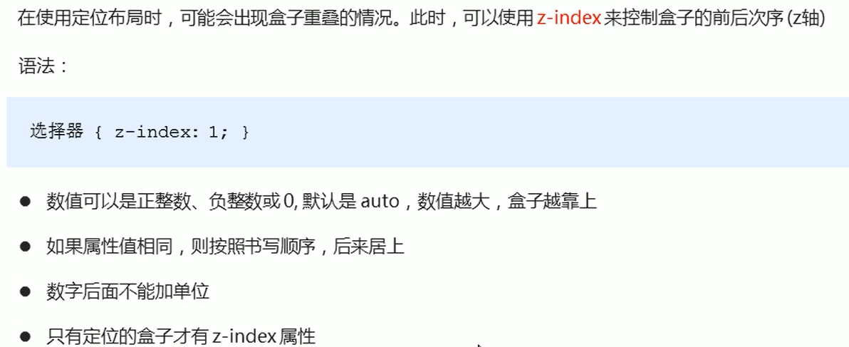
1.10、定位叠放次序 z-index
标准流和浮动没有 z-index 属性
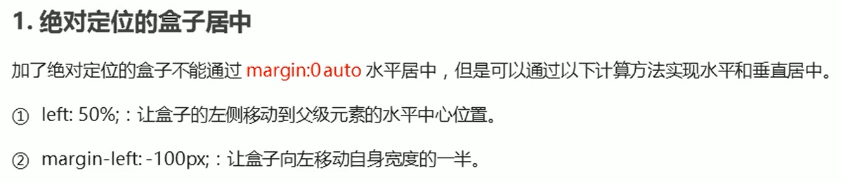
1.11、定位的拓展


2、综合案例
<head>
<meta charset="UTF-8">
<meta http-equiv="X-UA-Compatible" content="IE=edge">
<meta name="viewport" content="width=device-width, initial-scale=1.0">
<title>综合案例</title>
<style>
* {
margin: 0;
padding: 0;
}
li {
list-style: none;
}
.tb-promo {
position: relative;
width: 520px;
height: 280px;
margin: 100px auto;
/* 盒子水平居中 */
}
/* 并集选择器 */
.prev,
.next {
position: absolute;
/* 绝对定位盒子垂直居中算法 */
top: 50%;
margin-top: -15px;
/* 加了绝对定位的盒子可以直接给高和宽 */
width: 20px;
height: 30px;
background: rgba(0, 0, 0, 0.3);
/* 水平居中+垂直居中 */
text-align: center;
line-height: 30px;
color: #fff;
text-decoration: none;
}
.prev {
left: 0;
border-top-right-radius: 15px;
border-bottom-right-radius: 15px;
}
.next {
right: 0;
border-top-left-radius: 15px;
border-bottom-left-radius: 15px;
}
.promo-nav {
position: absolute;
width: 70px;
height: 14px;
left: 50%;
margin-left: -35px;
bottom: 15px;
background: rgba(255, 255, 255, 0.3);
border-radius: 7px;
}
.promo-nav li {
float: left;
margin: 3px;
width: 8px;
height: 8px;
background: rgba(255, 255, 255, 0.8);
border-radius: 50%;
}
.promo-nav .selected {
background-color: #ff5000;
}
</style>
</head>
<body>
<div class="tb-promo">
<img src="images/tb.jpg" alt="">
<!-- 左侧按钮 -->
<a href="#" class="prev"><</a>
<!-- 右侧按钮 -->
<a href="#" class="next">></a>
<!-- 下面小圆点 -->
<ul class="promo-nav">
<li class="selected"></li>
<li></li>
<li></li>
<li></li>
<li></li>
</ul>
</div>
</body>
</html>

3、网页布局总结

4、元素的显示与隐藏
类似网站广告,当我们点击关闭就不见了,但是重新刷新页面,会重新出现!
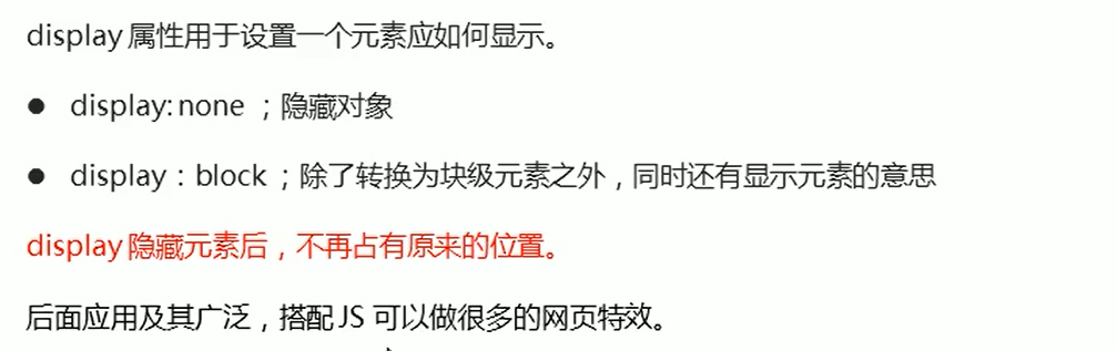
本质:让一个元素在页面中隐藏或者显示出来。
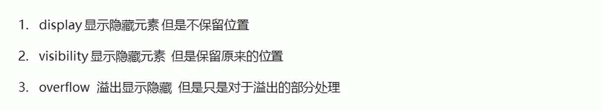
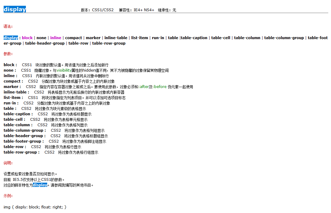
4.1、display属性
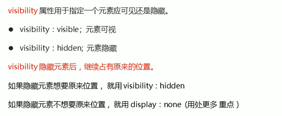
4.2、visibility属性

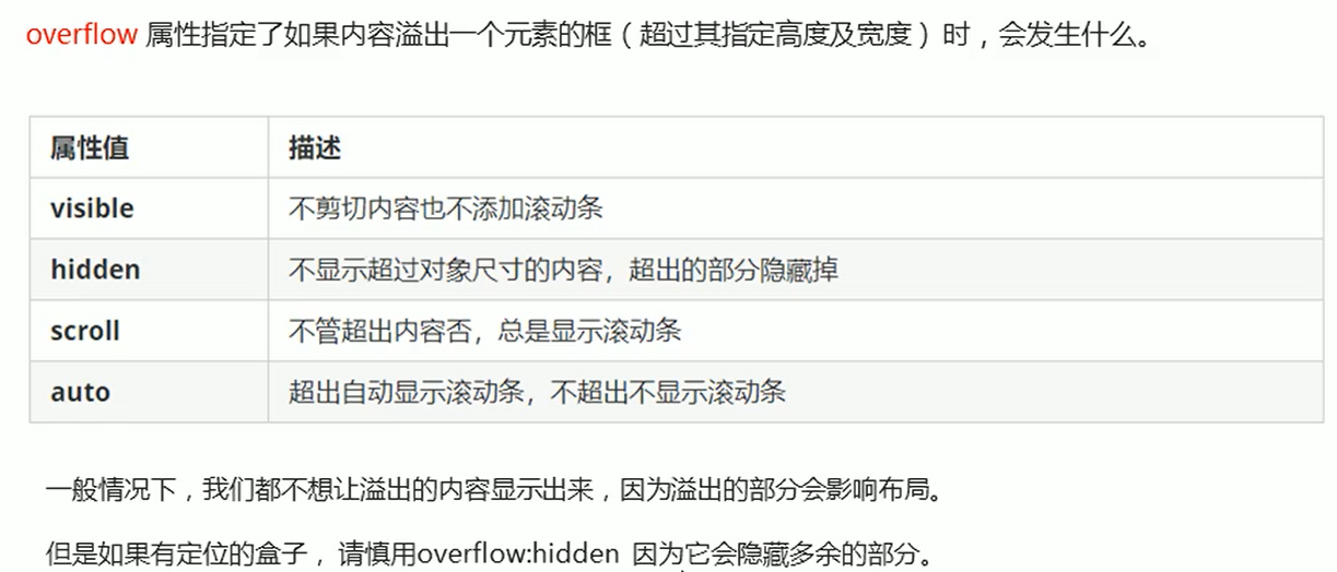
4.3、overflow溢出


 263
263


 被折叠的 条评论
为什么被折叠?
被折叠的 条评论
为什么被折叠?
 到【灌水乐园】发言


