


目录
2.background-clip 设置背景图向外裁剪的区域
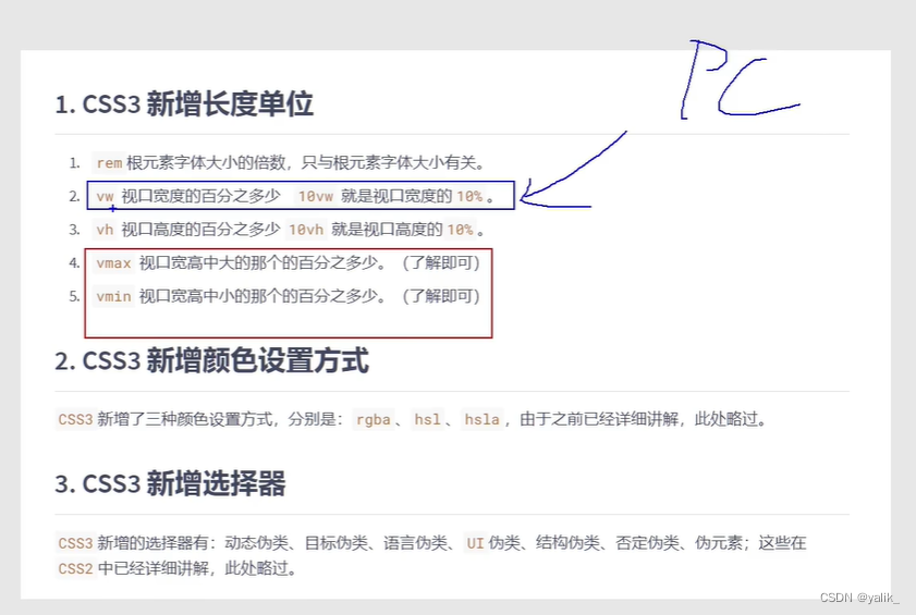
一、新增长度单位
①vw:相对于视口宽度的百分比
②vh:相对于视口高度的百分比
div{
    width:20vw;
    height:20vh;
}
二、新增盒子属性
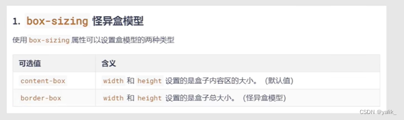
1.border-box 怪异盒模型
div{
    width:200px;
    height:200px;
    border:5px solid #fff;
    box-sizing:boeder-box;
}
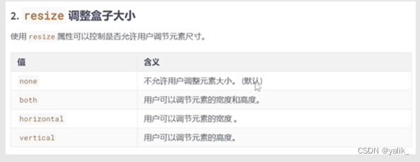
2.resize 调整盒子大小
resize一定要和overflow一起用
<div class="box1">
    <div class="box2"></div>
</div>

.box1{
    width:400px;
    height:400px;
    resize:both;
    overflow:scroll;
    background:orange;
}

.box2{
    width:800px;
    height:800px;
    background:blue;
}
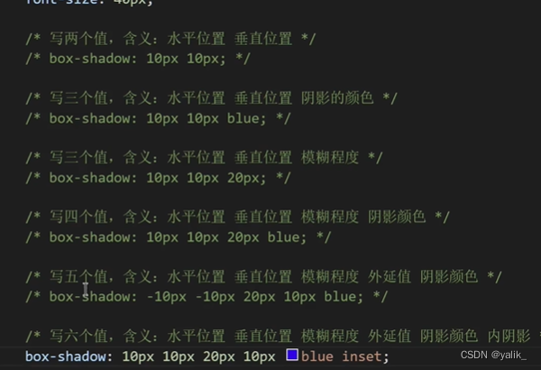
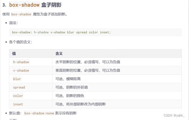
3.box-shadow 盒子阴影
案例:鼠标悬浮盒子上时,盒子有一个过度的阴影效果
div{
    width:300px;
    height:300px;
    background:orange;
    transition:1s linear all;
}

div:hover{
    box-shadow:0 0 10px black;
}
三、新增背景属性
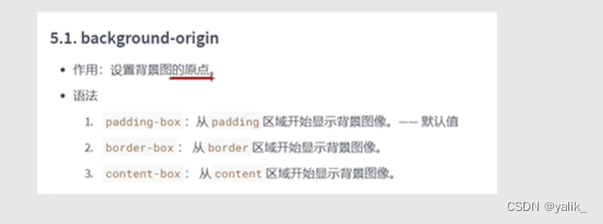
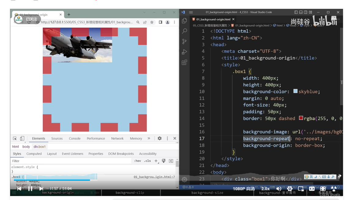
1.background-origin 设置背景图的原点
div{
    width:200px;
    height:200px;
    padding:20px;
    border:20px dashed pink;
    background-color:bule;

    background-image:url("../../image.png");
    background-repeat:no-repeat;
    background-origin:border-box;
}
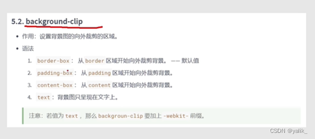
2.background-clip 设置背景图向外裁剪的区域
案例:让背景图呈现在文字上
1.设置字体颜色为透明色
2.设置background-clip:text
3.在background-clip前加上私有前缀

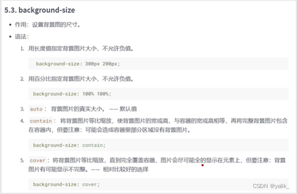
3.background-size 设置背景图的尺寸
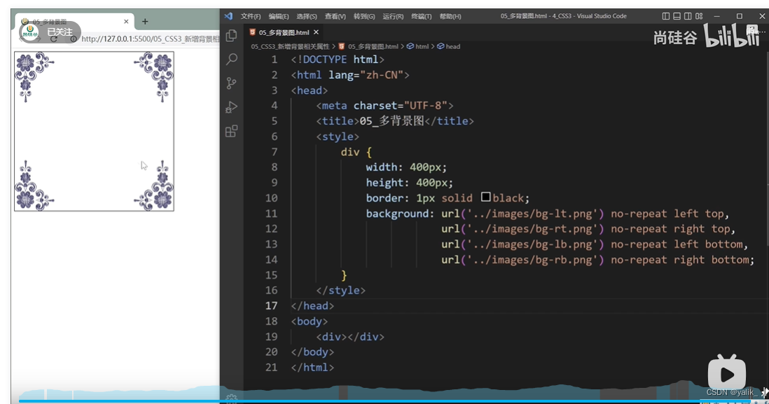
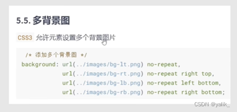
4.多背景图,用逗号隔开
不能用background-image
四、新增文本属性
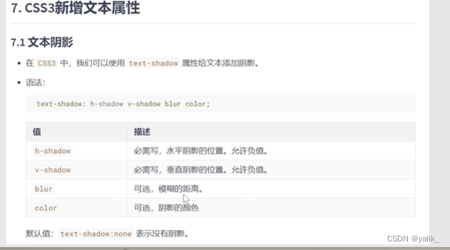
1.text-shadow 文本阴影
h1{
    background:black;
    text-shadow:0 0 20px red;
    color:#fff;
    margin:0 auto;
}
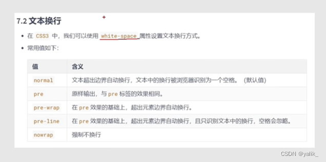
2.white-space 文本换行
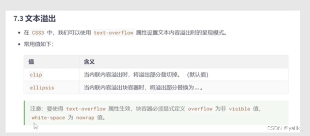
3.text-overflow 文本溢出
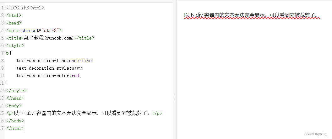
案例:一行超出的文本用...表示
div{
    width:200px;
    text-overflow:ellipsis;
    overflow:hidden;
    white-space:nowrap;
}
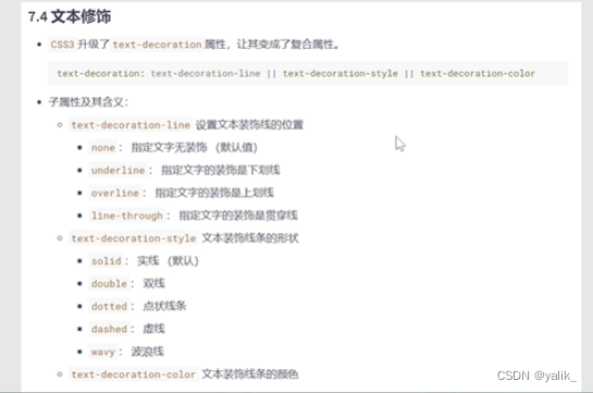
4.text-decoration 文本修饰
p{
	text-decoration-line:underline;
	text-decoration-style:wavy;
	text-decoration-color:red;
}
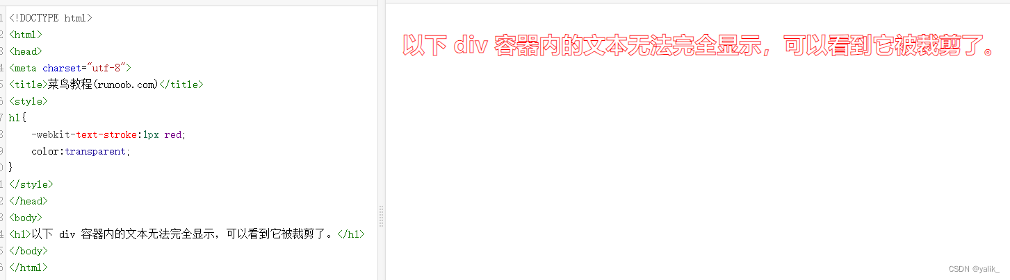
5.-webkit-text-stroke 文本描边
h1{
	-webkit-text-stroke:1px red;
	color:transparent;
}

五、新增渐变
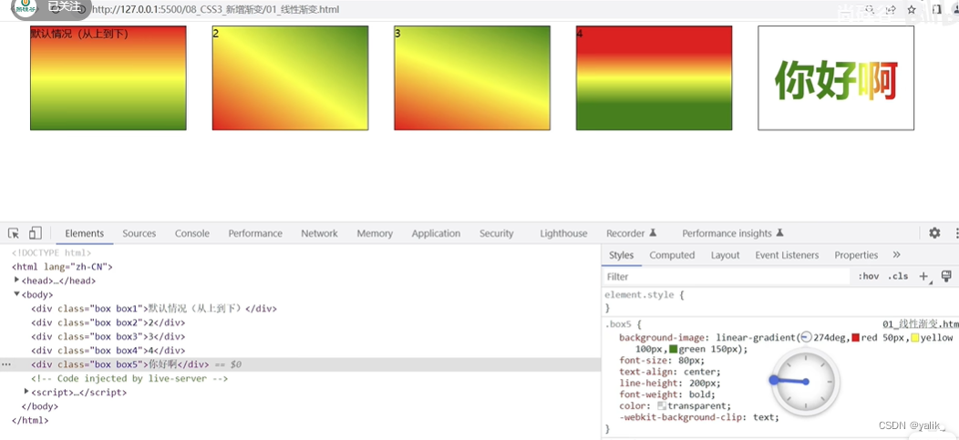
1.linear-gradient 线性渐变
.box1{
     height:200px;
     background-image: linear-gradient(red, yellow,green);
}

.box2{
     height:200px;
     background-image: linear-gradient(to right top, red, yellow,green);//往右上角
}

.box3{
     height:200px;
     background-image: linear-gradient(30deg, red, yellow,green); //顺时针偏转30度
}

.box4{
     height:200px;
     background-image: linear-gradient(red 50px, yellow 100px,green 150px);
}

.box5{
    height: 200px;
    background-image: linear-gradient(red 50px, yellow 100px,green 150px);
	-webkit-background-clip:text;
	color:transparent;
	font-size:80px;
	text-align:center;
}
2.radial-gradient 径向渐变
.box1{
     width:300px;
     height:200px;
     background-image: radial-gradient(red, yellow,green);//默认从圆心四散
}

.box2{
     width:300px;
     height:200px;
     background-image: radial-gradient(at right top, red, yellow,green);//调整圆心的位置
}

.box3{
     width:300px;
     height:200px;
     background-image: radial-gradient(at 100px 50px, red, yellow,green);
}

.box4{
     width:300px;
     height:200px;
     background-image: radial-gradient(circle, red, yellow,green);
}

.box5{
     width:300px;
     height:200px;
     background-image: radial-gradient(200px 200px, red, yellow,green);//半径为200px
}

.box6{
     width:300px;
     height:200px;
     background-image: radial-gradient(red 50px, yellow 100px ,green 150px);//从圆心开始,50px红色,100px黄色,150px绿色

}

.box7{
     width:300px;
     height:200px;
         background-image: radial-gradient(100px 50px at 150px 150px,red, yellow,green);//圆心x100px y100px 半径x100px y50px

}
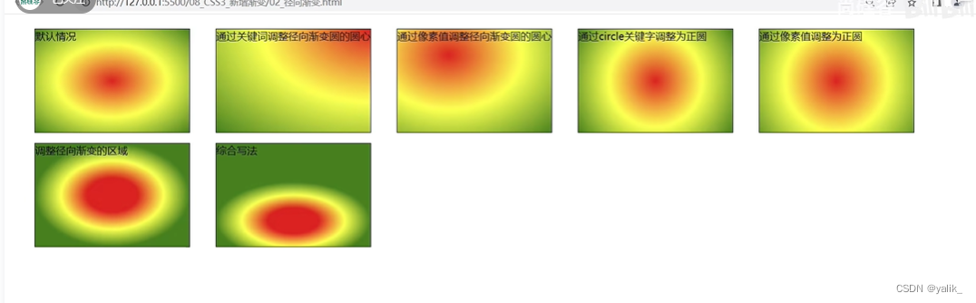
3.重复渐变
在设有具体像素值的线性渐变或者径向渐变前加上repeating-
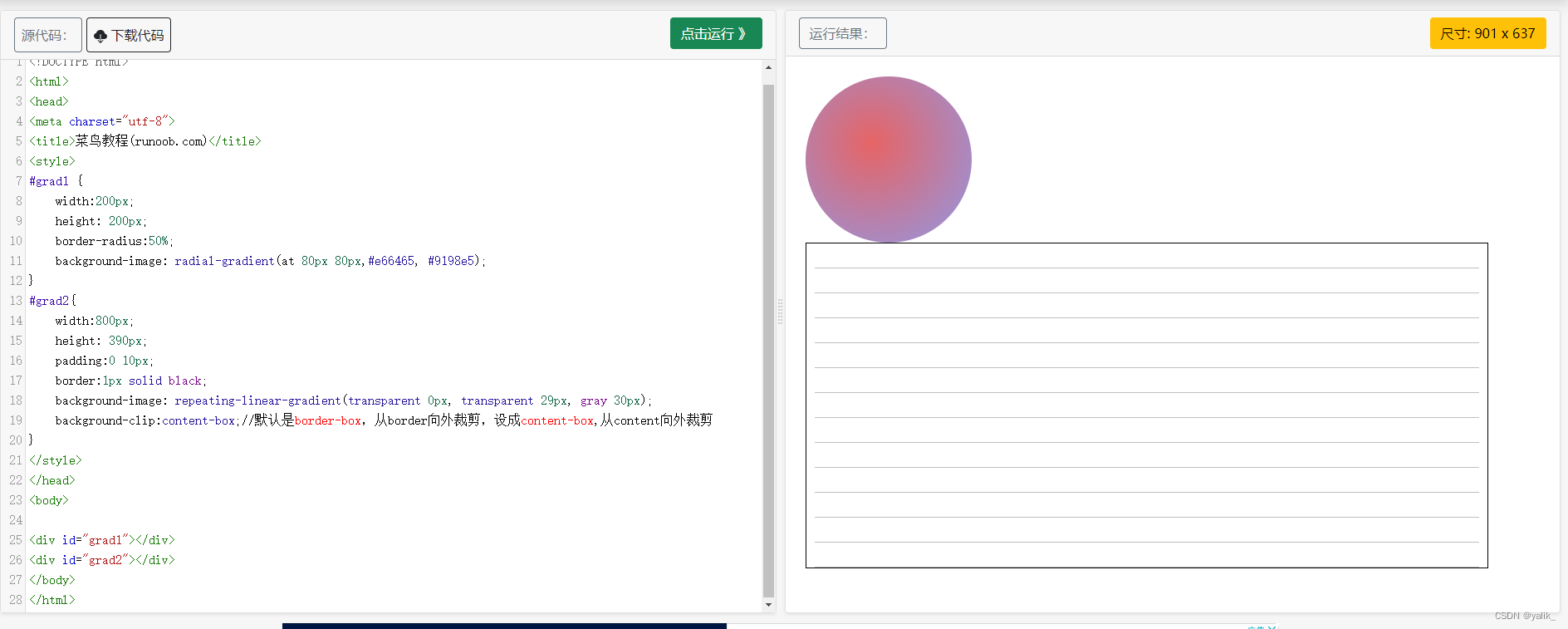
4.案例
书签页 立体的球
#grad1 {
	width:200px;
    height: 200px;
	border-radius:50%;
    background-image: radial-gradient(at 80px 80px,#e66465, #9198e5);
}
#grad2{
	width:800px;
    height: 390px;
	padding:0 10px;
	border:1px solid black;
	background-image: repeating-linear-gradient(transparent 0px, transparent 29px, gray 30px);
	background-clip:content-box;//默认是border-box,从border向外裁剪,设成content-box,从content向外裁剪
}
六、web字体
阿里字体定制工具:iconfont-webfont平台

七、字体图标
1.在线和下载

八、2D转换 transform
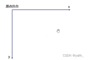
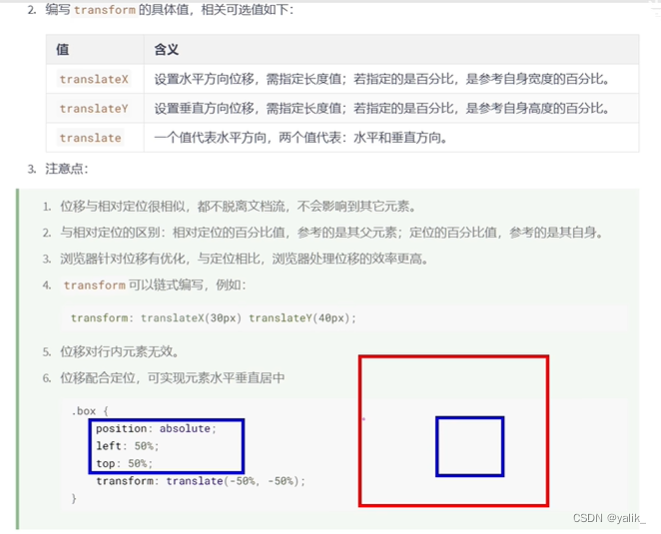
1.translate 位移
1.前提:二维坐标系如下:
2.使用方法
<div class="outer">
	<div class="inner"></div>
</div>

.outer{
	height:100px;
	width:100px;
	border:1px solid black;
}
.inner{
	height:50px;
	width:50px;
	transform:translate(50%,50%);
	background:blue;
}
3.注意点
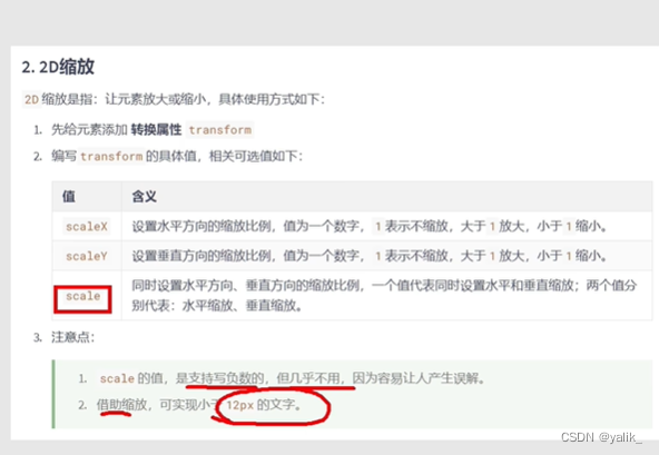
2.scale 缩放
注意:缩放也是运用在块级元素上
.outer{
	height:100px;
	width:100px;
	border:1px solid black;
}
.inner{
	height:100px;
	width:100px;
	transform:scale(0.5);
	background:blue;
	font-size:20px;
}
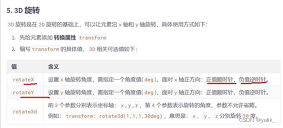
3.rotate 旋转
1.前提:坐标系如下: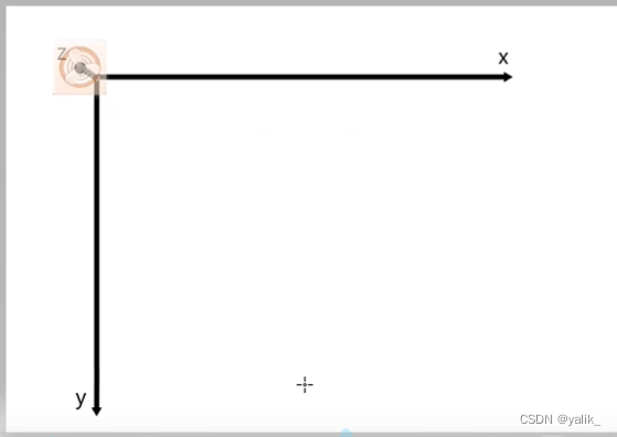
1.绕x轴旋转:
2.绕y轴旋转: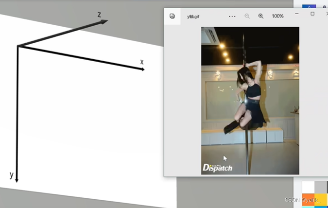
3.绕z轴旋转:
transform:rotate(30deg)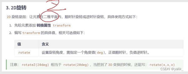
4.skew 扭曲
transform:skewX(30deg);//往左右两边拉
//transform:skewY(30deg);//往上下两边拉
5.多重变换

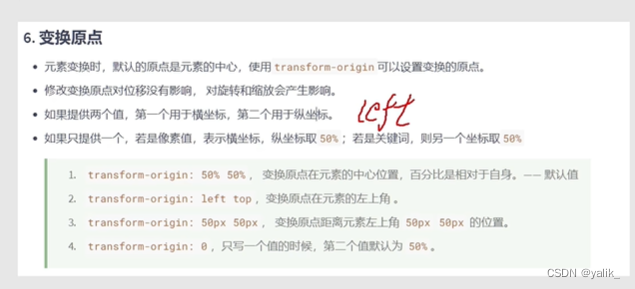
6.变换原点
九、3D变换 transform
1.开启3d空间,设置景深
.outer{
	height:100px;
	width:100px;
	border:1px solid black;
	margin:300px;
	transform-style:perserve-3d;//开启3d空间
	perspective:50px;//设置景深:近大远小
    perspective-origin:60px 50px;//透视点的位置
}
.inner{
	height:100px;
	width:100px;
	transform:rotatex(30deg);
	background:blue;
}

3.perspective-origin 透视点

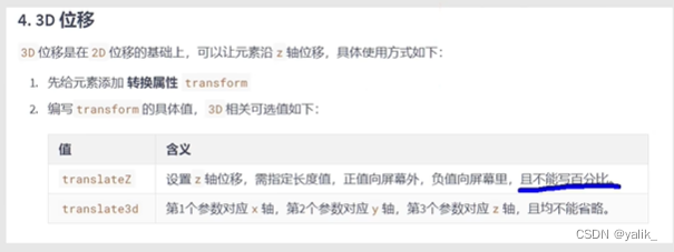
4.translateZ 位移
{
    transform:translateZ(100px);
    transform:translate3d(100px,100px,100px);
}
5.rotateX rotateY 旋转
{
    transform:rotateY(45deg);
}
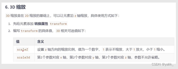
6.scaleZ 缩放
缩放值越大,景深越小,距离越近。
{
    transform:scaleZ(1) rotateY(45deg);
    transform:scale3d(1.5,1.5,1) rotateY(45deg);
}
7.backface-visibility 背部可见
{
    transform:rotateY(45deg);
    backface-visibility:hidden;
}
十、过渡 transition
注意:transition-property:all; transition-duration:1s;应该写在要发生过渡效果的元素身上,不要写在hover里,hover里的样式写过渡后的样式。
.inner{
  	width:100px;
   	height:100px;
  	background-color:red;
	opacity:1;
   	border:1px solid black;
	transition-property:all;
	transition-duration:1s;
}
.inner:hover{
	width:200px;
   	height:200px;
	background-color:pink;
	transform:rotate(45deg);
	opacity:0.5;
}


案例:鼠标经过旋转图片过渡,加上遮罩过渡
<!DOCTYPE html>
<html>
<title>CSS调试编辑器</title>
<head>
<style>
.outer{
  	width:200px;
   	height:200px;
	position:relative;
	overflow:hidden;
}
img{
	width:200px;
	height:200px;
	background-size:cover;
	transition:1s linear all;
}
.mask{
	width:200px;
	height:200px;
	background:black;
	position:absolute;
	left:0;
	top:0;
	color:white;
	text-align:center;
	line-height:200px;
	font-size:30px;
	opacity:0;
	transition:1s linear all;
}
.outer:hover img{
		transform:scale(1.5) rotate(10deg);
}
.outer:hover .mask{
		width:200px;
   		height:200px;
		opacity:0.5;
}
</style>
</head>
<body>
<div class="outer">
	<img src="https://img0.baidu.com/it/u=925843206,3288141497&fm=253&fmt=auto&app=138&f=JPEG?w=500&h=769">
	<div class="mask">山河秀丽</div>
</div>
</body>
</html>
十一、动画 animation
1.动画的基本使用
第一步:定义关键帧
@keyframes xiangyoudong{
	0%{

	}
	50%{
		background:pink;
	}
	100%{
		background:red;
		border-radius:50%;
		transform:translate(780px);
	}
}
第二步:给元素应用动画
.outer{
border:1px solid black;
width:580px;
height:100px;
}
.inner{
height:100px;
width:100px;
background:blue;
animation-name:xiangyoudong;
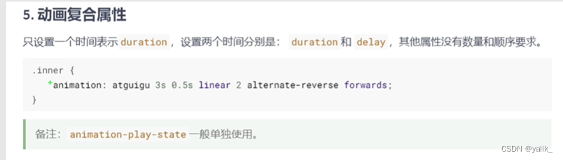
animation-duration:3s;
animation-delay:0.5s;
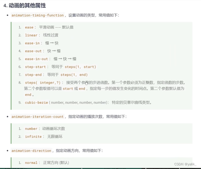
animation-timing-function:linear;
animation-iteration-count:2;
animation-direction:alternate-reverse;
animation-fill-mode:forwards;
//animation:xiangyoudong 3s 0.5s linear 2 alternate forwards;
}
.outer:hover .inner{
animation-play-state:paused;
}
@keyframes xiangyoudong{
0%{
}
50%{
background:pink;
}
100%{
background:red;
border-radius:50%;
transform:translate(480px);
}
}

十二、多列布局
.outer{
  	width:100%;
	columns:3 100px;
	column-rule:2px dashed red;
}

h1{
	column-span:all;
}

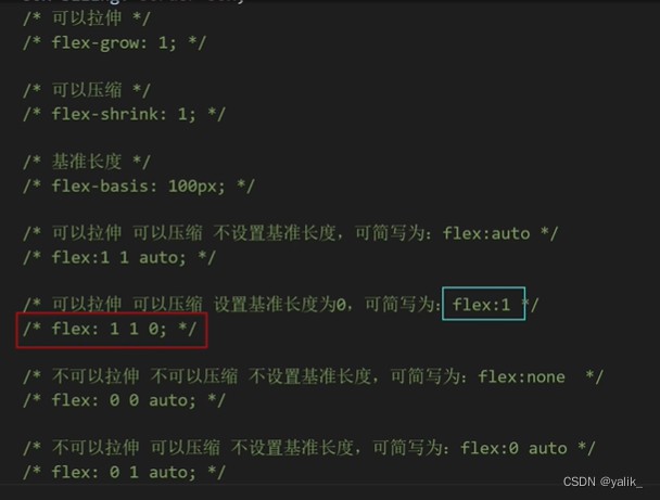
十三、伸缩盒模型
align-items:针对的是一行垂直方向对齐
align-content:针对的是多行垂直方向对齐
基准长度:flex-basic 根据主轴方向设置长度值
伸缩性:flex-grow 将剩余空间进行拉伸 flex-shrink:超过父级块的宽度,则将子块内容压缩,注意要将flex-wrap:wrap去掉。

.outer{
	width:200px;
	height:300px;
	display:flex;
	align-items:center;
	border:1px solid black;
}
.inner{
	width:100px;
	height:100px;
	background:blue;
	flex-grow:1;
	border:1px solid black;
}


word-wrap:break-word;强制文字换行
如何解决背景图片预留白边的问题

{
    background:url("~@/assets/...") norepeat;
    background-size:cover;
}
找最后一个元素
<div class="header">
<ul>
<li><a></a></li>
<li><a></a></li>
<li><a></a></li>
</ul>
</div>
.header ul li:last-child a{
margin-right:0;
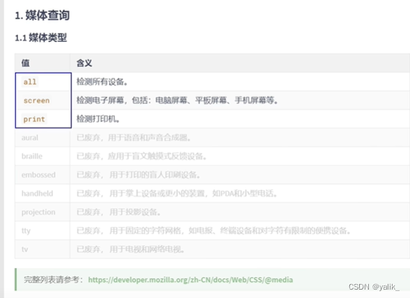
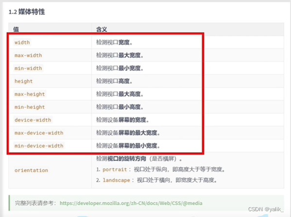
}十四、媒体查询
//只有在屏幕上才应用的样式
@media screen{
    h1{
        color:red
    }
}

十五、BFC

1.margin塌陷如下:

通过float、绝对定位等方式开启BFC,解决margin塌陷问题.也有一些方式如border:1px solid black可以解决margin塌陷问题,但是它没有开启BFC.
【解决】父元素开启BFC,子元素就不会有margin塌陷问题

2.其他元素浮动后,自己会被遮盖
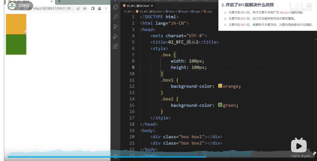
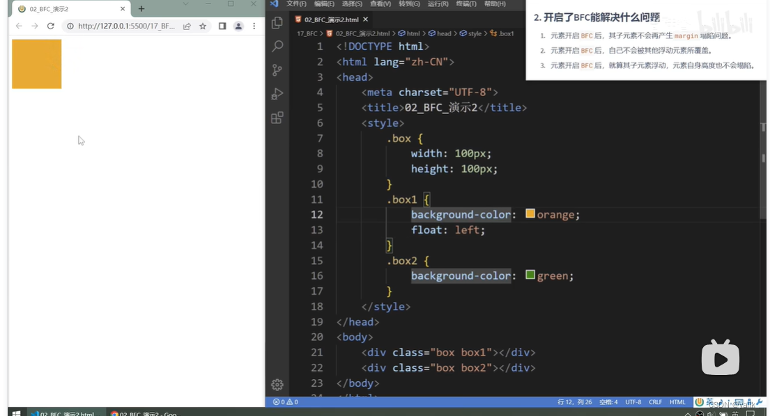
【解决】给自己开启BFC
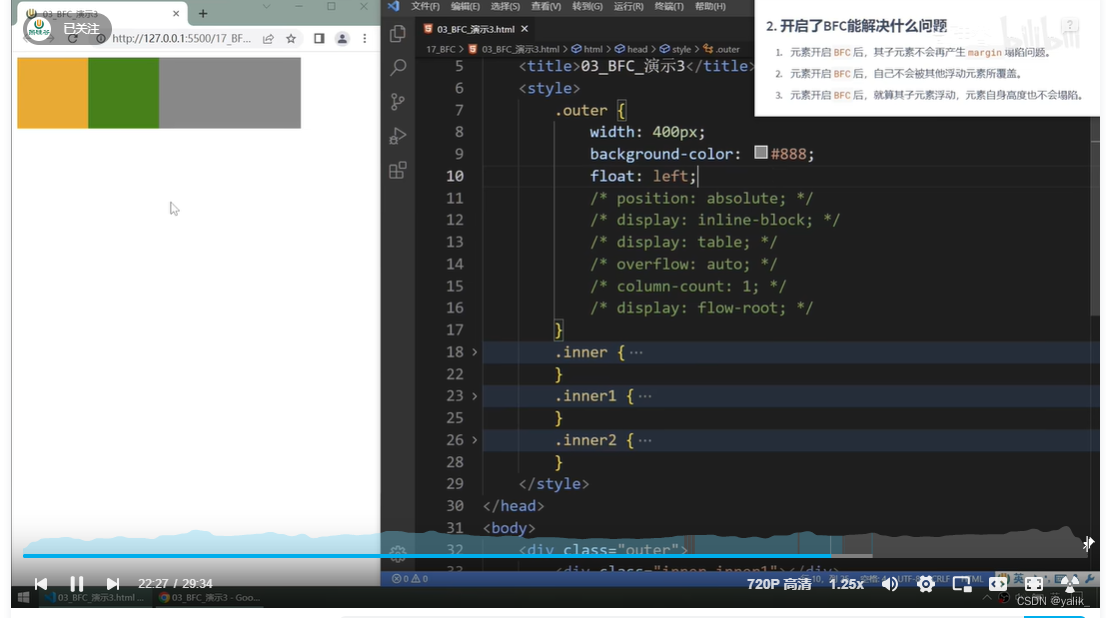
3.子元素浮动后,元素自身高度塌陷问题

 【 解决】子元素浮动后,元素自身高度塌陷问题


 1995
1995


 被折叠的 条评论
为什么被折叠?
被折叠的 条评论
为什么被折叠?
 到【灌水乐园】发言


