


button_item(activity)
package com.example.myapplication_one;

import android.os.Bundle;
import android.support.v7.app.AppCompatActivity;
import android.widget.Button;

public class button_item extends AppCompatActivity {
    Button button1,button2,button3,button4,button5,button6;


    @Override
    protected void onCreate(Bundle savedInstanceState) {
        super.onCreate(savedInstanceState);
        //用于加载页面布局   R.layout.名称
        setContentView(R.layout.layout_button_item);
        init();
    }

    private void init(){
        //在eclipse中 button =(Button)findViewById(R.id.button1); 将view类型强制转换为button类型
        button1 = findViewById(R.id.button1);
        button2 = findViewById(R.id.button2);
        button3 = findViewById(R.id.button3);
        button4 = findViewById(R.id.button4);
        button5 = findViewById(R.id.button5);
        button6 = findViewById(R.id.button6);

    }
}
layout_button_item.xml
<?xml version="1.0" encoding="utf-8"?>
<RelativeLayout xmlns:android="http://schemas.android.com/apk/res/android"
    android:layout_width="match_parent"
    android:layout_height="match_parent">

    <Button
        android:id="@+id/button1"
        android:layout_width="wrap_content"
        android:layout_height="wrap_content"
        android:text="我爱你"
        android:background="@color/color_item"
        />

    <Button
        android:id="@+id/button2"
        style="@style/bttonn_style"
        android:layout_width="wrap_content"
        android:layout_height="wrap_content"
        android:layout_marginTop="60dp"
        android:background="@drawable/drawable_shape"
        android:text="而且" />

    <Button
        android:id="@+id/button3"
        android:layout_width="wrap_content"
        android:layout_height="wrap_content"
        android:layout_marginTop="120dp"
        android:text="你爱我" />

    <Button
        android:id="@+id/button4"
        android:layout_width="wrap_content"
        android:layout_height="wrap_content"
        android:layout_marginTop="180dp"
        android:text="我们" />

    <Button
        android:id="@+id/button5"
        android:layout_width="wrap_content"
        android:layout_height="wrap_content"
        android:layout_marginTop="240dp"
        android:text="就是" />

    <Button
        android:id="@+id/button6"
        android:layout_width="wrap_content"
        android:layout_height="wrap_content"
        android:layout_marginTop="300dp"
        android:text="好朋友" />
</RelativeLayout>
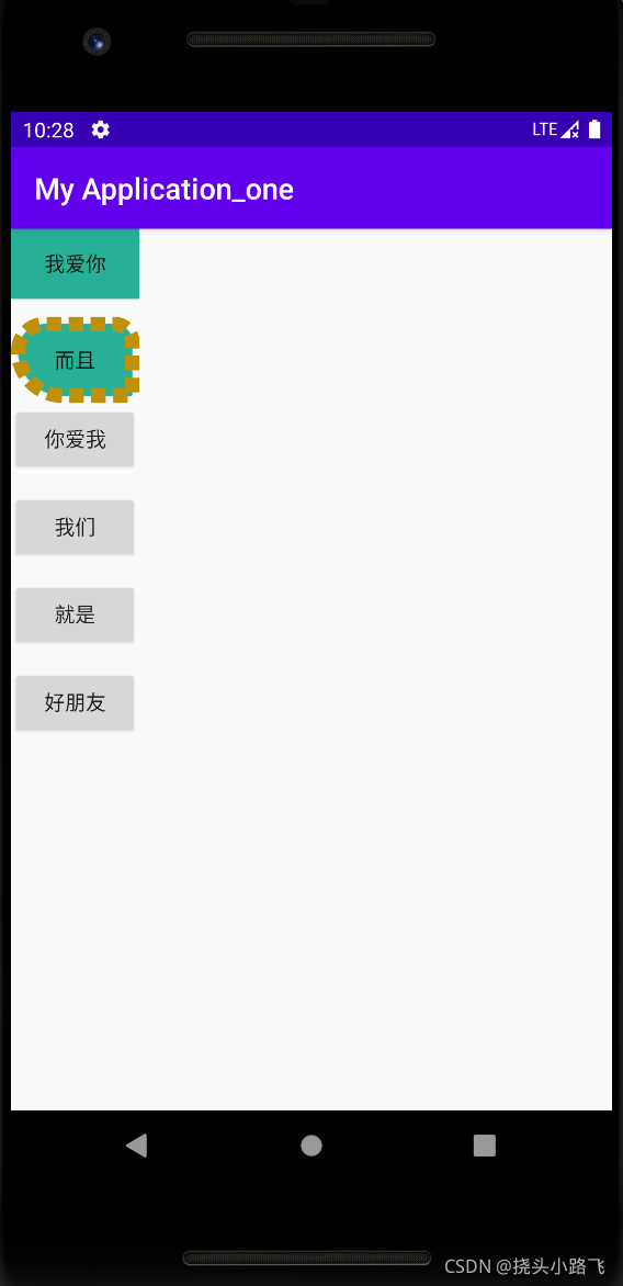
我们是通过android:background属性来引用自己编写的drawable_shape文件与color_item文件的。

color_item.xml
<?xml version="1.0" encoding="utf-8"?>
<selector xmlns:android="http://schemas.android.com/apk/res/android">
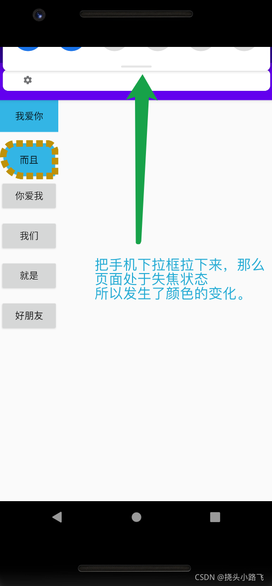
<!-- 当前窗口失去焦点 -->
<item
android:state_window_focused="false"
android:color="@android:color/holo_blue_light"
/>
<!-- 不可用 -->
<item
android:state_enabled="false"
android:color="@android:color/holo_red_light"
/>
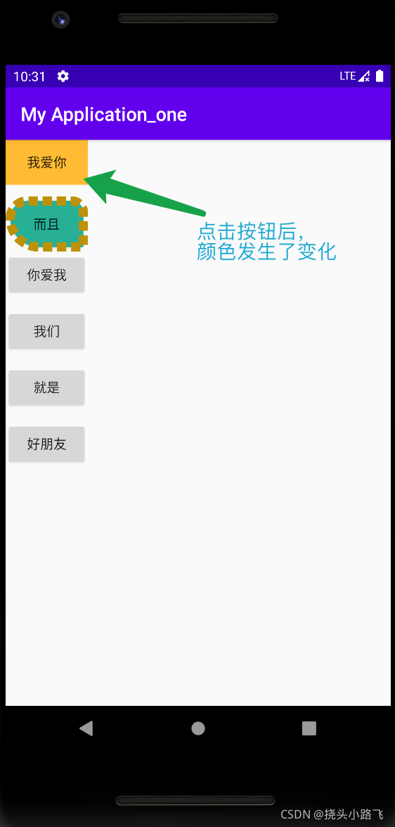
<!-- 按压 -->
<item
android:state_pressed="true"
android:color="@android:color/holo_orange_light"
/>
<!-- 选中时 -->
<item
android:state_selected="true"
android:color="@android:color/holo_green_light"
/>
<!-- 被激活时 -->
<item
android:state_activated="true"
android:color="#8641C3"
/>
<!-- 默认时 -->
<item
android:color="#27B095"
/>
</selector>
怎么创建的?在哪创建的?
1.
2.
3.
通过设置item标签来设置按钮的状态变化。


drawable_item.xml
<?xml version="1.0" encoding="utf-8"?>
<selector xmlns:android="http://schemas.android.com/apk/res/android">
<!--   当前窗口失去焦点     -->
        <item
            android:state_window_focused="false"
            android:drawable="@drawable/a1"
            />
<!--  按压时  -->
        <item
            android:state_pressed="true"
            android:drawable="@drawable/excel"
            />
</selector>
drawable_item.xml类似于color_item.xml文件,只不过drawable_item.xml是通过按钮来设置图片的变化,图片的切换,看效果的话就在layout_button_item.xml文件中,将android:background="@color/color_item"改为android:background="@drawable/drawable_item"
如果很多按钮需要相同的样式的话,就可以在themes.xml文件中进行设置,然后在drawable_item.xml中调用就好。
themes.xml
<resources xmlns:tools="http://schemas.android.com/tools">

    <style name="bttonn_style">
        <item name="android:layout_width">0dp</item>
        <item name="android:layout_height">match_parent</item>
        <item name="android:layout_weight">1</item>
        <item name="android:background">@color/color_item</item>
<!--        <item name="android:textColor">@color/color_item</item>-->
    </style>


    <!-- Base application theme. -->
    <style name="Theme.MyApplication_one" parent="Theme.AppCompat.Light.DarkActionBar">
        <!-- Primary brand color. -->
        <item name="colorPrimary">@color/purple_500</item>
        <item name="colorPrimaryDark">@color/purple_700</item>
        <item name="colorAccent">@color/teal_200</item>
        <!-- Customize your theme here. -->
    </style>

    <style name="Theme.MyApplication_one.NoActionBar">
        <item name="windowActionBar">false</item>
        <item name="windowNoTitle">true</item>
    </style>

    <style name="Theme.MyApplication_one.AppBarOverlay" parent="ThemeOverlay.AppCompat.Dark.ActionBar" />

    <style name="Theme.MyApplication_one.PopupOverlay" parent="ThemeOverlay.AppCompat.Light" />
</resources>


drawable_shape.xml
<?xml version="1.0" encoding="utf-8"?>
<shape xmlns:android="http://schemas.android.com/apk/res/android"
        android:shape="rectangle"
    >
<!--  solid:指定形状的填充色,只有android:color一个属性  -->
<!--  shape标签可以与selector嵌套适用  -->
    <solid
        android:color="@color/color_item"
        />
<!--  设置内容区域距离边界的间距  -->
    <padding
        android:bottom="20dp"
        android:right="20dp"
        android:left="20dp"
        android:top="20dp"
        />
<!--  corners设置圆角(弧度)、通过圆角半径设置  -->
    <corners
        android:radius="100dp"
        android:topLeftRadius="300dp"
        android:topRightRadius="200dp"
        android:bottomLeftRadius="500dp"
        android:bottomRightRadius="20dp"
        />
<!--  stroke设置描边 ,width为描边的厚度,color为描边的颜色
        dashGap为每段虚线的间隔,dashWidth为虚线的宽度,
        如果虚线的段度为0,则为实线-->
    <stroke
        android:width="10dp"
        android:color="#BF9108"
        android:dashGap="5dp"
        android:dashWidth="10dp"
        />


</shape>


创建drawable文件夹:
右击res,选择Directory,即可创建。
最终运行结果:


 扫一扫
扫一扫
 1389
1389

 被折叠的 条评论
为什么被折叠?
被折叠的 条评论
为什么被折叠?
 到【灌水乐园】发言


