


目录
CSS添加方法
- 行内添加
- 内嵌样式
- 单独文件
优先级:行内样式>内嵌样式>链接样式>浏览器默认样式
<head>
    <link rel="stylesheet" href="css/style.css"/>
    <style type="text/css">
        p {
            font-size: 12px;  /*像素*/  /*pt为英镑,一般在英文字体中使用*/
            color: blue;
            font-weight: bold;
        }
    </style>
</head>
<body>
    <p style="color:palegreen">woshiyizhimao</p>
    <h3>woshiyizhimao</h3>
</body>
选择器
标签选择器
p{}
属性选择器
a[title]{}
a[title="smg"]{}
a[class ~= "a"]{}
div[lang |= "zh"]{}
li[class ^= "box-"] 开头字符带box-
li[class $= "-box"] 结尾字符带-box
li[class *= "box"] 内容出现box
强制大小写敏感时在后面加个i:li[class^="a" i]
类别选择器
<head>
	<style>
		.one{}
	</style>
</head>
<body>
	<p class="one'>woshimeinv</p>
</body>
ID选择器
<head>
	<style>
		#two{}
	</style>
</head>
<body>
	<p id="two'>woshimeinv</p>
</body>
类选择器与ID选择器的区别在于类选择器能被多次引用,而ID选择器每个页面只能被引用一次。
嵌套声明 p span{} p>span{} p+span{} p~span{}
集体声明(一个选择器无效,整个语句都将被忽略)h1, .special { color: blue; }
全局声明 *{}

伪类选择器(冒号表示)
:first-child :last-child :only-child :invalid
:link, :visited, :hover, :active 见下文格式的超链接
:focus 使用键盘选中元素
伪元素(双冒号)
::first-line first-letter selection
p::before  { /*after在每个指定类型的元素后面加上新的内容*/
content:"台词 -";
background-color:yellow;
color:red;
font-weight:bold;
}
a::after {  /*在每个a类型的元素后面加上其title属性的内容*/
  content: attr(title);
}
奇偶选择器(见下面格式的表格)
选择器混合使用
<div class="one three four">...</div>(空格隔开)
<div id="two" class="one three four">...</div>(id选择器不可以多次使用,也不可以多个同时使用)
CSS样式
清除浏览器默认CSS格式可提高代码在浏览器间的兼容性
单位与颜色
单位:像素(px),字符(em,自适应用户使用的字体),百分比(%),vh,vw
颜色:
“red”,
rgb(x,x,x),
rgb(x%,x%,x%),
rgba(x,x,x,x)【a∈[0,1],表示透明度】,
#rrggbb
text
color,
letter-spacing(字符间距 2px,-3px,1em),
line-height(行高 1.5em),
text-align(对齐 center,right,left,justify),
text-decoration(装饰线 none,overline,underline,line-through), 【none可以去掉链接的下划线】
text-decoration 是一个缩写形式,它由 text-decoration-line, text-decoration-color 和 text-decoration-style (wavy) 构成。
text-indent(首行缩进 2em)
/*使用line-height垂直居中*/
p{
height:40px; /*背景高度*/
background-color:#ccc; /*灰色*/
font-size:14px;
line-height:40px;
}
font
font-family 字体
网页安全字体(没有空格的可以不加引号,多个值用逗号隔开)font-family: "Hiragino Sans GB", "Microsoft YaHei", sans-serif;
font-size 字号 12px 120%
font-style 斜体 italic
font-weight 粗体 bold
font(集合声明) : 斜体 粗体 字号/行高 字体
font: italic bold 16px/1.5em '宋体'
背景
空元素需先定义元素的高度和宽度才会显示背景。
背景颜色和背景图片同时设置时,图片会覆盖背景。
background-color
background-image:url(“logo.jpg”)
默认情况下,大图不会缩小以适应方框,因此我们只能看到它的一个小角,而小图则是平铺以填充方框。
可放多个url让背景重叠,用逗号隔开; 第一个url最靠近用户
background-repeat属性包括repeat, repeat-x, repeat-y, no-repeat
background-size: 100px 80%; 也可以写成cover(比例不变,可能溢出)或contain(比例不变,可能有一边有间隙)
background-position: top center; 或者50% 100px;
background-attachment背景附加,包括scroll(固定在页面上),fixed(固定在视图上),local(固定在盒子中) 实例
background(集体声明): color image repeat
超链接
a:link 普通的未被访问的
a:visited 用户已访问
a:hover 鼠标悬停
a:active 鼠标点击时刻
love & hate 要按这个次序排列
<style>
        a:link{
            text-decoration:none;
            color:aqua;
        }
        a:visited{
            text-decoration:none;
            color:brown;
        }
        a:hover{
            font-size:150%;
            text-decoration:underline;
        }
        a:active{
            background-color:blue;
        }
</style>
链接加上图标
a[href*="http"]{
         background: url('https://mdn.mozillademos.org/files/12982/external-link-52.png') no-repeat 100% 0;
         background-size: 16px 16px;
         padding-right: 19px;
       }
background后面两个参数是background-position,效果如下:
列表(ul ol)
list-style-image:url(" ")(设置图标)
也可利用背景图片设置图标:
ul li {
  padding-left: 2rem;
  background-image: url(star.svg);
  background-position: 0 0;
  background-size: 1.6rem 1.6rem;
  background-repeat: no-repeat;
}
ul li {
  padding-left: 2rem;
  background-image: url(star.svg);
  background-position: 0 0;
  background-size: 1.6rem 1.6rem;
  background-repeat: no-repeat;
}
CSS计数器提供用于自定义列表计数和样式的高级工具
list-style-position:inside,outside
list-style-type:
list-style(集合声明)

表格
border
width
height
border-collapse:collapse(边框重叠)
caption-side:bottom 标题位于表格下方
表格内容文字位置:vertical-align
table,th,td{
border:1px solid #eee; /*实线 灰色*/
}
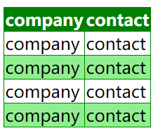
奇偶选择器(选取父元素的第 N 个子元素,与类型无关)
~: nth-child(odd|even|数字|3n+1)
:nth-of-type(n) 选择器匹配属于父元素的特定类型的第 N 个子元素的每个元素.
n 可以是数字、关键词或公式。
<head>
    <meta charset="utf-8" />
    <title>woshimeinv</title>
    <style type="text/css">
        table{
            border-collapse:collapse;
        }
        table, th, td {
            border: 1px solid green;
        }
        tr:nth-child(odd) {
            background-color:lightgreen;
        }
        th{
            color:white;
            background-color:green;
        }
    </style>
</head>
<body>
    <table>
        <tr>
            <th>company</th>
            <th>contact</th>
        </tr>
        <tr>
            <td>company</td>
            <td>contact</td>
        </tr>
        <tr>
            <td>company</td>
            <td>contact</td>
        </tr>
        <tr>
            <td>company</td>
            <td>contact</td>
        </tr>
        <tr>
            <td>company</td>
            <td>contact</td>
        </tr>
    </table>
</body>
布局设置: table-layout设置fixed后,设置第一列每个的宽度
      table {
        table-layout: fixed;
        width: 100%;
        border-collapse: collapse;
      }

      thead th:nth-child(1) {
        width: 30%;
      }

      thead th:nth-child(2) {
        width: 20%;
      }
其它
cursor属性可以设置鼠标放上去时的鼠标形状
盒子模型
页面中的所有元素都可以看成一个盒子。

默认模型属性:
height, width(指content的高和宽)
border: border-width border-style border-color
padding 内边距
margin 外边距 【垂直方向存在外边距重叠问题link】
替代模型 的高和宽则是到border的长度,如果需要使用替代模型,可以通过为其设置 box-sizing: border-box 来实现,默认模型则是 content-box
border,padding和margin四边都可以单独设置:~-top, ~-right, ~-bottom, ~-left
注意padding,margin如果用百分比,用的内联尺寸,不是父容器的尺寸
overflow属性:hidden, scroll, auto,默认visible
overflow-x overflow-y
调整图像在盒子中的大小:可以用max-width=100%或设置object-fit属性,包括cover,contain,fill
可利用盒子模型生成可设置格式的水平线:
<style>
.line{
height:1px;
width:500px;
border-top:1px solid #e5e5e5; /*或设置border-b0ttom*/
}
</style>
<body>
    <div class="line"></div>
</body>
盒子模型水平居中:margin:~ auto ~为任意数
盒中的图片文字水平居中用text-align
    <style type="text/css">
        *{                /*清除浏览器默认格式*/
            margin:0;
            padding:0;
        }
        #newsimglist{
            text-align:center;
            font-size:0;  /*否则图片间会有浏览器给文字默认留的间隙*/
            background-color:aquamarine;
            width:500px;
            margin:0 auto;  /*盒子水平居中*/
        }
        #newsimglist img{
            height:100px;
            width:100px;
            margin-left:5px;
            border:1px solid #0cf;
            padding:5px;
        }
    </style>
</head>
<body>
    <div id="newsimglist">
        <img src="images/p.jpg" />
        <img src="images/p.jpg" />
        <img src="images/p.jpg" />
    </div>
</body>
CSS定位
文档流flow
元素分类
- block
- 独占一行
- 元素的height,width,margin,padding都可设置
- 常见:div, p, h1~h6, ol, ul, table, from
- inline
- 不单独占一行
- height,width不可设置,width由包含的图片或文字的宽度决定
- 一行的元素之间有间距问题,可在父层将font-size设为0
- 常见:span, a
- inline-block
- 不单独占用一行,元素的height,width,margin,padding都可设置
- 常见:img
元素类型转换:display属性
a{display:block;} none不被显示 / inline / inline-block
导航栏实战
<head>
    <meta charset="utf-8" />
    <title>woshimeinv</title>
    <style type="text/css">
        *{
            margin:0;
            padding:0;
        }
        #nav{
            width:300px;
            margin:100px auto;
            font-size:0;
        }
        a{
            display:inline-block;
            width:80px;
            height:30px;
            font-size:14px;
            text-decoration:none;
            text-align:center;
            line-height:30px;
            border-bottom:1px solid #ccc;
        }
        a:hover{
            color:white;
            background-color:#ccc;
            border:1px solid;
            border-left-color:orange;
            border-right-color :orange;
            border-top-color:orange;
        }
    </style>
</head>
<body>
    <div id="nav">
        <a href="#">woshi</a>
        <a href="#">woshi</a>
        <a href="#">woshi</a>
    </div>
</body>
弹性盒子flex
在父容器设置display: flex;
flex-direction: row/column/row-reverse/column-reverse
换行 flex-wrap: wrap;
flex-direction和flex-wrap可缩写为flex-flow: row wrap;
设置flex项的长度/比例:flex
article {
  flex: 1 200px;
}

article:nth-of-type(3) {
  flex: 2 200px;
}
每个flex项将首先给出200px的可用空间,然后,剩余的可用空间将根据分配的比例共享
align-items控制flex项在交叉轴的位置(用于父元素,align-self则可用于flex item)
justify-content控制flex在主轴上的位置
flex项排序:order: 1 或 order: -1 默认为0,按从小到大排序
网格grid
单位fr表示可用空间的比例
显式网络由grid-template-columns grid-template-rows定义
隐式网络由grid-auto-columns grid-auto-rows定义
minmax(100px, auto)
display:grid;
grid-teamplate-columns: 200px 200px 200px;
/*grid-teamplate-columns: 2fr 1fr 2fr 1fr; 或 grid-teamplate-columns: repeat(2,2fr 1fr);*/
grid-template-columns: repeat(auto-fill, minmax(200px,1fr)); /*根据宽度自动显示列数*/
grid-gap:20px; /*或gap:20px; 不能用单位fr*/
元素放置
方法一:基于线
header{
  grid-column: 1 / 3;
  grid-row: 1;
}
article {
  grid-column: 2;
  grid-row: 2;
}
aside {
  grid-column: 1;
  grid-row: 2;
}
footer {
  grid-column: 1 / 3;
  grid-row: 3;
}
方法二:使用grid-template-areas属性
空格子用 . 表示
.container {
  display: grid;
  grid-template-areas:
      "header header"
      "sidebar content"
      "footer footer";
  grid-template-columns: 1fr 3fr;
  grid-gap: 20px;
}
header {
  grid-area: header;
}
article {
  grid-area: content;
}
aside {
  grid-area: sidebar;
}
footer {
  grid-area: footer;
}
浮动float
float属性 left, right, none
clear属性 left, right, both
clear right:元素右边没有浮动元素,自己往下排,不是删除元素
实战
<!--图片浮动-->
<head>
<style>
        .try{
            float:right;
        }
</style>
<head>
<body>
    <div class="try">
        <img src="images/p.jpg" height="50" />
    </div>
    <p>内容内容内容内容内容内容内容内容内容内容内容内容内容内容内容内容内容内容内容内容内容内容内容内容内容内容内容内容内容内容内容内容内容内容内容内容内容内容内容内容内容内容内容内容内容内容内容内容内容内容内容内容内容内容内容内容内容内容内容内容内容内容内容内容内容内容内容内容内容内容内容内容内容内容内容</p>
</body>

<!--布局-->
<head>
    <meta charset="utf-8" />
    <title>woshimeinv</title>
    <style type="text/css">
        *{
            margin:0;
            padding:0;
        }
        body{
            font-size:14px;
        }
        #container {
            margin: 0 auto;
            width: 1000px;
            height: 500px;
            /*background-color:blue;*/
        }
        #header{
            height:100px;
            background-color:#6cf;
            margin-bottom:5px;
        }
        #nav{
            height:30px;
            background-color:#09c;
            margin-bottom:5px;
        }
        #main {
            height: 500px;
            margin-bottom: 5px;
            /*background-color:blue;*/
        }
        .aside {
            float: left;
            width: 100px;
            background-color: #6cf;
            height: 500px;
        }
        #aside1{

        }
        #aside2{
            margin-left:5px;
        }
        #content {
            float: left;
            width: 790px;
            background-color: blue;
            height: 500px;
            margin-left:5px;
        }
        #footer{
            height:60px;
            background-color:#6cf;
        }
    </style>
</head>
<body>
    <div id="container">
        <div id="header"></div>
        <div id="nav"></div>
        <div id="main">
            <div id="aside1" class="aside"></div>
            <div id="content"></div>
            <div id="aside2" class="aside"></div>
        </div>
        <div id="footer"></div>
    </div>
</body>
层次layer
- position属性(相对于谁定位)
- static(默认值) 元素在正常文档流中,left…z-index属性无效
- fixed 相对于浏览器窗口定位,不随浏览器窗口的滚动条滚动而变化
- relative 相对于其直接父元素定位;在文档流的原位置依然保存
- absolute 相对于最近的absolute或relative父层进行定位,如没有,则相对body定位;在文档流的原位置不再保存
- left, right, top, bottom四个属性
- z-index(值大的在上面,可以是负数)
- sticky 允许被定位的元素表现得像相对定位一样,直到它滚动到某个阈值点就变得固定【吸顶灯】
一般是父元素relative,子元素absolute,子元素利用四个位置相对于父元素来进行偏移定位
<!--叠图+相对与绝对-->
<head>
    <meta charset="utf-8" />
    <title>woshimeinv</title>
    <style type="text/css">
        *{
            margin:0;
            padding:0;
        }
        div{
            border:1px solid red;
            color:white;
        }
        #box1{
            width:200px;
            height:100px;
            position:relative;
            top:100px;
            left:100px;
            z-index:0;
        }
        #box2{
            width:90%;
            position:absolute;
            bottom:0;
        }
        #box3{
            position:fixed;
            top:0;
            right:0;
            z-index:-999;
        }
    </style>
</head>
<body>
    <div id="box1">
        <img src="images/p.jpg" height="100" width="200"/>
        <div id="box2">在文档流的原位置依然保存在文档流的原位置依然保存</div>
    </div>
    <div id="box3">
        <img src="images/p.jpg"/>
    </div>
</body>
多列布局(报纸)
column-count: 3 列数
column-width: 200px 最小宽度,按照指定的宽度尽可能多的创建列;任何剩余的空间之后会被现有的列平分,可能无法期望得到指定宽度
column-gap: 20px 列间间隙
column-rule: 4px dotted green 列间分割线,使用gap空间,不额外占用空间
若不想拆开盒子 break-inside:aviod page-break-inside: avoid
CSS3
为了浏览器兼容,一些新属性需要加浏览器内核前缀
圆角边框 border-radius
border-top-left-radius:水平值 垂直值
border-top-right-radius
border-bottom-left-radius
border-bottom-right-radius
border-radius
阴影 box-shadow:inset(outset) 水平偏移 垂直偏移 模糊距离 颜色;
inset(内部阴影) outset(外部阴影,默认值)
    <style type="text/css">
        div{
            background-color: #f90;
            height: 50px;
            width: 200px;
            border-radius: 25px;
            -webkit-border-radius: 25px;
            -moz-border-radius: 25px;
            box-shadow: 10px 10px 5px #888;
            -webkit-box-shadow: 10px 10px 5px #888;
            -moz-box-shadow: 10px 10px 5px #888;
       }
    </style>
</head>
<body>
    <div></div>
</body>
text-shadow属性(可用于字体阴影,描边,浮雕)
text-shadow: 水平偏移 垂直偏移 (阴影大小) 颜色
可用逗号隔开将多个阴影应用于同一文本
word-wrap属性 允许长单词、URL强制进行换行
normal, break-word
@font-face属性(将服务端的web字体下载到客户端)

转换字体格式网站
 <style type="text/css">
        @font-face {
            font-family:webfont;
            src: url("fonts/241-cai978-webfont.ttf"),url("fonts/241-cai978-webfont.eot"),url("fonts/241-cai978-webfont.woff"),url("fonts/241-cai978-webfont.svg");
        }
        p {
            font-family:webfont;
        }
</style>
2D转换 transform属性
- 旋转rotate(30deg) rotate(0.5turn)
- 缩放scale(x,y) 0~1缩小,>1放大
- 平移translate(x,y)
图片链接实例(鼠标悬浮会放大+旋转)
<head>
    <meta charset="utf-8" />
    <title>woshimeinv</title>
    <style type="text/css">
        *{
            margin:0;
            padding:0;
        }
        a:after{        /*直接利用title属性在图片后加上文字说明*/
            content:attr(title);
            color:white;
            font-weight:bold;
        }
        a {
            text-decoration: none;
        }
        li {
            display: inline-block;  /*转换前li独占一行*/
            margin-right: 5px;
            margin-bottom:10px;
            padding:10px;
            width: 400px;
            background-color: navajowhite;
            text-align:center;
            box-shadow:5px 5px 4px #ccc;
            -webkit-box-shadow:5px 5px 4px #ccc;
            -mz-box-shadow:5px 5px 4px #ccc;
        }
        #container {
            width: 1000px;
            margin: 0 auto;
            background-color: #f7a148;
            text-align: center;
        }
        .temp {
            height: 10px;
            background-color: #f7a148;
        }
        li:hover{
            -webkit-transform:scale(1.1);
            -webkit-transform:rotate(4deg);
        }
    </style>
</head>

<body>
    <div id="container">
        <div class="temp"></div>
        <ul>
            <li>
                <a title="pikaqiu" href="#"><img src="images/pika.jpg" /></a>
            </li>
            <li>
                <a title="pikaqiu" href="#"><img src="images/pika.jpg" /></a>
            </li>
            <li>
                <a title="pikaqiu" href="#"><img src="images/pika.jpg" /></a>
            </li>
            <li>
                <a title="pikaqiu" href="#"><img src="images/pika.jpg" /></a>
            </li>
        </ul>
    </div>
</body>
过渡 transition属性
transition-property:属性名|all 多属性用逗号隔开
transition-duration 持续时间
transition-timing-function

transition-delay
transiton: 属性 持续时间 过渡方法
动画
定义动画 @keyframes规则
调用动画 animation属性
animation-name 引用@keyframes动画名称
animation-duration
animation-timing-function 默认ease
animation-play-state:running | paused
animation: rotation 3s linear infinite; 实现循环
<!--过渡和动画示例-->
<head>
    <meta charset="utf-8" />
    <title>woshimeinv</title>
    <style type="text/css">
        div{
            width:100px;
            height:30px;
            border-radius:5px;
            line-height:30px;
            color:#000;
            background-color:silver;
            transition:all 1s linear;  /*过渡*/
        }
        .div1:hover{
            color:white;
            background-color:#45B823;
        }
        .div2:hover{
            animation:mycolor 5s linear;  /*动画*/
        }
        @keyframes mycolor {  /*动画要定义名称;每一个关键帧要定义名称,一般用百分比*/
            0%  {background-color:red;}
            50% {background-color:yellow;}
            100%{background-color:green;}
        }
    </style>
</head>

<body>
    <div class="div1">web design</div>
    <div class="div2">web design</div>
</body>
鼠标悬浮列表下滑显示实例
<head>
    <meta charset="utf-8" />
    <title>woshimeinv</title>
    <style type="text/css">
        *{
            margin:0;
            padding:0;
        }
        .ver{
            width:300px;
        }
        h3{
            font-size:12px;
            height:20px;
            padding:10px;
        }
        .divtext{
            height:100px;
            background-color:#f0f0f0;
            padding:10px;
            color:black;
        }
        li {
            height: 40px;
            overflow: hidden;
            list-style-type: none;
            border: 1px solid black;
            background-color:silver;
            transition:all 0.5s linear;
        }
        li:hover{
            height:160px;
            color:white;
            background-color:black;
        }
    </style>
</head>

<body>
    <div class="ver">
        <ul>
            <li>
                <h3>标题1</h3>
                <div class="divtext">transiton: 属性 持续时间 过渡方法transiton: 属性 持续时间 过渡方法transiton: 属性 持续时间 过渡方法</div>
            </li>
            <li>
                <h3>标题2</h3>
                <div class="divtext">transiton: 属性 持续时间 过渡方法transiton: 属性 持续时间 过渡方法transiton: 属性 持续时间 过渡方法</div>
            </li>
            <li>
                <h3>标题3</h3>
                <div class="divtext">transiton: 属性 持续时间 过渡方法transiton: 属性 持续时间 过渡方法transiton: 属性 持续时间 过渡方法</div>
            </li>
        </ul>
    </div>
</body>
鼠标悬浮图片显示文字上滑实例
<style type="text/css">
        *{
            margin:0;
            padding:0;
        }
        .ver{
            width:400px;
            height:310px;
            overflow:hidden;
            position:relative;
        }
        .divtext{
            height:310px;
            width:400px;
            position:absolute;
            top:270px;
            transition:all 0.5s linear;
        }
        h3{
            line-height:30px;
            padding:10px;
        }
        .ver:hover .divtext{
            top:0;
            background-color:rgba(66,66,66,0.5);
        }
        .line {
            height: 1px;
            width: 95%;
            border-top: 1px solid black; /*或设置border-b0ttom*/
            margin:0 auto;
        }
        p{
            padding:10px;
        }
    </style>
</head>

<body>
    <div class="ver">
        <img src="images/pika.jpg"/>
        <div class="divtext">
            <h3>皮卡丘</h3>
            <div class="line"></div>
            <p>transiton: 属性 持续时间 过渡方法transiton: 属性 持续时间 过渡方法</p>
        </div>
    </div>
</body>
3D旋转
父容器:
transform-style: preserve-3d
transform:rotateX() rotateY() rotateZ() 单位deg
舞台:
透视:perspective属性 像素越大,离舞台越远,透视越不明显

图片翻转显示背后信息实例
<head>
    <meta charset="utf-8" />
    <title>woshimeinv</title>
    <style type="text/css">
        *{
            margin:0;
            padding:0;
        }
        body{
            background-color:#0d3462;
        }
        #stage{
            width:900px;
            height:310px;
            margin:100px auto;
        }
        .picbox {
            float: left;
            width: 400px;
            height: 310px;
            margin: 10px;

            transform-style: preserve-3d;
            -webkit-transform-style: preserve-3d;

            transition: 1.5s;
            position:relative;
        }
        .picbox:hover{
            transform:rotateY(180deg);
        }
        .face{
            height:310px;
            width:400px;
            position:absolute;
        }
        .front{
            border:2px dotted white;
        }
        .back {
            background-color: chocolate;
            border: 2px dotted white;
            transform: rotateY(180deg);
            -webkit-transform:rotateY(180deg)
        }
        .back h3{
            color:white;
            text-align:center;
        }
    </style>
</head>

<body>
    <div id="stage">
        <div class="picbox">
            <div class="face front"><img src="images/pika.jpg"/></div>
            <div class="face back"><h3>最爱百变小樱</h3></div>
        </div>
        <div class="picbox">
            <div class="face front"><img src="images/pika.jpg" /></div>
            <div class="face back"><h3>最爱百变小樱</h3></div>
        </div>
    </div>
</body>
响应式布局:媒体查询
对不同高度宽度的页面设置不同的格式
@media media-type and (media-feature-rule) {
  /* CSS rules go here */
}
media-type包括all, print, screen, speech
media-feature-rule包括min-width, max-width, width

<head>
    <meta charset='UTF-8' />
    <title>web前端开发</title>
    <meta name="viewport" content="width=device-width, initial-scale=1.0"/>
    <style>
        body{
            background-color:black;
        }
        @media screen and (min-width:768px){
            body{
                background-color:red;
            }
        }
        @media screen and (min-width:992px) {
            body {
                background-color: green;
            }
        }
    </style>
</head>


 3320
3320


 被折叠的 条评论
为什么被折叠?
被折叠的 条评论
为什么被折叠?
 到【灌水乐园】发言


