


开源内容:https://github.com/TommyZihao/zihao_course/tree/main/CS224W
子豪兄B 站视频:https://space.bilibili.com/1900783/channel/collectiondetail?sid=915098
斯坦福官方课程主页:https://web.stanford.edu/class/cs224w
NetworkX主页:https://networkx.org
文章目录
nx.draw可视化函数
使用NetworkX自带的可视化函数nx.draw,绘制不同风格的图。设置节点尺寸、节点颜色、节点边缘颜色、节点坐标、连接颜色等。
# 图数据挖掘
import networkx as nx

import numpy as np

# 数据可视化
import matplotlib.pyplot as plt
%matplotlib inline

# plt.rcParams['font.sans-serif']=['SimHei']  # 用来正常显示中文标签
plt.rcParams['axes.unicode_minus']=False  # 用来正常显示负号
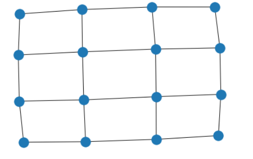
创建4x4网格图
G = nx.grid_2d_graph(4, 4)
原生可视化
pos = nx.spring_layout(G, seed=123)
nx.draw(G, pos)
不显示节点
nx.draw(G, pos, node_size=0, with_labels=False)

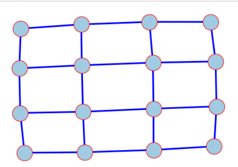
设置颜色
nx.draw(
    G,
    pos,
    node_color='#A0CBE2',      # 节点颜色
    edgecolors='red',          # 节点外边缘的颜色
    edge_color="blue",         # edge的颜色
    # edge_cmap=plt.cm.coolwarm, # 配色方案
    node_size=800,
    with_labels=False,
    width=3,
)
有向图
nx.draw(
    G.to_directed(),#变为有向图
    pos,
    node_color="tab:orange",
    node_size=400,
    with_labels=False,
    edgecolors="tab:gray",
    arrowsize=10,
    width=2,
)

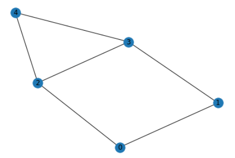
设置每个节点的坐标
无向图
G = nx.Graph()
G.add_edge(1, 2)
G.add_edge(1, 3)
G.add_edge(1, 5)
G.add_edge(2, 3)
G.add_edge(3, 4)
G.add_edge(4, 5)
nx.draw(G, with_labels=True)
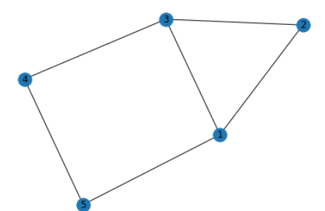
# 设置每个节点可视化时的坐标
pos = {1: (0, 0), 2: (-1, 0.3), 3: (2, 0.17), 4: (4, 0.255), 5: (5, 0.03)}

# 设置其它可视化样式
options = {
    "font_size": 36,
    "node_size": 3000,
    "node_color": "white",
    "edgecolors": "black",
    "linewidths": 5, # 节点线宽
    "width": 5, # edge线宽
}

nx.draw_networkx(G, pos, **options)

ax = plt.gca()
ax.margins(0.20) # 在图的边缘留白,防止节点被截断
plt.axis("off")
plt.show()
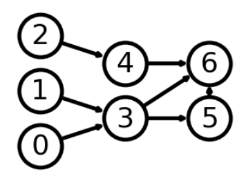
有向图
# 可视化时每一列包含的节点
left_nodes = [0, 1, 2]
middle_nodes = [3, 4]
right_nodes = [5, 6]
# 可视化时每个节点的坐标
pos = {n: (0, i) for i, n in enumerate(left_nodes)}
pos.update({n: (1, i + 0.5) for i, n in enumerate(middle_nodes)})
pos.update({n: (2, i + 0.5) for i, n in enumerate(right_nodes)})
pos
{0: (0, 0),
1: (0, 1),
2: (0, 2),
3: (1, 0.5),
4: (1, 1.5),
5: (2, 0.5),
6: (2, 1.5)}
nx.draw_networkx(G, pos, **options)

ax = plt.gca()
ax.margins(0.20) # 在图的边缘留白,防止节点被截断
plt.axis("off")
plt.show()
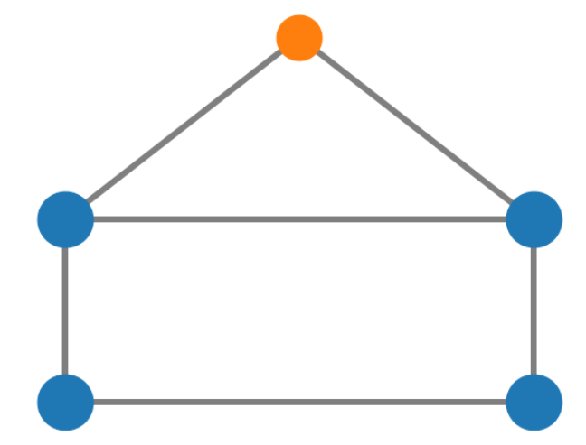
G = nx.house_graph()
nx.draw(G, with_labels=True)
# 设置节点坐标
pos = {0: (0, 0), 1: (1, 0), 2: (0, 1), 3: (1, 1), 4: (0.5, 2.0)}
plt.figure(figsize=(10,8))
# 绘制“墙角”的四个节点
nx.draw_networkx_nodes(G, pos, node_size=3000, nodelist=[0, 1, 2, 3], node_color="tab:blue")
# 绘制“屋顶”节点
nx.draw_networkx_nodes(G, pos, node_size=2000, nodelist=[4], node_color="tab:orange")
# 绘制连接
nx.draw_networkx_edges(G, pos, alpha=0.5, width=6)
plt.axis("off") # 去掉坐标轴
plt.show()
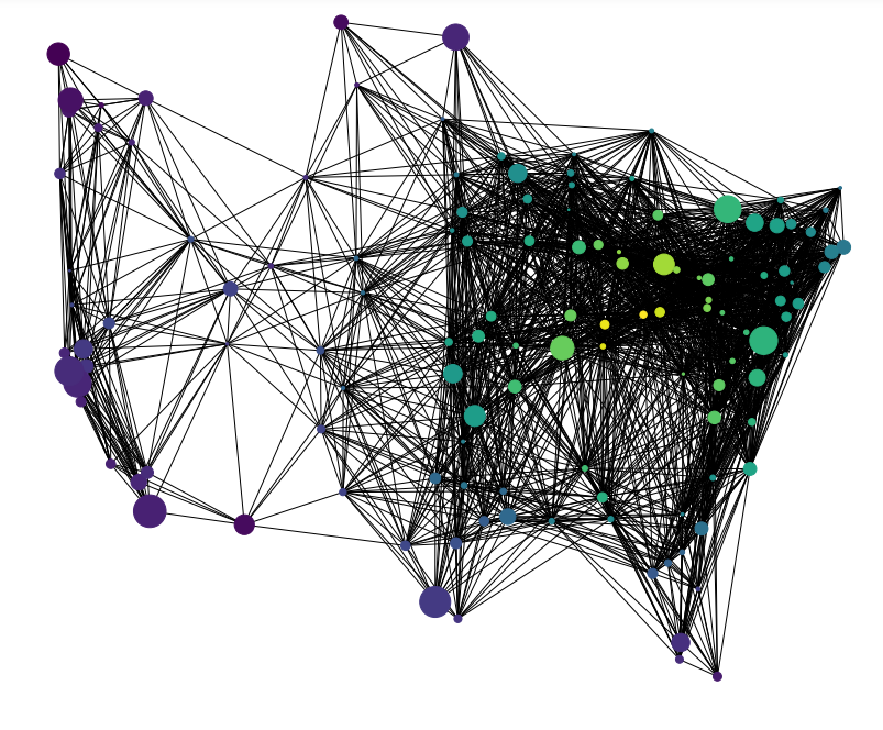
美国128城市交通关系无向图可视化
# 图数据挖掘
import networkx as nx

import numpy as np

# 数据可视化
import matplotlib.pyplot as plt
%matplotlib inline

# plt.rcParams['font.sans-serif']=['SimHei']  # 用来正常显示中文标签
plt.rcParams['axes.unicode_minus']=False  # 用来正常显示负号

import gzip
import re

import warnings
warnings.simplefilter("ignore")
构建图
fh = gzip.open("knuth_miles.txt.gz", "r")

G = nx.Graph()
G.position = {}
G.population = {}

cities = []
for line in fh.readlines(): # 遍历文件中的每一行
    line = line.decode()
    if line.startswith("*"):  # 其它行,跳过
        continue
    numfind = re.compile(r"^\d+")
    if numfind.match(line):  # 记录城市间距离的行
        dist = line.split()
        for d in dist:
            G.add_edge(city, cities[i], weight=int(d))
            i = i + 1
    else:  # 记录城市经纬度、人口的行
        i = 1
        (city, coordpop) = line.split("[")
        cities.insert(0, city)
        (coord, pop) = coordpop.split("]")
        (y, x) = coord.split(",")

        G.add_node(city)
        # assign position - Convert string to lat/long
        x = -float(x) / 100
        y = float(y) / 100
        G.position[city] = (x, y)
        pop = float(pop) / 1000
        G.population[city] = pop
查看图的基本信息
print(G)
G.nodes
G.position #128城市经纬度坐标
G.population #128城市人口数据
G.edges #128城市互联互通关系
我们可以查看任意两座城市之间的距离,以纽约到里士满的交通距离为例
G.edges[('Rochester, NY', 'Richmond, VA')]
{‘weight’: 486}
筛选出距离小于指定阈值的城市:即包含所有节点的 G G G的子图
H = nx.Graph()
for v in G:
    H.add_node(v)
for (u, v, d) in G.edges(data=True):
    if d["weight"] < 800:
        H.add_edge(u, v)
可视化:节点颜色根据节点的度来确定,节点的大小根据节点的人口来确定
# 节点颜色-节点度
node_color = [float(H.degree(v)) for v in H]

# 节点尺寸-节点人口
node_size = [G.population[v] for v in H]

fig = plt.figure(figsize=(12, 10))
nx.draw(
    H,
    G.position,#每个节点的经纬度
    node_size=node_size,
    node_color=node_color,
    with_labels=False,
)
plt.show()
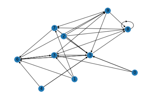
有向图可视化模板
NetworkX可视化有向图的代码模板。
# 图数据挖掘
import networkx as nx

import numpy as np

# 数据可视化
import matplotlib.pyplot as plt
%matplotlib inline

# plt.rcParams['font.sans-serif']=['SimHei']  # 用来正常显示中文标签
plt.rcParams['axes.unicode_minus']=False  # 用来正常显示负号
import matplotlib as mpl
初步可视化
seed = 13648
G = nx.random_k_out_graph(10, 3, 0.5, seed=seed)
pos = nx.spring_layout(G, seed=seed)
nx.draw(G, pos, with_labels=True)
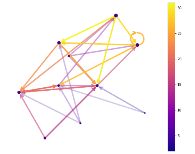
高级可视化设置
# 节点大小
node_sizes = [12 + 10 * i for i in range(len(G))]

# 节点颜色
M = G.number_of_edges()
edge_colors = range(2, M + 2)

# 节点透明度
edge_alphas = [(5 + i) / (M + 4) for i in range(M)]

# 配色方案
cmap = plt.cm.plasma
# cmap = plt.cm.Blues

plt.figure(figsize=(10,8))

# 绘制节点
nodes = nx.draw_networkx_nodes(G, pos, node_size=node_sizes, node_color="indigo")

# 绘制连接
edges = nx.draw_networkx_edges(
    G,
    pos,
    node_size=node_sizes,   # 节点尺寸
    arrowstyle="->",        # 箭头样式
    arrowsize=20,           # 箭头尺寸
    edge_color=edge_colors, # 连接颜色
    edge_cmap=cmap,         # 连接配色方案
    width=4                # 连接线宽
)


# 设置每个连接的透明度
for i in range(M):
    edges[i].set_alpha(edge_alphas[i])

# 调色图例
pc = mpl.collections.PatchCollection(edges, cmap=cmap)
pc.set_array(edge_colors)
plt.colorbar(pc)

ax = plt.gca()
ax.set_axis_off()
plt.show()
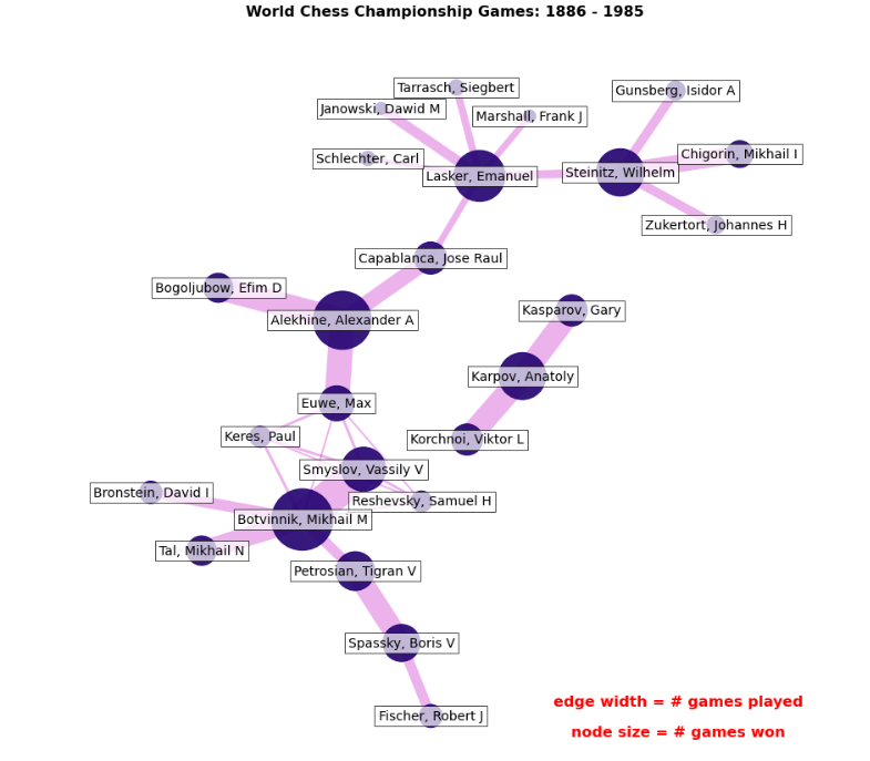
国际象棋对局MultiDiGraph多路图可视化
分析1886-1985年的国际象棋对局数据,绘制多路有向图,节点尺寸为胜利个数,连接宽度为对局个数。
参考文档
# 图数据挖掘
import networkx as nx

# 数据可视化
import matplotlib.pyplot as plt
%matplotlib inline

# plt.rcParams['font.sans-serif']=['SimHei']  # 用来正常显示中文标签
plt.rcParams['axes.unicode_minus']=False  # 用来正常显示负号
导入数据,构建MultiDiGraph
从连接表创建MultiDiGraph多路有向图
import pandas as pd
df = pd.read_csv('WCC.csv')
df
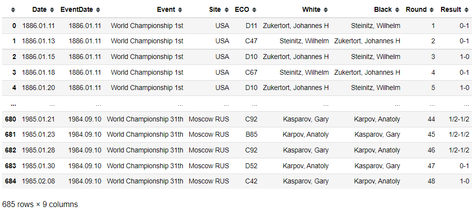
G = nx.from_pandas_edgelist(df, 'White', 'Black', edge_attr=True, create_using=nx.MultiDiGraph())
print('棋手(节点)个数', G.number_of_nodes())
print('棋局(连接)个数', G.number_of_edges())
棋手(节点)个数 25
棋局(连接)个数 685
# 所有节点
G.nodes

#所有连接(带特征)
G.edges(data=True)
我们可以查找到任意两个棋手之间的所有对局
# 两个棋手的所有棋局
G.get_edge_data('Zukertort, Johannes H', 'Steinitz, Wilhelm')
初步可视化
pos = nx.spring_layout(G, seed=10)
nx.draw(G, pos)
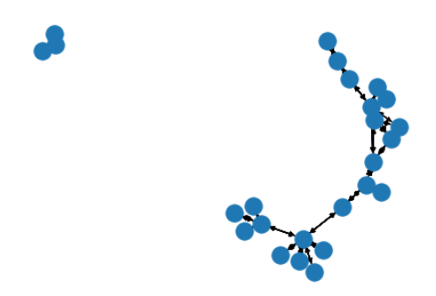
连通域分析
# 将G转为无向图,分析连通域
H = G.to_undirected()
for each in nx.connected_components(H):
    print('连通域')
    print(H.subgraph(each))
    print('包含节点')
    print(each)
    print('\n')
连通域
MultiGraph with 22 nodes and 304 edges
包含节点
{‘Botvinnik, Mikhail M’, ‘Petrosian, Tigran V’, ‘Schlechter, Carl’, ‘Spassky, Boris V’, ‘Bogoljubow, Efim D’, ‘Keres, Paul’, ‘Gunsberg, Isidor A’, ‘Steinitz, Wilhelm’, ‘Chigorin, Mikhail I’, ‘Tarrasch, Siegbert’, ‘Bronstein, David I’, ‘Janowski, Dawid M’, ‘Capablanca, Jose Raul’, ‘Lasker, Emanuel’, ‘Tal, Mikhail N’, ‘Smyslov, Vassily V’, ‘Zukertort, Johannes H’, ‘Alekhine, Alexander A’, ‘Marshall, Frank J’, ‘Euwe, Max’, ‘Fischer, Robert J’, ‘Reshevsky, Samuel H’}
连通域 MultiGraph with 3 nodes and 49 edges 包含节点 {‘Kasparov, Gary’,
‘Karpov, Anatoly’, ‘Korchnoi, Viktor L’}
高级可视化
# 将G转为无向-单连接图
H = nx.Graph(G)
我们可以查找到任意两个棋手之间的所有对局
# 两个棋手的所有棋局
len(G.get_edge_data('Zukertort, Johannes H', 'Steinitz, Wilhelm'))
# 两个棋手节点之间的 连接宽度 与 棋局个数 成正比
edgewidth = [len(G.get_edge_data(u, v)) for u, v in H.edges()]
# 棋手节点的大小 与 赢棋次数 成正比
wins = dict.fromkeys(G.nodes(), 0) # 生成每个棋手作为key的dict
for (u, v, d) in G.edges(data=True):
    r = d["Result"].split("-")
    if r[0] == "1":
        wins[u] += 1.0
    elif r[0] == "1/2":
        wins[u] += 0.5
        wins[v] += 0.5
    else:
        wins[v] += 1.0
nodesize = [wins[v] * 50 for v in H]

# 布局
pos = nx.kamada_kawai_layout(H)

# 手动微调节点的横坐标(越大越靠右)、纵坐标(越大越靠下)
pos["Reshevsky, Samuel H"] += (0.05, -0.10)
pos["Botvinnik, Mikhail M"] += (0.03, -0.06)
pos["Smyslov, Vassily V"] += (0.05, -0.03)

fig, ax = plt.subplots(figsize=(12, 12))

# 可视化连接
nx.draw_networkx_edges(H, pos, alpha=0.3, width=edgewidth, edge_color="m")

# 可视化节点
nx.draw_networkx_nodes(H, pos, node_size=nodesize, node_color="#210070", alpha=0.9)

# 节点名称文字说明
label_options = {"ec": "k", "fc": "white", "alpha": 0.7}
nx.draw_networkx_labels(H, pos, font_size=14, bbox=label_options)

# 标题和图例
font = {"fontname": "Helvetica", "color": "k", "fontweight": "bold", "fontsize": 16}
ax.set_title("World Chess Championship Games: 1886 - 1985", font)
# 图例字体颜色
font["color"] = "r"

# 文字说明
ax.text(
    0.80,
    0.10,
    "edge width = # games played",
    horizontalalignment="center",
    transform=ax.transAxes,
    fontdict=font,
)
ax.text(
    0.80,
    0.06,
    "node size = # games won",
    horizontalalignment="center",
    transform=ax.transAxes,
    fontdict=font,
)

# 调整图的大小,提高可读性
ax.margins(0.1, 0.05)
fig.tight_layout()
plt.axis("off")
plt.show()
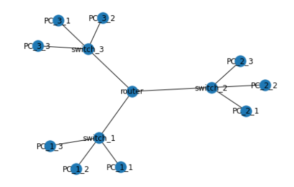
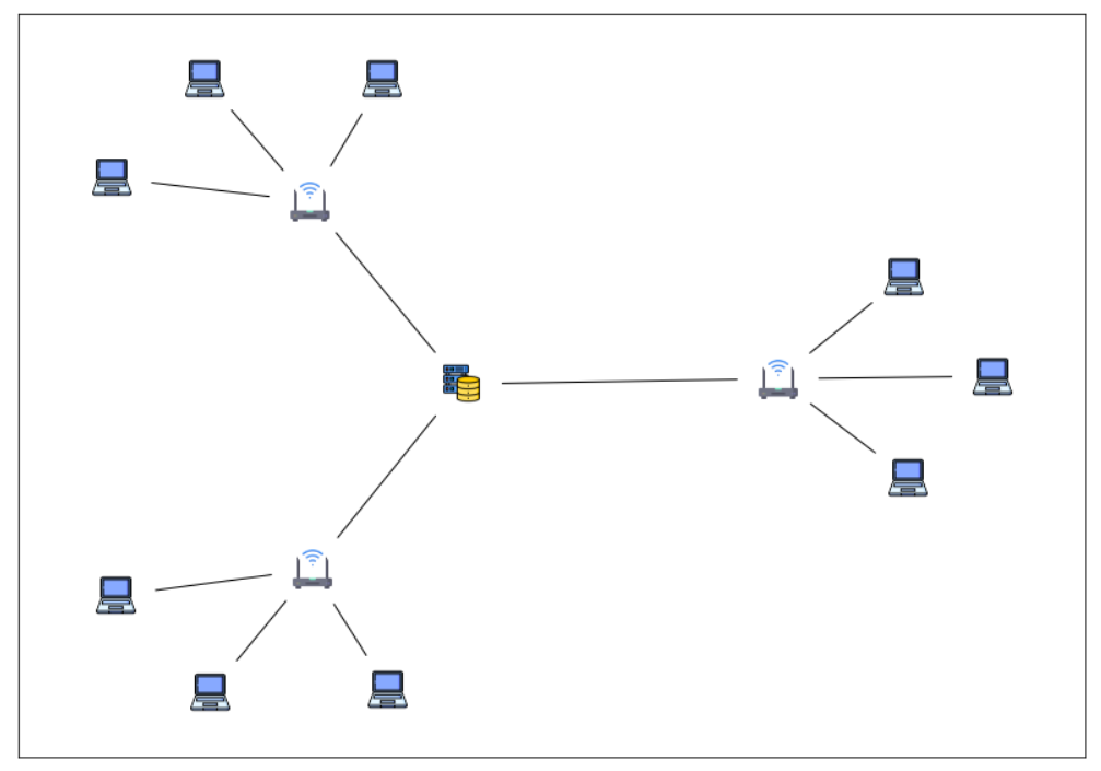
自定义节点图标
# 图数据挖掘
import networkx as nx

# 数据可视化
import matplotlib.pyplot as plt
%matplotlib inline

# plt.rcParams['font.sans-serif']=['SimHei']  # 用来正常显示中文标签
plt.rcParams['axes.unicode_minus']=False  # 用来正常显示负号

import PIL
载入自定义的图标
# 图标下载网站
# www.materialui.co
# https://www.flaticon.com/
# 服务器:https://www.flaticon.com/free-icon/database-storage_2906274?term=server&page=1&position=8&page=1&position=8&related_id=2906274&origin=search
# 笔记本电脑:https://www.flaticon.com/premium-icon/laptop_3020826?term=laptop&page=1&position=13&page=1&position=13&related_id=3020826&origin=search
# 路由器:https://www.flaticon.com/premium-icon/wifi_1183657?term=router&page=1&position=3&page=1&position=3&related_id=1183657&origin=search

icons = {
    'router': 'database-storage.png',
    'switch': 'wifi.png',
    'PC': 'laptop.png',
}

# 载入图像
images = {k: PIL.Image.open(fname) for k, fname in icons.items()}
images
{‘router’: <PIL.PngImagePlugin.PngImageFile image mode=RGBA size=512x512>,
‘switch’: <PIL.PngImagePlugin.PngImageFile image mode=RGBA size=512x512>,
‘PC’: <PIL.PngImagePlugin.PngImageFile image mode=RGBA size=512x512>}
创建图
# 创建空图
G = nx.Graph()

# 创建节点
G.add_node("router", image=images["router"])
for i in range(1, 4):
    G.add_node(f"switch_{i}", image=images["switch"])
    for j in range(1, 4):
        G.add_node("PC_" + str(i) + "_" + str(j), image=images["PC"])

# 创建连接
G.add_edge("router", "switch_1")
G.add_edge("router", "switch_2")
G.add_edge("router", "switch_3")
for u in range(1, 4):
    for v in range(1, 4):
        G.add_edge("switch_" + str(u), "PC_" + str(u) + "_" + str(v))
nx.draw(G, with_labels=True)
fig, ax = plt.subplots()

# 图片尺寸(相对于 X 轴)
icon_size = (ax.get_xlim()[1] - ax.get_xlim()[0]) * 0.04
icon_center = icon_size / 2.0

pos = nx.spring_layout(G, seed=1)
fig, ax = plt.subplots(figsize=(14,10))

# 绘制连接
# min_source_margin 和 min_target_margin 调节连接端点到节点的距离
nx.draw_networkx_edges(
    G,
    pos=pos,
    ax=ax,
    arrows=True,
    arrowstyle="-",
    min_source_margin=30,
    min_target_margin=30,
)

# 给每个节点添加各自的图片
for n in G.nodes:
    xf, yf = ax.transData.transform(pos[n]) # data坐标 转 display坐标
    xa, ya = fig.transFigure.inverted().transform((xf, yf)) # display坐标 转 figure坐标

    a = plt.axes([xa - icon_center, ya - icon_center, icon_size, icon_size])
    a.imshow(G.nodes[n]["image"])
    a.axis("off")

plt.show()
总结
本文主要介绍了使用NetworkX自带的可视化函数nx.draw,绘制不同风格的图。设置节点尺寸、节点颜色、节点边缘颜色、节点坐标、连接颜色等,并介绍了有向图可视化的模板和如何自定义节点坐标,最后以【美国128城市交通关系无向图可视化】和【国际象棋对局MultiDiGraph多路图可视化】实战演示了如何利用NetworkX工具包解决实际问题。


 被折叠的 条评论
为什么被折叠?
被折叠的 条评论
为什么被折叠?
 到【灌水乐园】发言


