


HTML代码:
<!DOCTYPE html>
<html lang="en">
<head>
<meta charset="UTF-8">
<title></title>

<link type="text/css" href="css/style.css" rel="stylesheet" />

</head>
<body>

<div class="box">
	<ul class="minbox">
		<li></li>
		<li></li>
		<li></li>
		<li></li>
		<li></li>
		<li></li>
	</ul>
	<ol class="maxbox">
		<li></li>
		<li></li>
		<li></li>
		<li></li>
		<li></li>
		<li></li>
	</ol>
</div>
</body>
</html>
CSS代码:
@charset "utf-8";
*{
	margin:0;
	padding:0;
}
body{

	/*background: url(../img/preview.png) ;*/
	max-width: 100%;
	min-width: 100%;
	height: 100%;
	background-size: cover;
	background-repeat: no-repeat;
	background-attachment: fixed;
	background-size:100% 100%;
	position: absolute;
	margin-left: auto;
	margin-right: auto;
}
li{
	list-style: none;
}
.box{
	width:200px;
	height:200px;
	background-size: cover;
	background-repeat: no-repeat;
	background-attachment: fixed;
	background-size:100% 100%;
	position: absolute;
	margin-left: 42%;
	margin-top: 22%;
	-webkit-transform-style:preserve-3d;
	-webkit-transform:rotateX(13deg);
	-webkit-animation:move 5s linear infinite;
}
.minbox{
	width:100px;
	height:100px;
	position: absolute;
	left:50px;
	top:30px;
	-webkit-transform-style:preserve-3d;
}
.minbox li{
	width:100px;
	height:100px;
	position: absolute;
	left:0;
	top:0;
}
.minbox li:nth-child(1){
	background: url(../imga/01.jpg) no-repeat 0 0;
	-webkit-transform:translateZ(50px);
}
.minbox li:nth-child(2){
	background: url(../imga/02.jpg) no-repeat 0 0;
	-webkit-transform:rotateX(180deg) translateZ(50px);
}
.minbox li:nth-child(3){
	background: url(../imga/03.jpg) no-repeat 0 0;
	-webkit-transform:rotateX(-90deg) translateZ(50px);
}
.minbox li:nth-child(4){
	background: url(../imga/04.jpg) no-repeat 0 0;
	-webkit-transform:rotateX(90deg) translateZ(50px);
}
.minbox li:nth-child(5){
	background: url(../imga/05.jpg) no-repeat 0 0;
	-webkit-transform:rotateY(-90deg) translateZ(50px);
}
.minbox li:nth-child(6){
	background: url(../imga/06.jpg) no-repeat 0 0;
	-webkit-transform:rotateY(90deg) translateZ(50px);
}
.maxbox li:nth-child(1){
	background: url(../imga/1.jpg) no-repeat 0 0;
	-webkit-transform:translateZ(50px);
}
.maxbox li:nth-child(2){
	background: url(../imga/2.jpg) no-repeat 0 0;
	-webkit-transform:translateZ(50px);
}
.maxbox li:nth-child(3){
	background: url(../imga/3.jpg) no-repeat 0 0;
	-webkit-transform:rotateX(-90deg) translateZ(50px);
}
.maxbox li:nth-child(4){
	background: url(../imga/4.jpg) no-repeat 0 0;
	-webkit-transform:rotateX(90deg) translateZ(50px);
}
.maxbox li:nth-child(5){
	background: url(../imga/5.jpg) no-repeat 0 0;
	-webkit-transform:rotateY(-90deg) translateZ(50px);
}
.maxbox li:nth-child(6){
	background: url(../imga/6.jpg) no-repeat 0 0;
	-webkit-transform:rotateY(90deg) translateZ(50px);
}
.maxbox{
	width: 800px;
	height: 400px;
	position: absolute;
	left: 0;
	top: -20px;
	-webkit-transform-style: preserve-3d;

}
.maxbox li{
	width: 200px;
	height: 200px;
	background: #fff;
	border:1px solid #ccc;
	position: absolute;
	left: 0;
	top: 0;
	opacity: 0.2;
	-webkit-transition:all 1s ease;
}
.maxbox li:nth-child(1){
	-webkit-transform:translateZ(100px);
}
.maxbox li:nth-child(2){
	-webkit-transform:rotateX(180deg) translateZ(100px);
}
.maxbox li:nth-child(3){
	-webkit-transform:rotateX(-90deg) translateZ(100px);
}
.maxbox li:nth-child(4){
	-webkit-transform:rotateX(90deg) translateZ(100px);
}
.maxbox li:nth-child(5){
	-webkit-transform:rotateY(-90deg) translateZ(100px);
}
.maxbox li:nth-child(6){
	-webkit-transform:rotateY(90deg) translateZ(100px);
}
.box:hover ol li:nth-child(1){
	-webkit-transform:translateZ(300px);
	width: 600px;
	height: 400px;
	opacity: 0.8;
	left: -100px;
	top: -100px;
}
.box:hover ol li:nth-child(2){
	-webkit-transform:rotateX(180deg) translateZ(300px);
	width: 600px;
	height: 400px;
	opacity: 0.8;
	left: -100px;
	top: -100px;
}
.box:hover ol li:nth-child(3){
	-webkit-transform:rotateX(-90deg) translateZ(300px);
	width: 400px;
	height: 400px;
	opacity: 0.8;
	left: -100px;
	top: -100px;
}
.box:hover ol li:nth-child(4){
	-webkit-transform:rotateX(90deg) translateZ(300px);
	width: 400px;
	height: 400px;
	opacity: 0.8;
	left: -100px;
	top: -100px;
}
.box:hover ol li:nth-child(5){
	-webkit-transform:rotateY(-90deg) translateZ(300px);
	width: 600px;
	height: 400px;
	opacity: 0.8;
	left: -100px;
	top: -100px;
}
.box:hover ol li:nth-child(6){
	-webkit-transform:rotateY(90deg) translateZ(300px);
	width: 600px;
	height: 400px;
	opacity: 0.8;
	left: -100px;
	top: -100px;
}
@keyframes move{
	0%{
		-webkit-transform: rotateX(13deg) rotateY(0deg);
	}
	100%{
		-webkit-transform:rotateX(13deg) rotateY(360deg);
	}
}
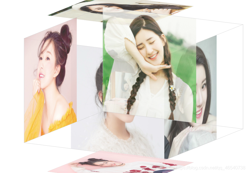
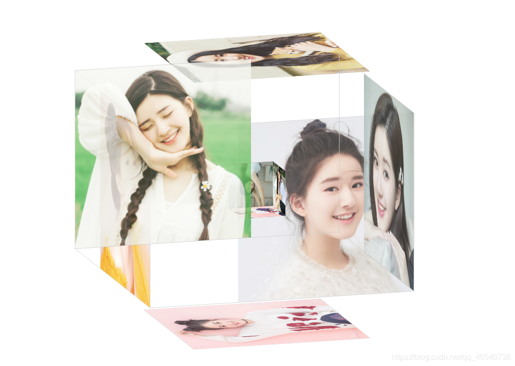
图片的话,根据自己喜好放自己喜欢的图片即可。


 4106
4106


 被折叠的 条评论
为什么被折叠?
被折叠的 条评论
为什么被折叠?
 到【灌水乐园】发言


