


下面这段代码绘制了一个折线图,其中包含了实际平均温度数据和使用线性回归模型预测的平均温度数据(用来近似地表示数据的整体趋势)。
具体来说,图中的横轴表示年份,纵轴表示平均温度。蓝色的实心线代表了实际的平均温度数据,而红色的实线则代表了使用线性回归模型所预测的平均温度数据。通过这个图,可以直观地比较实际数据和模型预测数据之间的趋势和关系。
import pandas as pd
import numpy as np
import matplotlib.pyplot as plt
from sklearn.linear_model import LinearRegression
import matplotlib.ticker as ticker

# 读取CSV文件
data = pd.read_csv(r'F:\Annual LST.csv')

# 去除年份列中的逗号,并转换为浮点数
data['Year'] = data['Year'].str.replace(',', '').astype(float)

# 提取第一列和第二列数据
years = data.iloc[:, 0].values.reshape(-1, 1)
mean_temps = data.iloc[:, 1].values

# 创建线性回归模型
model = LinearRegression()

# 拟合数据
model.fit(years, mean_temps)

# 提取斜率
slope = model.coef_[0]

# 计算预测值
predicted_temps = model.predict(years)

# 创建折线图
plt.figure(figsize=(10, 6))
plt.plot(years, mean_temps, marker='o', markersize=8, linestyle='-', color='blue', label='Actual Mean Temperature')
plt.plot(years, predicted_temps, linestyle='-', color='red', label='Predicted Mean Temperature')
plt.xlabel('Year', fontsize=14)
plt.ylabel('Mean Temperature', fontsize=14)
plt.tick_params(axis='both', which='both', direction='in', right=True, top=True)

# 设置横坐标整数刻度
plt.gca().xaxis.set_major_locator(ticker.MaxNLocator(integer=True))

plt.tight_layout()
plt.show()
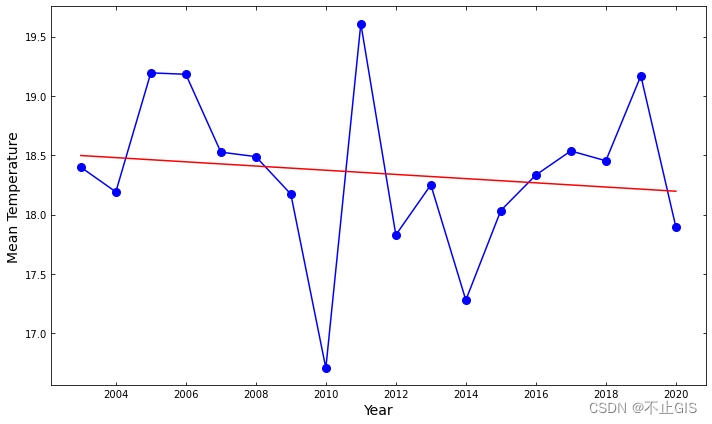
图 绘制的折线图


 696
696

 被折叠的 条评论
为什么被折叠?
被折叠的 条评论
为什么被折叠?
 到【灌水乐园】发言


