


1、定义放入Echart位置
<div id="echartOne" style="width: 400px; height: 75%"></div>
<div id="echartTwo" style="width: 400px; height: 75%"></div>
<div ref="assbf_cechart"></div>
2、引用Echart
import * as echarts from 'echarts'
3、使用:method里
    // 绘制echart饼图
    initChart1 () {
      var charDom = document.getElementById('echartOne')
      var myChart = echarts.init(charDom)
      var datas = [
        [
          { name: 'GF1', value: 3.1 },
          { name: 'GF2', value: 5.5 },
          { name: 'GF3', value: 0.33 },
          { name: 'GF4', value: 2.3 }
        ]
      ]
      myChart.setOption({
        series: datas.map(function (data, idx) {
          return {
            type: 'pie',
            radius: [40, 70],
            height: 200,
            left: 'center',
            width: 600,
            label: {
              alignTo: 'edge',
              minMargin: 5,
              edgeDistance: 10,
              lineHeight: 15,
              rich: {
                time: {
                  fontSize: 10,
                  color: '#999'
                }
              }
            },
            labelLine: {
              length: 15,
              length2: 0,
              maxSurfaceAngle: 80
            },
            data: data
          }
        })
      })
    },
// 柱状图
 initChart2 () {
      var charDom = document.getElementById('echartTwo')
      var myChart = echarts.init(charDom)
      var option

      option = {
        color: ['rgb(49, 255, 0)'],
        xAxis: {
          type: 'category',
          name: '部门',
          data: ['运维部门', '本单位'],
          axisLine: {
            show: true,
            lineStyle: {
              color: '#00ffce'
            } // x轴样式
          }
        },
        yAxis: {
          type: 'value',
          name: '景数',
          axisLine: {
            show: true,
            lineStyle: {
              color: '#00ffce'
            } // y轴样式
          }
        },
        series: [
          {
            data: [900, 4300],
            type: 'bar',
            barWidth: '20%'
          }
        ]
      }
      option && myChart.setOption(option)
}, 
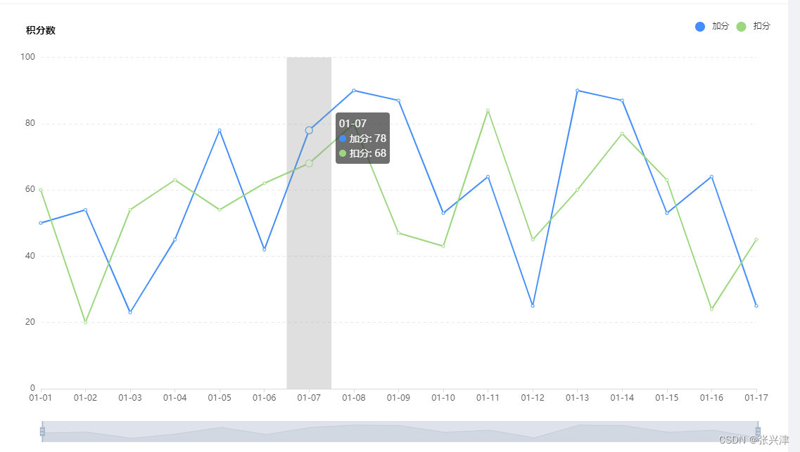
    // 折线图
    initChart3(){
      const data = [
        ['01-01', 50],
        ['01-02', 54],
        ['01-03', 23],
        ['01-04', 45],
        ['01-05', 78],
        ['01-06', 42],
        ['01-07', 78],
        ['01-08', 90],
        ['01-09', 87],
        ['01-10', 53],
        ['01-11', 64],
        ['01-12', 25],
        ['01-13', 90],
        ['01-14', 87],
        ['01-15', 53],
        ['01-16', 64],
        ['01-17', 25],
      ];
      const data1 = [
        ['01-01', 60],
        ['01-02', 20],
        ['01-03', 54],
        ['01-04', 63],
        ['01-05', 54],
        ['01-06', 62],
        ['01-07', 68],
        ['01-08', 80],
        ['01-09', 47],
        ['01-10', 43],
        ['01-11', 84],
        ['01-12', 45],
        ['01-13', 60],
        ['01-14', 77],
        ['01-15', 63],
        ['01-16', 24],
        ['01-17', 45],
      ];
      this.chart3 = echarts.init(this.$refs.assbf_cechart, 'assbf_cechart')
      this.chart3.setOption({
        tooltip: {
          trigger: 'axis', // 触发类型
          axisPointer: {
            type: 'shadow'
          }
        },
        grid: {
          left: '3%', // grid 组件离容器左侧的距离
          right: '4%',
          bottom: '10%',
          top: '12%',
          containLabel: true, // grid 区域是否包含坐标轴的刻度标签
        }, // grid:直角坐标系内绘图网格
        legend: {
          data: ['加分', '扣分'], // 要与series中name相对应
          right: '20',
          top: "20",
          icon: "circle",
        }, // 图例
        xAxis: {
          data: data.map(function (item) {
            return item[0];
          }),
          boundaryGap: false, // 坐标轴两边是否有间隔
          axisLine: {
            lineStyle: {
              color: '#d9d9d9'
            }
          },
          axisLabel: {
            color: '#5a5a5a',
            fontSize: 12
          }, // 坐标轴刻度标签的相关设置
        },
        yAxis: [
          {
            type: 'value',
            axisLabel: {
              color: '#5a5a5a',
              fontSize: 12
            },
            axisLine: {
              lineStyle: {
                color: '#fff'
              }
            },
            splitLine: {
              lineStyle: {
                color: '#e8e8e8',
                type: 'dashed' // dashed 虚线 dotted 点线 solid 实线
              }
            },
            name: "积分数",
            nameGap: 30,
            nameTextStyle: {
              color: "#000",
              fontSize: "14",
              fontWeight: "600",
            }
          }
        ],
        series: [
          {
            name: "加分",
            type: 'line',
            data: data,
            color: '#1a90ff'
          },
          {
            name: "扣分",
            type: 'line',
            data: data1,
            color: '#98D87D'
          }
        ]
      })
    },
常用参数配置:Documentation - Apache ECharts
① tigger:触发类型:可选 (经过出现提示信息)
-
item数据项图形触发,主要在散点图,饼图等无类目轴的图表中使用。
-
axis坐标轴触发,主要在柱状图,折线图等会使用类目轴的图表中使用。
-
none什么都不触发。

② 线条控制:lineStyle:{color:"颜色,type:'样式',},
③ tooltip. axisPointer :坐标轴指示器配置项
tooltip.axisPointer. type = ‘line’,
-
'line'直线指示器 -
'shadow'阴影指示器 -
'none'无指示器 -
'cross'十字准星指示器。其实是种简写,表示启用两个正交的轴的 axisPointer。 -
 此时为shadow选项
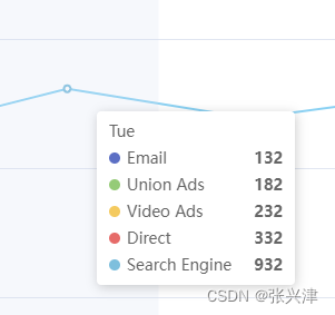
④ legend: Echarts图表中对图形的解释部分,就是下面图片的那部分
![]()
⑤ series:一组数值以及他们映射成的图
echarts 里系列类型(series.type)就是图表类型。系列类型(series.type)至少有:line(折线图)、bar(柱状图)、pie(饼图)、scatter(散点图)、graph(关系图)、tree(树图)、...
如下图,右侧的 option 中声明了三个 系列(series):pie(饼图系列)、line(折线图系列)、bar(柱状图系列),每个系列中有他所需要的数据(series.data)。


 9310
9310


 被折叠的 条评论
为什么被折叠?
被折叠的 条评论
为什么被折叠?
 到【灌水乐园】发言


