


1.background的属性
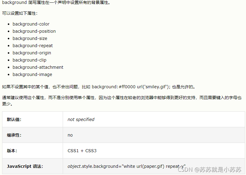
1.1background-color 属性设置元素的背景颜色。
这种颜色会填充元素的内容、内边距和边框区域,扩展到元素边框的外边界(但不包括外边距)。如果边框有透明部分(如虚线边框),会透过这些透明部分显示出背景色。
transparent 值。尽管在大多数情况下,没有必要使用 transparent。不过如果您不希望某元素拥有背景色,同时又不希望用户对浏览器的颜色设置影响到您的设计,那么设置 transparent 值还是有必要的。
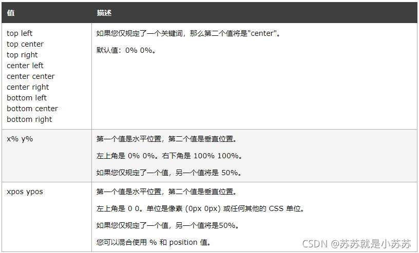
1.2background-position 属性设置背景图像的起始位置。**
这个属性设置背景原图像(由 background-image 定义)的位置,背景图像如果要重复,将从这一点开始。
提示:您需要把 background-attachment 属性设置为 “fixed”,才能保证该属性在 Firefox 和 Opera 中正常工作。
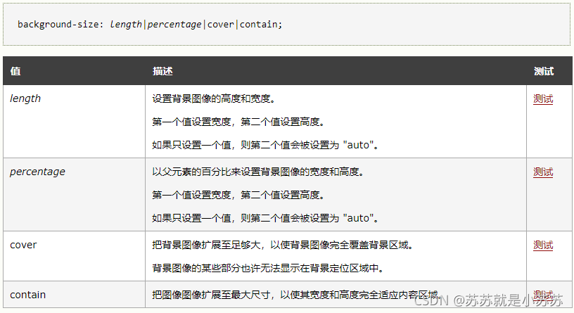
1.3background-size 属性规定背景图像的尺寸。**
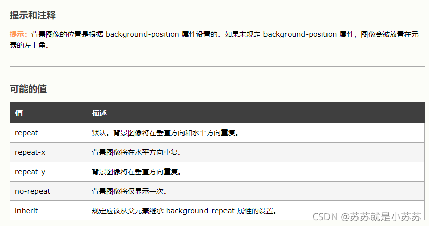
1.4background-repeat 属性设置是否及如何重复背景图像。**
默认地,背景图像在水平和垂直方向上重复。background-repeat 属性定义了图像的平铺模式。
从原图像开始重复,原图像由 background-image 定义,并根据 background-position 的值放置。
1.5background-origin 属性规定 background-position 属性相对于什么位置来定位。**
注释:如果背景图像的 background-attachment 属性为 “fixed”,则该属性没有效果。

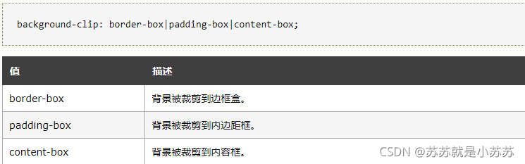
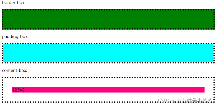
1.6background-clip 属性规定背景的绘制区域。**
效果:
代码:
<!DOCTYPE html>
<html>
<head>
<style>
#example1 {
  border: 5px dotted black;
  padding: 35px;
  background: #008000;
}

#example2 {
  border: 5px dotted black;
  padding: 35px;
  background: #00ffff;
  background-clip: padding-box;
}

#example3 {
  border: 5px dotted black;
  padding: 35px;
  background:  #ff007f;
  background-clip: content-box;
}
</style>
</head>
<body>


<p>border-box</p>
<div id="example1">
</div>

<p>padding-box:</p>
<div id="example2">
</div>

<p>content-box:</p>
<div id="example3">
	12346
</div>

</body>
</html>
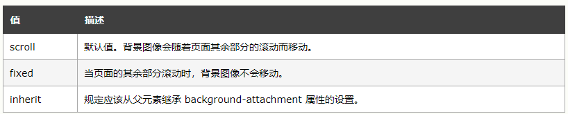
1.7background-attachment 属性设置背景图像是否固定或者随着页面的其余部分滚动。**
1.8background-image 属性为元素设置背景图像。**
background-image 属性会在元素的背景中设置一个图像。
根据 background-repeat 属性的值,图像可以无限平铺、沿着某个轴(x 轴或 y 轴)平铺,或者根本不平铺。初始背景图像(原图像)根据 background-position 属性的值放置。
2.background与background-image的区别
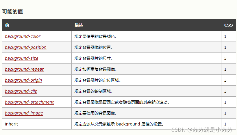
background是background-image,background-color,background-repeat,background-position,background-size等一系列与background有关属性的缩写。
设置background-image ,后边就只能跟图片的url,而不能设置repeat啥的了。
3.如何设置一张图片平铺背景
方法一:
	html,body{
		height: 100%;
		width: 100%;
		background: url('./img/1.jpeg') no-repeat center / cover;
		background-attachment:fixed;
	}
	或者
	html,body{
		height: 100%;
		width: 100%;
		background: url('./img/1.jpeg');
		background-repeat:no-repeat;
		background-attachment:fixed;
		background-position:top;
		background-size:cover;
	}
或者
html,body{
	background: url(./img/1.jpeg) no-repeat center 0px;
	background-size: cover;
}
方法二:
<div class="con">
	<img class="bgImg" src="./img/index_bg.png" width='100%' height='100%'/>
</div>
body{
		margin:0;
		padding:0;
	}
	.bgImg{
	  object-fit: cover;
	  left:0;
	  bottom:0;
	  position: absolute;
	}
tips:
object-fit: fill;
object-fit: contain;
object-fit: cover;
object-fit: none;
object-fit: scale-down;
fill: 中文释义“填充”。默认值。替换内容拉伸填满整个contentbox,不保证保持原有的比例。
contain: 中文释义“包含”。保持原有尺寸比例。保证替换内容尺寸一定可以在容器里面放得下。因此,此参数可能会在容器内留下空白。
cover: 中文释义“覆盖”。保持原有尺寸比例。保证替换内容尺寸一定大于容器尺寸,宽度和高度至少有一个和容器一致。因此,此参数可能会让替换内容(如图片)部分区域不可见(上面讲解的例子就是如此)。
none: 中文释义“无”。保持原有尺寸比例。同时保持替换内容原始尺寸大小。
scale-down: 中文释义“降低”。就好像依次设置了none或contain, 最终呈现的是尺寸比较小的那个。
4.设置背景颜色宽度为100%,子元素宽度为某一固定值;当缩小浏览器时候,滚动滚动条发现背景右侧出现空白。
问题情况:

浏览器缩小至宽度小于1000px;
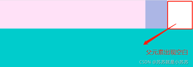
原因:
浏览器默认100%宽度为浏览器窗口的宽度。当这个100%的宽度小于页面最小元素的宽度时候,从而出现了固定宽度大于100%宽度的现象。
解决方法:将父元素设置一个最小宽度,这个最小宽度取决于子元素的最大宽度。(代码如下)
<!DOCTYPE html>
<html>
<head>
<meta charset="utf-8">
<title></title>
</head>
<style>
body,html{
margin: 0;
padding: 0;
}
.parent{
width: 100%;
height: 100%;
background: #acb6e5;
min-width:1200px;
}
.width_box{
margin: 0 auto;
width: 600px;
height: 100px;
background: #ffe1f7;
}
.height_box{
margin: 0 auto;
width: 1000px;
height: 1300px;
background-color: #00CCCC;
}
</style>
<body>
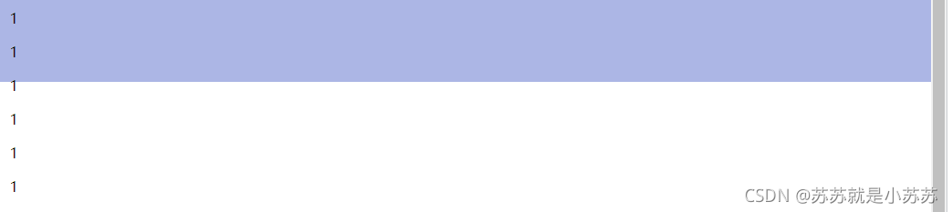
<div class="parent">
<div class="width_box">
1
</div>
<div class="height_box">
2
</div>
</div>
</body>
</html>
5.css 背景色如何铺满全屏幕
方法一:给当前div设置定位
.parent {
    position: absolute;
    width: 100%;
    height: 100%;
    background-color: #f2f2f2;
}
方法二:通过设置html,body的宽高,来实现
html,body{
    width: 100%;
    height: 100%;
}
.parent {
    width: 100%;
    height: 100%;
    background-color: #f2f2f2;
}
用上述方法实现,当子元素的高度超出100%的时候,会出现底部空白的问题。
解决方法:(将parent元素的高度设置为min-height:100%即可)
方法一:
html,body{
    width: 100%;
    height: 100%;
}
.parent {
    width: 100%;
    min-height: 100%;
    background-color: #f2f2f2;
}
方法二:
.parent {
    position: absolute;
    width: 100%;
    min-height: 100%;
    background-color: #f2f2f2;
}


 7871
7871


 被折叠的 条评论
为什么被折叠?
被折叠的 条评论
为什么被折叠?
 到【灌水乐园】发言


