


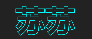
1.实现效果

2.实现步骤
2.1.写一个h2标签
<h2 content="苏苏">苏苏</h2>
2.3.设置字体镂空
body {
	margin: 0;
	padding: 0;
	display: flex;
	height: 100vh;
	justify-content: center;
	align-items: center;
	background-color: #222;
	min-width: 1200px;
}

h2 {
	color: #fff;
	font-size: 8em;
	color: transparent;
	-webkit-text-stroke: 2px #00ffff;
	position: relative;
}
如下图效果:
2.3text-stroke属性
使用text-stroke文字的描边属性,color: transparent,实现字体镂空的效果。
text-stroke是: text-stroke-width和text-stroke-color两个属性的简写写法。
text-stroke-width :设置或检索对象中的文字的描边厚度
text-stroke-color :设置或检索对象中的文字的描边颜色
2.4 h2添加一个相同文字的伪元素
h2::before {
	content: attr(content);
	position: absolute;
	top: 0;
	left: 0;
	color: #00ffff;
	animation: a 4s ease-in-out infinite;
}
content设置伪元素的内容,结合attr属性获取元素属性内容。
为其设置一个动画效果
@keyframes a {

	0%,
	100% {
		-webkit-clip-path: polygon(0 100%, 0 61%, 16% 77%, 29% 86%, 44% 90%, 62% 88%, 78% 81%, 89% 74%, 100% 62%, 100% 100%);
		clip-path: polygon(0 100%, 0 61%, 16% 77%, 29% 86%, 44% 90%, 62% 88%, 78% 81%, 89% 74%, 100% 62%, 100% 100%);

	}

	50% {
		-webkit-clip-path: polygon(0 100%, 0 25%, 16% 52%, 29% 65%, 43% 75%, 64% 76%, 77% 72%, 88% 62%, 100% 49%, 100% 100%);
		clip-path: polygon(0 100%, 0 25%, 16% 52%, 29% 65%, 43% 75%, 64% 76%, 77% 72%, 88% 62%, 100% 49%, 100% 100%);
	}
}
2.5clip-path
clip-path创建一个只有元素的部分区域可以显示的剪切区域。区域内的部分显示,区域外的隐藏。
clip-path的属性值可以是以下几种:
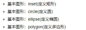
这里用到的就是多变形,推荐一个clip-path在线网站,快速帮助我们绘画出想要的形状。
clip-path在线生成网站

3.完整代码:
<!DOCTYPE html>
<html>
	<head>
		<meta charset="utf-8">
		<title></title>
	</head>
	<style>
		body {
			margin: 0;
			padding: 0;
			display: flex;
			height: 100vh;
			justify-content: center;
			align-items: center;
			background-color: #222;
			min-width: 1200px;
		}

		h2 {
			color: #fff;
			font-size: 8em;
			color: transparent;
			-webkit-text-stroke: 2px #00ffff;
			position: relative;
		}

		 h2::before {
			content: attr(content);
			position: absolute;
			top: 0;
			left: 0;
			color: #00ffff;
			animation: a 4s ease-in-out infinite;
		}

		@keyframes a {

			0%,
			100% {
				-webkit-clip-path: polygon(0 100%, 0 61%, 16% 77%, 29% 86%, 44% 90%, 62% 88%, 78% 81%, 89% 74%, 100% 62%, 100% 100%);
				clip-path: polygon(0 100%, 0 61%, 16% 77%, 29% 86%, 44% 90%, 62% 88%, 78% 81%, 89% 74%, 100% 62%, 100% 100%);

			}

			50% {
				-webkit-clip-path: polygon(0 100%, 0 25%, 16% 52%, 29% 65%, 43% 75%, 64% 76%, 77% 72%, 88% 62%, 100% 49%, 100% 100%);
				clip-path: polygon(0 100%, 0 25%, 16% 52%, 29% 65%, 43% 75%, 64% 76%, 77% 72%, 88% 62%, 100% 49%, 100% 100%);
			}
		}
	</style>
	<body>
		<h2 content="苏苏">苏苏</h2>
	</body>
</html>


 370
370


 被折叠的 条评论
为什么被折叠?
被折叠的 条评论
为什么被折叠?
 到【灌水乐园】发言


