


html css期末大作业 登录注册
一、源码地址
https://drive.uc.cn/s/f1e0070021a94
二、演示视频
登录注册
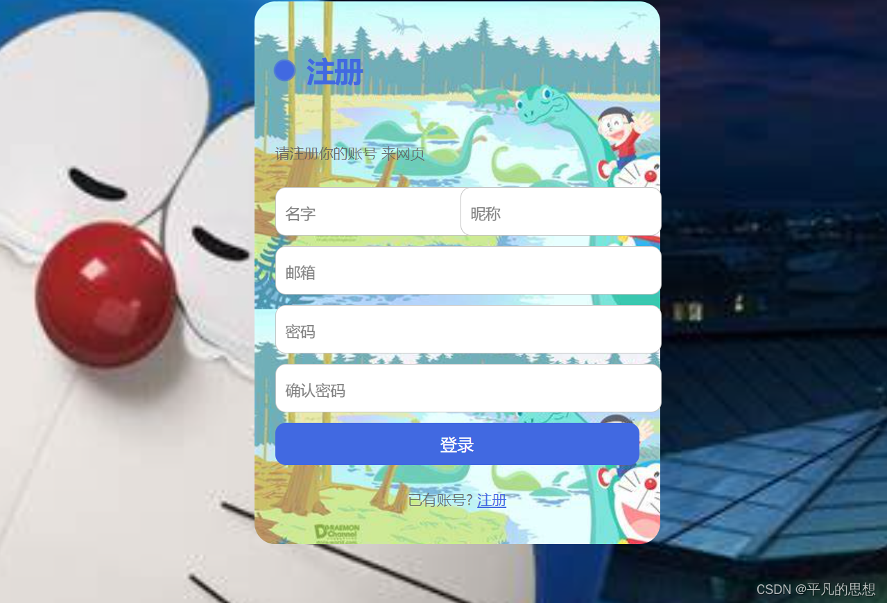
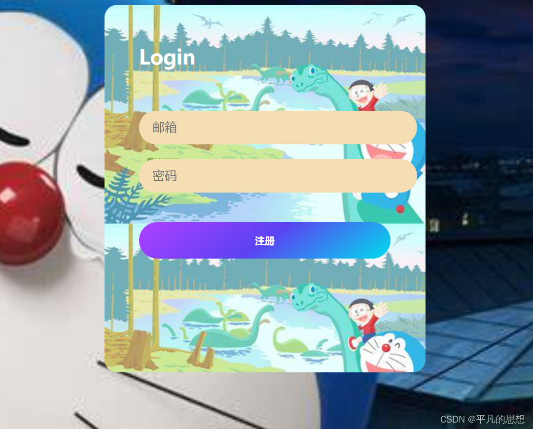
三、效果图
四、实现代码
  body{
            background-image: url(./image/1.jpg);
            background-repeat: no-repeat;
            background-size: cover;
        }
 .form {
  display: flex;
  flex-direction: column;
  gap: 10px;
  max-width: 350px;
 background-image: url(./image/4.jpg);
  padding: 20px;
  border-radius: 20px;
  position: relative;
  margin: auto;
}

.title {
  font-size: 28px;
  color: royalblue;
  font-weight: 600;
  letter-spacing: -1px;
  position: relative;
  display: flex;
  align-items: center;
  padding-left: 30px;
}

.title::before,.title::after {
  position: absolute;
  content: "";
  height: 16px;
  width: 16px;
  border-radius: 50%;
  left: 0px;
  background-color: royalblue;
}

.title::before {
  width: 18px;
  height: 18px;
  background-color: royalblue;
}

.title::after {
  width: 18px;
  height: 18px;
  animation: pulse 1s linear infinite;
}

.message, .signin {
  color: rgba(88, 87, 87, 0.822);
  font-size: 14px;
}

.signin {
  text-align: center;
}

.signin a {
  color: royalblue;
}

.signin a:hover {
  text-decoration: underline royalblue;
}

.flex {
  display: flex;
  width: 100%;
  gap: 6px;
}

.form label {
  position: relative;
}

.form label .input {
  width: 100%;
  padding: 10px 10px 20px 10px;
  outline: 0;
  border: 1px solid rgba(105, 105, 105, 0.397);
  border-radius: 10px;
}

.form label .input + span {
  position: absolute;
  left: 10px;
  top: 15px;
  color: grey;
  font-size: 0.9em;
  cursor: text;
  transition: 0.3s ease;
}

.form label .input:placeholder-shown + span {
  top: 15px;
  font-size: 0.9em;
}

.form label .input:focus + span,.form label .input:valid + span {
  top: 30px;
  font-size: 0.7em;
  font-weight: 600;
}

.form label .input:valid + span {
  color: green;
}

.submit {
  border: none;
  outline: none;
  background-color: royalblue;
  padding: 10px;
  border-radius: 10px;
  color: #fff;
  font-size: 16px;
  transform: .3s ease;
}

.submit:hover {
  background-color: rgb(56, 90, 194);
}

@keyframes pulse {
  from {
    transform: scale(0.9);
    opacity: 1;
  }

  to {
    transform: scale(1.8);
    opacity: 0;
  }
}
    </style>
        body{
            background-image: url(./image/1.jpg);
            background-repeat: no-repeat;
            background-size: cover;
        }
        .login {
  width: 340px;
  height: 400px;
  margin: auto;
 background-image: url(./image/4.jpg);
  padding: 47px;
  padding-bottom: 57px;
  color: #fff;
  border-radius: 17px;
  padding-bottom: 50px;
  font-size: 1.3em;
        }

.login input[type="text"],
.login input[type="password"] {
  opacity: 1;
  display: block;
  border: none;
  outline: none;
  width: 100%;
  padding: 13px 18px;
  margin: 20px 0 0 0;
  font-size: 0.8em;
  border-radius: 100px;
  background: wheat;
  color: #fff;
}

.login input:focus {
  animation: bounce 1s;
  -webkit-appearance: none;
}

.login input[type=submit],
.login input[type=button],
.h1 {
  border: 0;
  outline: 0;
  width: 100%;
  padding: 13px;
  margin: 40px 0 0 0;
  border-radius: 500px;
  font-weight: 600;
  animation: bounce2 1.6s;
}

.h1 {
  padding: 0;
  position: relative;
  top: -35px;
  display: block;
  margin-bottom: -0px;
  font-size: 1.3em;
}

.btn {
  background: linear-gradient(144deg, #af40ff, #5b42f3 50%, #00ddeb);
  color: #fff;
  padding: 16px !important;
}

.btn:hover {
  background: linear-gradient(144deg, #1e1e1e , 20%,#1e1e1e 50%,#1e1e1e );
  color: rgb(255, 255, 255);
  padding: 16px !important;
  cursor: pointer;
  transition: all 0.4s ease;
}

.login input[type=text] {
  animation: bounce 1s;
  -webkit-appearance: none;
}

.login input[type=password] {
  animation: bounce1 1.3s;
}

.ui {
  font-weight: bolder;
  background: -webkit-linear-gradient(#B563FF, #535EFC, #0EC8EE);
  -webkit-background-clip: text;
  -webkit-text-fill-color: transparent;
  border-bottom: 4px solid transparent;
  border-image: linear-gradient(0.25turn, #535EFC, #0EC8EE, #0EC8EE);
  border-image-slice: 1;
  display: inline;
}

@media only screen and (max-width: 600px) {
  .login {
    width: 70%;
    padding: 3em;
  }
}

@keyframes bounce {
  0% {
    transform: translateY(-250px);
    opacity: 0;
  }
}

@keyframes bounce1 {
  0% {
    opacity: 0;
  }

  40% {
    transform: translateY(-100px);
    opacity: 0;
  }
}

@keyframes bounce2 {
  0% {
    opacity: 0;
  }

  70% {
    transform: translateY(-20px);
    opacity: 0;
  }
}
    </style>
总结
今天记录到这里了,需要完整代码 自取。


 被折叠的 条评论
为什么被折叠?
被折叠的 条评论
为什么被折叠?
 到【灌水乐园】发言


