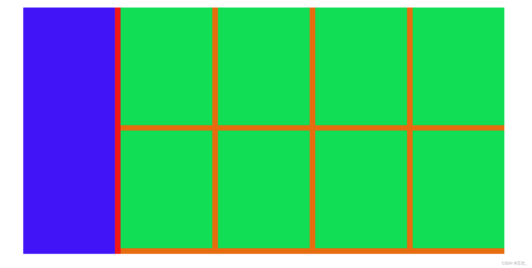
1.浮动
<!DOCTYPE html>
<html lang="en">
<head>
    <meta charset="UTF-8">
    <meta http-equiv="X-UA-Compatible" content="IE=edge">
    <meta name="viewport" content="width=device-width, initial-scale=1.0">
    <title>Document</title>
    <style>
        /* CSS书写顺序
          1.定位 2.浮动/display: 3.盒子模型:margin border padding  宽高背景 4.文字样式 */


        /* 顶对齐;让块级元素在一行显示(具备行内块特点);父级宽度不够子级会换行;浮动的盒子会脱离标准流*/
        *{
            margin: 0;
            padding: 0;
        }
        li{
            list-style: none;
        }
        .product{
            margin: 50px auto;
            width: 1226px;
            height: 628px;
            background-color: #f11717;

        }
        .left{
            margin-right: 14px;
            width: 234px;
            height: 628px;
            background-color: #4114f7;
            float: left;
        }
        .right{
            width: 978px;
            height: 628px;
            background-color: #e66c0f;
            float: left;
        }
        .right li{
            float: left;
            margin-right: 14px;
            margin-bottom: 14px;
            width: 234px;
            height: 300px;
            background-color: #11dd55;
        }
        .right li:nth-child(4n){
            margin-right: 0;
        }

    </style>
</head>
<body>
    <!-- 标准流:默认的显示模式 -->
    <!-- 浮动本质作用是实现图文混排效果 -->
    <div class="product">
        <div class="left"></div>
        <div class="right">
            <ul>
                <li></li>
                <li></li>
                <li></li>
                <li></li>
                <li></li>
                <li></li>
                <li></li>
                <li></li>
            </ul>
        </div>
    </div>

</body>
</html>
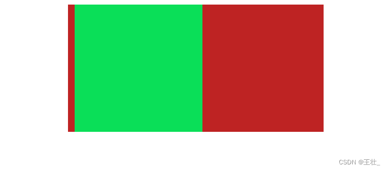
2.清除浮动
<!DOCTYPE html>
<html lang="en">
<head>
    <meta charset="UTF-8">
    <meta http-equiv="X-UA-Compatible" content="IE=edge">
    <meta name="viewport" content="width=device-width, initial-scale=1.0">
    <title>Document</title>
    <style>
        .top{
            margin: 20px auto;
            width: 400px;
            background-color: #be2323;
         /* 4.父元素加overflow:hidden--> */
            overflow: hidden;
        }
        .left{
            float: left;
            margin-left: 10px;
            width: 200px;
            height: 200px;
            background-color: #0adf58;
        }
        /* 1.额外标签法:父级内容后加clear:both */
        /* .clearfix1{
            clear: both;
        } */

        /* 2.单伪元素法 */
        /* .clearfix2::after{
            content: '';
            display: block;
            clear: both;
        } */

        /* 3.单伪元素法*/
        /* .clearfix2::before,解决外边距塌陷问题
        .clearfix2::after{
            content: '';
            display: table;
        }
        .clearfix2::after{
            clear: both;
        }  */
    </style>
</head>
<body>
    <!-- 浮动的父级没有高(子级浮动脱离标准流,不能撑开父级) -->
    <!-- 清楚浮动方法:
        1.额外标签法:父级内容最后加块级标签clear:both
        2.单伪元素法
        3.双伪元素法(推荐)
        4.浮动的父元素加overflow:hidden-->
        <div class="top clearfix2">
            <div class="left"></div>
            <div class="clearfix1"></div>
        </div>
</body>
3.结构伪类

<!DOCTYPE html>
<html lang="en">
<head>
    <meta charset="UTF-8">
    <meta http-equiv="X-UA-Compatible" content="IE=edge">
    <meta name="viewport" content="width=device-width, initial-scale=1.0">
    <title>结构选择器</title>
    <style>
        /* 第一个 */
        li:first-child{
            background-color: aqua;
        }
        /* 最后一个 */
        li:last-child{
            background-color: blue;
        }
        /* 第3个 */
        li:nth-child(3){
            background-color: brown;
        }
        /* 倒数第2个 */
        li:nth-last-child(2){
            background-color: gold;
        }
        /* 第4的倍数的 */
        li:nth-child(4n){
            background-color: #cd238f;
        }
        /* 公式(n从1开始取值):
                偶数:2n或even,
                奇数:2n+1或2n-1或odd,
                前五个:-n+5,
                第五个往后:n+5
         */

    </style>
</head>
<body>
    <ul>
        <li>这是第1个li</li>
        <li>这是第2个li</li>
        <li>这是第3个li</li>
        <li>这是第4个li</li>
        <li>这是第5个li</li>
        <li>这是第6个li</li>
        <li>这是第7个li</li>
        <li>这是第8个li</li>
    </ul>

</html>
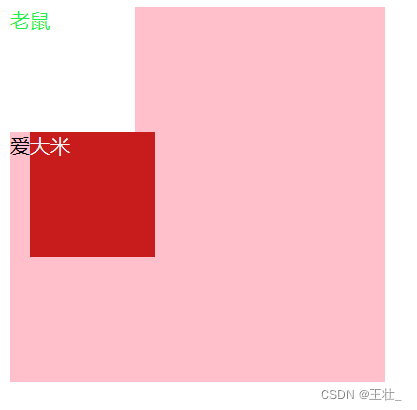
4.伪元素
<!DOCTYPE html>
<html lang="en">
<head>
    <meta charset="UTF-8">
    <meta http-equiv="X-UA-Compatible" content="IE=edge">
    <meta name="viewport" content="width=device-width, initial-scale=1.0">
    <title>伪元素</title>
    <style>
        /* 创造出来的标签(默认是行内)常用于装饰性不重要小图标 没有content不生效*/
        .father{
            width: 300px;
            height: 300px;
            background-color: pink;
        }
        .father::before{
            content: '老鼠';
            color: #1ff246;
            width: 100px;
            height: 100px;
            background-color: #fff;
            display: block;
        }
        .father::after{
            content: '大米';
            color: #f4f4f6;
            width: 100px;
            height: 100px;
            background-color: #c81c1c;
            display: inline-block;
        }
    </style>
</head>
<body>
    <div class="father">爱</div>
</body>
</html>
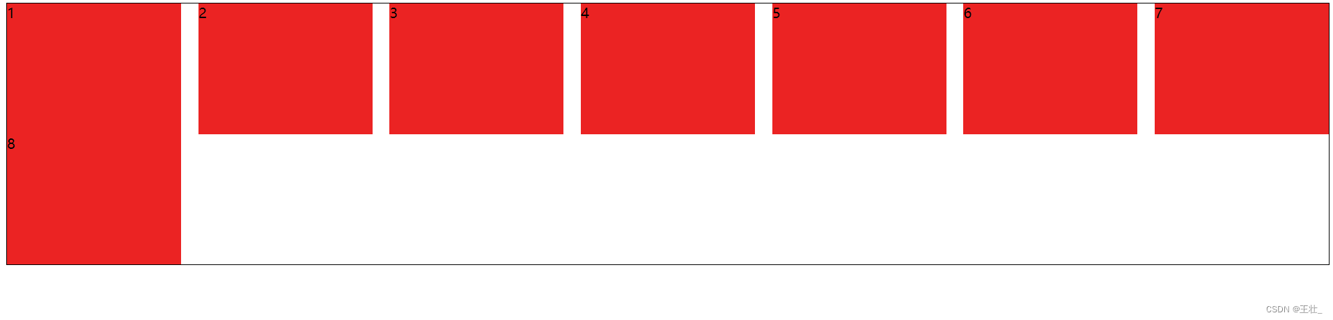
5.Flex布局
<!DOCTYPE html>
<html lang="en">
<head>
    <meta charset="UTF-8">
    <meta http-equiv="X-UA-Compatible" content="IE=edge">
    <meta name="viewport" content="width=device-width, initial-scale=1.0">
    <title>Flex布局</title>
    <style>
        /* 父级加display:flex */
        /* 弹性容器 */
        .box{
            display: flex;
            /* 主轴对齐方式 justify-content:.....*/
            /* 行对齐与主轴对齐一样align-content:..... */

            /* 均匀排列   空白间距在弹性盒子之间 */
            justify-content: space-between;
            /* 从起点开始排列
            justify-content: flex-start;
            /* 从终点开始排列 */
            /* justify-content: flex-end; */

            /* 常用 */
            /* 居中 */
            /* justify-content: center; */
            /* 均匀排列   空白间距在弹性盒子两侧 */
            /* justify-content: space-around; */
            /* 均匀排列   弹性盒子与容器之间间距相等 */
            /* justify-content: space-evenly;  */

            /*  侧轴对齐方式  所有弹性盒子align-items,某个弹性盒子align-self*/
            /* 常用 */
            /* 弹性盒子侧轴方向没有尺寸(默认拉伸)-拉伸铺满 */
            align-items: stretch;
            /* 居中 */
            /* align-items: center; */

            /* 不常用 */
            /* align-items: flex-start; */
            /* align-items: flex-end; */

            /* 修改主轴方向为垂直方向 */
            /* flex-direction: column; */

            /* 一行不够时自动换行 */
            flex-wrap: wrap;


            height: 300px;
            border: 1px solid #000;
        }
        /* 弹性盒子:沿着主轴方向排列 */
        .box div {
            /* float: left;
            margin: 50px; */
            width: 200px;
             /* 弹性盒子伸缩比--占父级剩余尺寸的份数 */
             /* flex: 1; */

            background-color: #eb2323;
        }
    </style>
</head>
<body>
    <div class="box">
        <div>1</div>
        <div>2</div>
        <div>3</div>
        <div>4</div>
        <div>5</div>
        <div>6</div>
        <div>7</div>
        <div>8</div>
    </div>
</body>
</html>
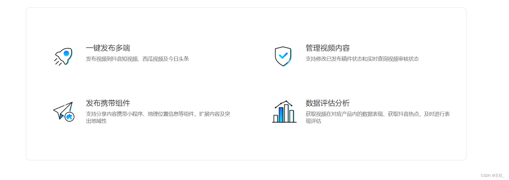
6.案例_抖音解决方案
<!DOCTYPE html>
<html lang="en">
<head>
    <meta charset="UTF-8">
    <meta http-equiv="X-UA-Compatible" content="IE=edge">
    <meta name="viewport" content="width=device-width, initial-scale=1.0">
    <title>Document</title>
    <style>
        *{
            margin: 0;
            padding: 0;
            box-sizing: border-box;
        }
        li{
            list-style: none;
        }
        .box{
            margin: 50px auto;
            border-radius: 10px;
            width: 1200px;
            height: 418px;
            border: 1px solid #ddd;
        }
        .box ul{
            display: flex;
            flex-wrap: wrap;
            justify-content: space-between;
            align-content: space-between;

            padding: 90px 40px 90px 60px;
            height: 418px;
        }
        .box li{
            display: flex;
            width: 500px;
            height: 88px;
        }
        .box .pic{
            margin-right: 15px;
        }
        .box .text h4{
            line-height: 40px;
            color:#333;
            font-size: 20px;
            font-weight: 400;
        }
        .box .text p {
            font-size: 14px;
            color: #666;
        }
    </style>
</head>
<body>
    <div class="box">
        <ul>
            <li>
                <div class="pic"><img src="./素材/1.svg" alt="1"></div>
                <div class="text">
                    <h4>一键发布多端</h4>
                    <p>发布视频到抖音短视频、西瓜视频及今日头条</p>
                </div>
            </li>
            <li><div class="pic"><img src="./素材/2.svg" alt="1"></div>
                <div class="text">
                    <h4>管理视频内容</h4>
                    <p>支持修改已发布稿件状态和实时查询视频审核状态</p>
                </div></li>
            <li><div class="pic"><img src="./素材/3.svg" alt="1"></div>
                <div class="text">
                    <h4>发布携带组件</h4>
                    <p>支持分享内容携带小程序、地理位置信息等组件,扩展内容及突出地域性</p>
                </div></li>
            <li><div class="pic"><img src="./素材/4.svg" alt="1"></div>
                <div class="text">
                    <h4>数据评估分析</h4>
                    <p>获取视频在对应产品内的数据表现、获取抖音热点,及时进行表现评估</p>
                </div></li>
        </ul>

    </div>
</body>
</html>


 240
240


 被折叠的 条评论
为什么被折叠?
被折叠的 条评论
为什么被折叠?
 到【灌水乐园】发言


