


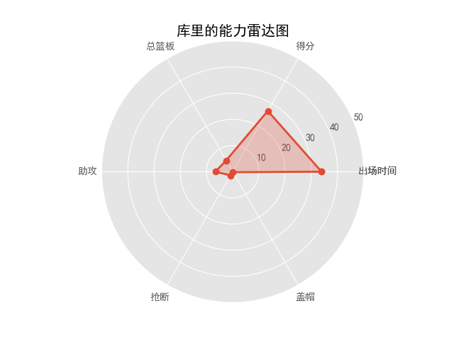
根据 库里的战绩.excel 绘制雷达图,要求选取有效赛季,即场次50场以上的赛季绘制雷达图
相关excel文件下载在这里:
我用夸克网盘分享了「库里的战绩.xlsx」,点击链接即可保存。打开「夸克APP」在线查看,支持多种文档格式转换。
链接:https://pan.quark.cn/s/7a9e9a7ed8db
接下来代码有两个版本,效果是一样的,自行阅读选取
版本一:
import numpy as np
import matplotlib.pyplot as plt
import pandas as pd

df=pd. DataFrame (pd.read_excel("GS.xlsx","Stephen Curry"))
a=df.loc[df['场次']>50]
data=a.loc[:,['时间','得分','总篮板','助攻','抢断','盖帽']]
scores = []
i=0
j=1
while i <= 5 and j<=6:
    dat=data.iloc[:,i:j]
    ave = np.mean(dat)
    scores.append(ave)
    i=i+1
    j=j+1


# 用于正常显示中文
plt.rcParams['font.sans-serif'] = 'SimHei'
# 用于正常显示符号
plt.rcParams['axes.unicode_minus'] = False

# 使用ggplot的绘图风格,这个类似于美化了,可以通过plt.style.available查看可选值,你会发现其它的风格真的丑。。。
plt.style.use('ggplot')

# 在下面放入你得到的数据!!!!
values = [scores[0],scores[1], scores[2], scores[3], scores[4],scores[5]]
feature = ['出场时间','得分','篮板','助攻','抢断','盖帽数据']

# 设置每个数据点的显示位置,在雷达图上用角度表示
angles = np.linspace(0, 2 * np.pi, len(values), endpoint=False)

# 拼接数据首尾,使图形中线条封闭
values = np.concatenate((values, [values[0]]))
angles = np.concatenate((angles, [angles[0]]))
feature=np.concatenate((feature,[feature[0]]))
# 绘图
fig = plt.figure()
# 设置为极坐标格式
ax = fig.add_subplot(111, polar=True)
# 绘制折线图
ax.plot(angles, values, 'o-', linewidth=2)
# 填充颜色
ax.fill(angles, values, alpha=0.25)

# 设置图标上的角度划分刻度,为每个数据点处添加标签
ax.set_thetagrids(angles * 180 / np.pi, feature)

# 设置雷达图的范围
ax.set_ylim(0, 50)
# 添加标题
plt.title('库里的能力雷达图')
# 添加网格线
ax.grid(True)

plt.show()
版本二:
import matplotlib.pyplot as plt
import pandas as pd
import numpy as np
#这里是在读取excel表格
file_name = 'D:\desktop\dazuoye\dazuoye4\库里的战绩.xlsx'
pd.read_excel(file_name)
f = open(file_name, 'rb')
df = pd.read_excel(f, sheet_name='Stephen Curry')

#接下来获取行数
n=df.shape[0]
#下面选取特定要求的数据:
i=0
m=0
skip=[]
while i<n:
    b = df.iloc[i, 1]
    if b<50:
        i=i+1
        skip.append(i)
    else:
        i=i+1
        m=m+1
#这里用iloc函数选取具体某个单元格的数据,‘i’是整数的意思


#指定要读取的列和不读取的行
df_use_skip = pd.read_excel('D:\desktop\dazuoye\dazuoye4\库里的战绩.xlsx',header=0,
                            usecols=[0,3,4,12,13,16,17], skiprows=skip)
print(df_use_skip)
#下面为雷达图写入数据
feature = ['出场时间','得分','总篮板','助攻','抢断','盖帽']
values = []
i=1
while i<7:
    a=np.mean(df_use_skip.iloc[0:,i:i+1])
    values.append(a)
    i=i+1

f.close()  # 没有使用with的话,记得要手动释放。

# 用于正常显示中文
plt.rcParams['font.sans-serif'] = 'SimHei'
# 用于正常显示符号
plt.rcParams['axes.unicode_minus'] = False

# 使用ggplot的绘图风格,这个类似于美化了,可以通过plt.style.available查看可选值,你会发现其它的风格真的丑。。。
plt.style.use('ggplot')


# 设置每个数据点的显示位置,在雷达图上用角度表示
angles = np.linspace(0, 2 * np.pi, len(values), endpoint=False)

# 拼接数据首尾,使图形中线条封闭
values = np.concatenate((values, [values[0]]))
angles = np.concatenate((angles, [angles[0]]))
feature=np.concatenate((feature,[feature[0]]))
# 绘图
fig = plt.figure()
# 设置为极坐标格式
ax = fig.add_subplot(111, polar=True)
# 绘制折线图
ax.plot(angles, values, 'o-', linewidth=2)
# 填充颜色
ax.fill(angles, values, alpha=0.25)

# 设置图标上的角度划分刻度,为每个数据点处添加标签
ax.set_thetagrids(angles * 180 / np.pi, feature)

# 设置雷达图的范围
ax.set_ylim(0, 50)
# 添加标题
plt.title('库里的能力雷达图')
# 添加网格线
ax.grid(True)

plt.show()
运行效果:


 1871
1871


 被折叠的 条评论
为什么被折叠?
被折叠的 条评论
为什么被折叠?
 到【灌水乐园】发言


