


- 标准文档流
标准文档流,指的是元素排版布局过程中,元素会默认自动从左往右,从上往下的流式排列方式。前面内容发生了变化,后面的内容位置也会随着发生变化。HTML就是一种标准文档流文件。HTML中的标准文档流特点通过两种方式体现:微观现象和元素等级。
块级元素:独占一行
行级元素:不独占一行
行内元素可以被包含在块级元素中,反之则不可以 - display
<!DOCTYPE html>
<html lang="en">
<head>
<meta charset="UTF-8">
<title>Title</title>
<style>
div{
width: 100px;
height: 100px;
border: 1px solid red;
display: inline;
}
span{
width: 100px;
height: 100px;
border: 1px solid red;
display: inline-block;/*block块元素 inline行内元素 inline-block既保持块元素的特性也能写在一行*/
}
</style>
</head>
<body>
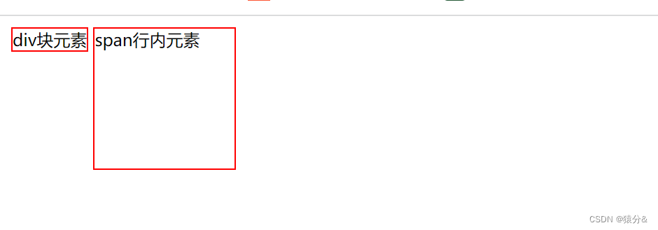
<div>div块元素</div>
<span>span行内元素</span>
</body>
</html>
这也是一种实现行内元素排列的方式,但是我们很多情况都是用float
- 浮动
向右浮动
float: right;
向左浮动
float: left;
清除周围两边浮动
clear: both;
- overflow及边框塌陷问题
4.1 增加父级元素的高度(不建议)
弊端:元素假设有了固定高度,就会被限制
4.2 增加一个空的div,然后清除浮动
弊端:代码中尽量避免空div
4.3 overflow: hidden;假如父级没有指定高度,那么高度就由内容决定,该方法可以避免他塌陷
弊端:有些不适合切除的地方不适合使用
<!DOCTYPE html>
<html lang="en">
<head>
<meta charset="UTF-8">
<title>Title</title>
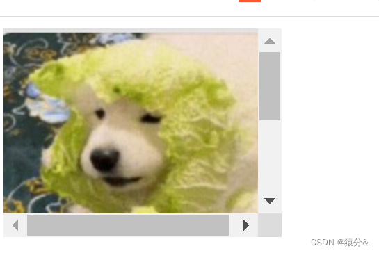
<!--overflow: hidden;超出隐藏
overflow: scroll;超出出现滚动条
-->
<style>
#content{
width: 200px;
height: 150px;
overflow: scroll;
}
</style>
</head>
<body>
<div id="content">
<img src="images/dog.jpg" alt="">
<p>
哈哈哈哈哈哈哈哈哈哈哈哈哈哈哈哈哈哈哈哈哈哈哈哈哈哈哈哈哈哈哈哈哈哈
</p>
</div>
</body>
</html>
4.4 父类添加一个伪类 :after(推荐,常考)
#father:after{
    content: '';
    display: block;
    clear: both;
}
- 对比
display:方向不可控
float:虽然方向可控,但是会脱离标准文档流,所以要解决父级边框塌陷的问题 - 定位
6.1相对定位
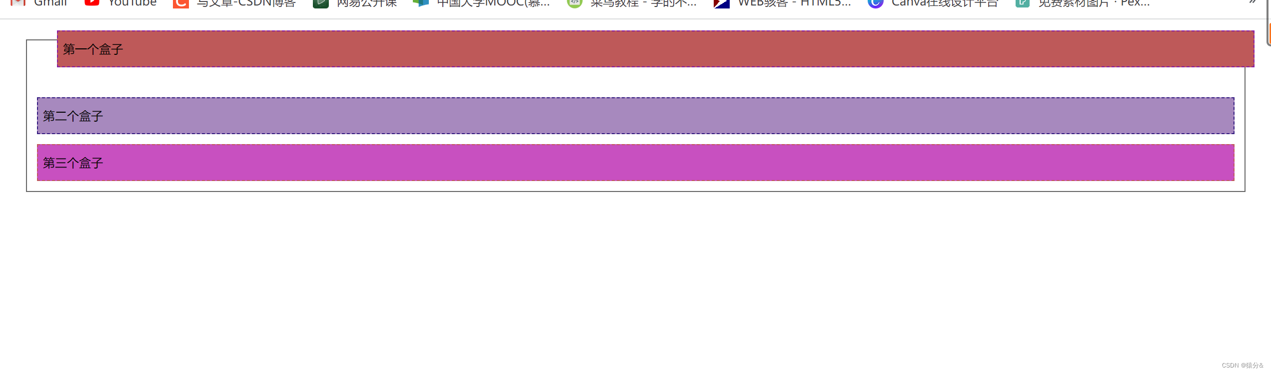
相对定位:相对于自己原来的位置进行偏移,但他仍然在标准文档流中,原来的位置会被保留
#first{
            border: 1px dashed #871aa5;
            background-color: #be5959;
            position: relative;/*相对定位:上下左右*/
            top: -20px;/*距离上面-20即:上移*/
            left: 20px;/*距离左边+20即:右移*/
        }
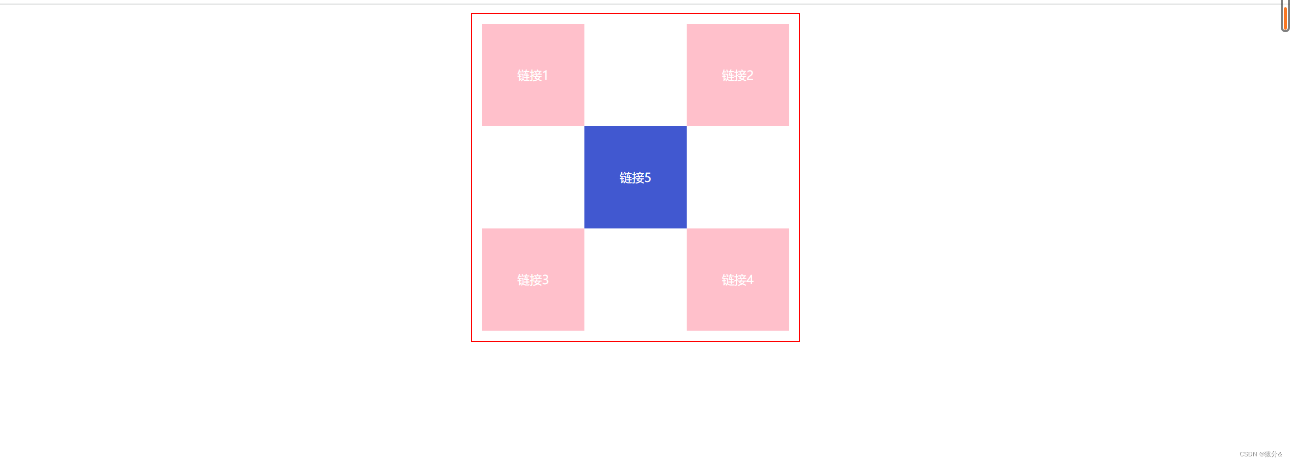
练习题:
<!DOCTYPE html>
<html lang="en">
<head>
    <meta charset="UTF-8">
    <title>Title</title>

    <style>
        #first,#second,#third,#fourth,#fifth{
            margin: 0px;
            padding: 0px;
            width: 100px;
            height: 100px;
            background: pink;
            font-size: 12px;
            text-align: center;
            line-height: 100px;
        }
        a{
            text-decoration: none;
            color: white;

        }

        /*div块级元素悬停变色连接使用*/
        div#first:hover,#second:hover,#third:hover,#fourth:hover,#fifth:hover{
            background-color: #4158D0;
        }
        #father{
            width: 300px;
            height: 300px;
            border: 1px solid red;
            margin: 0 auto;
            padding: 10px;
        }
        #first{

        }
        #second{
            position: relative;
            left:200px;
            top: -100px;
        }
        #third{

        }
        #fourth{
            position: relative;
            left:200px;
            top: -100px;
        }
        #fifth{
            position: relative;
            left:100px;
            top: -300px;
        }


    </style>

</head>
<body>
<div id="father">
    <div id="first"><a href="">链接1</a></div>
    <div id="second"><a href="">链接2</a></div>
    <div id="third"><a href="">链接3</a></div>
    <div id="fourth"><a href="">链接4</a></div>
    <div id="fifth"><a href="">链接5</a></div>
</div>
</body>
</html>
6.2绝对定位
定位:基于xxx定位,上下左右
6.2.1没有父级元素定位的前提下,相对于浏览器定位;
6.2.2父级元素存在定位,比如给父级加一个position: relative;,即父级元素存在定位,那就会相对父级元素定位;
绝对定位:相对于父级或浏览器的位置进行偏移,绝对定位不在标准文档流中,原来的位置不会被保留
6.2.3在父级元素范围内移动
6.3固定定位position: fixed;
固定定位永远都会相对于浏览器窗口进行定位 ,固定定位会固定在浏览器窗口某个位置,不会随滚动条滚动,IE6不支持固定定位
<!DOCTYPE html>
<html lang="en">
<head>
    <meta charset="UTF-8">
    <title>Title</title>
    <style>
        body{
            height: 1000px;
        }
        div:nth-of-type(1){
            width: 100px;
            height: 100px;
            background: red;
            position: absolute;
            right: 0;
            bottom: 0;
        }

        /*position: fixed;固定定位*/
        div:nth-of-type(2){
            width: 50px;
            height: 50px;
            background: yellow;
            position: fixed;
            right: 0;
            bottom: 0;
        }
    </style>

</head>
<body>
<div>div1</div>
<div>div2</div>
</body>
</html>
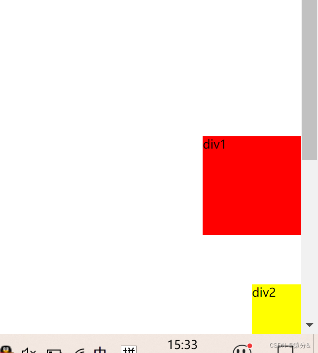
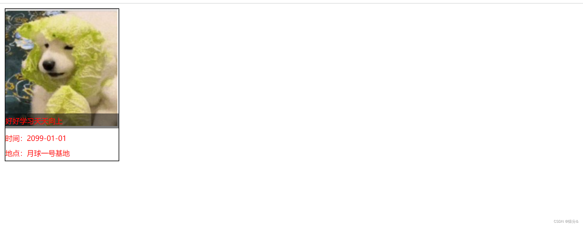
6.4层级 z-index,最底下是0层,然后是1层
<!DOCTYPE html>
<html lang="en">
<head>
    <meta charset="UTF-8">
    <title>Title</title>
</head>
<link rel="stylesheet" href="style.css">
<body>
<div id="content">
    <ul>
        <li><img src="images/dog.jpg" alt="">
        </li>
        <li class="tipText">好好学习天天向上</li>
        <li class="tipBg"></li>
        <li>时间:2099-01-01</li>
        <li>地点:月球一号基地</li>
    </ul>
</div>
</body>
</html>
#content{
    width: 190px;
    margin: 0;
    padding:0;
    overflow: hidden;
    font-size: 12px;
    line-height: 25px;
    border: 1px solid black;
}
ul,li{
    padding: 0;
    margin: 0;
    list-style: none;
    color: red;
}
/*父级元素相对定位*/
#content ul{
    position: relative;
}
.tipText,.tipBg{
    position: absolute;
    width: 190px;
    height: 25px;
    top: 175px;
}
.tipText{
    z-index: 999;
}
.tipBg{
    background: black;
    opacity: 0.5;/*背景透明度*/
    filter: alpha(opacity=50);/*部分浏览器支持该属性*/
}


 218
218


 被折叠的 条评论
为什么被折叠?
被折叠的 条评论
为什么被折叠?
 到【灌水乐园】发言


