


一、
1、matplotlib简单应用
matplotlib模块依赖于numpy模块和tkinter模块,可以绘制多种形式的图形,包括线图、直方图、饼状图、散点图、误差线图等等
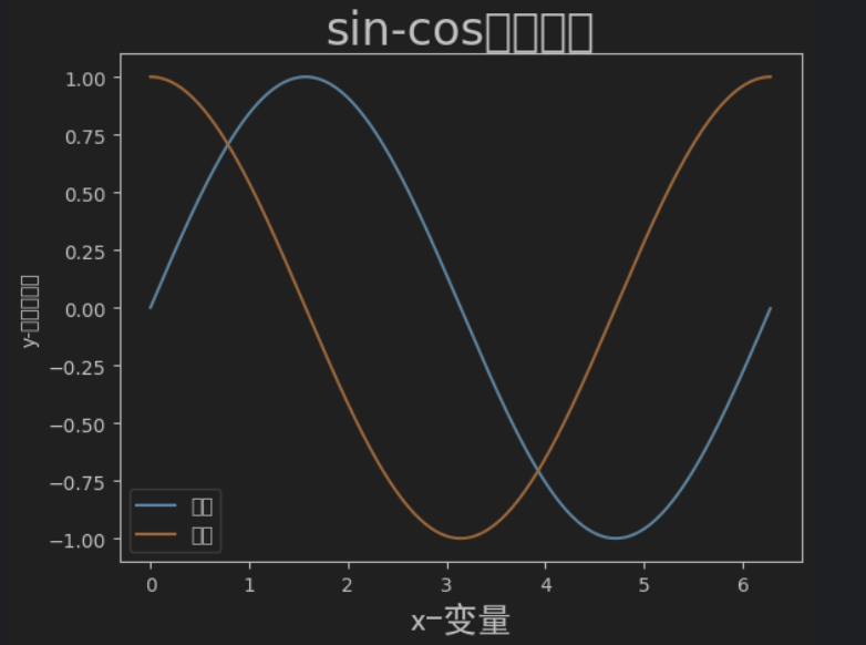
1.1、绘制带有中文标签和图例的图
import numpy as np
import matplotlib.pylab as pl
x = np.arange(0.0, 2.0*np.pi, 0.01)  # 自变量取值范围
y_sin = np.sin(x)
y_cos = np.cos(x)
pl.plot(x, y_sin, label='正弦')
pl.plot(x, y_cos, label='余弦')
pl.xlabel('x-变量', fontproperties='simhei', fontsize=18)  # 设置x标签
pl.ylabel('y-正弦余弦值')
pl.title('sin-cos函数图像', fontsize=24) # 标题
pl.legend()    # 设置图例
pl.show()
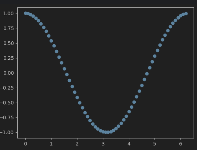
1.2、 绘制散点图
a=np.arange(0,2.0*np.pi,0.1)
b=np.cos(a)
pl.scatter(a,b)
pl.show()
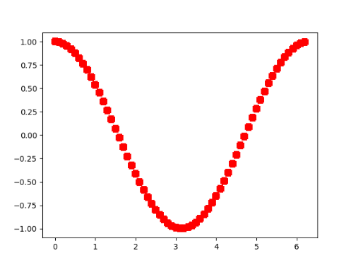
修改散点符号与大小/线宽/颜色
a=np.arange(0,2.0*np.pi,0.1)
b=np.cos(a)
pl.scatter(a,b,s=50,linewidths=10,c='red',marker='+')
pl.show()
import matplotlib.pylab as pl
import numpy as np
x = np.random.random(100)
y = np.random.random(100)
pl.scatter(x,y,s=x*500,c=u'r',marker=u'*')
# s指大小,c指颜色,marker指符号形状
pl.show()

1.3、绘制饼状图
import numpy as np
import matplotlib.pyplot as plt
labels = 'Frogs', 'Hogs', 'Dogs', 'Logs'
colors = ['yellowgreen', 'gold', '#FF0000', 'lightcoral']
explode = (0, 0.1, 0, 0.1)              # 使饼状图中第2片和第4片裂开

fig = plt.figure()
ax = fig.gca()
ax.pie(np.random.random(4), explode=explode, labels=labels, colors=colors,
       autopct='%1.1f%%', shadow=True, startangle=90,
       radius=0.25, center=(0, 0), frame=True)   # autopct设置饼内百分比的格式
ax.pie(np.random.random(4), explode=explode, labels=labels, colors=colors,
       autopct='%1.1f%%', shadow=True, startangle=45,
       radius=0.25, center=(1, 1), frame=True)
ax.pie(np.random.random(4), explode=explode, labels=labels, colors=colors,
       autopct='%1.1f%%', shadow=True, startangle=90,
       radius=0.25, center=(0, 1), frame=True)
ax.pie(np.random.random(4), explode=explode, labels=labels, colors=colors,
       autopct='%1.2f%%', shadow=False, startangle=135,
       radius=0.35, center=(1, 0), frame=True)

ax.set_xticks([0, 1])                    # 设置坐标轴刻度
ax.set_yticks([0, 1])

ax.set_xticklabels(["Sunny", "Cloudy"])  # 设置坐标轴刻度上的标签
ax.set_yticklabels(["Dry", "Rainy"])

ax.set_xlim((-0.5, 1.5))                 # 设置坐标轴跨度
ax.set_ylim((-0.5, 1.5))

ax.set_aspect('equal')                   # 设置纵横比相等

plt.show()

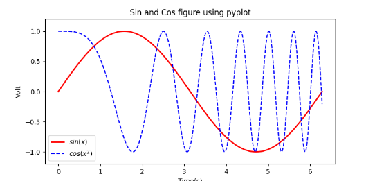
1.4、多个图形一起显示
import numpy as np
import matplotlib.pyplot as plt
x = np.linspace(0, 2*np.pi, 500)
y = np.sin(x)
z = np.cos(x*x)
plt.figure(figsize=(8,4))
# 标签前后加$将使用内嵌的LaTex引擎将其显示为公式
plt.plot(x,y,label='$sin(x)$',color='red',linewidth=2)   # 红色,2个像素宽
plt.plot(x,z,'b--',label='$cos(x^2)$')                            # 蓝色,虚线
plt.xlabel('Time(s)')
plt.ylabel('Volt')
plt.title('Sin and Cos figure using pyplot')
plt.ylim(-1.2,1.2)
plt.legend()                                                                 # 显示图例
plt.show()                                                                   # 显示绘图窗口
import numpy as np
import matplotlib.pyplot as plt
x= np.linspace(0, 2*np.pi, 500) # 创建自变量数组
y1 = np.sin(x) # 创建函数值数组
y2 = np.cos(x)
y3 = np.sin(x*x)
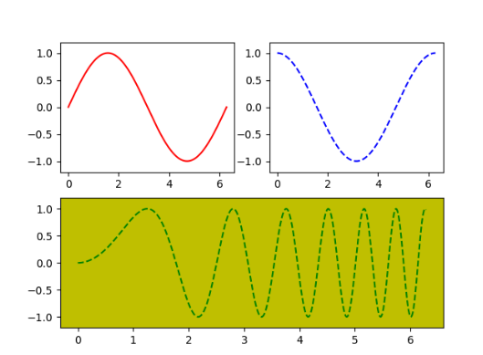
plt.figure(1) # 创建图形
ax1 = plt.subplot(2,2,1) # 第一行第一列图形
ax2 = plt.subplot(2,2,2) # 第一行第二列图形
ax3 = plt.subplot(212, facecolor='y') # 第二行
plt.sca(ax1) # 选择ax1
plt.plot(x,y1,color='red') # 绘制红色曲线
plt.ylim(-1.2,1.2) # 限制y坐标轴范围
plt.sca(ax2) # 选择ax2
plt.plot(x,y2,'b--') # 绘制蓝色曲线
plt.ylim(-1.2,1.2)
plt.sca(ax3) # 选择ax3
plt.plot(x,y3,'g--')
plt.ylim(-1.2,1.2)
plt.show()


 327
327


 被折叠的 条评论
为什么被折叠?
被折叠的 条评论
为什么被折叠?
 到【灌水乐园】发言


