


利用css样式表做一个旋转写轮眼
成品效果图
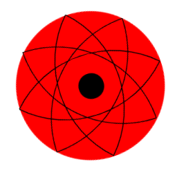
首先分析效果图
图中有红色背景圈和里面的三个椭圆和最中心的黑圈组成。
因此,我们应该写一个大的div盒子,来装这三个椭圆div,里面的三个椭圆div和圆的画法类似。
可以用以下代码实现:
        width: 200px;
        height: 200px;
        border-radius:100% 0% 100% 0%;
        border: black 2px solid;
注意:
这里除了两个斜着的椭圆div,还需要画一个竖着的椭圆div,我们可以利用图形的变形操作,将椭圆沿着Z轴旋转45度。
**用以下代码实现**
transform: rotateZ(45deg);
关键帧动画写旋转动画
首先写剧本,写每个时间段图片的旋转位置,然后在需要旋转的div下导入这个剧本
代码如下
写剧本代码
@keyframes xly{
        0%{
            transform: rotate(0deg);
        }
        100%{
            transform: rotate(360deg);
        }
    }
    导入剧本代码
            animation: xly 2s linear infinite;
整个程序的代码如下
在这里插入代码片
<!DOCTYPE html>
<html lang="en">
<head>
    <meta charset="UTF-8">
    <meta name="viewport" content="width=device-width, initial-scale=1.0">
    <title>Document</title>
</head>
<style>
        .father{
        margin: 100px auto;
        width: 283px;
        border-radius: 50%;
        background-color: red;
        border: 2px solid red;
        height: 283px;
        position: relative;
        animation: xly 2s linear infinite;
    }
    .father:hover{
            animation-play-state: paused;
        }
    .son1{
        width: 200px;
        height: 200px;
        border-radius:100% 0% 100% 0%;
        border: black 2px solid;
        margin: 0 auto;
        position: absolute;
        left: 40px;
        top: 40px;

    }
    .son2{
        width: 200px;
        height: 200px;
        border-radius:0% 100% 0% 100%;
        border: black 2px solid;
        margin: 0 auto;
        position: absolute;
        left: 40px;
        top: 40px;
    }
    .son3{
        width: 200px;
        height: 200px;
        border-radius:100% 0% 100% 0%;
        border: black 2px solid;
        transform: rotateZ(45deg);
        margin: 0 auto;
        position: absolute;
        left: 40px;
        top: 40px;
    }
    .son4{
        width: 200px;
        height: 200px;
        border-radius:0% 100% 0% 100%;
        border: black 2px solid;
        transform: rotateZ(45deg);
        margin: 0 auto;
        position: absolute;
        left: 40px;
        top: 40px;
    }
    .son5{
        width: 50px;
        height: 50px;
        background-color: black;
        border-radius: 50%;
        position: absolute;
        left: 115px;
        top: 115px;
    }
    @keyframes xly{
        0%{
            transform: rotate(0deg);
        }
        100%{
            transform: rotate(360deg);
        }
    }
</style>
<body>
    <div class="father">
        <div class="son1"></div>
        <div class="son2"></div>
        <div class="son3"></div>
        <div class="son4"></div>
        <div class="son5"></div>
    </div>
</body>
</html>


 扫一扫
扫一扫


 被折叠的 条评论
为什么被折叠?
被折叠的 条评论
为什么被折叠?
 到【灌水乐园】发言


