


一. 回顾
1.1 position 定位
CSS position 属性用于指定元素在页面中的定位方式,top 与 bottom,left 和 right 四个属性用于确定元素在页面中的具体位置。
position 的属性值有五个,分别是: static,relative ,absolute ,fixed ,sticky
static: 该关键字指定元素的正常布局行为,并且他不受 top ,bottom,left,right 的影响,一般被称为静态定位。
relative: 相对定位元素的定位是相对其 没有添加 position 属性的 位置。
absoult: 绝对定位的元素的位置相对于最近的已定位父元素,如果元素没有已定位的父元素,那么它的位置相对于 html 元素进行定位
fixed: 元素的位置相对于浏览器窗口是固定位置,即使窗口是滚动的它也不会移动
sticky:基于用户的滚动位置来定位,通俗的来说就是根据整个页面的高度和宽度定位的,会随着窗口的滚动而变化。
1.2 块级元素的宽度和高度
宽度:是指块级元素内容区、左右内边距、左右边框和左右外边距的宽度之和
高度: 块级元素的高度不会自动填充,需要手动通过 padding ,margin 或者 height 设置
1.2 代码演示
<!DOCTYPE html>
<html lang="en">
<head>
    <meta charset="UTF-8">
    <meta name="viewport" content="width=device-width, initial-scale=1.0">
    <title>测试</title>

    <!-- css 样式 -->
    <style>
        .outer-box{
            height: 100px;
            width: 100px;
            border: 1px solid black;
            margin: auto;
            padding: 10px;
        }
    </style>
</head>
<body>
    <!-- 父文件 外部盒子:outer-box -->
    <div class="outer-box">


    </div>
</body>
</html>
1.2 代码演示结果
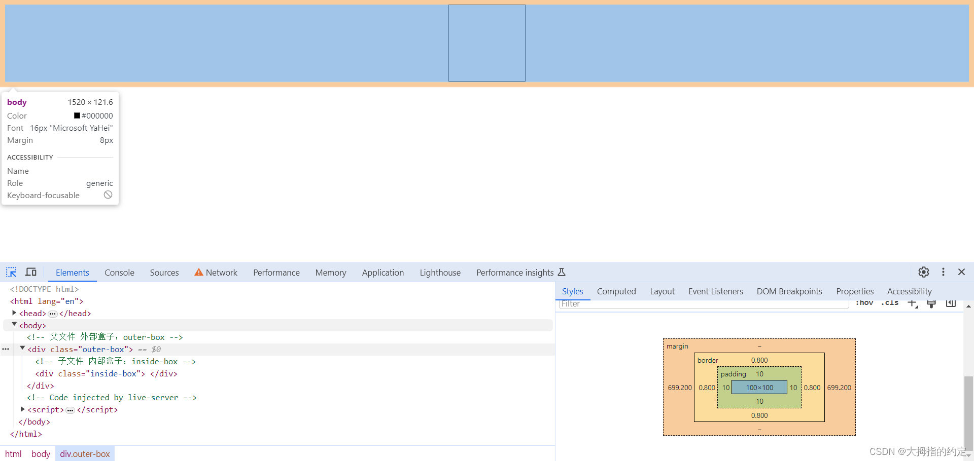
从 1.2代码演示结果 可以看出,块级标签的宽度可以被 margin 标签拉长,也可以被 padding 标签设置。而块级标签的高度只能被设置,不能 margin 标签被拉长。
二. position:absoult 简单技巧
2.1 设置绝对定位后距离四个方向的优先级
在平面坐标轴上定位一点只需要 x 的数据 和 y 的数据,所以平时我们我们早使用绝对定位的时候一般只使用 left 和 top,或者是 bottom 和 rigtht . 所以很多人都不知道,top 的优先级是比 bottom 较高的,left 的优先级是比 right 高的。
证明 top 的优先级比 bottom 高,证明过程如下:
2.1 优先级证明代码(1)
<!DOCTYPE html>
<html lang="en">
<head>
    <meta charset="UTF-8">
    <meta name="viewport" content="width=device-width, initial-scale=1.0">
    <title>测试</title>

    <!-- css 样式 -->
    <style>
        .outer-box{
            height: 100px;
            width: 100px;
            border: 1px solid black;
            padding: 10px;

            position: absolute;

            bottom: 10px;
            top:10px;
        }
    </style>
</head>
<body>

    <div class="outer-box">


    </div>
</body>
</html>
2.1 优先级证明代码结果(1)
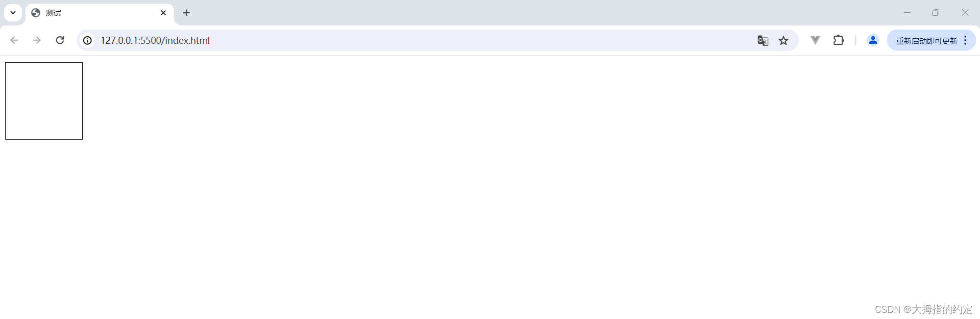
这部分是 bottom 属性先执行,top 属性后执行。
2.1 优先级证明代码(2)
<!-- 替换上面代码中的 style 标签 -->
<style>
.outer-box{
height: 100px;
width: 100px;
border: 1px solid black;
padding: 10px;
position: absolute;
top:10px;
bottom: 10px;
}
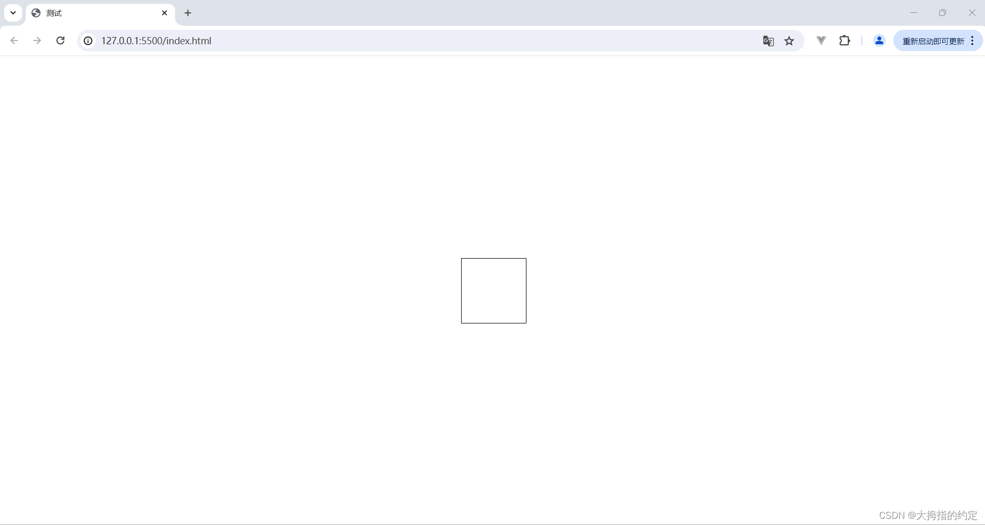
</style>2.1 优先级证明代码结果(2)

从这里可以证明出 top 的优先级高于 bottom ,也可以用同样的办法证明 left 的优先级高于 right。
这个知识点,平时不会用到,知道就好。
2.2 利用绝对定位实现 上下左右同时居中对齐。
2.2 代码展示
<!DOCTYPE html>
<html lang="en">
<head>
    <meta charset="UTF-8">
    <meta name="viewport" content="width=device-width, initial-scale=1.0">
    <title>测试</title>

    <!-- css 样式 -->
    <style>
        .outer-box{
            height: 100px;
            width: 100px;
            border: 1px solid black;


            position: absolute;
            top:0;
            right: 0;
            bottom: 0;
            left: 0;
            margin: auto;
        }
    </style>
</head>
<body>
    <!-- 父文件 外部盒子:outer-box -->
    <div class="outer-box">


    </div>
</body>
</html>
2.2 代码展示结果
此时的小方块的位置是保持绝对居中的 ,无论怎么更改浏览器页面他都会保持居中
2.2 代码展示结果(改变窗口后的结果)
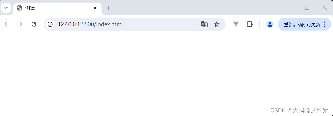
代码解释: style 标签中,四个方向的属性都为 0 ,并不是只能为 0 ,只要 top 和 bottom 相等,left 和 right 相等即可,但是四个缺一不可。
。
其实,就相当于: 强制把 四个方向的 margin 设置成了最大。从而使其强制居中。
如果能理解,这个强制居中,就可以在用 绝对定位解决很多问题。


 11万+
11万+


 被折叠的 条评论
为什么被折叠?
被折叠的 条评论
为什么被折叠?
 到【灌水乐园】发言


