


一. HTML 部分代码及代码解释
此处的三级导航栏是自己手写的,等到大家真正开发项目的时候。这些数据后端都会写好传递过来,我们写好自己的代码逻辑就好。
1.1 CSS文件 和 JavaScript 文件引入的位置
在本文中,引用 CSS 样式表 和 JavaScript 页面的时候,都在 head 标签中进行了引用。
CSS 文件可以在 HTML 页面的引用位置并没有什么明确的限制,甚至是可以在 body 标签中引入。但是为了美观,一般选择在 head 标签中进行引用。
JavaScript 文件引入一般选择在 body 标签和 html 标签中间引用,很少在其他位置引用。因为在其他位置引用会可能关于出现错误,本文在 head 标签中引用虽然没有出错,但是不推荐使用。
1.1 JavaScript 文件正常引用位置
</body>
    <!-- JavaScript 正确的引用位置 -->
    <script type="text/javascript" src="index.js"></script>

</html>
1.2 标签的解释
-
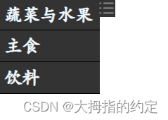
class="one" 一级导航栏
-
class="one" 二级导航栏
-
class="one" 三级导航栏
1.3 代码部分
<!DOCTYPE html>
<html lang="en">

<head>
    <meta charset="UTF-8">
    <meta name="viewport" content="width=device-width, initial-scale=1.0">
    <title>导航栏页面</title>

    <link rel="stylesheet" type="text/css" href="index.css">
    <script type="text/javascript" src="index.js"></script>
</head>

<body>

    <div class="navigator" id="vegetablesFruits">
        <div class="one" onclick="isShowVF()">
            <span>蔬菜与水果</span>
        </div>

        <div id="fruits">
            <div class="two" onclick="isShowFruit()">
                <span>水果</span>
            </div>
            <div class="three" id="fruitList">
                <ul>
                    <li><span>苹果</span></li>
                    <li><span>香蕉</span></li>
                    <li><span>橘子</span></li>
                </ul>
            </div>
        </div>

        <div id="vegetables">
            <div class="two" onclick="isShowVegetable()">
                <span>蔬菜</span>
            </div>

            <div class="three" id="vegetableList">
                <ul>
                    <li><span>胡萝卜</span></li>
                    <li><span>西红柿</span></li>
                    <li><span>西兰花</span></li>
                </ul>
            </div>
        </div>


        <div class="one" onclick="isShowFood()">
            <span>主食</span>
        </div>

        <div class="two" id="food">
            <ul>
                <li><span>大米</span></li>
                <li><span>馒头</span></li>
                <li><span>水饺</span></li>
            </ul>
        </div>


        <div class="one" onclick="isShowDrink()">
            <span>饮料</span>
        </div>

        <div class="two" id="drink">
            <ul>
                <li><span>可乐</span></li>
                <li><span>啤酒</span></li>
                <li><span>雪碧</span></li>
            </ul>
        </div>
    </div>

    <div >
        <img src="menu.png" alt="菜单图片" id="imgMenu" onclick="isShow()" >
    </div>

</body>

</html>
二. CSS 部分代码及代码解释
CSS 代码部分大家加载出来之后可能太小,但是代码实现是没问题的。如果感觉不合适的话,可以自己调动。
2.1 代码部分解释
calc() 函数 用于动态计算长度值。可以获取 <div> 元素的宽度。
height: calc(50vh); /*当前窗口高度的 50%*,动态的,会随页面的大小变动而变动*/
width: calc(25vw); /*当前窗口宽度的 25%*,动态的,会随页面的大小变动而变动*/
需要注意的是,calc() 函数中是可以有计算公式的,但是需要复合calc的规则。并且,运算符前后都需要保留一个空格,例如:
width: calc(100% - 50px)
width: calc(50% - 1em);
代码中有大量,display: none; 是为了让页面初始的时候导航栏是关闭状态。类似于下图所示:
2.2 代码部分
部分解释在代码中有标注。
body,html{
    margin: 0;
    font-family: STKaiti;   /* 字体华文新魏 */
    font-weight: bold;
    user-select: none;  /* 禁止在双次点击的时候选中文本 */
}

ul{
    margin: 0;
    padding: 0;
}

li{
    list-style-type:none;  /* 清楚 li 样式*/
}


/*------------------------------------------------------------------------------------*/
.navigator{
    width: 130px;
    height: calc(100vh); /* 设置为页面可视高度 */
    overflow-y:scroll;  /* y轴方向超出部分滑轮滚动 */
    overflow-x:hidden; /* x轴方向超出部分隐藏 */
    scrollbar-color: transparent transparent; /* 设置滑轮透明 */
    float: left;
}

.navigator .one{
    border: 1px solid black;
    height: 35px;
    line-height: 35px;
    background-color: rgba(51,51,51,1);
    color: aliceblue;
    margin: -1px;
}

.navigator .one span{
    display: inline-block;
    font-size: 20px;
    margin-left: 5px;
}

.navigator #fruits{
    display: none;
}

.navigator #fruitList{
    display: none;
}

.navigator #vegetables{
    display: none;
}

.navigator #vegetableList{
    display: none;
}

.navigator #food{
    display: none;
}

.navigator #drink{
    display: none;
}

.navigator .two{
    border: 1px solid black;
    background-color: rgba(51,51,51,0.7);
    color: aliceblue;
    margin: -1px;
}

.navigator .two li{
    height:20px;
    line-height: 20px;
    border: 1px solid black;
    margin: -1px;
}

.navigator .two span{
    margin-left: 15px;
}

.navigator .three{
    border: 1px solid black;
    background-color: rgba(51,51,51,0.4);
    color: aliceblue;
    margin: -1px;
}

.navigator .three li{
    border: 1px solid black;
    height:20px;
    line-height: 20px;
    margin: -1px;
}

.navigator .three span{
    margin-left: 20px;
}

/*------------------------------------------------------------------------------------*/

img {
    width: 20px;
    height: 20px;
    float: left;
    background-color: #333333;
    margin-left: -19px;
}
三. JS 部分代码及代码解释
3.1 代码逻辑
- 把所有的导航栏初始设置为关闭,让页面在加载导航栏在页面展示
- 通过函数来控制导航栏是否打开
- 如果打开,就改变他的判断属性,例如 displayVF = !displayVF。代码意思就是改变导航栏,当导航栏开启的时候,下一次点击关闭。
- 其中在有三级导航栏的地方,关闭一级导航,就会关闭二级和三级导航。
3.2 代码片段
// VF 是 vegetable 和 food 的缩写
// 其余都是 英语直译
// Meau 侧边栏效果

let  displayVF = false;
let  displayFood = false;
let  displayDrink = false;
let  displayVegetable = false;
let  displayFruit = false;
let  displayMenu = false;

// 蔬菜和食物展示
function isShowVF(){

    if(!displayVF){

        document.getElementById("vegetables").style.display = "block";
        document.getElementById("fruits").style.display = "block";

    }else{

        document.getElementById("vegetables").style.display = "none";
        document.getElementById("fruits").style.display = "none";

    }

    displayVF = !displayVF
    document.getElementById("fruitList").style.display = "none";
    document.getElementById("vegetableList").style.display = "none";

}

// 食物展示
function isShowFood(){

    if(!displayFood){

        document.getElementById("food").style.display = "block";

    }else{

        document.getElementById("food").style.display = "none";

    }
    displayFood = !displayFood

}

// 饮料展示
function isShowDrink(){

    if(!displayDrink){

        document.getElementById("drink").style.display = "block";

    }else{

        document.getElementById("drink").style.display = "none";

    }

    displayDrink = !displayDrink

}

// 水果展示
function isShowFruit(){

    if(!displayFruit){

        document.getElementById("fruitList").style.display = "block";

    }else{

        document.getElementById("fruitList").style.display = "none";

    }

    displayFruit = !displayFruit

}

// 蔬菜展示
function isShowVegetable(){

    if(!displayVegetable){

        document.getElementById("vegetableList").style.display = "block";

    }else{

        document.getElementById("vegetableList").style.display = "none";

    }

    displayVegetable = !displayVegetable

}

// 侧边栏按钮
function isShow(){

    if(!displayMenu){

        document.getElementById("vegetablesFruits").style.display = "none";
        document.getElementById("imgMenu").style.margin = "0"

    }else{

        document.getElementById("vegetablesFruits").style.display = "block";
        document.getElementById("imgMenu").style.margin = "0 0 0 -19px"

    }

    displayMenu = !displayMenu


}
四. 效果演示
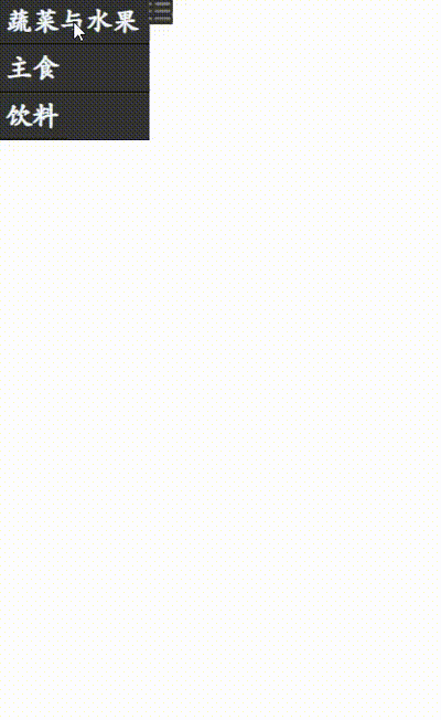
代码是可以直接复制运行的,有不懂的可以评论区直接询问。关闭和打开侧边栏,可能会和电脑显示屏大小有关系,所以 CSS 样式可以自己手动设置。


 3297
3297

 被折叠的 条评论
为什么被折叠?
被折叠的 条评论
为什么被折叠?
 到【灌水乐园】发言


