


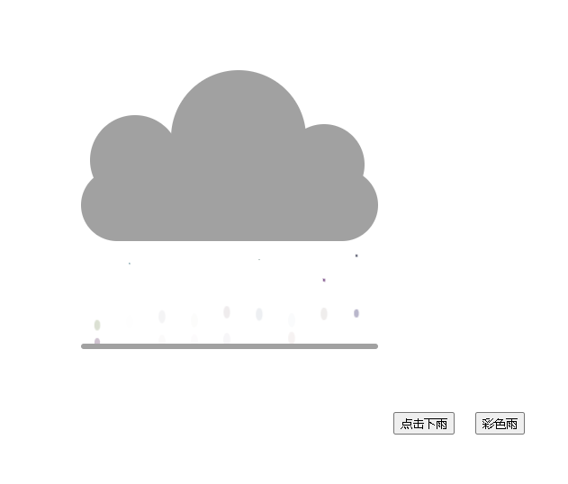
效果:
代码:
<!DOCTYPE html>
<html lang="en">
<head>
    <meta charset="UTF-8">
    <title>乌云下雨</title>
</head>
<style >
    body{
        background-color: white;
        display: flex;
    }
    .yun{
        margin: auto;
        display: flex;
        width: 100%;
        height: 100vh;

    }
    .WuYun {
        width: 330px;
        height: 80px;
        background-color: #a1a1a1;
        margin: auto;
        border-radius: 50px;
        position: relative;
    }
    .WuYun::after{
        content: '';
        width: 330px;
        height: 6px;
        border-radius: 3px;
        background-color: #a1a1a1;
        position: absolute;
        bottom: -120px;
        left: 0;
    }
    .One{
        background-color: #a1a1a1;
        border-radius: 50%;
        position: absolute;
        z-index: -1;
    }
    .One_A{
        width: 100px;
        height: 100px;
        border-color: red;
        top: -60px;
        left: 10px;
    }
    .One_B{
        width: 150px;
        height: 150px;
        border-color: #42b983;
        top: -110px;
        right: 80px;
    }
    .One_C{
        border-color: yellow;
        width: 90px;
        height: 90px;
        top: -50px;
        right: 15px;
    }
    button{
        position: absolute;
        left: 60%;
        bottom: 200px;
    }
    #but{
        left: 65%;
    }
    .WuYun span{
        width: 10px;
        height: 10px;
        background-color: black;
        display: inline-block;
        margin: 0 13px;
        z-index: 999;
        /* 动画开启 */
       animation-name:xiayu;
       /* 完成时间 */
       animation-duration:calc(var(--RanDom)*4s);
       /* 循环执行 */
       animation-iteration-count:infinite;
       /* 开始时间 */
       animation-delay:-2s;
    }
    @keyframes xiayu {
        0%{transform: translateY(54px) scale(0);border-radius: 30%;height: 10px;}

        100%{transform: translateY(160px)  scale(0.8) ;border-radius: 50%;height: 20px;opacity: 0;}
    }
</style>
<body>
<div class="yun">
    <div class="WuYun">
        <div class="One One_A"></div>
        <div class="One One_B" ></div>
        <div class="One One_C"></div>
    </div>
   <button>点击下雨</button>
   <button id="but">彩色雨</button>
</div>
</body>
<script>
  // 创建雨滴的方法
  function SetRain(){
    let i=0;
    let  MyWuYun=document.getElementsByClassName('WuYun')[0];
    for(i;i<20;i++){
      // 创建span节点
      let Span=document.createElement('span');
      Span.style=`--RanDom:${Math.random()}`;
      // 向父元素里面追加span标签
      MyWuYun.appendChild(Span);
    }
  };
  // 获取按钮下雨
  let But=document.getElementsByTagName('button'),
      Tag=true;
  // 点击下雨事件
  But[0].onclick=function(){
    if(Tag){
      SetRain()
      Tag=false;
    }else{
      return ;
    }
  };
  // 彩虹糖
  But[1].onclick=function(){
    for(let i=0;i<document.getElementsByTagName('span').length;i++){
      document.getElementsByTagName('span')[i].style.backgroundColor=`rgb(${Math.random()*100},${Math.random()*100},${Math.random()*100})`
    }
  }

</script>
</html>


 584
584


 被折叠的 条评论
为什么被折叠?
被折叠的 条评论
为什么被折叠?
 到【灌水乐园】发言


