uniapp开发微信小程序自定义tabbar

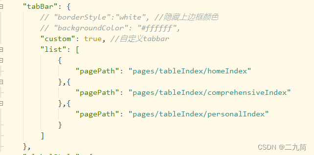
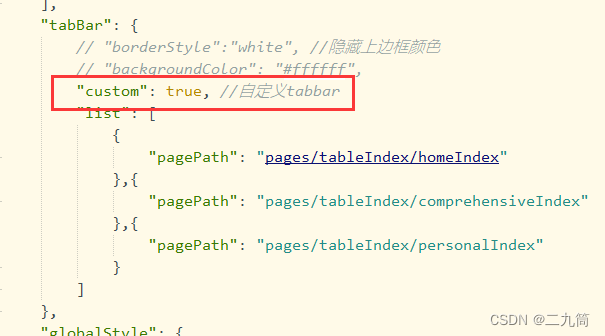
第一步:在pages.json里定义自己tabbar路径,定义的时候只需要写上页面路径即可

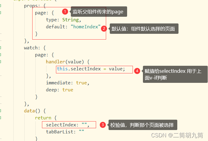
 第二步:自定义tabbar页面,为了实现点击动作的动态效果,需要用到watch监听父组件传来的值的改变

 自定义tabbar页面全部代码

<template>
	<view class="tab_bar">
		<view class="tabbarBox">
			<view class="handleBox" v-for="(item,index) in tabBarList" :key="index">
				<view class="menuBox" @click="goPages(item.pageIndex.index)">
					<view class="menuIcon">
						<image v-if="item.pageIndex.index!=selectIndex" class="img"                 :src="item.iconPath"></image>
						<image v-else class="img" :src="item.selectIconPath"></image>
					</view>
					<view class="menuName">
						<text :class="item.pageIndex.index==selectIndex?'TextColor':'Text'" >{{item.tabbarName}}</text>
					</view>
				</view>
			</view>
		</view>
		
	</view>
</template>

<script>
export default {
	props: {
		page: {
			type: String,
			default: "homeIndex"
		}
	},
	watch: {
		page: {
			handler(value) {
				this.selectIndex = value;
			},
			immediate: true,
			deep: true
		}
	},
	data() {
		return {
			selectIndex: "",
			tabBarList: "",
		}
		
	},
	//uniapp子组件不支持应用生命周期,所以只能用vue生命周期
	created() {

        //tabbar数据,这儿也支持后台定义通过接口获取数据
        this.tabBarList = [{
    			"tabbarName":"", //tababr名称
				"iconPath":"", //tabbar icon
				"selectIconPath":"", //tabbar 选择icon
				"pageIndex":"" //页面路径
            }]
		
	},methods: {
	
		
		//进入tabble页
		goPages(pageIndex) {
			uni.switchTab({
				url:pageIndex
			})
		},
		
	},
}
</script>
<style lang="scss">
.tab_bar {
	width: 100vw;
	height: 120rpx;
	position: fixed;
	bottom: 30rpx;
	/* 模糊大小就是靠的blur这个函数中的数值大小 */
	backdrop-filter: blur(10px);
	border-radius: 60rpx;
		
.tabbarBox {
	display: flex;
	margin-top: 10rpx;
	justify-content: space-evenly;
	
	
.handleBox {
	width: 20vw;
	height: 110rpx;
	

.menuBox {
	padding: 0rpx 20rpx;
	width: 120rpx;
	height: 98%;
	text-align: center;

.img {
	width: 50rpx;
	height: 50rpx;
	}
}
	}
}
	}

.Text {
	font-size: 24rpx;
	font-family: Cochin, serif;
	font-weight: 900;
}

.TextColor {
	@extend .Text;
	color: #d81e06;
}

</style>

注:该页面可以直接用组件的方式来放,因为uniapp支持easycom模式,这样比较简单,不用全局注册

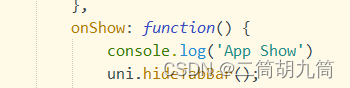
 第三步:隐藏原生tabbar,在App.vue 文件里面onshow写上 uni.hideTabbar();也可直接在pages.json中通过tabbar内custom配置项关闭默认tabbar

方式一:

方式二:

第四步:引入table页面,如果是使用了easycom规则的组件,可以直接在页面使用

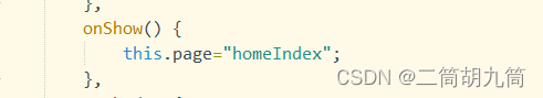
 这儿父组件页面要动态传值,就是为了告诉组件现在的停留页面,也是为了组件动态显示提供基础条件

注意:这个传值必须是动态传值,所以要放在onshow里面,当页面切换的时候就改变值
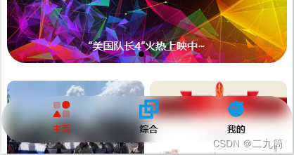
 当所有页面都引入组件后就可以查看效果了

效果图:

tabbar用的磨砂背景,看着感觉还不错

  • 4
    点赞
  • 16
    收藏
    觉得还不错? 一键收藏
  • 打赏
    打赏
  • 1
    评论
对于uniapp微信小程序,你可以通过自定义组件来实现自定义tabbar。以下是一种实现方法: 1. 在 uniapp 项目中创建一个新的自定义组件,例如 "custom-tabbar"。 2. 在 custom-tabbar 组件的文件夹中,创建一个 JSON 文件,命名为 "custom-tabbar.json"。在该文件中定义组件使用的自定义属性,例如: ```json { "component": true, "usingComponents": {} } ``` 3. 在 custom-tabbar 组件的文件夹中,创建一个 WXML 文件,命名为 "custom-tabbar.wxml"。在该文件中编写自定义tabbar的布局,例如: ```html <view class="custom-tabbar"> <!-- 自定义tabbar按钮 --> <view class="custom-tabbar-item" bindtap="navigateToPage"> <!-- 按钮图标 --> <image src="{{ activeIndex === 0 ? 'icon1-active' : 'icon1' }}"></image> <!-- 按钮文字 --> <text class="{{ activeIndex === 0 ? 'active' : '' }}">Tab1</text> </view> <view class="custom-tabbar-item" bindtap="navigateToPage"> <!-- 按钮图标 --> <image src="{{ activeIndex === 1 ? 'icon2-active' : 'icon2' }}"></image> <!-- 按钮文字 --> <text class="{{ activeIndex === 1 ? 'active' : '' }}">Tab2</text> </view> <!-- 更多按钮 --> <view class="custom-tabbar-item more" bindtap="showMoreOptions"> <!-- 更多按钮图标 --> <image src="more-icon"></image> </view> </view> ``` 4. 在 custom-tabbar 组件的文件夹中,创建一个 WXSS 文件,命名为 "custom-tabbar.wxss"。在该文件中编写自定义tabbar的样式,例如: ```css .custom-tabbar { display: flex; align-items: center; height: 50px; background-color: #fff; } .custom-tabbar-item { flex: 1; display: flex; flex-direction: column; align-items: center; justify-content: center; } .custom-tabbar-item image { width: 30px; height: 30px; } .custom-tabbar-item text { font-size: 12px; margin-top: 5px; } .custom-tabbar-item.more { position: relative; } .custom-tabbar-item.more image { width: 40px; height: 40px; } .active { color: #007aff; } ``` 5. 在需要使用自定义tabbar的页面中,引入 custom-tabbar 组件,例如: ```html <template> <view> <!-- 页面内容 --> </view> <!-- 引入自定义tabbar组件 --> <custom-tabbar></custom-tabbar> </template> <script> import customTabbar from '@/components/custom-tabbar/custom-tabbar' export default { components: { customTabbar }, // 页面逻辑代码 } </script> <style> /* 页面样式 */ </style> ``` 通过以上步骤,你就可以在uniapp微信小程序中实现自定义tabbar了。你可以根据自己的需求修改自定义tabbar的布局和样式,以及处理相应的点击事件。希望能对你有所帮助!

“相关推荐”对你有帮助么?

  • 非常没帮助
  • 没帮助
  • 一般
  • 有帮助
  • 非常有帮助
提交
评论 1
添加红包

请填写红包祝福语或标题

红包个数最小为10个

红包金额最低5元

当前余额3.43前往充值 >
需支付:10.00
成就一亿技术人!
领取后你会自动成为博主和红包主的粉丝 规则
hope_wisdom
发出的红包

打赏作者

二九筒

你的鼓励将是我创作的最大动力

¥1 ¥2 ¥4 ¥6 ¥10 ¥20
扫码支付:¥1
获取中
扫码支付

您的余额不足,请更换扫码支付或充值

打赏作者

实付
使用余额支付
点击重新获取
扫码支付
钱包余额 0

抵扣说明:

1.余额是钱包充值的虚拟货币,按照1:1的比例进行支付金额的抵扣。
2.余额无法直接购买下载,可以购买VIP、付费专栏及课程。

余额充值