


最近在学习微信小程序的制作,之前未接触过也算是第一次经历,就来记录一下学到的新的知识点吧!
一、wxml和HTML的区别
(1)标签名称不同
- HTML(div、span、img)
- wxml(view、text、image、navigator)
(2)属性节点不同
- <a href="#">超链接</a>
- <navigator url="pages/home/home"></navigator>
(3)提供了类似于vue中的模板语法
- 数据绑定、列表渲染、条件渲染
二、wxss和css的区别
(1)新增了rpx尺寸单位
- css中需要手动进行像素单温换算,例如rem
- wxss在底层支持新的尺寸单位rpx,在不同大小的屏幕上小程序会自行进行换算
(2)提供了全局的样式和局部样式
- 项目根目录中的app.wxss会作用于所有小程序页面
- 局部页面的.wxss样式仅对当前页面生效
(3)wxss仅支持部分css选择器
.class和#id、element、并集选择器、后代选择器、::after和::before等伪类选择器
-
三、小程序中的.js
分三大类:app.js、页面的.js文件、普通的.js文件
(1)app.js:是整个小程序项目的入口文件,通过调用APP()函数来启动整个小程序
(2)页面的.js文件:是页面的入口文件,通过调用page()函数来创建并运行页面
(3)普通的.js文件:是普通的功能模块文件,用来封装公共的函数和属性供页面使用
-
四、组件
(一)常用的视图容器类组件:
(1)view:普通视图区域、类似于HTML中的div,是一个块级元素、常用咯爱实现页面的布局效果
(2)scroll-view:可滚动的视图区域、常用来实现滚动列表效果
(3)swiper和swiper-item:轮播图容器组件和轮播图item组价
-
swiper组件的常用属性
-

实例代码如下:
-
<!-- 轮播图结构 -->
<swiper class="swiper-container" indicator-dots indicator-color="white" indicator-active-color="red" autoplay circular interval="3000">
  <!-- 第一个轮播图 -->
  <swiper-item>
    <view class="item">A</view>
  </swiper-item>
  <!-- 第二个轮播图 -->
  <swiper-item>
    <view class="item">B</view>
  </swiper-item>
  <!-- 第三个轮播图 -->
  <swiper-item>
    <view class="item">C</view>
  </swiper-item>
</swiper>
<!-- 轮播图结构 end -->
height: 150px; } .item{ height: 100%; line-height: 150px; text-align: center; } swiper-item:nth-child(1) .item { background-color: salmon; } swiper-item:nth-child(2) .item { background-color: blue; } swiper-item:nth-child(3) .item { background-color: greenyellow; } -
(二)常用的基础内容组件
-
(1)text:文本组件、类似于HTML中的span标签,是一个行内元素;
-
<!-- text组件使用 --> <view> 手机号支持长按选中效果 <text selectable="true">138000005126</text> </view> <!-- text组件使用 end --> -
(2)rich-text:富文本组件、支持吧HTML字符串渲染为wxml结构
-
<!-- rich-text组件的使用 -->
<rich-text nodes="<h1 style='color:red;'>标题一</h1>"/>
<!-- rich-text组件的使用 end-->
(三)其他常用组件
(1)button:按钮组件、功能比HTML中的button丰富、通过open-type属性可以调用微信提供的各种功能;
<!-- button组件使用 -->
<!-- 通过type属性指定按钮的颜色类型 -->
<button>普通按钮</button>
<button type="primary">主色调按钮</button>
<button type="warn"> 警告按钮</button>
<!-- size="mini"小尺寸按钮 -->
<button size="mini">普通按钮</button>
<button type="primary" size="mini">主色调按钮</button>
<button type="warn" size="mini"> 警告按钮</button>
<!-- plain镂空按钮 -->
<button size="mini" plain>普通按钮</button>
<button type="primary" size="mini" plain>主色调按钮</button>
<button type="warn" size="mini" plain> 警告按钮</button>
<!-- button组件使用 end-->
(2)image:图片组件、image组件默认宽度约300px、高度约240px。
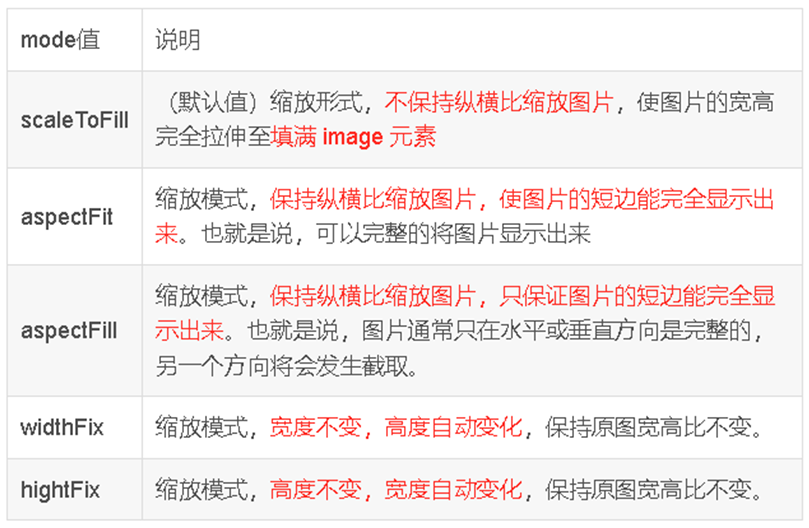
image组件的mode属性
<!-- image图片组件使用 -->
<image src="/images/duo.jpeg" mode="aspectFill"/>
<!-- image图片组件使用 end-->
(3)navigator:页面导航组件、类似于HTML中的a链接


 1698
1698


 被折叠的 条评论
为什么被折叠?
被折叠的 条评论
为什么被折叠?
 到【灌水乐园】发言


