


一、效果图:
二、项目中使用效果
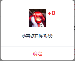
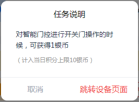
1、弹窗一展示
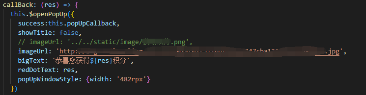
this.popUpCallback是在你调用弹窗的页面写的方法,点击确定的回调
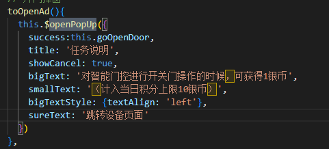
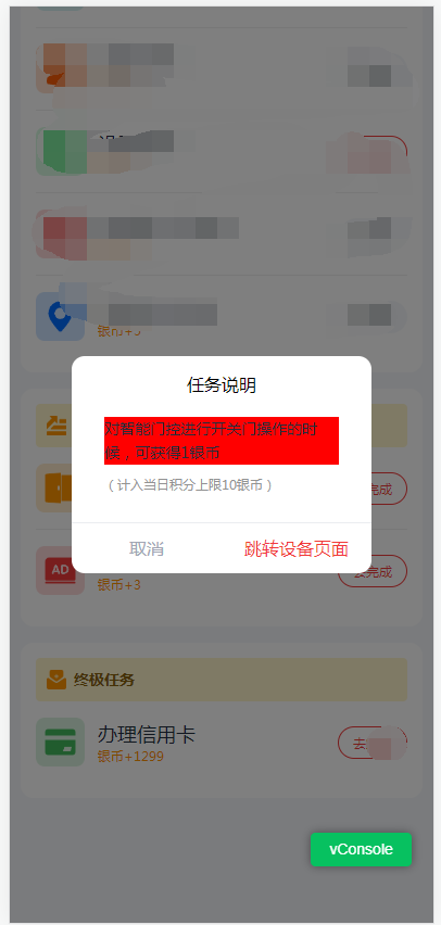
2、弹窗二展示
三、代码相关
1、popup.js
import Popup from './popup.vue'

export default {
  install(Vue) {
    const Profile = Vue.extend(Popup)

    // 弹出弹窗
    Vue.prototype.$openPopUp = function(params) {
      const instance = new Profile()
      for (const key in params) {
        if (Object.hasOwnProperty.call(params, key)) {
          const value = params[key]
          instance[key] = value
        }
      }
      instance.vm = instance.$mount()
      const popUpEle = document.body.lastElementChild
      if (popUpEle.className === 'popup-box') return
      setTimeout(() => document.body.appendChild(instance.vm.$el))
      return instance
    }

    // 关闭弹窗
    Vue.prototype.$closePopUp = function() {
      const instance = new Profile()
      instance.vm = instance.$mount()
      const popUpEle = document.body.lastElementChild
      if (popUpEle.className !== 'popup-box') return
      document.body.removeChild(popUpEle)
      return instance
    }
  }
}
2、main.js 直接挂载安装到全局
// 导入弹窗
import popup from './components/popup/popup.js'
// 安装插件
Vue.use(popup)
3、popup.vue
<template>
  <div class="popup-box">
    <view class="center-box" :style="[popUpWindowStyle]">
      <view class="header" :style="[headerStyle]">
        <view v-if="showTitle" class="title" :style="[titleStyle]">
          <text>{{ title }}</text>
        </view>
        <view v-if="imageUrl" class="img">
          <image
            :src="imageUrl"
            mode="scaleToFill"
            :style="[{width:`${imageWidth}rpx`},{height:`${imageHeight}rpx`}]"
          />
          <view v-if="redDotText != 'X'" class="redDot" :style="[{right: `calc( 50% - ${imageWidth}rpx )`}]">
            <text>
              {{ "+" + redDotText }}
            </text>
          </view>
        </view>
        <view class="textBox">
          <view v-if="bigText" class="bigText" :style="[bigTextStyle]">
            <text>
              {{ bigText }}
            </text>
          </view>
          <view v-if="smallText" class="smallText" :style="[smallTextStyle]">
            <text>
              {{ smallText }}
            </text>
          </view>
        </view>
      </view>
      <view class="footer">
        <view v-if="showCancel" class="btnBox">
          <view class="btn cancelBtn" @tap="closePopUp(0)">{{ cancelText }}</view>
        </view>
        <view class="btnBox">
          <view class="btn sureBtn" @tap="closePopUp(1)">{{ sureText }}</view>
        </view>
      </view>
    </view>
  </div>
</template>

<script>

export default {
  name: 'Popup',

  props: {
    success: {
      type: Function,
      default: undefined
    }, // 确定的回调
    cancel: {
      type: Function,
      default: undefined
    }, // 取消的回调
    headerStyle: {
      type: Object,
      default: () => {}
    }, // 头部样式
    showTitle: {
      type: Boolean,
      default: true
    }, // 是否展示标题(默认展示)
    title: {
      type: String,
      default: '提示'
    }, // 标题
    showCancel: {
      type: Boolean,
      default: false
    }, // 是否展示取消按钮(默认不展示)
    titleStyle: {
      type: Object,
      default: () => {}
    }, // 标题样式不会覆盖掉标题大小以及颜色
    popUpWindowStyle: {
      type: Object,
      default: () => {}
    }, // 弹窗窗口样式
    imageUrl: {
      type: String,
      default: ''
    }, // 图片地址(没有就不显示,图片地址相对位置以当前文件(就是这个文件)为基准)
    imageWidth: {
      type: Number,
      default: 116
    }, // 图片宽度
    imageHeight: {
      type: Number,
      default: 116
    }, // 图片宽度
    redDotText: {
      type: String,
      default: 'X'
    }, // 图片右上角小红点数字
    bigText: {
      type: String,
      default: '这是一个提示弹窗'
    }, // 大文本
    bigTextStyle: {
      type: Object,
      default: () => {}
    }, // 大文本样式
    smallText: {
      type: String,
      default: ''
    }, // 小文本
    smallTextStyle: {
      type: Object,
      default: () => {}
    }, // 小文本样式
    cancelText: {
      type: String,
      default: '取消'
    }, // 取消按钮文本
    sureText: {
      type: String,
      default: '确定'
    } // 确认按钮文本
  },

  data() {
    return {}
  },

  mounted() {
  },

  methods: {
    closePopUp(flag) {
      this.$closePopUp() // 关闭弹窗
      if (flag === 1 && this.success) {
        this.success()
      } else if (flag === 0 && this.cancel) {
        this.cancel()
      }
    }
  }
}
</script>
<style scoped>
.popup-box {
  position: fixed;
  top: 0;
  left: 0;
  width: 100vw;
  height: 100vh;
  background: rgba(0,0,0,0.5);
  z-index: 9999;
}
.popup-box .center-box {
  position: absolute;
  top: 50%;
  left: 50%;
  transform: translate(-50%, -50%);
  width: 532rpx;
  border-radius: 24rpx;
  opacity: 1;
  background: rgba(255,255,255,1);
}
.popup-box .center-box .header {
  padding: 30rpx;
  border-bottom:  rgba(235, 237, 240, 1) solid 2rpx;
  /* margin叠加问题 */
  /* overflow: hidden; */
}
.popup-box .center-box .header .title{
  font-size: 32rpx;
  font-weight: 500;
  text-align: center;
  margin-bottom: 40rpx;
  /* background-color: aqua; */
}
.popup-box .center-box .header .img{
  position: relative;
}
.popup-box .center-box .header .img .redDot{
  position: absolute;
  top: 0;
  right: calc( 50% - 116rpx);
  font-weight: 700;
  color: rgba(241, 58, 58, 1);
  text-align: left;
}
.popup-box .center-box .header .img image{
  width: 116rpx;
  height: 116rpx;
  display: block;
  margin: 30rpx auto;
}
.popup-box .center-box .header .textBox{
  margin: 20rpx 30rpx;
}
.popup-box .center-box .header .textBox .bigText {
  margin-top: 40rpx;
  font-size: 28rpx;
  line-height: 44rpx;
  font-weight: 400;
  color: rgba(35, 47, 63, 1);
  text-align: center;
}
.popup-box .center-box .header .textBox .smallText {
  margin-top: 16rpx;
  font-size: 24rpx;
  font-weight: 400;
  line-height: 40rpx;
  color: #929292;
}
.popup-box .center-box .footer {
  display: flex;
  width: 100%;
}
.popup-box .center-box .footer .btnBox {
  width: 50%;
  height: 90rpx;
  line-height: 90rpx;
  font-size: 32rpx;
  font-weight: 400;
  text-align: center;
  flex: 1;
}
.popup-box .center-box .btnBox .btn {
  color: rgba(161, 166, 179, 1);
}
.popup-box .center-box .btnBox .btn.sureBtn {
  color: rgba(241, 58, 58, 1);
}
</style>
4、prop
success: {
  type: Function,
  default: undefined
}, // 确定的回调
cancel: {
  type: Function,
  default: undefined
}, // 取消的回调
headerStyle: {
  type: Object,
  default: () => {}
}, // 头部样式
showTitle: {
  type: Boolean,
  default: true
}, // 是否展示标题(默认展示)
title: {
  type: String,
  default: '提示'
}, // 标题
showCancel: {
  type: Boolean,
  default: false
}, // 是否展示取消按钮(默认不展示)
titleStyle: {
  type: Object,
  default: () => {}
}, // 标题样式不会覆盖掉标题大小以及颜色
popUpWindowStyle: {
  type: Object,
  default: () => {}
}, // 弹窗窗口样式
imageUrl: {
  type: String,
  default: ''
}, // 图片地址(没有就不显示,图片地址相对位置以当前文件(就是这个文件)为基准)
imageWidth: {
  type: Number,
  default: 116
}, // 图片宽度
imageHeight: {
  type: Number,
  default: 116
}, // 图片宽度
redDotText: {
  type: String,
  default: 'X'
}, // 图片右上角小红点数字
bigText: {
  type: String,
  default: '这是一个提示弹窗'
}, // 大文本
bigTextStyle: {
  type: Object,
  default: () => {}
}, // 大文本样式
smallText: {
  type: String,
  default: ''
}, // 小文本
smallTextStyle: {
  type: Object,
  default: () => {}
}, // 小文本样式
cancelText: {
  type: String,
  default: '取消'
}, // 取消按钮文本
sureText: {
  type: String,
  default: '确定'
} // 确认按钮文本


 1万+
1万+


 被折叠的 条评论
为什么被折叠?
被折叠的 条评论
为什么被折叠?
 到【灌水乐园】发言


