


 这篇博客展示了如何利用CSS3技术制作西游记主题的动画效果。通过将动画分为八个动作,并结合HTML背景图,作者成功地将师徒四人的形象融入到动画中。文章提供了代码示例和实际效果的展示。
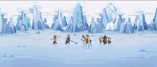
一、西游记动画展示
构思:先添加背景图,把动画分成八段主要是因为这个图片中有八个动作,最后再把师徒四人加入到一起。
代码如下(示例):
<!DOCTYPE html>
<html lang="en">
<head>
    <meta charset="UTF-8">
    <meta http-equiv="X-UA-Compatible" content="IE=edge">
    <meta name="viewport" content="width=device-width, initial-scale=1.0">
    <title>eesDOYO专属</title>
    <style>
        body{
            background-image: url(./西游记/image/bac.webp);
            background-repeat: no-repeat}
        div{
            width: 200px;
            height: 180px;
            position: absolute;
            margin-left: 50%;
            margin-top: 20%;
            transform: translateX(-200%);
            background-image: url(./西游记/image/west_01.png);
            animation: run 1s steps(8) infinite;
        }
        @keyframes run{
            from{
                background-position: 0px 0px;
            }
            to{
                background-position: -1600px 0px;
            }
        }
        @keyframes run2{
            from{
                background-position: 0px 0px;
            }
            to{
                background-position: -1360px 0px;
            }
        }
        @keyframes run3{
            from{
                background-position: 0px 0px;
            }
            to{
                background-position: -1680px 0px;
            }
        }
        .one{
            width: 200px;
            height: 180px;
            position: absolute;
            margin-left: 50%;
            margin-top: 20%;
            transform: translateX(-100%);
            background-image: url(./西游记/image/west_02.png);
            animation: run 1s steps(8) infinite;
        }
        .tow{
            width: 170px;
            height: 180px;
            position: absolute;
            margin-left: 50%;
            margin-top: 20%;
            transform: translateX(0%);
            background-image: url(./西游记/image/west_03.png);
            animation: run2 1s steps(8) infinite;
        }
        .three{
            width: 210px;
            height: 180px;
            position: absolute;
            margin-left: 50%;
            margin-top: 20%;
            transform: translateX(100%);
            background-image: url(./西游记/image//west_04.png);
            animation: run3 1s steps(8) infinite;
        }

    </style>
</head>
<body>
    <div></div>
    <div class="one"></div>
    <div class="tow"></div>
    <div class="three"></div>
</body>
</html>
效果图展示


 扫一扫
扫一扫


 677
677

 被折叠的 条评论
为什么被折叠?
被折叠的 条评论
为什么被折叠?
 到【灌水乐园】发言


