


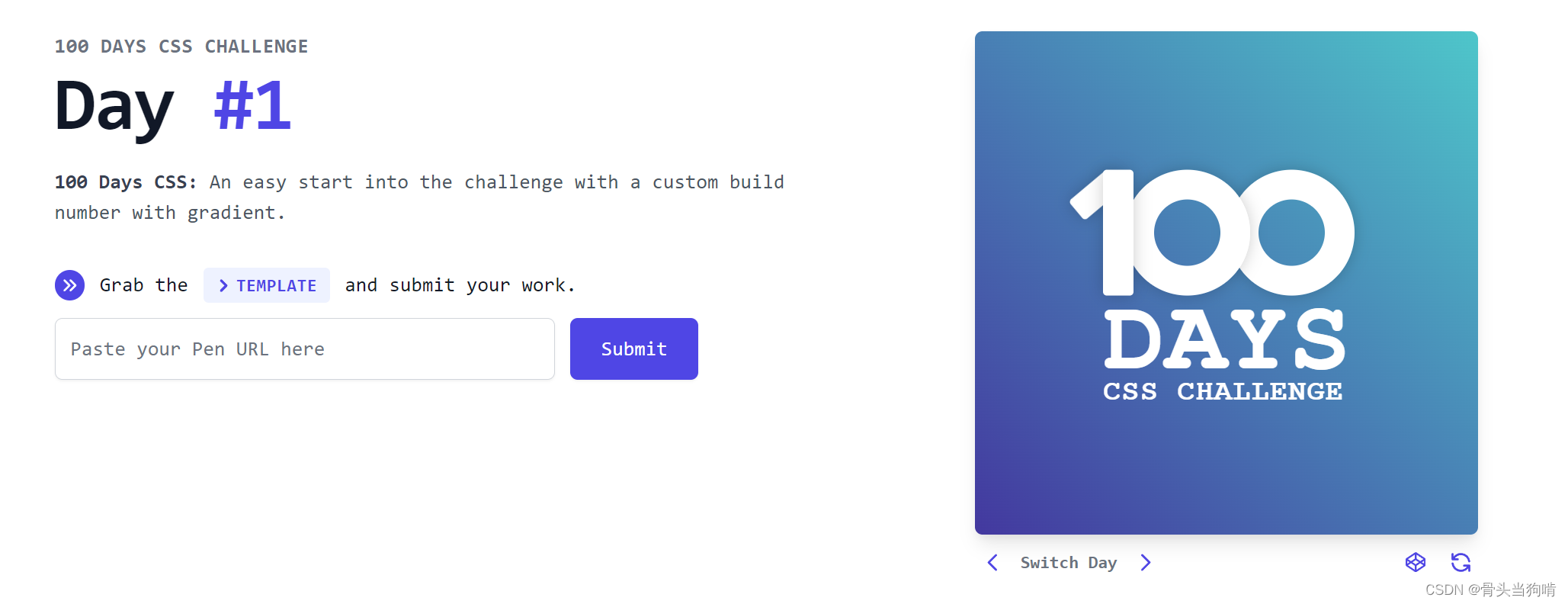
结构分析
那么我们的html结构就呼之欲出了
<div class="day1">
    <div class="box">
      <div class="one">
        <div class="one-p"></div>
      </div>
      <div class="zero"></div>
      <div class="zero"></div>
    </div>
    <div class="bottom">
      <h1>DAYS</h1>
      <h2>CSS CHALLENGE</h2>
    </div>
  </div>
day1是整个框架父类,包含了背景
在box类中有三个元素,one,zero,zero分别对应着1,0,0
bottom里面的是两个文字元素
样式分析
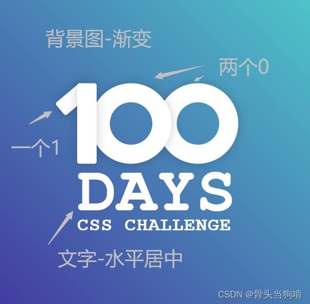
背景

从左下角的深蓝色到右上角的浅蓝色
background: linear-gradient(to top right, #43389F 0%, #4ec6ca 100%);然后中间的100和文字都是要水平垂直居中的
display: flex;
flex-direction: column;
justify-content: center;
align-items: center;
100的样式
我们先从简单的两个0开始,0的样式是一个同心圆
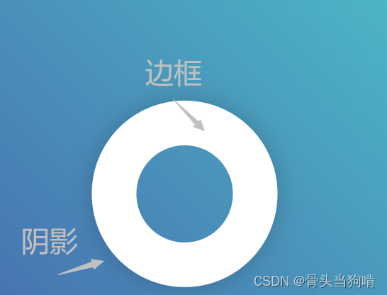
就相当于是一个圆形透明的元素包含一个厚厚的边框
.zero{
width: 100px;
height:100px;
border-radius: 50%;
margin-left: -10px;
background-color: transparent;
border: #fff 24px solid;
box-shadow: 0 0 13px 0 rgba(0, 0, 0, 0.2);
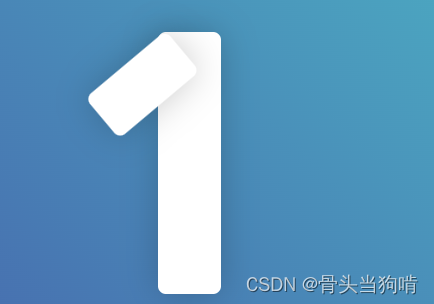
}然后是1的样式
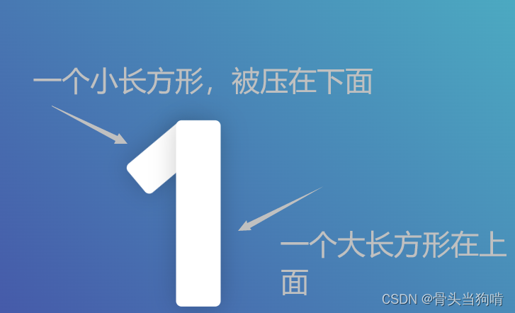
我们要把这个小长方形做一个absolute绝对定位,让他定位在这个大长方形上面,
再给它一个rotate旋转
    position: absolute;
    top: 0;
    left: -16px;
    height: 40px;
    width: 20px;
    background: #fff;
    border-radius: 3px;
    transform: rotate(50deg);
    box-shadow: 0 0 13px 0 rgba(0, 0, 0,0.2);
但是我们就会发现子元素在父元素的上方,而如果并列同级的话又不方便调整距离
这时就有一个很好的解决办法
在mdn文档中,提到了一个名词叫做层叠上下文
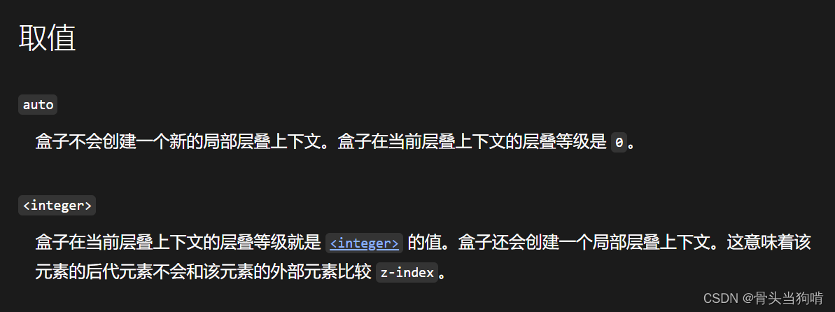 当我们给父元素设置z-index时,子元素就会不与父元素比较z-index,而是默认覆盖在父元素上面
当我们给父元素设置z-index:auto或者不设置z-index,父元素是会和子元素进行z轴的比较的,父元素不设置z-index/auto的时候,他的默认z-index是0,而我们将子元素的z-index设置为-1即可
但是,父元素的z-index不能设置为0,一旦为0,也是创建了层叠上下文,一旦创建层叠上下文,子元素就会直接不比较z-index直接覆盖在父元素上面
所以:1的完整样式如下
.one{
  position: relative;
  height: 100px;
  width: 24px;
  background: #fff;
  border-radius: 3px;
  box-shadow: 0 0 13px 0 rgba(0, 0, 0, 0.2);
  z-index: auto;
  &-p{
    position: absolute;
    top: 0;
    left: -16px;
    height: 40px;
    width: 20px;
    background: #fff;
    border-radius: 3px;
    transform: rotate(50deg);
    box-shadow: 0 0 13px 0 rgba(0, 0, 0,0.2);
    z-index: -1;
  }
}
(因为我用了sass,解释一下这个&-p的意思,&意为上一级的名称,&在此处对应的就是 .one,&-p对应的就是.one-p ,sass里面的嵌套编译为css就是 .one .one-p{} )
你也可以理解为这样:
.one{
  position: relative;
  height: 100px;
  width: 24px;
  background: #fff;
  border-radius: 3px;
  box-shadow: 0 0 13px 0 rgba(0, 0, 0, 0.2);
  z-index: auto;

}
.one .one-p{
    position: absolute;
    top: 0;
    left: -16px;
    height: 40px;
    width: 20px;
    background: #fff;
    border-radius: 3px;
    transform: rotate(50deg);
    box-shadow: 0 0 13px 0 rgba(0, 0, 0,0.2);
    z-index: -1;
  }
那么此时,我们的100长这样
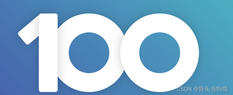
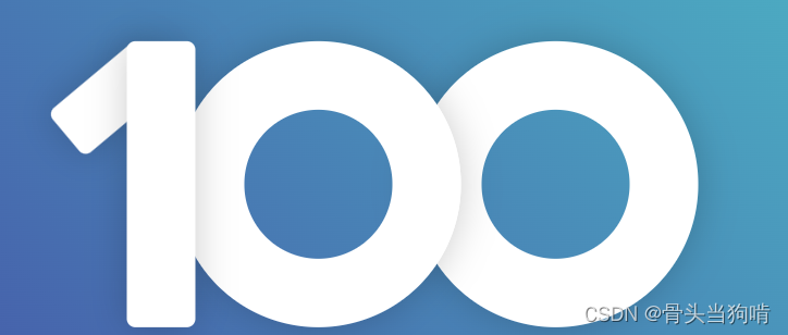
我们要把它变成这样
这里有2处区别:
- 第二个0应该覆盖在第一个上面
- 右边的0离左边的0太远了
我们直接给他们两个设置一下内联样式就好了
<div class="zero" style="z-index: -1;"></div>
<div class="zero" style="z-index: -2;margin-left: -20px;"></div>
margin-left设置负数就是往左挪20px
后面的文字
对于后面这些文字的样式,虽然看着花哨,但是其实就是一个字体花了一点
font-family: "Courier New"然后就是一个文字大小,加粗,行高,以及字间距的设置了
在标答里面,还有一个很奇怪的属性
-webkit-font-smoothing: antialiased;经过上网搜寻,这是一个抗锯齿属性,让字体的转角更平滑
.bottom{
  font-family: "Courier New", "Courier", sans-serif;
  color: #fff;
  h1{
    font-size: 82px;
    line-height: 60px;
    text-transform: uppercase;
    font-weight: 700;
    margin-top: 6px;
    margin-bottom: 0;
  }
  h2{
    font-size: 23px;
    line-height: 20px;
    text-transform: uppercase;
    font-weight: 700;
    letter-spacing: 0.04em;
  }
}
完整代码如下
<script setup>
</script>
<template>
  <div class="day1">
    <div class="box">
      <div class="one">
        <div class="one-p"></div>
      </div>
      <div class="zero" style="z-index: -1;"></div>
      <div class="zero" style="z-index: -2;margin-left: -20px;"></div>
    </div>
    <div class="bottom">
      <h1>DAYS</h1>
      <h2>CSS CHALLENGE</h2>
    </div>
  </div>
</template>


<style lang="scss" scoped>
.day1{
  width: 100%;
  height: 100%;
  background-image: linear-gradient(to top right, #43389F 0%, #4ec6ca 100%);
  position: relative;
  z-index: -1;
  display: flex;
  flex-direction: column;
  justify-content: center;
  align-items: center;
}
.zero{
  width: 100px;
  height:100px;
  border-radius: 50%;
  margin-left: -10px;
  background-color: transparent;
  border: #fff 24px solid;
  box-shadow: 0 0 13px 0 rgba(0, 0, 0, 0.2);
}
.one{
  position: relative;
  height: 100px;
  width: 24px;
  background: #fff;
  border-radius: 3px;
  box-shadow: 0 0 13px 0 rgba(0, 0, 0, 0.2);
  z-index: auto;
  &-p{
    position: absolute;
    top: 0;
    left: -16px;
    height: 40px;
    width: 20px;
    background: #fff;
    border-radius: 3px;
    transform: rotate(50deg);
    box-shadow: 0 0 13px 0 rgba(0, 0, 0,0.2);
    z-index: -1;
  }
}
.box{
  padding-left:20px ;
  display: flex;
  justify-content: center;
  align-items: center;
}
.bottom{
  font-family: "Courier New", "Courier", sans-serif;
  color: #fff;
  -webkit-font-smoothing: antialiased;
  h1{
    font-size: 82px;
    line-height: 60px;
    text-transform: uppercase;
    font-weight: 700;
    margin-top: 6px;
    margin-bottom: 0;
  }
  h2{
    font-size: 23px;
    line-height: 20px;
    text-transform: uppercase;
    font-weight: 700;
    letter-spacing: 0.04em;
  }
}
</style>


 317
317

 被折叠的 条评论
为什么被折叠?
被折叠的 条评论
为什么被折叠?
 到【灌水乐园】发言


