


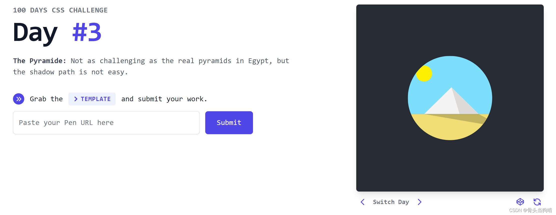
今天是一个埃及金字塔和日出日落以及阴影效果的复杂动画

结构分析
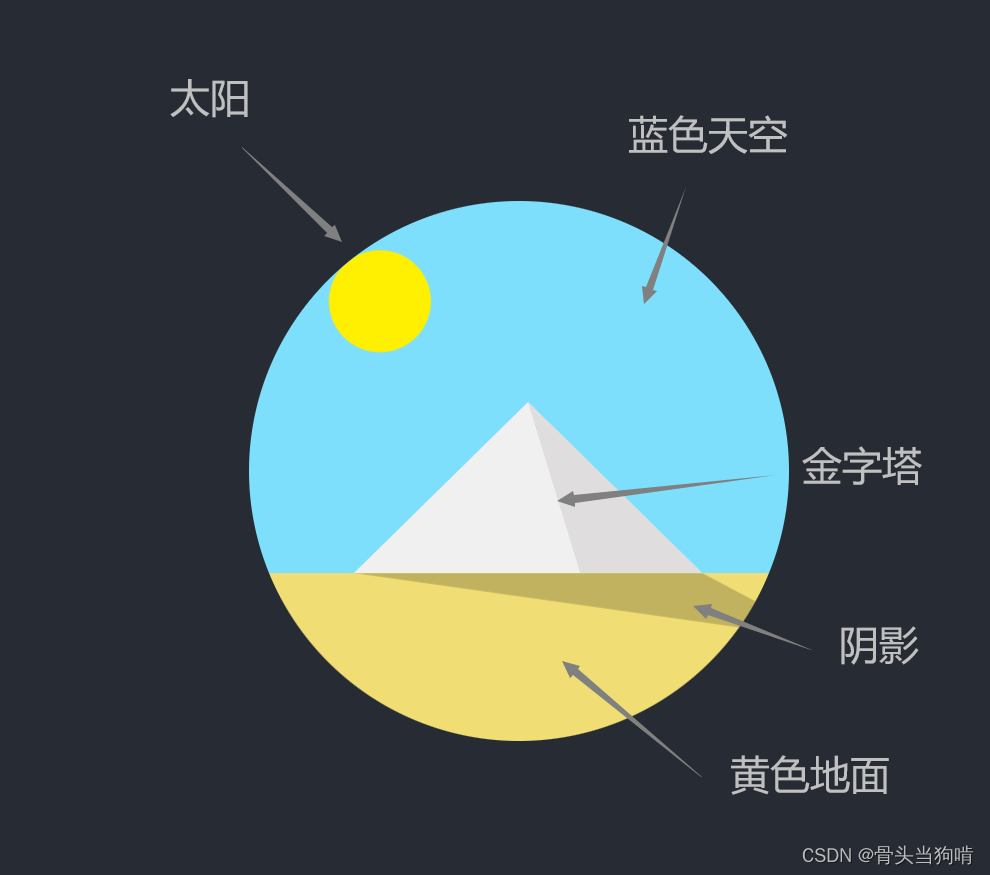
结构是不是看起来有点多,但是其实元素是不多的
<div class="day3">
<div class="circle">
<div class="triangle"></div>
<div class="sun"></div>
<div class="shadow"></div>
</div>
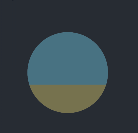
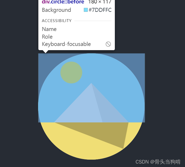
</div>圆形框架-天空和地面
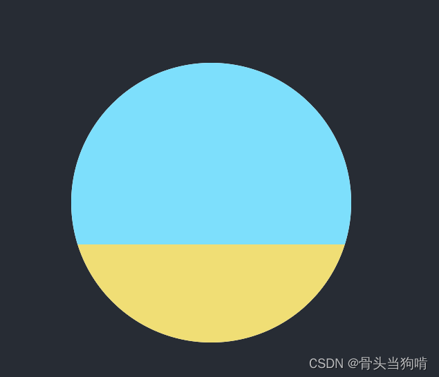
它这个天空和地面只是一个背景,所以我们可以上半部分是一个before伪元素,下半部分是after伪元素,这个圆形当然就是一个父元素
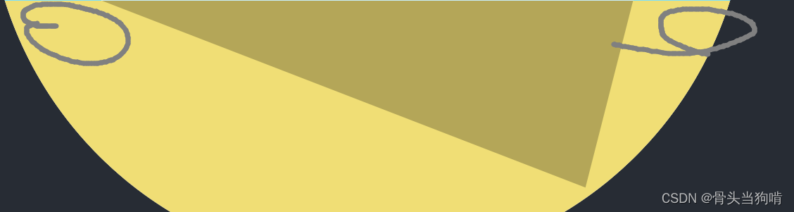
金字塔
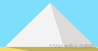
我们仔细观察,这个金字塔只由左半部分和右半部分所组成。这种3D的立体感是由左边三角和右边三角的颜色差所带来的视觉效果,当然这也只是一个三角形父元素带before和after伪元素了
太阳
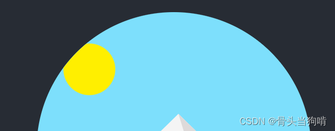
我们可以注意到,太阳它是绕着这个圆形框架所转的,我们其实并不需要去真正去编写它的轨迹。这里有2种方法
- 一个在圆形框架中央的元素,透明,然后设置一个boxshadow,x和y偏移量的根号平方和就为这个太阳轨迹的半径,然后我们只需要设置中央元素的rotate即可
- 一个flex布局的长条,其中首部是太阳元素,尾部固定在圆形的中央,然后将transform的原点设置在尾部,也是控制这个大长条的rotate,这个大长条的长度就是轨迹的半径
我这里选用的是第一种办法
阴影
阴影也是一个三角形,固定在金字塔的尾部,设置它的clippath即可
对于clip-path的详解放在后面的样式分析
样式分析
圆形框架
圆形框架样式以及淡入淡出
.circle{
  position: relative;
  width: 180px;
  height: 180px;
  border-radius: 50%;
  background-color: #fff;
  overflow: hidden;
  display: flex;
  flex-direction: column;
  animation: dark-light $time $cb infinite;
  &::before{
    content: '';
    width: 100%;
    height: 65%;
    background-color: #7DDFFC;
  }
  &::after{
    content: '';
    width: 100%;
    height: 35%;
    background-color: #F0DE75;
  }
}
@keyframes dark-light{
  0%{
    opacity: 0;
  }
  30%{
    opacity: 1;
  }
  70%{
    opacity: 1;
  }
  100%{
    opacity: 0;
  }

}
这个before以及after就是蓝天和地面,在父元素上用了一个overflow:hidden;
就将蓝天和地面切割成了两个圆形
太阳的轨迹
.sun{
  position: absolute;
  left: 40%;
  top: 60%;
  width: 37px;
  height: 37px;
  border-radius: 50%;
  box-shadow: -100px 0px 0px 0px #ffef00;
  transform: rotate(0);
  animation: sun-rotate $time $cb infinite;
}
我们先绘制了一个在圆形框架中间的圆形,然后给它一个box-shadow,太阳是那个box-shadow所显现出来的圆形
然后再给它一个animation,做周期运动
@keyframes sun-rotate{
  0%{
    box-shadow: -100px 0px 0px 0px #ffc800;
    transform: rotate(0deg);
  }
  30%{
    box-shadow: -100px 0px 0px 0px #ffef00;
    transform: rotate(70deg);
  }
  70%{
    box-shadow: -100px 0px 0px 0px #ffef00;
  }
  100%{
    box-shadow: -100px 0px 0px 0px #ffc800;
    transform: rotate(180deg);
  }
}
动画的配置属性
$cb:cubic-bezier(0.4, 0, 0.49, 1);
$time:4s;
我们不去将动画的时长和动画的animation-timing-function写死,而是写成变量的形式,方便修改
金字塔
我们先来写一下金字塔的样式
一个大三角里面有贴紧的两个小三角,这两个小三角的颜色不同
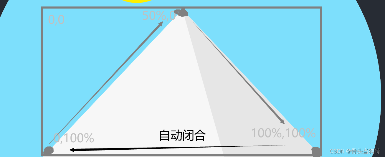
语法 clip-path:polygon(x1 y1,x2,y2......)
就是从左上角为(0 0),右下角为(100% 100%)为坐标系,选取x1 y1,x2 y2.....来组成一个自动闭合的坐标集,这些坐标集就可以组成一个多边形
我们可以用clippath来裁剪出一个多边形,比如三角形
//大三角
.triangle{
  position: absolute;
  bottom: 35%;
  width: 70%;
  height: 37%;
  background-color: #fff;
  clip-path: polygon(50% 0%, 0% 100%, 100% 100%);
  left: 50%;
  transform: translateX(-50%);
  overflow: hidden;
//左边的小三角
  &::before{
    content: '';
    width: 100%;
    height: 100%;
    background-color: #fff;
    clip-path: polygon(50% 0%, 65% 100%, 0 100%);
    position: absolute;
    animation: light-to-dark $time $cb infinite;
  }
//右边的小三角
  &::after{
    content: '';
    width: 100%;
    height: 100%;
    background-color: #fff;
    clip-path: polygon(50% 0%, 65% 100%, 100% 100%);
    position: absolute;
    animation: dark-to-light $time $cb infinite;
  }
}
动画效果:
@keyframes light-to-dark {
  0% {
    background-color: #fff;
  }

  30% {
    background-color: #fff;
  }

  70% {
    background-color: #dedede;
  }

  100% {
    background-color: #ababab;
  }

}
@keyframes dark-to-light {
  0% {
    background-color: #ababab;
  }

  30% {
    background-color: #dedede;
  }

  70% {
    background-color: #fff;
  }

  100% {
    background-color: #fff;
  }

}
动画效果就是两个小三角颜色的变换
阴影
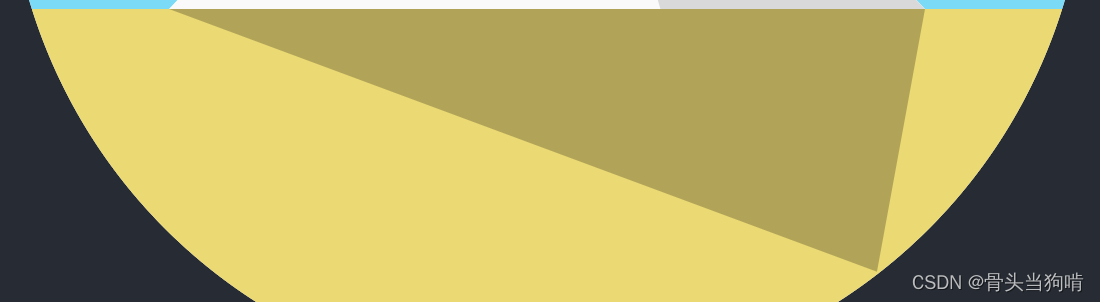
这个所谓阴影,其实也是一个深灰色的三角形,只不过是为它的clip-path做了一个动画效果
我们先用clip-path剪切出来一个三角形
.shadow{
  position: absolute;
  top: 65%;
  width: 100%;
  left: 50%;
  transform: translateX(-50%);
  height: 50%;
  background-color: #000;
  opacity: 0.25;
  clip-path: polygon(15% 0,50% 100%,85% 0);
  animation: shadow-rotate $time $cb infinite;
}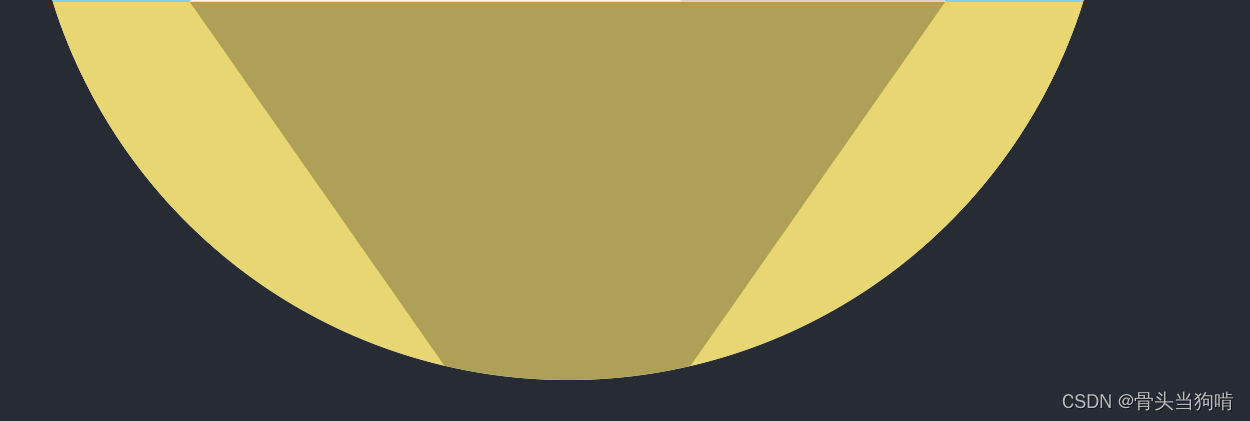
随后我们给它设置动画,这个动画也就是固定左右两点x1 y1,x3 y3,将它中间的那个x2 y2修改
$startP:15%;
$endP:85%;
@keyframes shadow-rotate {
  0%{
    clip-path: polygon($startP 0,100% 1%,$endP 0);
  }
  30%{
    clip-path: polygon($startP 0,80% 50%,$endP 0);
  }
  100%{
    clip-path: polygon($startP 0,0 1%,$endP 0);
  }
}
这个$startp和$endp是这个三角的最左侧和最右侧,因为我们shadow的元素的父元素是整个大圆,所以我们要设置一下它的宽,让它与金字塔贴紧并且宽相同
完整代码
<script setup>
</script>
<template>
  <div class="day3">
    <div class="circle">
      <div class="triangle"></div>
      <div class="sun"></div>
      <div class="shadow"></div>
    </div>
  </div>
</template>


<style lang="scss" scoped>
.day3{
  width: 400px;
  height: 400px;
  background-color: #272C34;
  display: flex;
  justify-content: center;
  align-items: center;
}
$cb:cubic-bezier(0.4, 0, 0.49, 1);
$time:4s;
.circle{
  position: relative;
  width: 180px;
  height: 180px;
  border-radius: 50%;
  background-color: #fff;
  overflow: hidden;
  display: flex;
  flex-direction: column;
  animation: dark-light $time $cb infinite;
  &::before{
    content: '';
    width: 100%;
    height: 65%;
    background-color: #7DDFFC;
  }
  &::after{
    content: '';
    width: 100%;
    height: 35%;
    background-color: #F0DE75;
  }
}
.triangle{
  position: absolute;
  bottom: 35%;
  width: 70%;
  height: 37%;
  background-color: #fff;
  clip-path: polygon(50% 0%, 0% 100%, 100% 100%);
  left: 50%;
  transform: translateX(-50%);
  overflow: hidden;
  &::before{
    content: '';
    width: 100%;
    height: 100%;
    background-color: #fff;
    clip-path: polygon(50% 0%, 65% 100%, 0 100%);
    position: absolute;
    animation: light-to-dark $time $cb infinite;
  }
  &::after{
    content: '';
    width: 100%;
    height: 100%;
    background-color: #fff;
    clip-path: polygon(50% 0%, 65% 100%, 100% 100%);
    position: absolute;
    animation: dark-to-light $time $cb infinite;
  }
}
.sun{
  position: absolute;
  left: 40%;
  top: 60%;
  width: 37px;
  height: 37px;
  border-radius: 50%;
  box-shadow: -100px 0px 0px 0px #ffef00;
  transform: rotate(0);
  animation: sun-rotate $time $cb infinite;
}
.shadow{
  position: absolute;
  top: 65%;
  width: 100%;
  left: 50%;
  transform: translateX(-50%);
  height: 50%;
  background-color: #000;
  opacity: 0.25;
  clip-path: polygon(15% 0,50% 100%,85% 0);
  animation: shadow-rotate $time $cb infinite;
}
@keyframes dark-light{
  0%{
    opacity: 0;
  }
  30%{
    opacity: 1;
  }
  70%{
    opacity: 1;
  }
  100%{
    opacity: 0;
  }

}
@keyframes light-to-dark {
  0% {
    background-color: #fff;
  }

  30% {
    background-color: #fff;
  }

  70% {
    background-color: #dedede;
  }

  100% {
    background-color: #ababab;
  }

}
@keyframes dark-to-light {
  0% {
    background-color: #ababab;
  }

  30% {
    background-color: #dedede;
  }

  70% {
    background-color: #fff;
  }

  100% {
    background-color: #fff;
  }

}
@keyframes sun-rotate{
  0%{
    box-shadow: -100px 0px 0px 0px #ffc800;
    transform: rotate(0deg);
  }
  30%{
    box-shadow: -100px 0px 0px 0px #ffef00;
    transform: rotate(70deg);
  }
  70%{
    box-shadow: -100px 0px 0px 0px #ffef00;
  }
  100%{
    box-shadow: -100px 0px 0px 0px #ffc800;
    transform: rotate(180deg);
  }
}
$startP:15%;
$endP:85%;
@keyframes shadow-rotate {
  0%{
    clip-path: polygon($startP 0,100% 1%,$endP 0);
  }
  30%{
    clip-path: polygon($startP 0,80% 50%,$endP 0);
  }
  100%{
    clip-path: polygon($startP 0,0 1%,$endP 0);
  }
}
</style>


 372
372

 被折叠的 条评论
为什么被折叠?
被折叠的 条评论
为什么被折叠?
 到【灌水乐园】发言


