


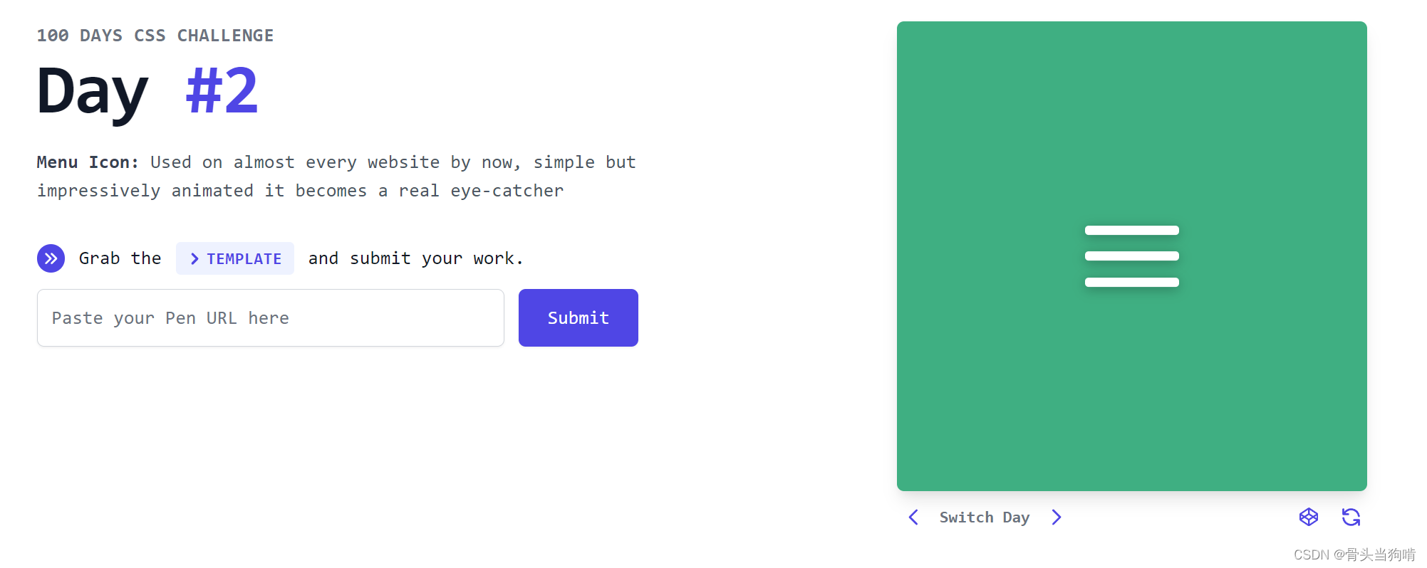
第二天是一个菜单按钮的动画效果

结构分析


点击切换状态
在html中,可以实现点击切换的就是input中的checkbox
而label标签可以将checkbox的点击事件绑定到label标签上
而这个事件就是原生checkbox的选中和不选中,即我们不需要写js代码就可以控制

那么我们的html结构如下
 <div class="day2">
    <label class="menu">
      <input type="checkbox" style="display: none;"/>
      <div class="line"></div>
      <div class="line"></div>
      <div class="line"></div>
    </label>
  </div>
一个不显示的checkbox,和一个控制checkbox选中事件的label标签
在label标签中包裹一个checkbox,就可以不需要label的for属性来绑定checkbox

样式分析
静止时的三条杠

首先是这个一条横线
.line{
    width: 100%;
    height: $lh;
    border-radius: 5px;
    background-color: #fff;
    box-shadow: 0 2px 10px 0 rgba(0, 0, 0, 0.3);
  }
在sass中,使用$加变量名即可声明或者使用变量,我们后面的动画还需要用到这个height的值,我们不把它硬编码,防止后面反复修改
$lh: 8px;对于包裹这三个杠的菜单div,它的样式是一个竖着的排列的flex布局
.menu{
  display: flex;
  flex-direction: column;
  justify-content: center;
  align-items: center;
  cursor: pointer;
  gap: $gap;
  width: 80px;
}
gap是flex中的的属性,意为间隔,我们可以将间隔设为一个值,然后让flex布局中的元素的间隔都为同一个值
$gap: 16px;我们后续还要用到gap的值,先不要硬编码
到此,我们的静止时的三条杠已经写好

选中后的交叉的两条杠
到此时,我们可以点击这三个杠所组成的菜单来控制checkbox的选中了
但是我们还没有将checkbox的选中与css样式关联起来,要与之关联,我们有2种办法
- 使用~选择checkbox的所有兄弟元素
- 使用:has()来选择checkbox的父类元素


这两种方法都可以实现,我写的是使用:has()的实现
.menu:has(input:checked){

  }
选择了 -> 存在子类已经被选中的checkbox的.menu类
主语是.menu,所以这个选择器选择的是checkbox的父类 .menu
当然我们也可以选择不存在子类已经被选中的checkbox的.menu类
.menu:has(input:not(:checked)){

}
此时我们就可以通过这个.menu类来控制它的子类line了
.menu:has(input:checked){
    .line:nth-child(2){

    }
    .line:nth-child(3){

    }
    .line:nth-child(4){

    }
  }
在父类中是第几个子元素的.line元素
在html中,我们可以看到这三个.line元素是第2,3,4个子元素。那么我们使用:nth-child()就是选择2,3,4


我们要计算第一个杠和第三个杠他们的位置要移到哪里去,是不是就是y坐标移到第二条杠上面

那么第一条杠就是Y坐标减下$lh和$gap了,也就是
transform: translateY(calc($gap + $lh));第二条杠就是Y坐标加上$lh和$gap
然后他们就会与第三条杠重叠

最后再给它加上rotate即可
//第一条杠
transform: translateY(calc($gap + $lh)) rotate(-45deg);
//第三条杠
transform: translateY(calc(-1 * ($gap + $lh))) rotate(135deg);
对于第二条杠点击之后会从大到小消失,就是
那么完整的交叉后的两条杠的代码如下
.menu:has(input:checked){
    .line:nth-child(2){
      transform: translateY(calc($gap + $lh)) rotate(-45deg);
    }
    .line:nth-child(3){
      scale: 0;
      opacity: 0;
      transition: all $time;
    }
    .line:nth-child(4){
      transform: translateY(calc(-1 * ($gap + $lh))) rotate(135deg);
    }
  }
  .menu:has(input:not(:checked)){
    .line:nth-child(2){
      transform: none;
    }
    .line:nth-child(3){
      scale: 1;
      opacity: 1;
      transition: all $time;
    }
    .line:nth-child(4){
      transform: none;
    }
  }
动画分析

杠变叉的时候,是第一个杠和第三个杠向中间靠拢,然后再去rotate
那么up动画就是第三个杠,down动画就是第一个杠
@keyframes up {
  0%{
    transform: none;
  }
  65%{
    transform: translateY(calc(-1 * ($gap + $lh)));
  }
  100%{
    transform: translateY(calc(-1 * ($gap + $lh))) rotate(45deg);
  }
}
@keyframes down {
  0%{
    transform: none;
  }
  65% {
    transform: translateY(calc($gap + $lh));
  }

  100% {
    transform: translateY(calc($gap + $lh)) rotate(135deg);
  }
}
叉变杠的动画,是先将rotate设为0再去向上移和向下移

@keyframes upBack {
0% {
transform: translateY(calc(-1 * ($gap + $lh))) rotate(45deg);
}
65% {
transform: translateY(calc(-1 * ($gap + $lh)));
}
100% {
transform: none;
}
}
@keyframes downBack {
0% {
transform: translateY(calc($gap + $lh)) rotate(135deg);
}
65% {
transform: translateY(calc($gap + $lh));
}
100% {
transform: none;
}
}总代码
<script setup>
</script>
<template>
  <div class="day2">
    <label class="menu">
      <input type="checkbox" style="display: none;"/>
      <div class="line"></div>
      <div class="line"></div>
      <div class="line"></div>
    </label>
  </div>
</template>


<style lang="scss" scoped>
.day2{
  background-color: #3FAF82;
  width: 100%;
  height: 100%;
  display: flex;
  justify-content: center;
  align-items: center;
}
$gap: 16px;
$lh: 8px;
$time: 0.7s;
.menu{
  display: flex;
  flex-direction: column;
  justify-content: center;
  align-items: center;
  cursor: pointer;

  gap: $gap;
  width: 80px;
  .line{

    width: 100%;
    height: $lh;
    border-radius: 5px;
    background-color: #fff;
    box-shadow: 0 2px 10px 0 rgba(0, 0, 0, 0.3);
  }
  &:has(input:checked){
    .line:nth-child(2){
      transform: translateY(calc($gap + $lh)) rotate(-45deg);
      animation: down $time forwards;
    }
    .line:nth-child(3){
      scale: 0;
      opacity: 0;
      transition: all $time;
    }
    .line:nth-child(4){
      transform: translateY(calc(-1 * ($gap + $lh))) rotate(135deg);
      animation: up $time forwards;
    }
  }
  &:has(input:not(:checked)){
    .line:nth-child(2){
      transform: none;
      animation: downBack $time forwards;
    }
    .line:nth-child(3){
      scale: 1;
      opacity: 1;
      transition: all $time;
    }
    .line:nth-child(4){
      transform: none;
      animation: upBack $time forwards;
    }
  }
}
@keyframes up {
  0%{
    transform: none;
  }
  65%{
    transform: translateY(calc(-1 * ($gap + $lh)));
  }
  100%{
    transform: translateY(calc(-1 * ($gap + $lh))) rotate(45deg);
  }
}
@keyframes upBack {
  0% {
    transform: translateY(calc(-1 * ($gap + $lh))) rotate(45deg);
  }

  65% {
    transform: translateY(calc(-1 * ($gap + $lh)));
  }

  100% {
    transform: none;
  }
}
@keyframes down {
  0%{
    transform: none;
  }
  65% {
    transform: translateY(calc($gap + $lh));
  }

  100% {
    transform: translateY(calc($gap + $lh)) rotate(135deg);
  }
}
@keyframes downBack {
  0% {
    transform: translateY(calc($gap + $lh)) rotate(135deg);
  }

  65% {
    transform: translateY(calc($gap + $lh));
  }

  100% {
    transform: none;
  }
}
</style>


 291
291


 被折叠的 条评论
为什么被折叠?
被折叠的 条评论
为什么被折叠?
 到【灌水乐园】发言


