# 基础函数库
import numpy as np
# 导入画图库
import matplotlib. pyplot as plt
import seaborn as sns
#导入逻辑回归模型函数
from sklearn. linear_model import LogisticRegression
# 构造数据集
x_features= np. array ( [ [ - 1 , - 2 ] , [ - 2 , - 1 ] , [ - 3 , - 2 ] , [ 1 , 2 ] , [ 2 , 1 ] , [ 3 , 2 ] ] )
y_label = np. array ( [ 0 , 0 , 0 , 1 , 1 , 1 ] )
# 调用逻辑回归模型
lr_c = LogisticRegression ( )
# 用逻辑回归模型拟合构造的数据集
# 拟合方程为y= w0+ w1* x1+ w2* x2
lr_cc = lr_c. fit ( x_features, y_label)
## 查看其对应模型的w
print ( 'the weight of Logistic Regression:' , lr_c. coef_)
## 查看其对应模型的w0
print ( 'the intercept(w0) of Logistic Regression:' , lr_c. intercept_)
the weight of Logistic Regression: [[0.75047876 0.70836656]]
the intercept(w0) of Logistic Regression: [0.]
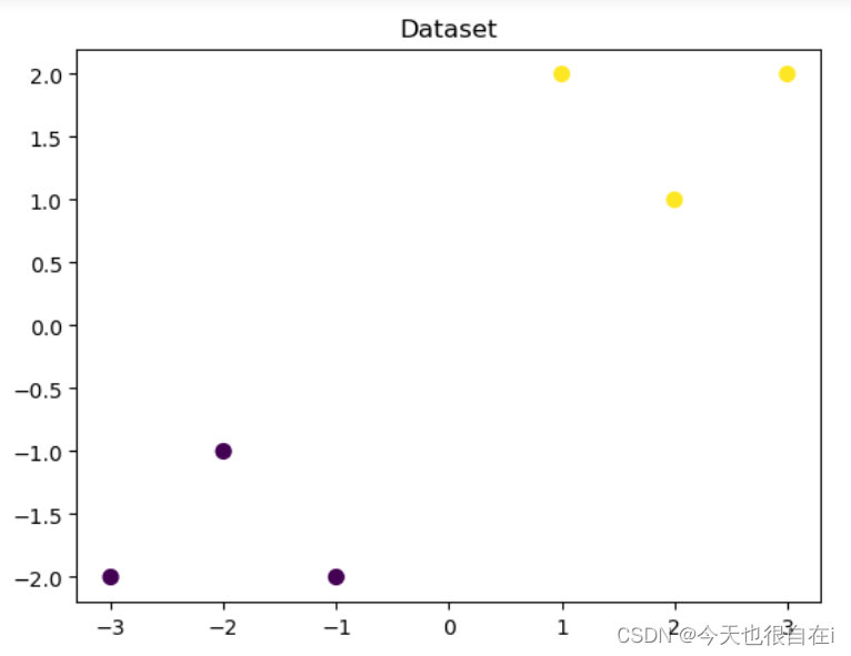
## 可视化构造的数据样本点
plt. figure ( )
# s: 指定散点的大小
# c: 指定散点的颜色
# cmap: 颜色映射对象,用于把标量映射为颜色。默认为None
plt. scatter ( x_features[ : , 0 ] , x_features[ : , 1 ] , c= y_label, s= 50 , cmap= 'viridis' )
plt. title ( 'Dataset' )
plt. show ( )
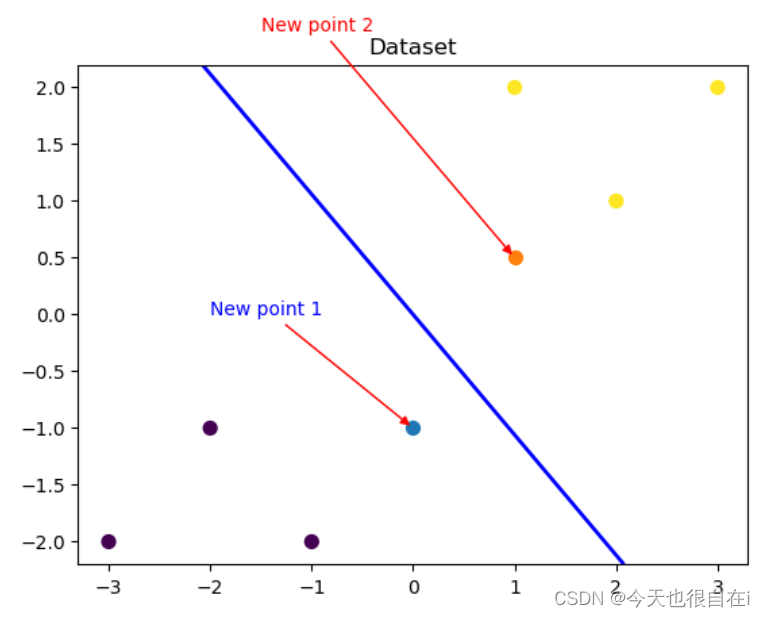
# 可视化决策边界
plt. figure ( )
plt. scatter ( x_features[ : , 0 ] , x_features[ : , 1 ] , c= y_label, s= 50 , cmap= 'viridis' )
plt. title ( 'Dataset' )
nx, ny = 200 , 100
#设置坐标轴范围
x_min, x_max = plt. xlim ( )
# print ( x_min, x_max)
y_min, y_max = plt. ylim ( )
# print ( y_min, y_max)
# 返回网格坐标矩阵
x_grid, y_grid = np. meshgrid ( np. linspace ( x_min, x_max, nx) , np. linspace ( y_min, y_max, ny) )
# print ( x_grid, y_grid)
# np. mgrid[ 起始值:结束值:步长,起始值:结束值:步长]
# x. ravel ( ) 将x变为一维数组,即将x拉直
# np. c_[ ] 将返回的间隔数值点配对
# np. c_[ 数组1 ,数组2 , …]
# predict_proba返回的是一个 n 行 k 列的数组, 第 i 行 第 j 列上的数值是模型预测 第 i 个预测样本为某个标签的概率,并且每一行的概率和为1 。
z_proba = lr_c. predict_proba ( np. c_[ x_grid. ravel ( ) , y_grid. ravel ( ) ] )
# print ( z_proba)
# reshape函数是MATLAB 中将指定的矩阵变换成特定维数矩阵一种函数,
# 且矩阵中元素个数不变,函数可以重新调整矩阵的行数、列数、维数。
# 函数语法为B = reshape ( A , size) 是指返回一个和A 元素相同的n维数组,
# 但是由向量size来决定重构数组维数的大小。
z_proba = z_proba[ : , 1 ] . reshape ( x_grid. shape)
# print ( z_proba)
# contour用来绘制矩阵数据的等高线
plt. contour ( x_grid, y_grid, z_proba, [ 0.5 ] , linewidths= 2. , colors= 'blue' )
plt. show ( )
## 可视化预测新样本
plt. figure ( )
## new point 1
x_fearures_new1 = np. array ( [ [ 0 , - 1 ] ] )
plt. scatter ( x_fearures_new1[ : , 0 ] , x_fearures_new1[ : , 1 ] , s= 50 , cmap= 'viridis' )
# 对点(x, y)添加带箭头的注释文本。
# xy: (float, float),浮点数组成的元组,被注释点的坐标
# xytext: (float, float),浮点数组成的元组,放置注释文本的坐标
# arrowstyle: 箭头类型
# connectionstyle: 连接类型
plt. annotate ( text= 'New point 1' , xy= ( 0 , - 1 ) , xytext= ( - 2 , 0 ) , color= 'blue' , arrowprops= dict ( arrowstyle= '-|>' , connectionstyle= 'arc3' , color= 'red' ) )
## new point 2
x_fearures_new2 = np. array ( [ [ 1 , 0.5 ] ] )
plt. scatter ( x_fearures_new2[ : , 0 ] , x_fearures_new2[ : , 1 ] , s= 50 , cmap= 'viridis' )
plt. annotate ( text= 'New point 2' , xy= ( 1 , 0.5 ) , xytext= ( - 1.5 , 2.5 ) , color= 'red' , arrowprops= dict ( arrowstyle= '-|>' , connectionstyle= 'arc3' , color= 'red' ) )
## 训练样本
plt. scatter ( x_features[ : , 0 ] , x_features[ : , 1 ] , c= y_label, s= 50 , cmap= 'viridis' )
plt. title ( 'Dataset' )
# 可视化决策边界
plt. contour ( x_grid, y_grid, z_proba, [ 0.5 ] , linewidths= 2. , colors= 'blue' )
plt. show ( )
## 在训练集和测试集上分别利用训练好的模型进行预测
y_label_new1_predict = lr_c. predict ( x_fearures_new1)
y_label_new2_predict = lr_c. predict ( x_fearures_new2)
print ( 'The New point 1 predict class:' , y_label_new1_predict)
print ( 'The New point 2 predict class:' , y_label_new2_predict)
## 由于逻辑回归模型是概率预测模型(前文介绍的 p = p ( y= 1 | x, \theta) ), 所以我们可以利用 predict_proba 函数预测其概率
y_label_new1_predict_proba = lr_c. predict_proba ( x_fearures_new1)
y_label_new2_predict_proba = lr_c. predict_proba ( x_fearures_new2)
print ( 'The New point 1 predict Probability of each class:\n' , y_label_new1_predict_proba)
print ( 'The New point 2 predict Probability of each class:\n' , y_label_new2_predict_proba)
The New point 1 predict class: [0]
The New point 2 predict class: [1]
The New point 1 predict Probability of each class:
 [[0.67004013 0.32995987]]
The New point 2 predict Probability of each class:
 [[0.24886739 0.75113261]]


 680
680


 被折叠的 条评论
为什么被折叠?
被折叠的 条评论
为什么被折叠?
 到【灌水乐园】发言


