


网页中常见一些三角形,使用 CSS 直接画出来就可以,不必做成图片或者字体图标
因为边框的衔接处是倾斜的,所以可以设置一个宽高为0的盒子,边框设置的大一些,不想要的部分设置成透明色,只给想要的部分设置颜色。这样就可以实现三角形的效果。
.box {
    width: 0;
    height: 0;
    border-top: 50px solid pink;
    border-right: 50px solid red;
    border-bottom: 50px solid blue;
    border-left: 50px solid green;
}
<div class="box"></div>

等腰直角三角形
div {
 width: 0;
 height: 0;
 line-height: 0;
 font-size: 0;
 border: 50px solid transparent;
 border-left-color: pink;
}
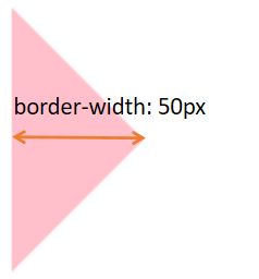
直角边不等的直角三角形
- 综合属性实现
.box1 {
    width: 0;
    height: 0;
    /* 顺时针方向,分别是上、右、下、左 */
    border-color: transparent red transparent transparent;
    border-style: solid;
	/*根据预期的三角形2边长设置这2个方向的边框宽度*/
    border-width: 100px 50px 0 0 ;
}
- 四个边框的属性分开写
.box1 {
width: 0;
height: 0;
border-top: 100px solid transparent;
border-right: 50px solid red;
/* 左边和下边的边框宽度设置为0 */
border-bottom: 0;
border-left: 0;
实现过程

等腰三角形
只需相对的边框宽度相等
.box {
    width: 0;
    height: 0;
	/*这里设置的是上下的边框相等*/
    border-top: 25px solid transparent;
    border-left: 50px solid green;
    border-right: none;
    border-bottom: 25px solid transparent;
}

普通的三角形
只需相对的边框宽度不相等
.box {
    width: 0;
    height: 0;
	/*这里设置的是上下的边框相等*/
    border-top: 10px solid transparent;
    border-left: 50px solid green;
    border-right: none;
    border-bottom: 25px solid transparent;
}

案例练习
练习1
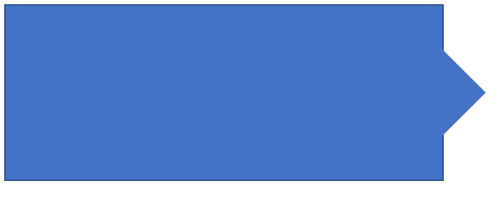
实现如下气泡效果

参考代码:
.left{
    position: relative;
    width: 500px;
    height: 200px;
    background-color: rgb(68, 114, 196);
    border: 2px solid rgb(47, 82, 143);
}
.right{
    position: absolute;
    top: 50%;
    margin-top: -50px;
    right: -99px;
    width: 0;
    border: 50px solid transparent;
    /* border-left-color: pink */
    border-left-color: rgb(68, 114, 196);
}
<div class="left">
    <div class="right"></div>
</div>
运行效果
练习2
实现如下效果
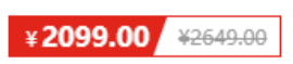
.price {
    width: 160px;
    height: 24px;
    line-height: 24px;
    border: 1px solid red;
    margin: 0 auto;
}
.miaosha {
    position: relative;
    float: left;
    width: 90px;
    height: 100%;
    background-color:red;
    text-align: center;
    color: #fff;
    font-weight: 700;
}
.miaosha i {
    position: absolute;
    right: 0;
    top: 0;
    width: 0;
    height: 0;
    border-color: transparent #fff transparent transparent;
    border-style: solid;
    border-width: 24px 10px 0 0;
}
.origin {
    font-size: 12px;
    color: gray;
    text-decoration: line-through;
    margin-left: 8px;
}
<div class="price">
    <span class="miaosha">
        ¥1650
        <i></i>
    </span>
    <span class="origin">¥5650</span>
</div>


 485
485


 被折叠的 条评论
为什么被折叠?
被折叠的 条评论
为什么被折叠?
 到【灌水乐园】发言


