


1、前言
| 记录一下QML设计登录界面,巩固自己对于QML的学习,方便自己日后回顾,也可以给有需要的人提供帮助。每个目录都是知识点,大家可以按照目录逐步浏览,也可以点击目录跳转到所需部分。 |
2、应用程序窗口
设计登录窗口
//应用程序窗口
ApplicationWindow{
    id:window
    width: 540
    height: 420
    visible: true
    title: qsTr("登录")

    //背景矩形
    Rectangle{
        anchors.fill: parent
        gradient: Gradient{
        GradientStop{position: 0.0; color: "#8EC5FC"}

        GradientStop{position: 1.0;color: "#E0C3FC"}
        }
    }
}
3、用户输入区域
// 用户名输入区域
ColumnLayout {
    spacing: 5  // 内部元素间距
    Text {      // 标签文本
        text: "用户名"
        color: "#34495e"
        Layout.leftMargin: 5
    }
        // 用户名输入框
        TextField {
            id: usernameField      // 组件ID
            placeholderText: "请输入用户名" // 占位提示文字
            Layout.fillWidth: true  // 填充可用宽度
             Layout.preferredHeight: 45     //固定高度
            background: Rectangle { // 自定义背景
                radius: 8           // 圆角半径
                // 边框颜色(根据焦点状态变化)
                border.color: usernameField.focus ? "#3498db" : "#bdc3c7"
                border.width: 1    // 边框宽度
            }
            onAccepted: loginButton.clicked() // 回车键触发登录
        }
}
4、密码输入区域
// 密码输入区域(结构与用户名类似)
ColumnLayout {
    spacing: 5
    Text {
        text: "密码"
        color: "#34495e"
    }

    TextField {
        id: passwordField
        placeholderText: "请输入密码"
        echoMode: TextInput.Password // 密码模式(显示为圆点)
        Layout.fillWidth: true
         Layout.preferredHeight: 45     //固定高度
        background: Rectangle {
            radius: 5
            border.color: passwordField.focus ? "#3498db" : "#bdc3c7"
            border.width: 1
        }
        onAccepted: loginButton.clicked()
    }
}
5、登录按钮
// 登录按钮
Button {
    id: loginButton
    text: "登录"
    Layout.fillWidth: true  // 按钮宽度填满容器
    Layout.topMargin: 20
    Layout.preferredHeight: 50  // 明确按钮高度

    // 自定义按钮内容(文字样式)
    contentItem: Text {
        text: loginButton.text
        color: "white"                // 文字颜色
        horizontalAlignment: Text.AlignHCenter // 水平居中
        verticalAlignment: Text.AlignVCenter   // 垂直居中
    }
    // 自定义按钮背景
    background: Rectangle {
        radius: 5  // 圆角半径
        // 按钮颜色(按下时变深色)
        color: loginButton.down ? "#2980b9" : "#3498db"
    }
    // 点击事件处理
    onClicked: {
        // 非空验证
        if(usernameField.text === "" || passwordField.text === ""){
            errorMessage.text = "用户名和密码不能为空!"
            errorMessage.visible = true // 显示错误提示
        } else {
            errorMessage.visible = false
            // 此处应添加实际登录验证逻辑
            console.log("尝试登录:", usernameField.text)
        }
    }
}
6、底部注册提示
// 底部注册提示
Text {
    Layout.topMargin: 20
    anchors {  // 锚点布局
        bottom: parent.bottom       // 底部对齐父容器
        horizontalCenter: parent.horizontalCenter // 水平居中
        margins: 20                 // 外边距
    }
    text: "还没有账号?立即注册"
    color: "#3498db"  // 链接颜色
}
7、QML文件
import QtQuick 2.12
import QtQuick.Window 2.12
import QtQuick.Controls 2.0
import QtQuick.Layouts 1.1


//应用程序窗口
ApplicationWindow{
    id:window
    width: 540
    height: 420
    visible: true
    title: qsTr("登录")

    //背景矩形
    Rectangle{
        anchors.fill: parent
        gradient: Gradient{
            GradientStop{position: 0.0; color: "#8EC5FC"}

            GradientStop{position: 1.0;color: "#E0C3FC"}
        }
    }

    // 登录表单布局(垂直列布局)
    ColumnLayout {
        id: loginBox
        anchors.centerIn: parent // 在父容器中居中
        spacing: 20             // 子元素间距
        width: parent.width * 0.8 // 宽度为父容器的80%

        // 标题文本
        Text {
            text: "用户登录"
            font.pixelSize: 28   // 字体大小
            color: "#2c3e50"     // 字体颜色
            Layout.alignment: Qt.AlignHCenter // 水平居中
        }

        // 用户名输入区域
        ColumnLayout {
            spacing: 5  // 内部元素间距
            Text {      // 标签文本
                text: "用户名"
                color: "#34495e"
                Layout.leftMargin: 5
            }
                // 用户名输入框
                TextField {
                    id: usernameField      // 组件ID
                    placeholderText: "请输入用户名" // 占位提示文字
                    Layout.fillWidth: true  // 填充可用宽度
                     Layout.preferredHeight: 45     //固定高度
                    background: Rectangle { // 自定义背景
                        radius: 8           // 圆角半径
                        // 边框颜色(根据焦点状态变化)
                        border.color: usernameField.focus ? "#3498db" : "#bdc3c7"
                        border.width: 1    // 边框宽度
                    }
                    onAccepted: loginButton.clicked() // 回车键触发登录
                }
        }
        // 密码输入区域(结构与用户名类似)
        ColumnLayout {
            spacing: 5
            Text {
                text: "密码"
                color: "#34495e"
            }

            TextField {
                id: passwordField
                placeholderText: "请输入密码"
                echoMode: TextInput.Password // 密码模式(显示为圆点)
                Layout.fillWidth: true
                 Layout.preferredHeight: 45     //固定高度
                background: Rectangle {
                    radius: 5
                    border.color: passwordField.focus ? "#3498db" : "#bdc3c7"
                    border.width: 1
                }
                onAccepted: loginButton.clicked()
            }
        }

        // 登录按钮
        Button {
            id: loginButton
            text: "登录"
            Layout.fillWidth: true  // 按钮宽度填满容器
            Layout.topMargin: 20
            Layout.preferredHeight: 50  // 明确按钮高度

            // 自定义按钮内容(文字样式)
            contentItem: Text {
                text: loginButton.text
                color: "white"                // 文字颜色
                horizontalAlignment: Text.AlignHCenter // 水平居中
                verticalAlignment: Text.AlignVCenter   // 垂直居中
            }
            // 自定义按钮背景
            background: Rectangle {
                radius: 5  // 圆角半径
                // 按钮颜色(按下时变深色)
                color: loginButton.down ? "#2980b9" : "#3498db"
            }
            // 点击事件处理
            onClicked: {
                // 非空验证
                if(usernameField.text === "" || passwordField.text === ""){
                    errorMessage.text = "用户名和密码不能为空!"
                    errorMessage.visible = true // 显示错误提示
                } else {
                    errorMessage.visible = false
                    // 此处应添加实际登录验证逻辑
                    console.log("尝试登录:", usernameField.text)
                }
            }
        }

        // 错误提示文本
        Text {
            id: errorMessage
            visible: false         // 默认隐藏
            color: "#e74c3c"      // 红色错误提示
            Layout.alignment: Qt.AlignHCenter // 居中显示
        }

        // 底部注册提示
        Text {
            Layout.topMargin: 20
            anchors {  // 锚点布局
                bottom: parent.bottom       // 底部对齐父容器
                horizontalCenter: parent.horizontalCenter // 水平居中
                margins: 20                 // 外边距
            }
            text: "还没有账号?立即注册"
            color: "#3498db"  // 链接颜色

            // 鼠标点击区域
            MouseArea {
                anchors.fill: parent  // 填充整个文本区域
                onClicked: console.log("转到注册页面") // 点击事件
                cursorShape: Qt.PointingHandCursor // 鼠标指针变为手型
            }
        }
    }

}
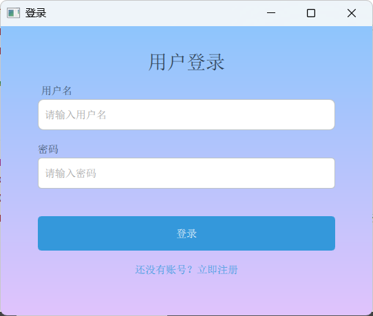
8、实现效果
9、总结
| 以上就是QML设计登录界面的整个过程了,浏览过程中,如若发现错误,欢迎大家指正,有问题的欢迎评论区留言或者私信。最后,如果大家觉得有所帮助,可以点一下赞,谢谢大家!祝大家天天开心,顺遂无虞! |


 扫一扫
扫一扫


 631
631

 被折叠的 条评论
为什么被折叠?
被折叠的 条评论
为什么被折叠?
 到【灌水乐园】发言


