


一、什么是Bootstrap:
Bootstrap是一个建立一个页面,就可以载三个终端(PC端,平板,手机)上完美展示的响应式前端框架.
二、为什么要用他:
1、响应式设计(Bootstrap的响应式CSS能够自适应台式机、平板、电脑和手机)
2、移动设备优先
3、浏览器支持
4、容易上手
三、用于哪里:
企业网站、博客、网站后台之类的网站
不适合 :电商(电商网站分类太多)
四、思维导图:

案例一和案例二如下:
记得导入CSS和JS
<!DOCTYPE html>
<html>
	<head>
		<meta charset="utf-8" />
		<title>案例1:查询按钮原生态实现对比Bootstrap方式实现</title>
		<style>
			.aa{
				background-color: #007BFF;/* 背景颜色 */
				color: white;/* 字体颜色 */
				border: 0px;/* 去除边框 */
				width: 50px;/* 宽度 */
				height: 30px;/* 高度 */
				border-radius: 4px;/* 设置边框圆角 */

			}

		</style>
		<!-- 支持手机端 -->
          <meta name="viewport" content="width=device-width,initial-scale=1,minimum-scale=1,maximum-scale=1,user-scalable=no" />
		<!-- 引入Bootstrap的CSS(样式) -->
		<link rel="stylesheet" type="text/css" href="css/bootstrap.css"/>
	</head>
	<body>
		<!-- 固定容器 -->
		<div class="container">
			<button class="aa">查询</button>
			<hr color="red" />
		<!-- Bootstrap的按钮 -->
		<button class="btn btn-outline-success">搜索</button>
		</div>

		<!-- 引入jQuery的类库 -->
		<script type="text/javascript" src="js/jquery-3.3.1.js"></script>
		<!-- 引入Bootstrap的类库 -->
		<script type="text/javascript" src="js/bootstrap.js"></script>
	</body>
</html>
效果如下:

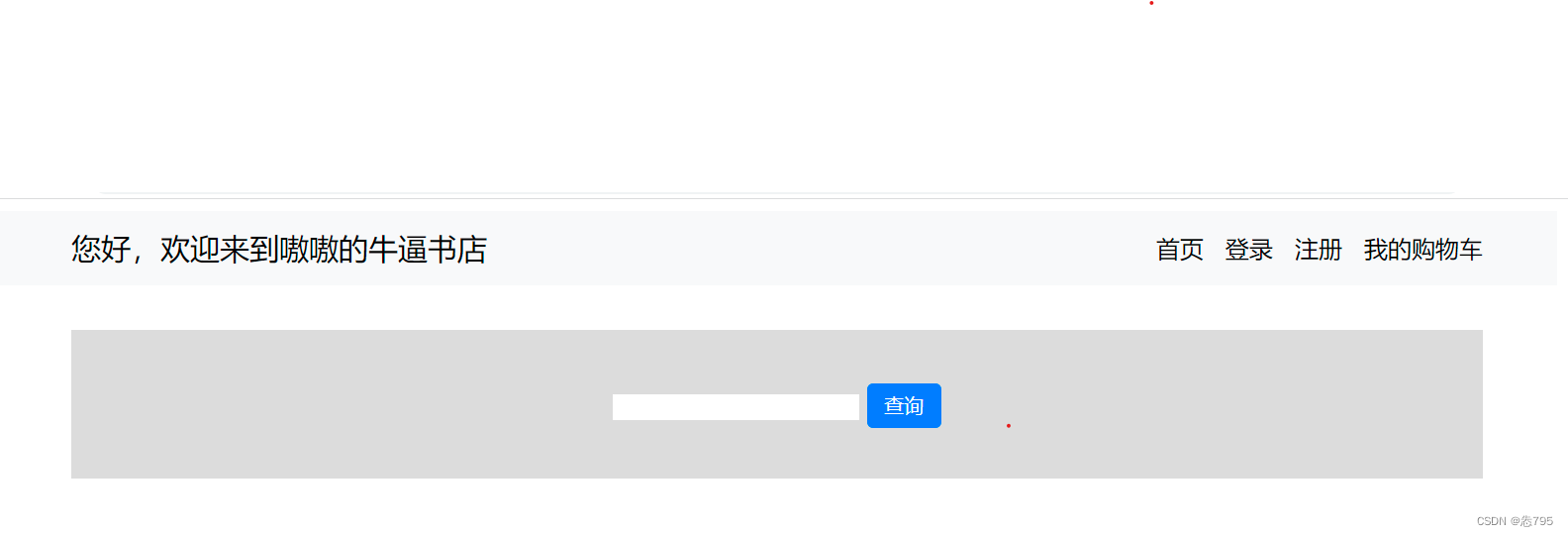
案例三代码如下:
<!DOCTYPE html>
<html>
	<head>
		<meta charset="utf-8">
		<title>案例3:首页导航&搜索区域原生态实现(div+css)</title>
	    <style>
			.dh{
				height: 50px;/* 高度 */
				background-color: #F8F9FA;/* 背景颜色 */
				line-height: 50px;/* 垂直居中s */
			}
			.bt{
				float: left;/* 左浮动 */
				margin-left: 50px;/* 左间距 */
				font-size: 20px;/* 字体大小 */
			}
			.an{
				float: right;/* 右浮动 */
				margin-right: 50px;/* 右间距 */
			}
			.an a{
				margin-left: 10px;/* 有间隔 */
			}
			.ss{
				height: 100px;/* 高度 */
				background-color: #DCDCDC;/* 背景颜色 */
				text-align: center;/* 水平居中 */
				line-height: 100px;/* 行高 */
				margin: 30px 50px 0px 50px;/* 上右下左 */
			}
			.ss input{
				border: 0px;/* 去除边框 */
			}
			.ss button{
				background-color: #007BFF;/* 背景颜色 */
				color: white;/* 字体颜色 */
				border: 0px;/* 去除边框 */
				width: 50px;/* 宽度 */
				height: 30px;/* 高度 */
				border-radius: 4px;/* 设置边框圆角 */
			}
		</style>
	</head>
	<body>
		<!-- 导航区域 -->
		<div class="dh">
			<div class="bt">您好,欢迎来到嗷嗷的牛逼书店</div>
			<div class="an">
				<a>首页</a>
				<a>登录</a>
				<a>注册</a>
				<a>我的购物车</a>
			</div>
		</div>
		<!-- 搜索区域 -->
		<div class="ss">
			<input  />
			<button type="button">查询</button>
		</div>
	</body>
</html>
效果如下:
案例四代码:
<!DOCTYPE html>
<html>
	<head>
		<meta charset="utf-8">
		<title>案例4:首页导航&搜索区域Bootstrap实现&搭首页框架</title>
		<!-- 引入Bootstrap的样式-->
		<link rel="stylesheet" type="text/css" href="css/bootstrap.css" />
		<style>
			.navbar-collapse{
				 flex-grow: 0;/* 固定容器中 1代表弹性过大占用父容器剩余空间  0代表不占用 */
			 }
			 .form-group{
				 width: 300px;/* 宽度 */
				 margin-left: auto;/* 左间距自适应 自动 */
				 margin-right: auto;/* 右间距自适应 自动 */
				 margin-top: 31px;/* 100-38=62/2=31px  居中*/
			 }
			 .ss{
				 height: 100px;/* 高度 */
				 margin-top: 30px;/* 上间距 */
				 background-color: #DCDCDC;/* 背景颜色 */
			 }
		 </style>
	</head>
	<body>
		<!-- 导航区域条组件  -->
		<nav class="navbar navbar-expand-lg navbar-light bg-light">
			<div class="container">
				<a class="navbar-brand" href="#">您好,欢迎来到嗷嗷的牛逼书店</a>
				<button class="navbar-toggler" type="button" data-toggle="collapse" data-target="#navbarNav" aria-controls="navbarNav"
				 aria-expanded="false" aria-label="Toggle navigation">
					<span class="navbar-toggler-icon"></span>
				</button>
				<div class="collapse navbar-collapse" id="navbarNav">
					<ul class="navbar-nav">
						<li class="nav-item active">
							<a class="nav-link" href="#">首页 <span class="sr-only">(current)</span></a>
						</li>
						<li class="nav-item">
							<a class="nav-link" href="#">登录</a>
						</li>
						<li class="nav-item">
							<a class="nav-link" href="#">注册</a>
						</li>
						<li class="nav-item">
							<a class="nav-link " href="#">我的购物车</a>
						</li>
					</ul>
				</div>
			</div>
		</nav>

		<!-- 栅格搭建主页框架 -->
		<div class="container">
			<!-- 第一行: 1列:搜索区域 -->
			<div class="row ss" >
				<div class="col">
					<!--搜索区域  -->
					<form>
						<div class="form-group">
							<!-- 输入框组合-->
							<div class="input-group mb-3">
								<input type="text" class="form-control" placeholder="书籍关键字" aria-label="Recipient's username"
								 aria-describedby="button-addon2">
								<div class="input-group-append">
									<button class="btn btn-primary" type="button" id="button-addon2">查询</button>
								</div>
							</div>
						</div>
					</form>
				</div>
			</div>

			<!-- 第二行-->
			<div class="row">
				<div class="col-3" style="background-color: yellow;">
					左三为书籍分类
				</div>
				<div class="col-9">
					<!-- 右9为 轮播图&新书上架&热门书籍 -->
					<!-- 右9中第一行 -->
					<div class="row" style="background-color: yellowgreen;">
						<div class="col">
							轮播图
						</div>
					</div>

					<!-- 右9中第二行 新书上架 5列-->
					<div class="row" style="background-color: moccasin;">
						<div class="col">
							①新书上架
						</div>
						<div class="col">
							②新书上架
						</div>
						<div class="col">
							③新书上架
						</div>
						<div class="col">
							④新书上架
						</div>
						<div class="col">
							⑤新书上架
						</div>
					</div>

					<!-- 右9中第三行 热门书籍 5列-->
					<div class="row" style="background-color: skyblue;">
						<div class="col">
							①热门书籍
						</div>
						<div class="col">
							②热门书籍
						</div>
						<div class="col">
							③热门书籍
						</div>
						<div class="col">
							④热门书籍
						</div>
						<div class="col">
							⑤热门书籍
						</div>
					</div>

				</div>

			</div>

		</div>
		<!-- 分别引入jQuery和Bootstrap的类框 -->
		<script type="text/javascript" src="js/jquery-3.3.1.js"></script>
		<script type="text/javascript" src="js/bootstrap.js"></script>
	</body>
</html>
效果如下:


 485
485


 被折叠的 条评论
为什么被折叠?
被折叠的 条评论
为什么被折叠?
 到【灌水乐园】发言


